")
Jan
2016
Advert Draft 1 – Feedback – Targets
After completing the first draft of our advert, we collected feedback, so we could get suggestions for what could be improved. I asked an A2 Media Studies student (Cameron Le Page) to look at the first draft of my advert, I then transcribed what he told me.
Draft 1 of Advert:
Below is the image Cameron provided feedback for.
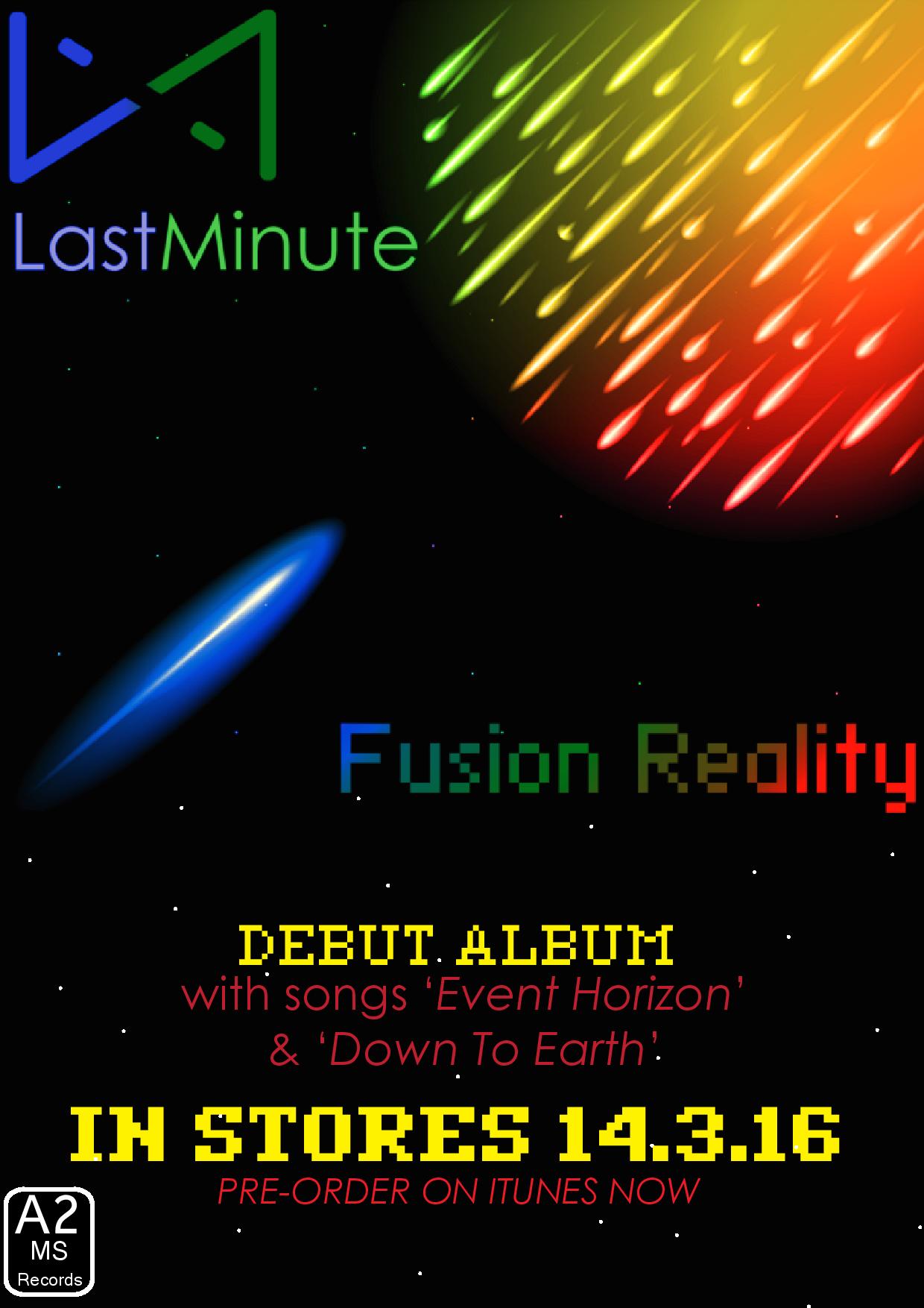
Feedback:
“The colours in the advert contrast and mix together well to create an interesting and attention grabbing poster, The text fonts work well with the electro genre and the image at the top works well with the style of music. The pixelated text also adds the electronic genre feel to the advert, which combines with the image. The headings and sub-text also attracts the audiences attention to all the right places.” – Cameron Le Page
Overview:
- Good use of colour
- Grabbing poster
- Effective fonts used in relation to genre
- Front cover image works well with advert
- Heading and sub-text attracts the audience’s attention to all the right places.
What I have learnt:
Based on this feedback I am happy with the overall quality of our advert after receiving this response. I feel that we will not need to drastically modify our advert from its current form. However, we will still be editing aspects of the advert as we feel there are some aspects that need to be modified. For instance, in the feedback Cameron states the font is effective for the electronic genre, although we feel that the font size is too large. In our next draft we will be looking to reduce the size of the font at the bottom of the page.