December
9
December
6
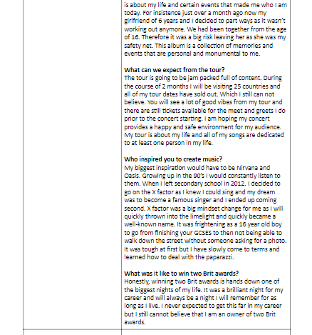
Draft Feature Article
From this read through my article I have produced some targets for my next draft:
- Find some better adjectives and synonyms for the words I repeated using throughout the article
- Ensure my sentence structure is better
- Proof read my work before submitting as some sentences didn’t make sense
- Check for Spelling, Grammar, Punctuation
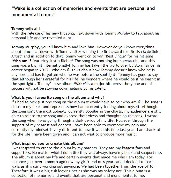
Please click to view the article
Feedback from first draft:
- Very nicely structured overall
- A few words that weren’t finished or spelt incorrectly
- Make sure you proof read your work before submitting it
- Always check for punctuation
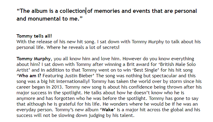
Below is my new and improved article:


What has changed from the previous article?:
- I have proof read my sentences before submitting it.
- Improved on my punctuation and spelling
- I have made the sentences flow better
- I have added a name for the tour
What can be improved?:
- I could cut down the story line as it is quite long
- Speak more about the tour
December
5
Draft 3 of front page

Please click on this link or the image to view my next draft of my magazine
Above is my third draft of my front page of my music magazine. Since my second draft I have listened to my peers opinions and I have now changed the following:
- Make the price tag a more basic font like Ariel
- Make the ‘Tour Poster Exclusive’ Box Bigger
- Capitalize ‘Worlds’ and ‘Best’
In addition to that I have also added an outer glow on the name ‘Tommy’ for a dramatic effect.
When producing a new draft of my magazine I will be including or improving on the following:
- Add in a logo whether its a logo of a music platform (I.e Spotify or soundcloud etc)
- Play around with the line underneath the masthead
- Make the date and issue number a more basic font like the price tag
- Experiment more with the masthead
December
2
Article Idea Development

December
2
Language Analysis
Part of the task is to not only take the photos and do the design of the magazine; but I am also required to write a double page article, in addition to that I will be assessed on that writing.
Therefore, I need to analyse an article from a professional music magazine and consider how it is written. I should be considering the target audience and evaluate how the written word (copy) fulfils their needs, uses and pleasure of this particular media text.
Previously we agreed that their needs, uses and pleasures included:
- Up to date information (gigs, trends, available media…)
- Fashion ideas / new looks
- Gaining an insight into stars’ lives and personalities
- A reflection of their own values, attitudes and beliefs
We were asked to analysis one of the following articles:
- Biography
- Intro to a long read
- 10 Tips for Life
- Q&A
- New Band
- Album Reviews
- Interview
I have choose to look closer into an article based off of an interview.
Task:
‘Billboard (June 20, 2015), Adam Lambert: Don’t Look Back, Shirley Halperin’
The Article:
The article I have selected to look at, is by Billboard magazine published on the 20th of June 2015 and is about Adam Lambert. Lambert talks about his experiences and his struggles in the music industry. The musician in the magazine is typically styled for the genre of the following:
- Pop Music
- Dance Music
- Pop Rock
- Electronic Music
Structure:
The article is presented as an Interview and displayed through columns. I like how the writer has chosen to do an interview for Lambert as it feels more personal then a Q&A. This allows the audience to get an closer insight to the background of the musician.
Presence of Journalist:
There is a clear tone that there is a journalists presence instantly due to the tense being written in 3rd person. ‘After six years in the spotlight, Lambert, 33, is still trying to find himself and his comfort zone in the music industry.’ This conveys the idea that the journalist is behind the scenes as the narrator.
The article states the journalists name at the start (Shirley Halperin). However we do not hear the journalists name again, this has been done to ensure we have a level of professionalism and will stay formal as there is not any personal or opinionated language from the journalist.
Language and Aim:
The article is presented from two perspectives. The journalists and Lambert are the perspective. When Lambert is speaking the journalists has indicated this by using quotation marks. “The album is really honest, It’s about where I’m at in my life right now.” The quote conveys that Lambert is opening up in terms of his new album and is okay with sharing personal information. This conventional language means that the majority of readers will most likely have a preferred style of reading to the article. Another quote that Lambert has said is “I don’t know what I want in relationship, which is probably the reason I’m pouring my energy into my work. I’m dating my album right now.” This quote is talking about how Lambert struggles with his love life and is confused as to what he wants in terms of his relationship status. Due to the fact that Lambert struggles with his relationship status, he has chosen to focus predominately on his music as that is his main passion.
Representation of the Performer:
The article is represented as realistic and down to earth with it’s casual style of interviewing. This indicates that the target audience are able to relate to the musician showcasing their personal identity. Lambert is represented as powerful in his own work. “So I sat with the idea and started researching the time period, but it just wasn’t resonating with me. It felt forced.” This shows that he is not going to stay with an idea if it doesn’t suit his style and personality. In addition to that it appears that isn’t afraid to speak out about when something isn’t right.


Click here or the image above to preview the article
December
2
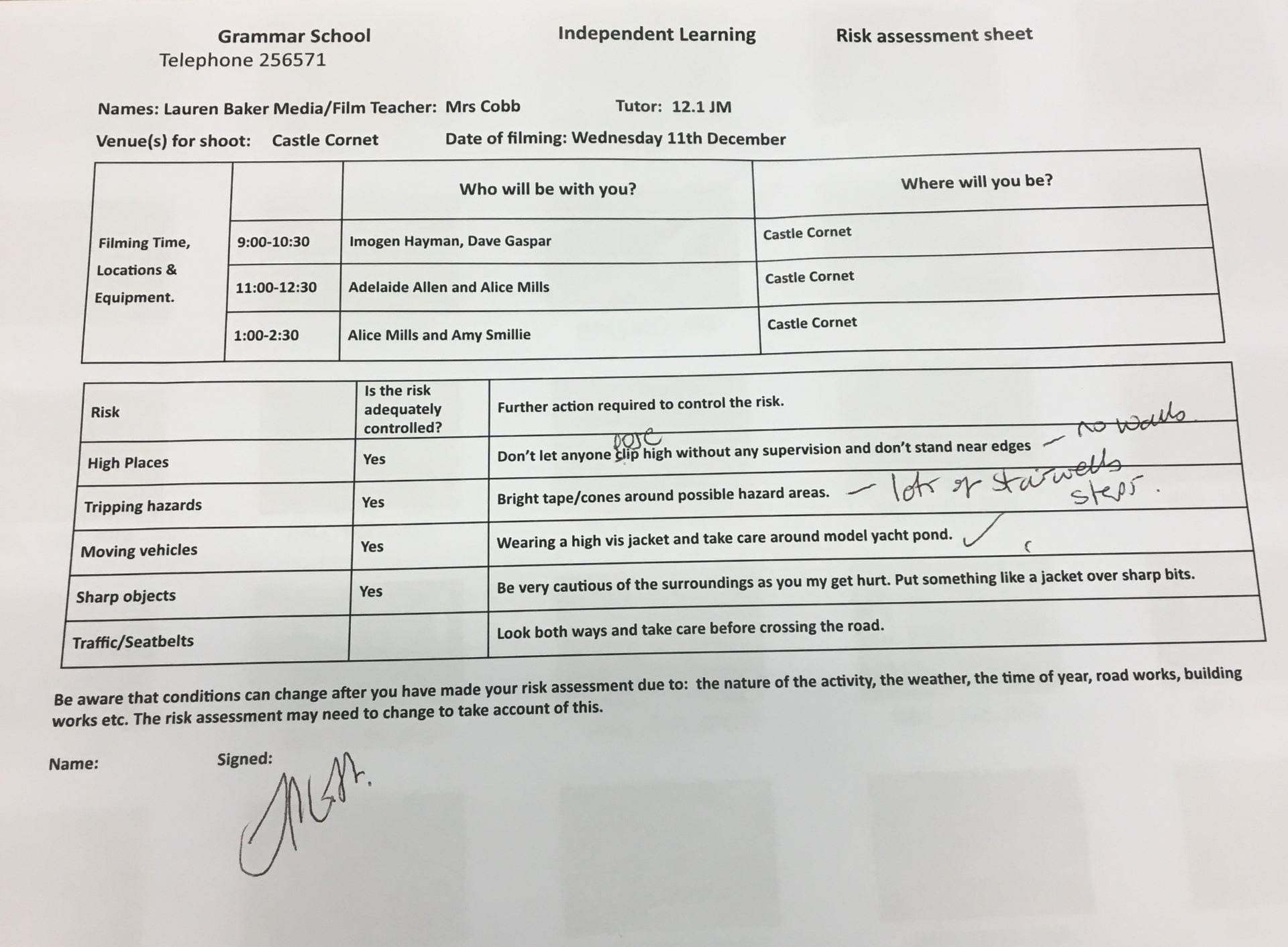
Production Meeting Agenda For 2nd Photo Shoot and Risk Assessment

November
28
A New Improved Front Page
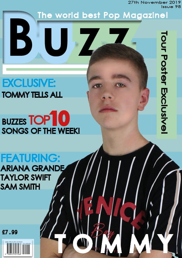
Click Here To Have A Closer Look At My Magazine Front Cover
The image above is my new and improved version of my magazine, I have changed many things since I last produced a front cover. I took on board the previous advice my fellow peers gave me on how I could improve my magazine. Below is my first draft and then next to it is my current draft.

The magazines are very different. I am happy with the final product. I changed many things as I felt they did not work.
Changes I made from magazine draft 1:
- I changed the cover star image as I felt it didn’t fit my genre of music correctly.
- I have changed the font style as the previous one wasn’t quite right.
- Added blue stripes on my background for extra effect instead of the one green strip
- Added more information
I have gotten some feedback from a fellow peer on how I can make my magazine even better and they have said I could improve on the following:
- Make the price tag a more basic font like Ariel
- Make the ‘Tour Poster Exclusive’ Box Bigger
- Capitalize ‘Worlds’ and ‘Best’
November
27
Draft of Front Page

Click here to view my first draft of my magazine.
The image above is my first draft of my magazine ‘Buzz’ I asked one of my peers to examine the front cover and give me some feedback on how I can improve my poster and make it better. Overall she likes the colour scheme I am going for. However she felt as if my model was distorted, however she is unable to identify why it doesn’t look correct. Personally I do agree with the comments and feedback she gave and will be taking this information into consideration when producing my next draft of my magazine cover. This information is crucial as this will allow myself to progress and produce a better front page cover. In addition to that my peer noticed a little white spec on top of my model, during Photoshop I will ensure to have removed any excess background.
November
19
First Shoot Contact Sheet(s)
Contact Sheets:


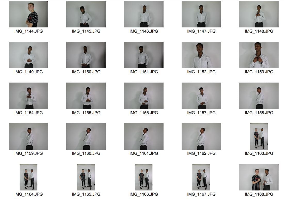


Click on this link to see the images close up
The images above are my contact sheets from the photo shoot I took of my models. There is variety of different camera angles. By using the soft box lights I was able to enhance my models features and ensure that they look their best. When looking at the photos it made it clear how much a pose and stance can convey the message the model is trying to get across.
![]()
The slide show above shows some of my favourite images from the shoot. I have noticed some of the ideas are quite dark however the stance and facial expressions are perfect for my style of Pop. I will be using Indesign and Photoshop a lot to help design and construct my magazine cover. To get the look i wanted I used the research I had been doing from previous lessons on camera and flash equipment, which made it a lot easier to take photos. The images portray the air of power and confidence. These are major factors I looked into when researching for my star.

Above is the photo I have edited in photoshop which is my cover photo for my magazine. I used different tools such as the eye whitening tool to ensure the colour and make the eyes stand out.
November
15
Mast Head Designs

Click here to view my masthead ideas in full view:
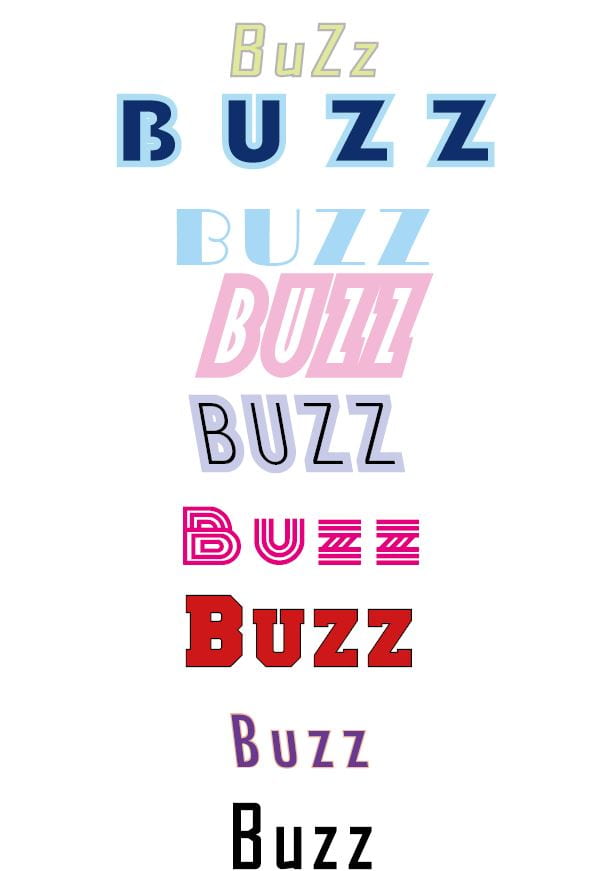

Above are 9 examples of Mast Head Designs I have done using Adobe INDESIGN. We were set on the task to start looking at different styles of fonts, different colors and sizes. My magazines name is ‘Buzz’ and I have experimented with a variety of fonts and colors. Overall I am impressed with how the fonts turned out and would say this task is a success. Also above we have an Adobe Color Wheel to get an idea as to what kind of colours would suit my magazine best. I have decided I like the pastel route of specific colours such as Yellow, Blue and Purple. My reasoning for choosing these colours is because this is the kind of styling I would like my magazine to be. I personally like the 4th and the 5th fonts the best as they are the closest to my adobe colour wheel experimentation.