November
25
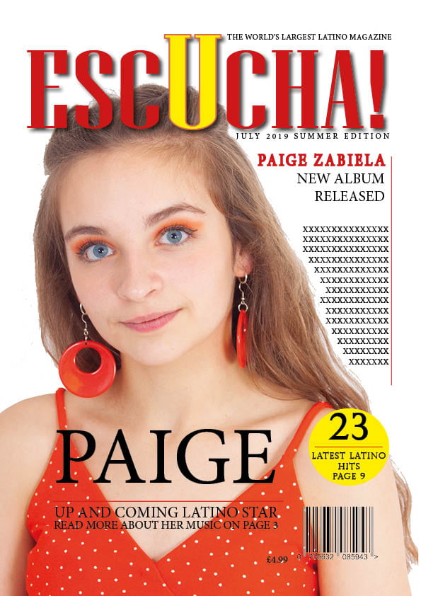
Draft of Front Page
This is the first draft of my magazine cover. So far I am happy with how my magazine is going.
I think that these factors all work well:
- The masthead- it stands out and is interesting
- The colour scheme- is eye catching and suits the theme
- The imagery- is suitable for the genre and different
I think that there are some areas that I need to improve on to make my magazine even better such as:
- A background- as currently my magazine is too plain.
- Texts- don’t use too many different texts and ensure they can all be read clearly.
- The pug- is not situated in a suitable place and is too large
A peer assessment stated that I should think more about:
- adding more colour to make it more interesting
- think about using a background
- change some of the fonts so they are easier to read
- lower the date and edition as it is too close to the masthead
- add more small bits of information to engage with the reader so that they want to buy it
I think that my masthead works well as it stands out and is interesting. I also like the colour scheme that I have used. To improve my front cover, I think that I need to make a background to improve it and make is stand out even more.