October 14

Digipak Photoshoot

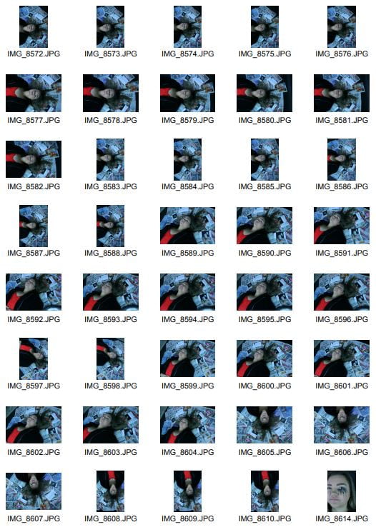
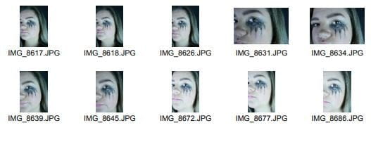
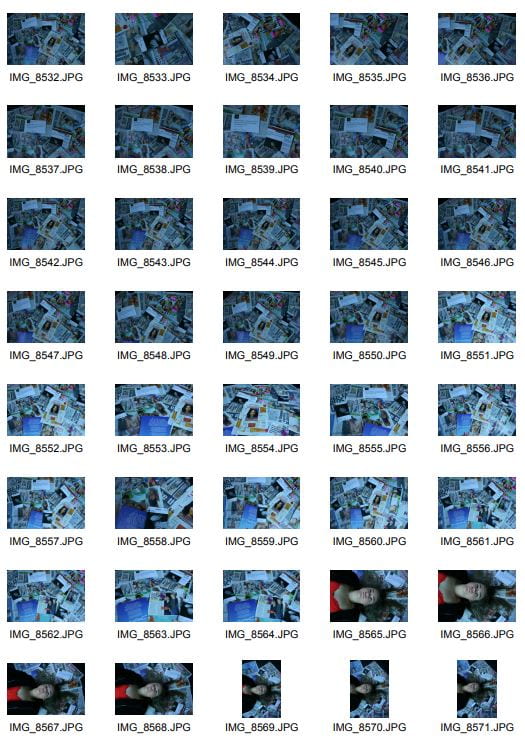
Here are the contact sheets from our photo shoot. Overall our photo shoot went really well, and me and Paige were really happy with what we got out of the shoot. We think that we have achieved an image for each part of our digipak which we feel will work well and be successful. We were able to attain all of the different types of shots we needed and more, we had additional photos in case any of our previous ones did not work how we wanted them to. We felt that the newspaper collage background that we made worked really well and was effective in conveying our narrative.

Category: Digipak | LEAVE A COMMENT
October 12

Photoshoot / Design Production Meeting and Risk Assessment

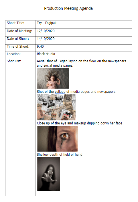
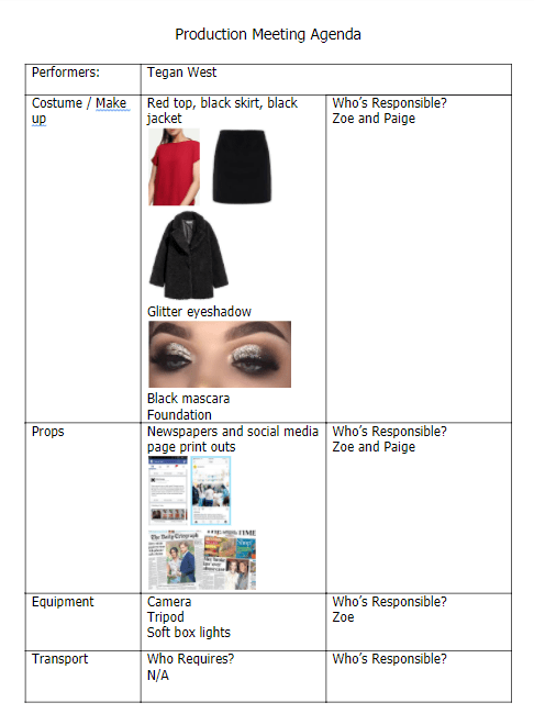
Here is the production meeting agenda for our shoot for our music video. We planned out the shots that we needed, the mise en scene, equipment and props. This helped us to ensure that we had everything ready on the day.

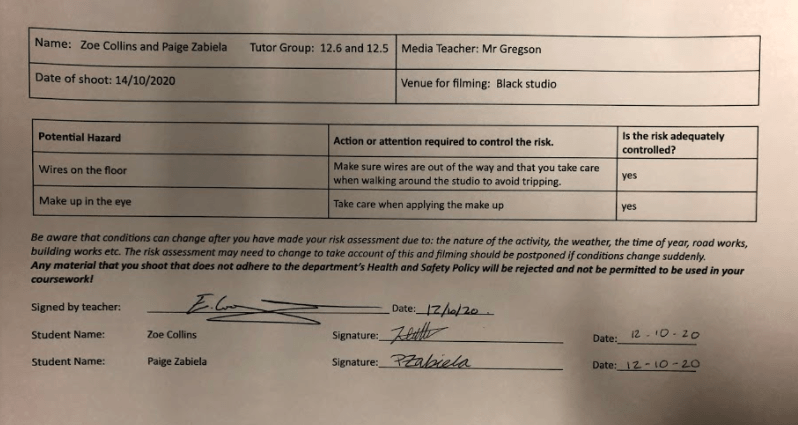
Here is the risk assessment that we have filled out to ensure that ourselves and models are safe.

What are our aims for the shoot?

  • To gain good imagery to use in our digipack.
  • To explain our narrative through our branding.
  • To express the artist and what she believes in through the digipack.
  • To make the images striking and eye catching to draw the audience in.
  • To express emotion through our photography.
  • To make the photography relatable for the audience.
Category: Digipak | LEAVE A COMMENT
October 9

Hand drawn mockup

Here is a hand drawn mock up that we have made for the plan for our digipack. We thought carefully about the ideas that we had collated on our Padlet board, and had a discussion as a group about what we wanted to achieve. We sketched out some ideas, and then made our final design. Here is the design that we have made.

Reflection:

We wanted to continue the themes from our music video into our Digipack, we wanted our message to stay the same and present a strong idea about what our artist stands for. We chose to feature our artist on the front  surrounded by media texts to demonstrate how she is always in the light and feels constantly attacked by them. On the back we then had her with her hand raised this was to demonstrate that she was fed up and she had had enough. We chose to have media articles and posts written about her behind the CD. And then a picture with her makeup running to the left, this is ti demonstrate how the media is drowning her and she is being broken down, her own message and ask for help will be written in her tears digitally.

Overall I think that we demonstrate our message clearly in our Digipack plan. I think that we have emphasized not only the impact that the media can have, but how artist are unwilling to stand for it anymore. Paige and I are really happy with our design, and we feel confident that it will work well and demonstrate our message.

Category: Digipak | LEAVE A COMMENT
October 7

Branding Moodboard

Here is a Padlet that me and Paige have made to collate our ideas for the Digipack. Before we began to design our own design, we wanted to collate our ideas together, we included copy, typefaces, photography, album covers and lighting ideas. This helped us to get some more ideas on the way that we could make our digipack and also different elements of photography and editing that could help us make a really cool design for our Digipack. We wanted to continue our idea of critizing the media and social media, and the concept of star image. We wanted our album to break the conventions to demonstrate that people can break societies expectations of them and be their own unique self. We felt that we needed a strong element and focus on typography and the photographic element to our Digipack. We found some denotations that represent, connote and encode not only the music genre that we have chosen but also the star and her message.

Made with Padlet
Category: Digipak | LEAVE A COMMENT
October 7

Digipak Conventions Analysis

Here is a slideshow that I have created where I have analysed the album “Reputation” by Taylor Swift. I chose to evaluate this album because Taylor Swift is in a similar genre to our chose artist. This album was also known for the way that it criticizes the media and the press not only in the album art and design but also her music as well. Overall, I really liked the style and layout of this album, especially the use of the black and white. I think that it works really well to not only demonstrate her message but to represent the artist and what she stands for as a whole. I also looked into the presses response to the album release and also the response from the audience on how they reacted to it.

Category: Digipak | LEAVE A COMMENT
October 5

Our Mission Statement – The Package Brand

Here is a slideshow that I have made with Paige, on our mission statement and the branding of our digipack and artist. We revisited our audience and the importance that they will have on our digipack design. We also wrote a call to action, their USP and looked at the competition of our star. We also looked at our mission statement for our digipack.

Category: Digipak | LEAVE A COMMENT
September 30

Music Video Draft 5

After receiving some more feedback from conversations with our peers and our teacher. We made a few additional changes to our music video.

WHAT WE CHANGED:

  • We felt that our wipe transitions were a bit harsh and we wanted to make these a bit smoother and a bit more fluent. To learn how to do this we watched a youtube video, attached below, on how to create a feather wipe. We did this by adding in a video effect of a linear wipe and then elongating our second clip. We could then make this as feathered as we wanted. We felt that this made a smoother transition and it was more fluid. This worked well and we were happy with the way that it looked compared to our previous edit.

SELF ASSESSMENT:

  • Our teacher also suggested feathering the split screen, however we felt that the harsh wipe was more impactful as it showed a greater contrast and juxtaposition between the star and the ordinary people.
  • Paige and I were really happy with this edit. We felt that we had improved it as much as possible and had responded well to feedback that we had been given by our peers, teachers and people in the industry. We worked hard to make our video as successful as possible, and we now feel that both our performance and narrative segments are powerful and meaningful. Overall we are really happy and proud of what we have achieved.

Here is our draft 5 of our music video…

September 28

Music Video Draft 4

Here is our 4th draft of our music video. Paige and I are very happy with this draft, and we think that it has gone really well.

In this draft we changed:

  • COLOUR: we used the adjustment layer tool to add filters onto our footage. We wanted to create an Instagram filter effect, so that it represented the idea of the people feeling acceptable to post themselves on social media when they had make up on. This was very effective and worked well.
  • KEY FRAMES: we used key frames throughout the video to slowly increase/decrease the filters that we applied. This allowed us to either remove the filter with the makeup, or add to it as the artist changes. Whilst this was time consuming, the end product worked really well and we felt it conveyed our message even more.
  • TRANSITIONS: we added in some more transitions such as the wipe transition, this was meant to symbolize the idea of the makeup being wiped off which we felt worked well. We also added in a few more cross dissolve transitions.

WHAT WENT WELL:

  • I think the juxtaposition between the complete Instagram filtered look and the authentic look works well and conveys the message well to the audience of what we are trying to achieve. I think this worked well in the wipe of the messages.
  • I think that the whole video has come together well, our peers agreed with us and understood the narrative in the video.

THINGS TO IMPROVE ON:

  • Make the wipe transitions softer, or feathered so that they are less harsh and the videos blend more into one another.

Here is a video of our peers watching our video and giving us feedback at the end. We asked them if they understood our narrative and if they felt that there was any areas that we needed  to improve.


September 24

Critical Reflection 01

How does your music video use of challenge conventions…form, genre, star image, narrative…? How do your music video represent social groups or issues?


Our video challenges a lot of conventions regarding the way that women are expected to portray themselves, but also the expectations placed on the star to appear as the definition of perfection. The aim of our video is to reflect the idea that expressing your true identity will bring you the most happiness. We looked heavily into and focused on the star image in our music video, and the impact that being a celebrity had on your identity. We wanted to present our star as a normal person, that they are no different to you or I. We wanted them to be relatable for the audience and for them to appear naturalistic. However over the course of the video the star begins to change, this is from pressures of the management company, the media and the public. Because stars are always under the public eye, photographers, journalists and reporters are always following them. This means that the artists are always under pressure to look their best. There are high expectations on them to appear in a specific way, they are not able to be their true selves without being scrutinized by the media and audience. it also demonstrates the pressure of the management, they want their star to appear a certain way, they need them to fit the stereotypes of what is expected from them. As if they are too different or too unique then the public and audience will reject them. Therefore in our video we tried to make slight changes to our star throughout the video, she stars naturalistic with no make up, in causal clothes and she is happy and free. This then changes as the video progresses, she then is placed in a studio, with harsher lighting, and her outfit changes. We then begin to add makeup, and also there id a gradual filter being added to the star. By the end of the video she is presented to be the ideal, she is made up and has extravagant make up. This demonstrates these pressures on her to look this way, because at the end she is not happy or comfortable where she is.

We then wanted ‘ordinary’ people, who are members of the public to feature in our video as well. They were supposed to represent the audience, and they would be able to relate to them.

September 24

Music Video Draft 3

Here is the 3rd draft of our music video, in this draft we made some changes from Feedback that we received from our teacher.

What changes have we made?

  • Made the true taking off of make up and hair later- this added more emphasis on how the stars were unhappy being in this position, and meant that we could use more of these shots from our shoot to really emphasis their unhappiness and the extremes to the makeup. We moved this to around half way through rather than about a quarter of the way through. This slowed down the pace of the whole video, and made it flow more nicely, it also meant that the narrative lined up more with the performance and the that the reverse of what is happening to Tegan is happening at around the same time.
  • We added in transitions between the shots. We used different ones in different areas e.g. the wipe so that it reflects her wiping the make up off, the cross dissolve to fluently dissolve the shots from one to another as the star begins to get made up for her performance. These were successful in continuing to exaggerate our narrative, they added more effect and as a whole made the whole video more exciting, it makes the video less repetitive and adds something new to the different segments.
  • Switched the clips at the beginning so it starts with a close up of the star, this added a better dynamic and introduction to the beginning of our video. Even though this was only a small change, I feel that it sets the video off to a better start and is much more effective.
  • Removed the lens flare near the end as it was not necessary and did not really fit our theme or the rest of the video.
  • Made the ending longer to drag out the emotion. As she closes her eye, we wanted to slow it down to add more emotion and more feeling into the piece.

What is next and how can we improve? 

  • Next we want to look into adding colouring changes, filters and adjustment layers into our video. We want to experiment with what Lenny from Specsavers taught us. I think that this will add even more impact into our work, and can help us to make our message even stronger. We will do this by adding adjustment layers and key marks to change the opacity of the effects at different points. This means that for the star the filter will becoming stronger enhancing this idea of perfection. However for the narrative the filter will be decreasing to nothing, showing how they do not need this filter to be beautiful.
  • I think that we could add in some more transitions to really emphasis the message and make our video exciting. it would also make some of the transitions a little bit more fluent. However we do not want to add too many otherwise it would become too much.
  • I also think that we could make a few changes to the basics like the exposure just to make sure all of our shots are as good as they can be. These slight improvements will do a lot for the video as a whole.
  • Could we feather the wipe transition to make it a bit softer and less harsh.
  • Maybe make the divide between the split screen a bit smoother as well so it is less harsh.

Peer Feedback

We asked some of our peers to watch our music video and to comment their thoughts on it. In their opinion what went well and where could we improve? I t was very helpful and interesting to see what different people liked and disliked and also the way that they interpreted our message behind our music video. As a media producer, it is important to seek feedback and try to get impartial audience comments, this way we can improve our music video further and make it more impactful for the audience. We used impartial viewers for our comments, who had not see it or had no connection or knowledge of the message, therefore we could see their understanding and how well it is portrayed to the audience.

Tegan West

Rhiannon Dowinton

Jake Bradley

First of all I really enjoyed the mise en scene that was used from the makeup to the outfits. Second of all I think the mirror shot is nice and works well with your theme.
I think the shot of the star in front of a black background gets a bit repetitive, so maybe you have some other shots to change it up a bit?But overall, think it is great well done 🙂

Sylvie Rouget