After completing some changes to our draft 3, like changing the spines and adding some more graphic continuty throughout, we printed everything out to get a good idea on how our digipack design looks in physical form as a hard copy.
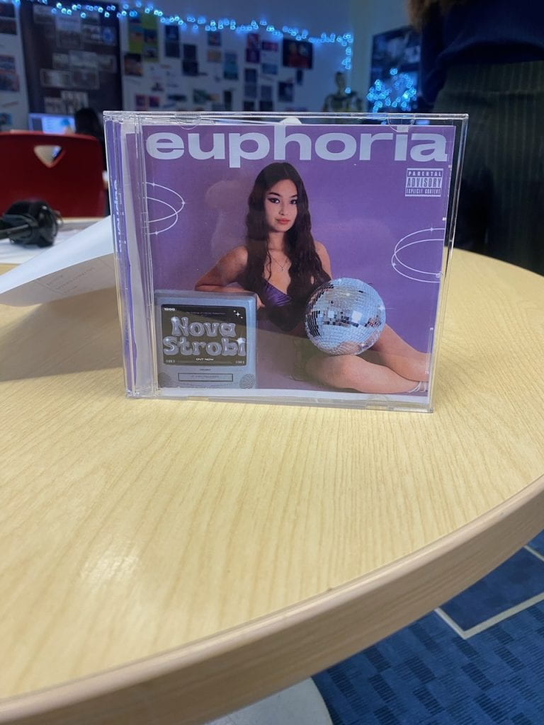
From doing this we could identify what worked and what perhaps needed some changes.
Summary of Reflection
- The front cover looks good, the star is well placed using the rule of thirds and the text in the tv stands out more after adding some sparkle effects
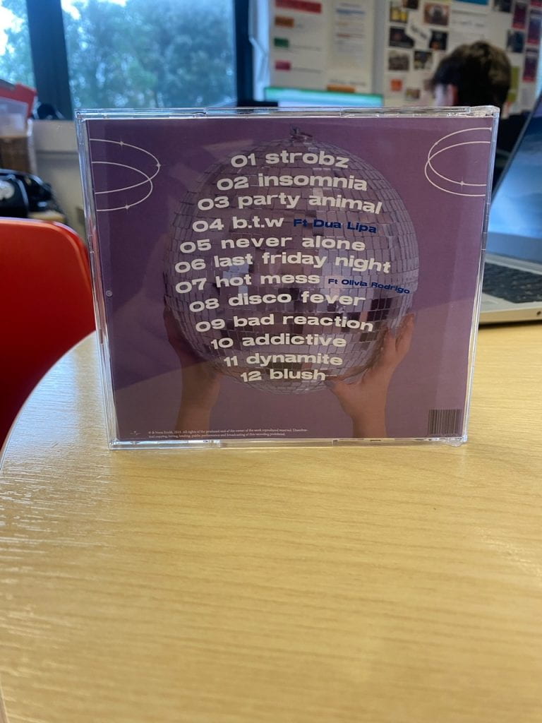
- Adding rings to the back cover has created a more cohesive look
- The spines could have some graphics like maybe a sparkle just to make it stand out more
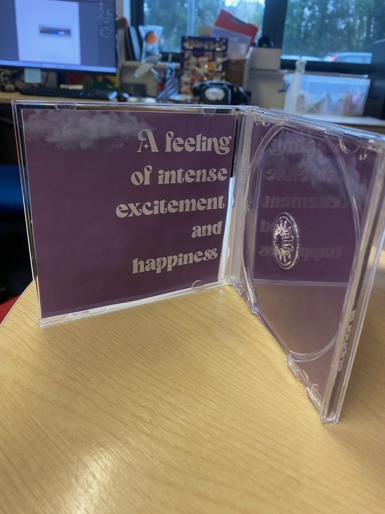
- The inside pages looks quite dull so we perhaps need to add some more clouds and sparkles to really tie in the whole theme
Furthermore, we got student feedback to see what genre they thought our digipack fitted in to.
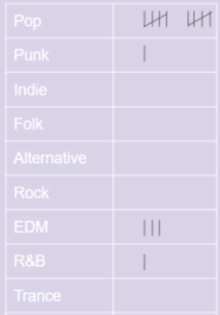
The majorety agreeded ours was a pop album which proves we successfully represented the genre through our media language choices.
From this reflection, we now are coming to the final stage of our design with just a few adjustemnets to really ensure our digipack looks complete and and has all the genre conventions and technical conventions of a digipack so the audience can have this prefered reading (Hall).