Digipack Final Draft

After multiple drafts and edits we have final completed our final draft for the digipack of ‘euphoria”.

Click on front cover to view PDF

Within the music industry, artists don’t make a lot of money from music royalties and streams therefore it’s important we also push and sell hard copies as this is the main source of revenue. Moreover, despite the digitalisation of the music industry it’s evident that the audience and consumers still enjoy having that physical copy as it creates a stronger sense of fandoms (Jenkins) and builds loyalty between fans and artists.

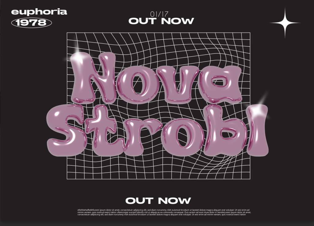
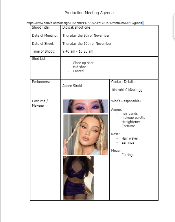
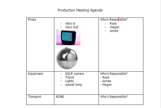
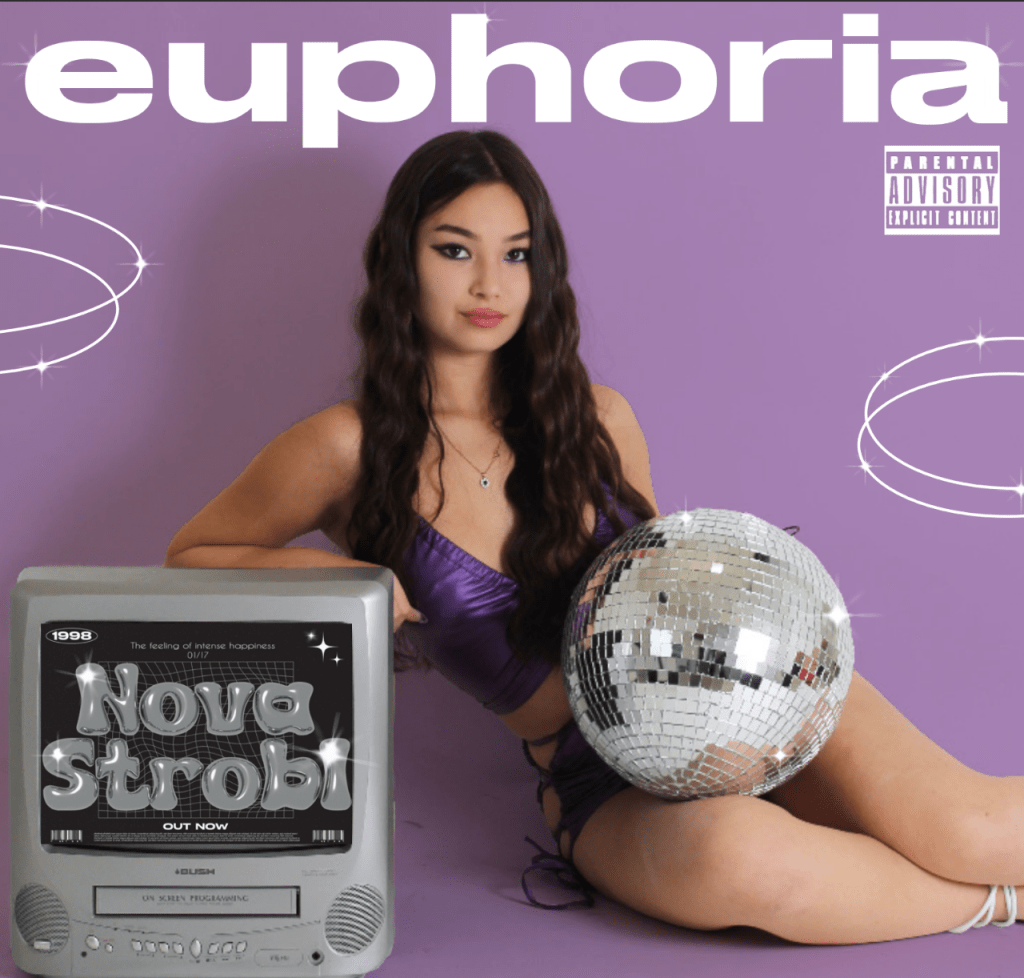
After reasearching the key technical and genre specific conventions for a pop digipack we began the designing and production process using adobe photoshop to edit and do photo manipulation , indesign for the designing process like the text and layout then used adobe illustrator when creating the graphics like the sparkles and the inflated text in the tv. Due to the project being a group work we all had roles in order to collectivly contribute in the design and production, more specifically my main role was designing and creating the graphics like the tv advert and spakrles using adobe illustrator getting feedback from my teammates working effiently together.

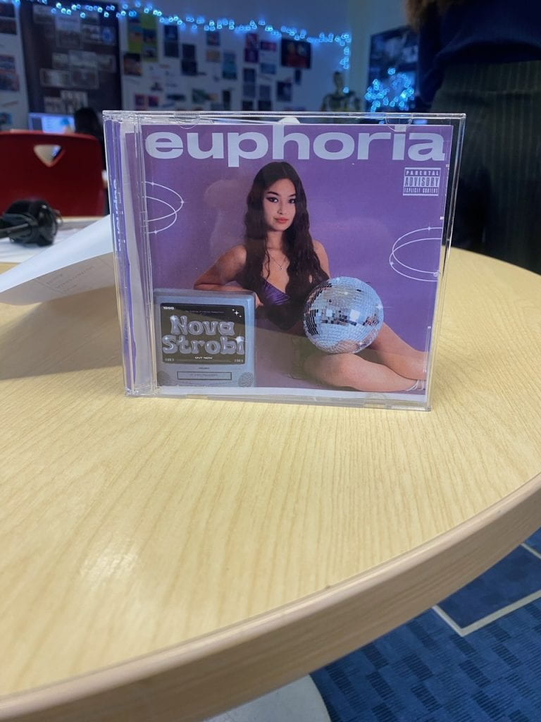
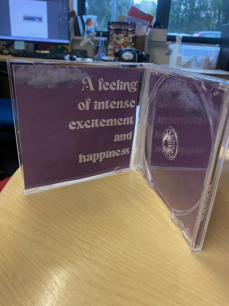
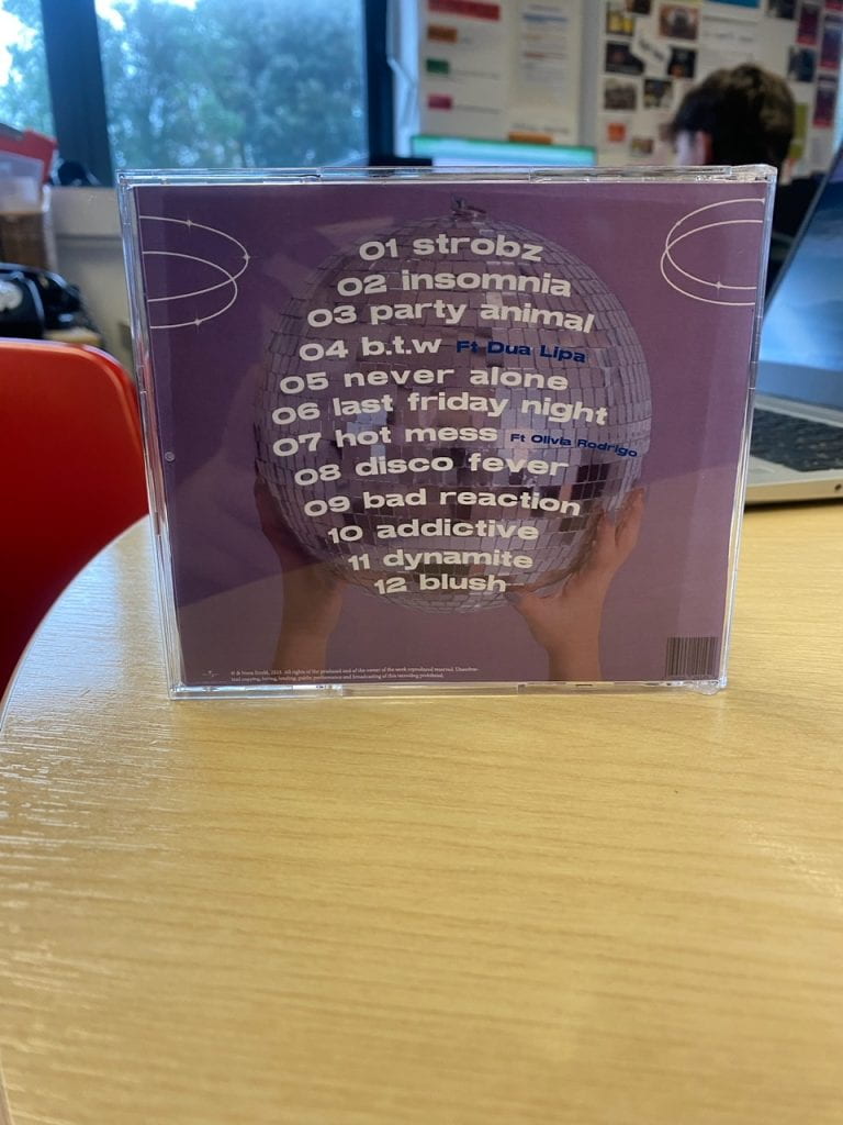
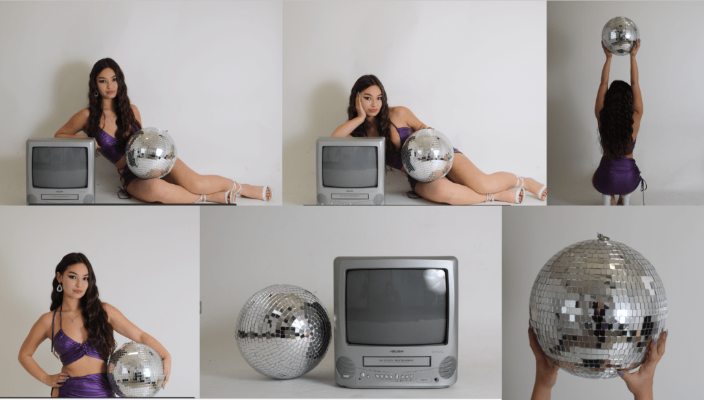
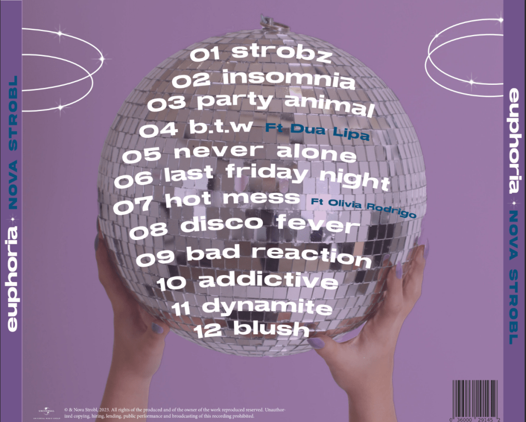
In keeping with our misson statment and brand identity we created a digipack that followed a retro-nostalgic feel with cultural codes (Barthes) of a disco ball and tv signifing (de Saurrure) this. To create a cohesive look we followed a coulour scheme of prodomitly purple using the colour theory where an audience can assoisate a certain era/album with a dominant colour making the album more memomarble. We created cloud graphics for the inside covers as it represents this ‘euphoric’ out of this world feeling that nostalgia brings with the sparkles creating an overall cohesive look throughout. Combining elements of retro with modernity with the costume and modern, techno ad with have created an engaging, magical digipack that perfectly represents our brand identity and mission statment.

Digipack Draft 3

After completing some changes to our draft 3, like changing the spines and adding some more graphic continuty throughout, we printed everything out to get a good idea on how our digipack design looks in physical form as a hard copy.

From doing this we could identify what worked and what perhaps needed some changes.

Summary of Reflection

  • The front cover looks good, the star is well placed using the rule of thirds and the text in the tv stands out more after adding some sparkle effects
  • Adding rings to the back cover has created a more cohesive look
  • The spines could have some graphics like maybe a sparkle just to make it stand out more
  • The inside pages looks quite dull so we perhaps need to add some more clouds and sparkles to really tie in the whole theme

Furthermore, we got student feedback to see what genre they thought our digipack fitted in to.

The majorety agreeded ours was a pop album which proves we successfully represented the genre through our media language choices.

From this reflection, we now are coming to the final stage of our design with just a few adjustemnets to really ensure our digipack looks complete and and has all the genre conventions and technical conventions of a digipack so the audience can have this prefered reading (Hall). 

Digipack Draft 2 Teacher Feedback

Here is Draft 2 of our digipack which we recieved lots of feedback from our teacher of any improvements and ajustments we could potencially make.

Here is a summary of the feedback:

Front Cover

  • The rings are good however we should incoorporate them throughout
  • The text on the TV doesn’t stand out perhaps try a light purple or white colour
  • The sparkles are good

Inside Pages

  • The clouds are nice
  • Consider graphic cohension
  • Add in the definiton of euphoria

Back cover

  • Copyright info needs to be correct.
  • Pull rings throughout.
  • Nice attention to detail with the nails.
  • Add in record label logo and check conventions.
  • Look at the curving of the font at the bottom of the disco ball as the ball then curves the other way.
  • Possibly change the colour of the song numbers to blue to tie in the colour on the panes.
  • See what it looks like with no capital letters to be consistent with the song tittle.
  • Add in some sparkles on letters on the track list.
  • See if we can weave in the font we have used on the inside

From this feedback we can reflect and look back when creating our draft 3 design taking some on board to overall improve our design. For example, we shall add some rings on the back cover as suggested to create some graphic cohesion througout and morever we will also add some more clouds to the inside pages to again create more graphic cohension giving the digipack a complete look. It is also vital we fix the copyright as this is a key technical conventions of a digipack.

Digipack Draft 2

Here is our 2nd draft for our digipack.

Whats New

  • Added inside pages with the definition of euphoria with some clouds
  • Added the tv advert design into the tv
  • Created some ring graphics on the front cover
  • Added sparkles to make to make the design stand out more
  • Curved the text to match the shape of the disco ball on the back cover
  • Added spines with the album and stars name
  • Added some technical coverntions like a barcode, copyright and parentory advisory label

We have made lots of progress so far and now to further improve our digipack we will seek external feedback from our teacher to get an idea of what works and what perhaps needs adapating to ensure our product is not only visually pleasing but also represents our genre and star image successfully.

Digipack Draft 1

Here is our Digipack draft 1 for the front and back cover as well as the tv design.


Whats Good

  • Some technical conventions like copyright, barcode, track list and the album title
  • The bold, modern font for the album title looks sleek
  • The front cover background colour scheme looks well blended and the purple represents nostolgia and our brand identity very well. Having a signiture colour throughout our campaign helps keep a brand identity consitent and more recognisable.

Whats Next 

  • We need to sort the track list layout out by fitting the inside the disco ball curving the text
  • We need to add the advertisment inside the tv with our stars name as this is a conventional technical feature
  • We should make the image bigger to fill the front cover as the star is a bit small as well as consider the rule of thirds
  • We will add some graphic design feature like some shine and sparkles to really make sure our digipack stands out and looks more exciting
  • For the back cover we need to match the background colour to the front to create more of a consitency as the shades are off.
  • Removing the reflection off the disco ball will help give a more proffessional look
  • Make the stars name bigger to really sell that extrodinary star image
  • Add a barcode on tv advert design as right now the media language won’t denote (Hall) to an audience an advertisment

Overall, we have lots more to do to ensure we produce a eye catching, engaging digipack to help captavate an audience to promote purchases of our album. We have been using Adobe Illustrator the make the graphics and the tv advertisment to add some more dimension as right now the design is very simplistic.

Evaluation of Shoot

Here is our contact sheet from our first shoot

We got many different photos of different angles, poses and props to ensure we had a variety to chose from when it came to designing.

Here are some of our favourites from the shoot:

These are my favourite as we have used a variety of different shots and directed different poses to really help convey are fun, nostaligic star image and brand identity. We directed the star and carefully framed her thinking about the layout of the digipack ensuring we had space above her head to fit in the album title. My favourite is the first one were we directed the star not not lay down but sit up staright which this pose ultimately makes her look more confident signifing (de Saursure) a powerful female star iamge.

The shoot went well however half of the photos taken the lighting was bad and too dark making these photos unusable. As a result our second front cover idea cannot be achieved unless we do a reshoot due to the dark low key lighting. Luckily in the beginning the lighting was good and nice and bright so we could use those photos and we did have a back up design so we thankfully won’t necessarily need to do a reshoot.

Now we have done our shoot, we can begin the designing and editing process using the professional softwares like photoshop and indesign to create our digipack to promote our star and new album.

Digipack Mockup

Here are the digipack mockups that I designed taking so inspiration from our look book as well as hints from our music video. Using the design app Canva I have experimented with some different design/graphics giving us an idea of the final look we want to achieve and ensuring it’s cohesive with our mission statement and our brands identity.

Every digipack has this repertoire of elements (Altman) that is essential to include whilst designing and creating. I have included lot’s of conventional features to ensure our audience has a preferred viewing (Hall) such as:

  • Album Title
  • Stars Name
  • Mid shot of star
  • Track List
  • Barcode
  • Copyright
  • Parental Advisory

However, to fulfil this ‘same but different look’  we need to have a unique selling point and stand out in a highly competitive industry. So, we must ensure we also include some unconventional aspects within our design. Some aspects I’ve done with some of my designs:

  • Interesting graphic designs
  • Unusal/quirky mise-en-scene (props, costume)
  • Use of photo manipulation (photoshop)

Analysing all the designs, it’s evident we have come to a consensus with the colour palette of mainly purple and blues, a modern bold typeface and the use of the mise-en-scene of the props of a tv and disco ball. For example, using colour symbolism, our colour palette helps signify (de Saussure) this feminine, fun, popular star image and album, with purple symbolising a powerful, wealthy woman helping construct this extraordinary star image (Dyer). The media language of the typeface is conventional to the pop genre as it reflects the modernity and trendiness of the genre. Moreover, our choice of mise-en-scene of the props is carefully selected. Such as the disco ball as it has denotations of a party which then has connotations (Hall) of  this happy energetic and fun album/star image- in keeping with our brand identity. It also creates interrelations as the music video is also about a party so there is still a connection without it being too obvious which is again conventional.

I played around with some graphic designs to add more dimension to the album making it more aesthetically appealing and interesting in order to grab an audiences attention. The stacking of the tv which would have the our star sticking out of is unconventional and quirky which is great way to boost engagement and interest and also the tv is a symbolic code (Barthes) of the retro era fitting to the nostalgic vibe of the campaign. Furthermore, shaping the track list to the shape of the disco ball design is another unconventional idea I had as conventionally the track list is usually laid out simply.

Thinking forward, now we have the blueprint for our design we now must take the photos of our star, referencing to the mock up which can be used as a guide us to any poses and different camera angles we may need. Also, for when we come to the design process it should become more quicker and more efficient as we all have the layout and design planned roughly ahead of time.


Digipack PMA

Here is my groups production meeting agenda for our shoot to take the photographs for our digipack. We have carefully thought about the mise-en-scene considering the denotations and connotations (Hall) of our choices in hopes we are able to represent the star image and the album as a fun, energetic with a nostalgic vibe- in-keeping with our mission statement and brand identity.

Digipack Content Analysis

Every Digipack has a repertoire of elements which establishes the product, in order to create and design my Digipack in the promotional package, it’s vital I research about the conventions of a Digipack within the pop genre so I can ensure my audience gets a preferred viewing (Hall). Furthermore, it’s important to note unconventional features which I could potentially include to create an edge to my product and stand out in a competitive, saturated market (USP).

I have chosen Doja Cats album “Hot Pink” as she is a famous star within the pop genre who unconventionally mixes rap with pop, so I believed her album will represent the conventions of the pop genre as well as have aspects which stand out above the rest.

Thanks to my research, I have learnt the formal/technical conventions of digipacks with some being the:

  • Album title
  • Track list
  • Barcode
  • Copyright
  • Stars name

These are the universal conventions that an audience would expect to find despite the genre. Another feature I noticed is that the design throughout is usually balanced and are all cohesive with one another which helps create a brand identity for the album. However it’s important to look into the generic conventions for the pop genre to really capture and engage our target audience demographic and psychographics. Due to pop being a very broad genre, I have looked into the sub genre of girly-pop to really aim and focus on our target audience being teenage girls.

Doja Cats age demographic is a bit older than ours which can be seen with her more sexual star image representation which is actually quite a common representation for females within the pop industry, however due to our younger audience demographic we are aiming to create a more girl next door, popular, realistic teenage girl that younger fans can look up to and idolize.

Generic Conventions to the Pop Genre

  • A photograph of the star is usually on the front cover, following the rule of thirds they are usually placed in the center in order to stand out.
  • A mid shot or close up of the star is conventional as it establishes the star as they are the face of the brand. Moreover, it helps so fans of the star can easily recognise their product boosting engagement and sales.
  • Conventionally, the star is usually breaking the forth wall making eye contact with the consumer which helps build a more personal connection between the star and fan potentially helping construct this in reach yet still out of reach (Dyer) star image.
  • The text throughout the digipack is usually a sans serif typeface with a bold and modern font which helps represents the modernity of the pop genre and has denotations and connotations (Hall) of a trendy, popular and clean star image and album.
  • More specifically for the ‘girly-pop’ sub genre the colour palette usually is made up of bright, vibrant colours like pinks, purples and blues avoiding a colour palette dominated by greys, blacks and red for example. The bright colours signifies (de Saussure) a fun, upbeat and energetic star/album which perfectly reflects the pop genre.
  • The mise-en-scene is typically bold which according to Richard Dyer helps construct an extraordinary, out of reach star image. The outgoing choice of mise-en-scene also helps create fascination generating more attention and interest to an audience.

Thinking forward, now that I understand the technical conventions of a digipack as well as the generic conventions for the pop industry I can begin the mock up for our first draft of the digipack including the repertoire of elements needed as well as potentially coming up with some unconventional features to create an edge and have a unique selling point amongst the competition.

Our Look Book

As a group we needed to research the brand image for our performing giving us inspiration and ideas for the overall ‘look’ for the digipack and social media page. So we researched the conventional repertoire of elements of media language used by artists within the pop genre so we can achieve this preferred viewing for an audience. However, it was also important to get inspiration from non conventional styles in order to stand out from a heavily populated industry in order to achieve this ‘same but not the same’ look.

Below is a look book made using padlet were me and my team contributed images that we thought matched the vibe we were aiming to achieve.

Made with Padlet

A common style is a vibrant, neon colour palette which fits the brand image we wanted to represent through our promotional package with that being a fun, popular, wild star image. The colour choices also match the music video with it having a simular colour and lighting so it ties together nicely but it is important to remember this isn’t just a promotion for the music video it’s for the whole album. Therefore, we must ensure to include other elements to look different so perhaps avoiding any costume or props that may represent a party or using different colours like silver glitter and blues.

We also looked into the some of the fonts and typefaces used with a blocky, contemporary sans serif fonts being the most conventional to the pop genre. However, in order to stand out in a saturated market and have a unique selling point we also looked for inspiration for more outgoing, quirky fonts to create a more eye catching design wether it’s for the Digipack, Website or the Social Media Page.

Overall, creating a visual look book is very useful for when it’s going to come to the design process of our Digipack as it gives us inspiration and a blue print of styles we could include. Furthermore, it allows us to also think about how we want the audience to perceive our brand and how we want them to denote our media language choices in order to achieve the correct representation.