Click here to view PDF version with images
Mission Statement- “The pop leader Nova Strobl is back and better than ever before! After the worldwide success of her last album “Heartbreaker” she is swinging her melodic vocals into a whole new direction. Combining catchy dance pop beats with hints of retro-nostalgia, her newest album ‘euphoria’ evolves into the light. Join her as you dance back in time into the euphoric feeling of nostalgia”
Within this highly competitive industry, creating a compelling and unique brand is vital for an artist’s success. The integration of our production work, of a social mediapag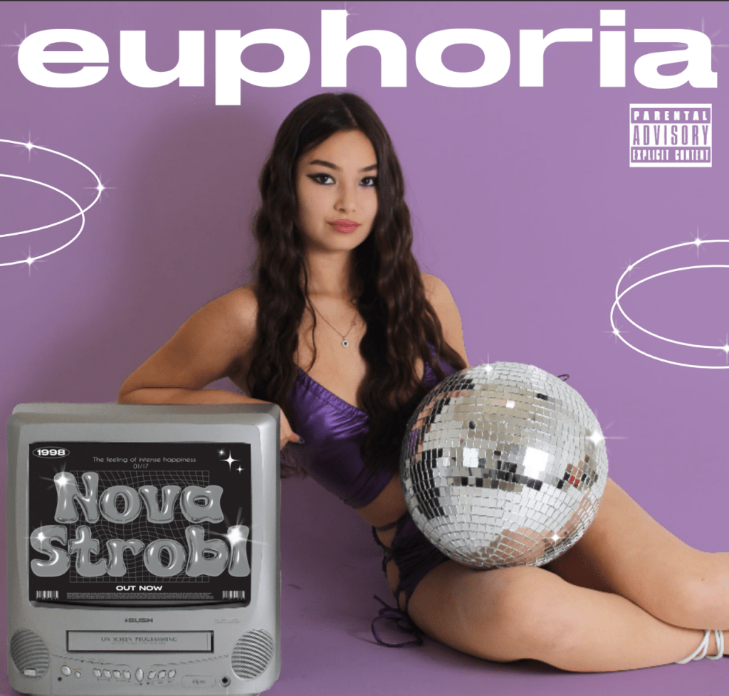 e, music video and digipak, all harmoniously work together- creating a strong brand identity centred around an exciting pop nostalgia theme. Firstly, we crafted a cohesive digital presence using a variety of forms of media language. All products follow the same colour schemes of blues, purples and pinks which is strongly evident in the lighting and colour choices throughout. Moreover, the same san serif block font is utilised throughout all products representing the modernity side of the pop genre. The use of these media languages is not only conventional to the genre, so our audience can have a preferred reading (Hall), but also can connote (de Saussure) a fun, exciting girly-pop brand identity and
 further denote (de Saussure) a nostalgic feel more specifically with the use of LED neon lighting seen in the music video and social media page. We decided to primarily use the colour purple which can be seen prominently throughout which represents the fun, successful star image as well as this almost magical, nostalgic feeling of ‘euphoria’. Many social media posts stick to this colour theme with the highlight icon being purple to the posts lighting being purple, the digipak costume is all purple matching the purple background and the music video while less noticeable there is lots of purple seen through the scenes of the air hockey. In addition, we have carefully thought about the media language of mise-en-scene of props throughout all products. With the jukebox and retro air hockey table and Barbie in the music video, to the retro tv and disco ball in the digipak, then the vinyl record player, digital camera/polaroid photo
 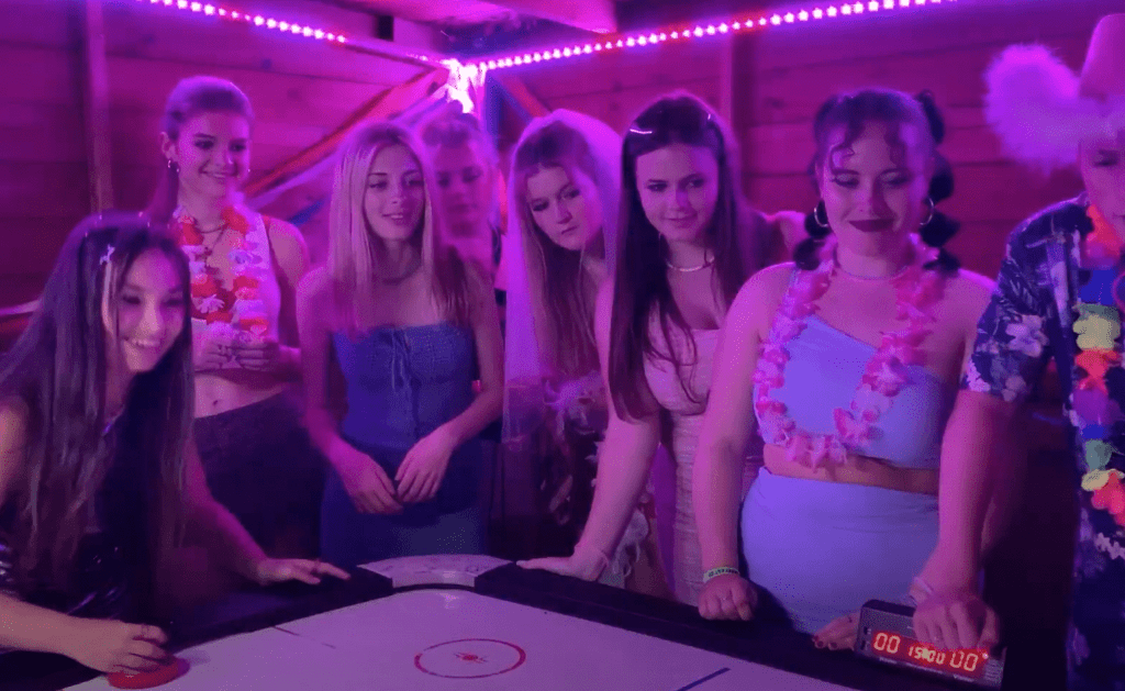 manipulation effects and the recurring motif of the disco ball presence in the SMP collectively are all symbolic codes (Barthes) of this bygone era. Featuring these nostalgic props helps strengthen and remind the audience of our brand identity as well as capture the essence of the specific era. Having recurring features across platforms like the camcorder filter being used in both the music video and SMP helps communicate a sense of branding and unity. All our media language links up with one another allowing us to convey and reinforce our brand identity of being a pop-nostalgic album.
My music video resided in the pop genre, which in order to successfully represent required me to research the repertoire of elements (Lacey) for music videos like different editing, cinematography and mise-en-scene conventions used by other pop artists. My music video ‘Last Friday Night’ fits the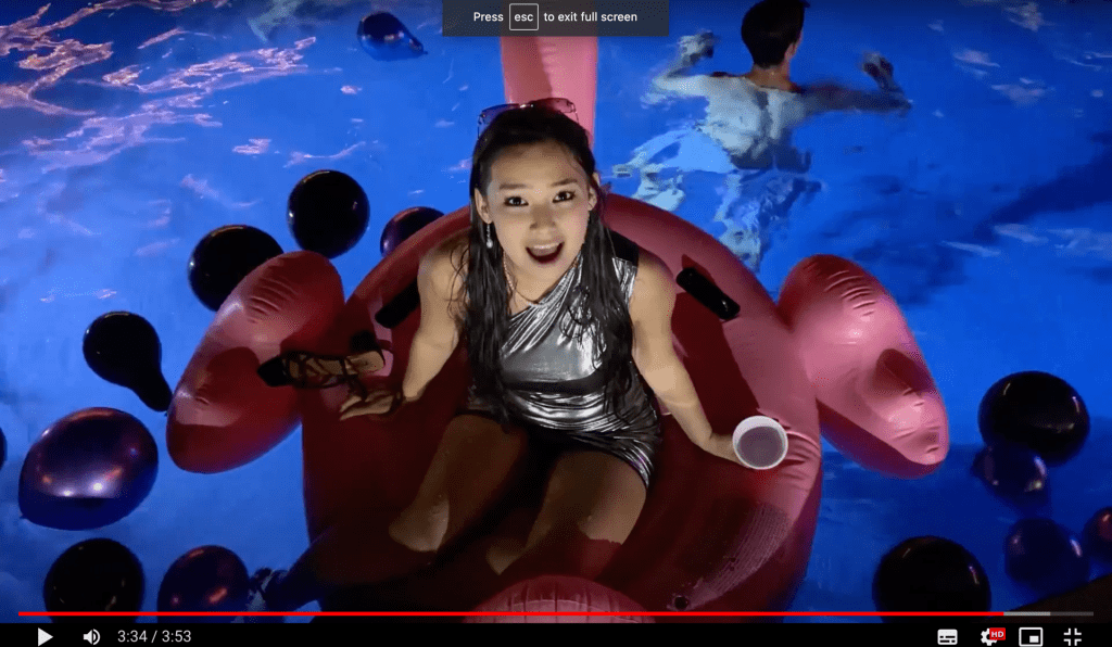 female, pop sub-genre so I carefully selected music videos which also slotted into this category to ensure my music video follows the conventions allowing my target audience to have a preferred reading (Hall). ‘Genre is similarity and difference’ (Lacey) meaning that the audience wants their media to be the same yet different as well as be predictable yet also innovative. Due to this, I had to also consider ways to challenge certain conventions and make my video have a unique selling point amongst the highly competitive industry ensuring we make a profitable product.
Key technical conventions of music videos were: cuts to close ups, continuity editing, editing to the beat, still shots, having a  performance and narrative sequence- as seen in Dua Lipa’s video ‘Levitating’- evidently we followed these so our audience can achieve a preferred reading (Hall). The overarching convention I found in the girly-pop genre was female empowerment highlighting a progressive representation (Gauntlet) of an independent, confident, sexy woman like in Tyla’s video ‘Water’. For our music video, we decided to use this convention due to our audience demographic being young females in hopes to provide an empowering role model. We did this through the use of MES like the costume of a bold metallic, body-con short dress and pink eyeshadow with lashes for the makeup to all collectively signifies (de Saussure) this confident, fun, sultry star image which the glamorous party look was notably a common convention in the music videos like ‘Mad Love’ by Mabel. Following Altman’s theory we had this ‘blueprint’ covered by representing this confident female star, we now needed to ‘develop’ it. So by directing her to jump into the pool with her glam still on represents her as wild, not only challenging the traditional expectations of female behaviour but also challenges the genre convention as most music videos I researched just had the star sitting there looking pretty- as seen in Ariana Grande’s ‘God is a Woman’.
In addition, a technical convention I identified within my research was this bright fun video setting, like in Arianna Grande’s 7 Rings, which we followed with the use of high key lighting as well as neon LED colours of pink and purple to represent an exciting, energetic, pop music video. Even for the morning scenes we utilised high key lighting and manipulated footage in post-production to appear more vibrant ensuring we had a visually energetic video throughout- conventional to the genre. Another conventional element we used was an establishing shot with the song title on which I saw in the majority of the videos I studied, especially Olivia Rodrigo’s ‘Bad idea right?’. We used this ‘blueprint’ but also evolved it (Altman) making it more engaging by shooting using an aerial shot and adding some personal flair by editing the text to appear under the flamingo, establishing the scene for an audience in an unconventional more dynamic way. Finally, for cinematography the genre conventions is more still shots and tracks as seen in Madison Beer’s ‘Selfish’ we challenged this by utilising lots of whip pans and hand held shots with an unconventional record-cam filter on immersing the audience within the party representing and signifying (de Saussure) a sense of realisticness, wildness and energy. Altogether, we followed the media language conventions like mise-en-scene, camera and editing while also developing it, challenging certain conventions ignoring the risk of audience rejection.
For our pop-genre digipak it was vital for us to research and understand the social group and any issues of our target audience demographic and psychographic- achieving this preferred reading (Hall). Our target audience is young women and teenagers which is a social group often represented as being young, fun and confident. Some key issues this social group faces are predominantly gender stereotypes, and inequality within a patriarchal society telling them how a ‘woman’ should behave. To showcase and challenge this issue we have constructed this star image to represent a powerful, confident, extraordinary (Dyer) female star image in aims to empower our audiences female identity. For example, the mise-en-scene of our digi-pack like the purple metallic, sultry two-piece costume, alongside the acting/posing, directing our model to sit with propped up on the tv- collectively work together to signify (de Saussure) a cool, care-free, confident star image. The study of body language by S. Bartky identified how men tend to make themselves bigger and spread out while women do the opposite; our digipak image deviates and challenges this, with our star taking centre stage spread out across the page, using the rule of thirds, with a cool, assured pose. Further examples of our representation is, via the media language of colour choosing a purple and silver colour scheme. Analysing colour symbolism, purple is a symbolic code (Barthes) of royalty and power accompanied by silver which has connotations of wealth and glamour which all unites together in representing this powerful, successful star image. Purple also connotes fantasy which could denote (Hall) to an audience this ‘euphoric’, magical feeling that nostalgia fuels- creating a sense of cohesion with the album title and brand identity. This is further reinforced via the media language of graphic design, language and font. The inside pages have clouds with sparkles and a fantastical, magical-like cursive font with the definition of ‘euphoria’ reflecting this ‘out of this world’, surreal feeling that happiness and nostalgia brings- in hopes to resonate with a teenage audience and serve as an escape. In addition, we carefully chose mise-en-scene with props like a disco ball and retro tv to transport our young female audience to this bygone era. Both props are highly identifiable cultural codes (Barthes) to the 70’s linking to the nostalgic theme and allows our young audience to explore the culture of previous generations of their parents, potentially establishing a connection between different social groups- uniting generations. As well as this we are seeing retro styles having a resurgence as fashion is cyclical so for our audience demographic it’s currently trendy to be vintage- making our digipak very appealing to our target audience. The
  reference to the disco era of the 70’s helps signify (de Saussure) party, dancing and excitement which ties nicely to the music video and was also notably a phenomenon that transcended gender and was an inclusive, happy environment. Overall, the representation and incorporation of media language has created a fantasy environment providing a haven for the audience. Our representation of this extraordinary (Dyer), powerful female star image hopes to serve as a role model for our audience demographic, and also encourage them to be aspirational, pursuing their dreams fearlessly- empowering and supporting them through the inequality they face.
In this digital age, social media platforms are a powerful tool for an artist to not only engage with the audience but also connect with their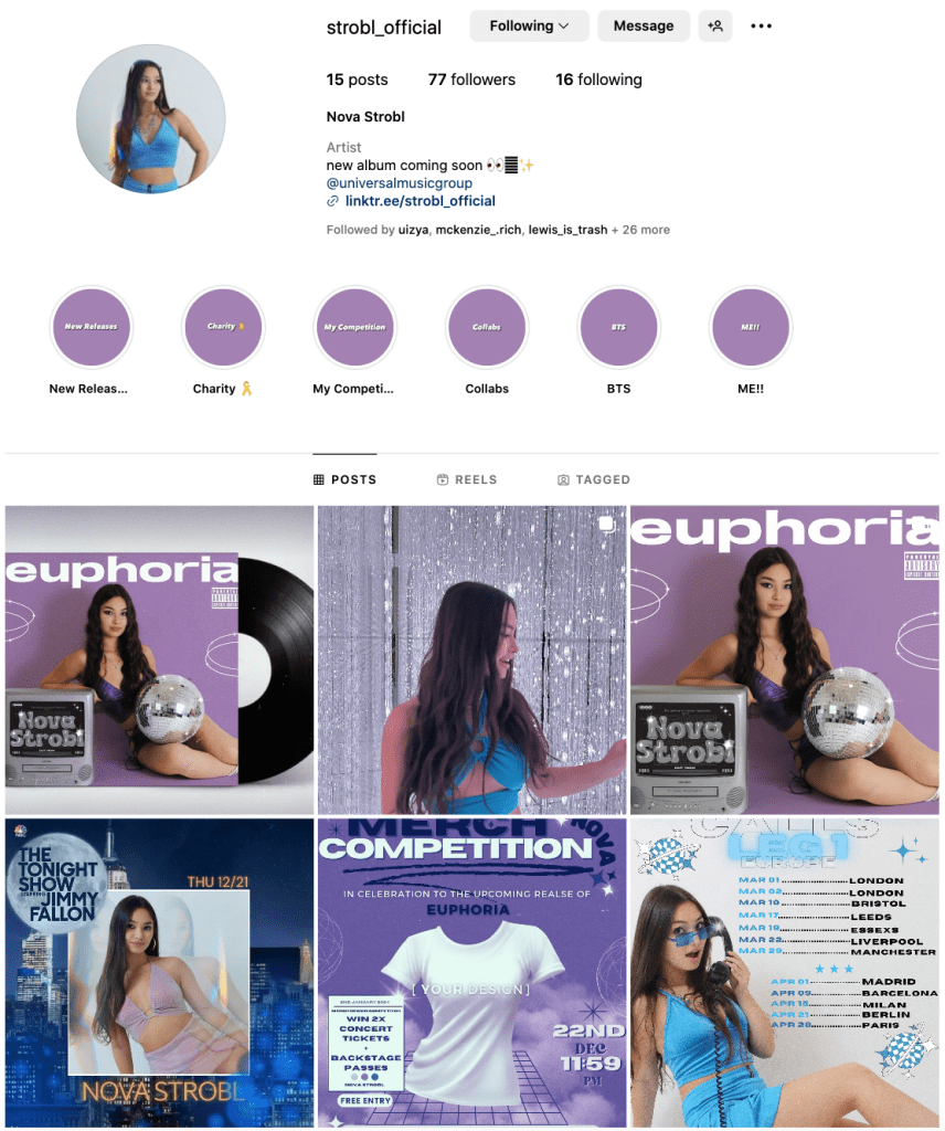 fans. Among all these platforms, instagram stood out, as it’s the most popular within our young audience demographic with 40.1% of active users being aged 13-24 (Orbelo), therefore making it the most efficient platform to maximise our audience engagement. Furthermore, creating a social media page to promote the album is an effective way to help construct and showcase this ordinary and extraordinary (Dyer) side of our star, creating a sense of intrigue and awe in hopes for the audience to subscribe/follow to this fandom (Jenkins).
Our social media page engages with our audience by following rules of AIDA and including many interactive elements between fan and artists- building a sense of community within the fandom (Jenkins). For maximum audience engagement the media product must include ways in which an audience can be informed, entertained, reinforce their personal identity and socially interact (Blumler and Katz). 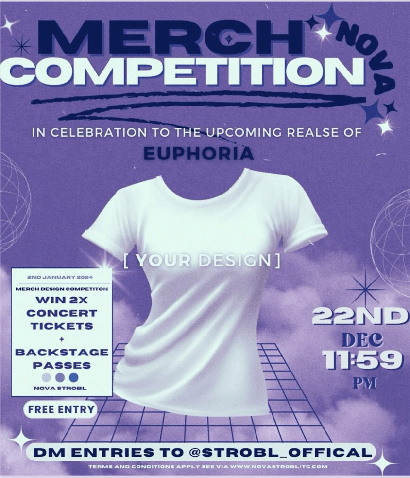 Following these ideas, some posts and interactive features we included are polls, questionnaires, competitions, a livestream listening party, tour poster, CMC and challenges. The Merch Competition allowed the audience to be ‘prosumers’ (Gauntlet) encouraging them to create content showcasing their creativity. This not only will make the audience feel validated within the fandom (Jenkins) but also establishes a connection between artist and fans as their submissions will be judged by Nova. Living in an age of participatory audiences (Shirky), the audience now have the power to promote the artist and album. To our advantage we encouraged the use of the hashtag ‘TGIF’ sharing their favourite moment of the music video, an example of viral marketing, which is so beneficial as it makes the audience feel included whilst also a free way to market our products boosting profits/revenue- the main goal within the music industry.
Another example is our exciting teaser trailer reels for the track list and music video. Teaser trailers/reels add some diversity to the feed making the promotion more engaging for an audience in comparison to just posts. Moreover, reels have a high engagement rate and are a great source of entertainment,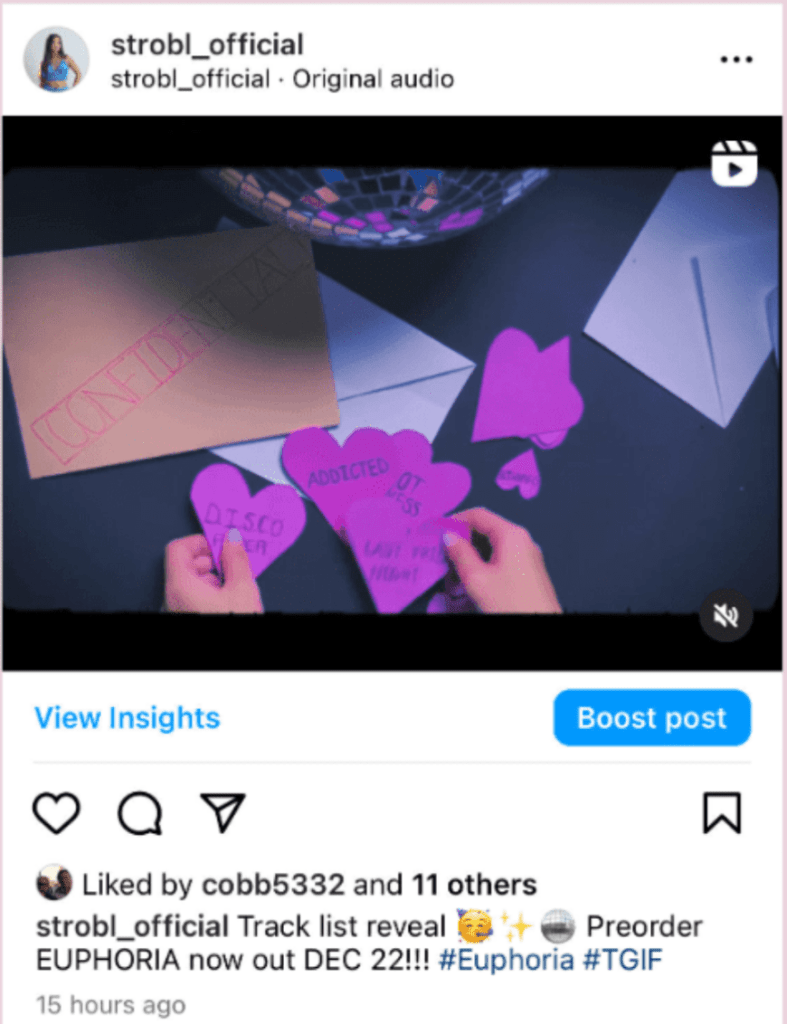 information and social interaction (Blumler and Katz) as the audience can utilise the comment section theorising and communicating with fans alike building anticipation and excitement. Furthermore, behind the scenes posts and Q&A’s aid in the construction of this extraordinary and ordinary (Dyer) star image. Q&A’s are an effective way for fans to interact with the star as they can ask anything, building a strong connection and ordinary image (Dyer) as if they could be friends. This glimpse into Nova’s personal life creates authenticity allowing fans to feel a personal bond with her promoting them to join the fandom (Jenkins) evoking a sense of loyalty and investment. Therefore, their engagement levels will be much higher, where they are exposed and driven to the link in bio (call to action) leading them to buying into products Nova endorses generating revenue for the artist and industry.