Final Magazine

Click to see my PDF
Click to see PDF
Click to see PDF

After all the hard work I have completed my first every magazine design! I have learned so much and have made amazing progression along the way. Back in September we started the preparation learning the technical key terms of magazines as well as the conventional features. We learned how to attract our target audience for a preferred reading through media language as well as the competition before we began designing. We did a practical task were I dressed up as a music star from a randomly selected genre this taught us how the use of mis-en-scene is very effective in creating a star image then we learned how the different camera angles can convey different feelings and tell a story.

We began learning the basics of indesign and photoshop by copying a magazine cover which taught me most of the basic skills I need to start designing on my own. We created a tour poster using the photos from are practical which further developed my knowledge of these software. Then we did a course on learning how to use the camera in a studio and setting up the lighting to get the best quality pictures and planned out the mise-en-scene to create a star image I wanted to portray.

Finally, after all the tasks we began the designing process which just from comparing my first draft to my final piece I am really proud of how much I have improved and I’m very happy with how it all comes together.

My Chosen Adverts

A magazine contains lots of different ads that companies pay a lot of money for. To complete my magazine I have chosen 2 advertisements that I think best suit my genre and my target audience demographic. My target audience is older teens to young adults so from ages of 16-21 and a majority female audience.

This is my first advert, it’s an advert from one of the most famous pop stars Ariana Grande which my target audience will easily recognise. The colours and atheistic match the fun girly vibe my magazine has. The product is a perfume which my target audience will really like and fits the female demographic.

Madison Beer - Revolution Live

This is my second advert, it’s advertising Madison Beer’s tour. Since this is a music magazine putting a tour advert is very fitting, she also is very popular with my target audience age demographic and I did some research and found most of her fans at her concerts are female which is perfect for my magazine.

Now that I found my ads, I can do the finishing touches for my magazine and join it together.

My Magazine Draft 3

Below are all 3 of my designs for my magazine in their 3rd draft. I have also embedded my teachers feedback below.

Click on image to see PDF
Click on image to see my PDF
Click on Image


In summary here are the improvements my teacher recommended:

Front Cover

  • Move the main cover line with the name of my main cover star to bottom left
  • Make sure the “Win!” cover line in inline with the others
  • Make “Izzy” bigger

Contents Page 

  • Change the font on the categories to the bold modern one
  • Go through spelling
  • Move “Izzy spills all” down so it’s not on her face

Double Page Spread

  • Move the article on the right page to the right to avoid the fold
  • Tryout making the “Q” gold

Now that I have received my feedback I will be making these final changes and adjustments to complete my first ever magazine.

2nd Draft of DPS

Click to view my DPS

This is my second draft of my DPS, I’m loving the layout although unconventional I feel as if it’s very exciting and works well.

Whats New?

  • Added the article
  • Played around with the text layout for the article
  • Put the article in a san serief font so it’s easier to read
  • Added ‘Q’ and ‘A’ and made them stand out and easier to navigate
  • Changed ‘Izzy Upson’
  • Added a byline
  • Played around with the pull quote
  • Added the email to allow the reader to contact the editors

Whats Next?

  • Try out making the ‘Celebrity’ in a textured gold
  • Add some graphics like some lines around the pull quote to emphasise the shock
  • Play with ‘Izzy Upson’ make it more exciting

Draft 2 of my Contents Page

Click to view my PDF

Here is my 2nd draft of my contents page.

Whats New?

  • Added a new image of a different model
  • Added hot pink colours to tie in with the pink fan
  • Added an editors note
  • Made the line spacing closer
  • Changed “Celebs and News” to “Music and Celebs”
  • Changed the page number

Whats Next?

  • Change the colour of Izzy’s outfit to match the front cover and DPS
  • Edit the numbers to center them in the box
  • Fix Izzy’s head in photoshop
  • Get rid of the mark on Izzy’s stomach
  • Make line spacing 1pt wider as I feel it looks too empty
  • Edit Sophie’s skirt to make it fit in the circle

My Front Cover Draft 2

Here is my 2nd draft, I started from scratch as I wasn’t keen on my 1st draft and pretty much changed the whole cover.

Whats new?

  • New image from my retake
  • Changed the fonts
  • Added new cover lines
  • Made the background colour pink instead of grey to match my DPS
  • Changed the colour of ’11’ in my masthead
  • Added my main cover stars name
  • Changed the colour and brightened the outfit
  • Brightened my models eyes

Whats next?

  • Get rid of the border or see if it looks better
  • Put something else in the blue box
  • Add another cover line in the top right
  • Play around with the cover lines trying a different font on some as it looks very blocky
  • Fix her hair in photoshop
  • Remover the pink bead as it looks weird

DPS 1st Article Draft

This is the plan I made before beginning to write up my 1st draft for my article. This plan helps me have structure and also reminds me to think of the Blumer and Katz gratification theory trying to include some forms of information, entertainment, social interaction and include ways to reinforce my readers personal identity.

I’ve recorded me reading my first draft of the the article out loud to check everything makes sense and will help me highlight any changes I want to make. And I have received teachers feedback which from this I will edit and make any final changes.

Click to listen to my mp3 recording

Some Changes:

  • Add a conclusion note from the celebrity
  • Edit the stand first as it didn’t sound right
  • Fix grammar errors

Final Draft

This is my final draft of my article, I’ve included a mix of real life problems which is conventional to the agony aunt sections as well as music related problems as this is a music magazine. I’m hoping this article will entertain the reader with some of the scandalous situations as well as inform them with some advice and information about the music industry. Furthermore, the article is a form of social interaction as I’m including an email were the fans can have a chance to send in their questions in hopes their star will read it in next months article.

Now, I have completed the article, I can pick certain parts to include to shorten it down so it will fit in my double page spread and just put a “Continued on next page”.

1st Draft of Double Page Spread

Click to see me DPS

A double page spread is an article in the magazine which has many conventional features like a byline (who it’s by), stand first (Mini paragraph to introduce and engage interest for the article), pull quote (an interesting quote taken from the article itself) page numbers, captions (go under photos to anchor it) and a drop capital (large letter that indicated where the article starts). Here is my self assessment of my DPS.

The star image is communicated well through the mise-en-scene and how she appears very dominant on the page. She is placed unconventionally however it works as she is placed strategically so that the center cuts through the stomach. The good use of  a pull quotes in the interview article such as ‘My ex husband cheated… help intrigue the audience to read and find out more.

The Feature Article is laid out well and complies with some of the conventional techniques with no copy going over the staple fold, page numbers, a large full page image. However not all the other conventional elements such as bylines, serif font for the feature article and captions all proficiently integrated.

The themes and subject matter have not be included yet. 

The use of key phrases like ‘burning questions’ and direct address ‘your’ are all well crafted to hook the reader making it feel personal to them as well as in and tempt them to read on. But it doesn’t show reveal anything about the star image. 

Bold san serif fonts are used for the headlines, stand first and pull quotes to stand out. But the feature article should not be in a san serif font as well. The colour pallet matches the genre being bright and fun.

Overall, I’m happy with the 1st draft layout, although it’s breaking conventions of a tradition double page article as the image is spread across both pages I believe it works and stands out more. Thinking forward here is my overview for when I begin my second draft.

3 Things I Like:

  • The layout
  • The photoshop used to cut her out
  • How the headline is layed out

5 Improvements:

  • Change feature article to a serif font
  • Play around with “Izzy Upson” maybe making it more transparent
  • Add a byline
  • Make the pull quote stand out change the layout paly with colours
  • Edit the page numbers

Contact Sheets for 2nd Shoot

These are my contact sheets from my 2nd shoot. In this shoot I wanted to get photos for my double page spread and for my contents page and try reshoot the front cover to see if it cuts out easier. For this shoot we tried out more props and effects to create more interesting and intriguing pictures. I also used my phone to recreate some photo effects I saw online where I used a toilet roll and just my flash to create a spotlight effect.

I love this image for my double page spread her expression is shocked which will match with my double page spread having some gossip and scandals in it. I used the same mis-en-scene as I did in my 1st shoot which I think I will try brighten the outfit making it more bright and fun which is conventional to my genre.

This photo was my funky photo, I love this one for my contents page she looks happy and really exciting. I used the fan to make it look like her top and the mise-en-scene matches the pop genre.

I used the flamingo as another weird and exciting prop, although I don’t think it will make it into my magazine I thought it looks interesting and very different which can be a good thing.

Overall, the shoot went well and I really like the use of the fun props which will attract the audience and gage interest  to the reader. The props also fit my genre as it creates a fun, exciting tone which is very conventional. Now that I have done my second shoot, I can begin making my double page spread for my music magazine using one of my favourite photos and also pick out the photo I’ll put in my contents page.

Language Analysis

This is my analysis of a double page spread from a published magazine. I will be unpicking how the journalist has represented the individual with the language and how this article follows the rules of AIDA (attract, interest, desire, action) and linking this in with Blumer and Katz uses and gratification theory.

Journalistic Reportage

  • Who- Wyclef Jean
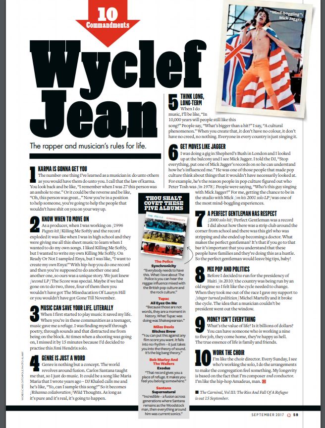
  • What- “The rappers and musicians rules for life” in the stand first
  • Where- An interview, most likely done in office
  • When- September 2017
  • Why- He is a popular rapper/musician with a positive view of life
  • How- He is reveling all, states in the stand first

What’s this article about? 

This article is an interview with the rapper/musician Wyclef Jean on his top 10 rules for life. The audience will learn his personal tips and his perspective on life. Thinking of the uses and gratification theory by Blumer and Katz this article will inform the audience and reinforce their personal identity if they follow any of these tips as he can be seen as a role model.

What’s my sense of this person that the Journalist is writing about?

When I read through the article and even just by looking at it I got a sense of who this person is, he comes across as calm, chill, wise and also I have the impression of fun and quite youthful as well as a respectable person. I’m going to analyze how this representation was achieved.

How do they represent the artist?

Firstly, the use of colloquial language within the headlines and sub heading for example the simile heading “Get moves like Jagger” is a cultural allusion to the popular song by Maroon 5, as well as referencing the famous Mick Jagger this makes him seem fun and also relatable to the audience. He also uses slang language which you can see with “Leave big tips, baby!” saying “baby” is very colloquial which again represent him as relatable, fun, youthful individual. Then we see this respectable side to him with the heading “A perfect gentlemen has respect” this creates a kind, perfect star image, with the noun “gentlemen” and adjective “respect”, which is very appealing for the audience. One of the stories he shares his hardship in his childhood/teen hood in tip number 3, sharing a personal experience presents him as human and can evoke emotion from the audience and represents him as authentic and not fake which is really appealing to an audience. There is also a section of his top 5 albums, which informs the reader on his personals likes and can create a connection and relatability to his readers if they perhaps like the same albums.

Conclusion

Overall, the journalist has captured a respectable, fun and relatable star to the audience with a very positive, optimistic tone throughout the article. It’s clear that the journalist thought about AIDA as the article really attracts and interests the reader through the use of quotes and the language used in the headings. And finally, the uses and gratification theory this article is evidently one to inform the audience as he is giving the reader tips for life, reinforce their personal identity by sharing personal stories and his favourite albums and finally some entertainment as well with some of the interesting stories he shares.

Thinking forward, I decided to do this analysis in order to understand what sort of language the journalists uses to represent the star so for when I start writing my own article I have an idea in what  language to include to create a successful article. Furthermore, I also know that I must keep in mind AIDA and the gratification theory when designing my double page spread.