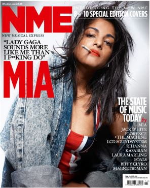
My Magazine Front Page Swede
Please click on the image to see the pdf
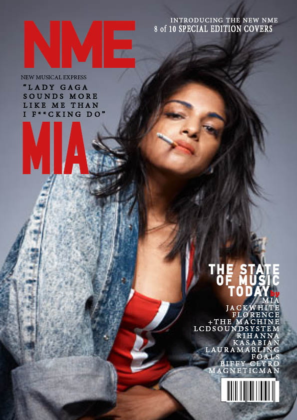
The real design:
I have used technical forms and conventions in order to construct the poster by adding all of the details that are seen when first looking at the poster. When doing this, I have made sure that I have matched the fonts and typefaces by experimenting with different fonts until it looked identically similar. The colours were the most important in my opinion as this is what the audience sees when they first look at the poster. Doing this, I had to also make sure that the layout was spot on as this could be what the audience is most likely going to be used to in this type of magazine cover. So I have used desk top publishing as this was one of the main purposes of this task to practice using this software which I have done in order achieve what I needed which was to try to deconstruct this magazine poster. Being able to use the software InDesign in order to have an idea of what settings could be used in order to construct a magazine poster. Also having the ability to experiment with different fonts and settings to get the result I am trying to get.
When I started to construct this poster, I have made sure that the main image needed to be enlarged, so I started sizing an image which was the one of Mia and placed it correctly covering the whole page. I also needed to go online to find a barcode to include on my version so placing an image from the web that are identical to the one on the real one. In the making, I needed to make it as close to the real one as possible so in the fonts, I have used extra tools in order to try to recreate it. This involves using the stroke tool which is used to “puff” out the font to make it a lot bolder (this is seen in the massive typeface in this poster).
Strengths:
- Looks well presented and identical to the real one
- The fonts look good on most bits
- Including the right information and in the right space
- Knowing how to use stroke, fill and also the drop shadow tool to make the text stand out.
Weakness:
- Barcode needs improving (adjusting)
- Positioning of the typeface could be better
- Missed out a section from the top left (really small writing)
Videos which could be used for improvement:
When it comes to my music magazine, this would help a lot as it has made me understand how important it is to include the main details in the cover as this could do a lot in what the audience sees for the first time when looking at the front cover. This possibly leading to more sales which could be involved in doing this.