Question 4: How did you integrate technologies (software, hardware and online) in this project?

Loading...

Loading…

Chosen Adverts


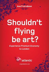
The reason I have chosen these two adverts is because they both correlate to the psychographics and demographics of my target audience. The Virgin atlantic advert fits in with the demographic of men of Gen X, as well as the psychographics of my audience, this being mainly filled with men of Gen X & Early Millennials. Many men of generation look forward to holidays and breaks as they usually have the financial stability, as well as working hard day in, day out which would warrant a break to relax and have some time off. This advert not only links into the psychographics but also into the next advert of the Cape Town international jazz festival which is somewhere that Virgin Atlantic can fly to.

Complete Magazine Draft 3

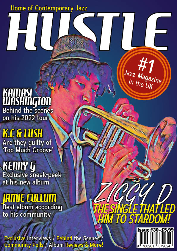
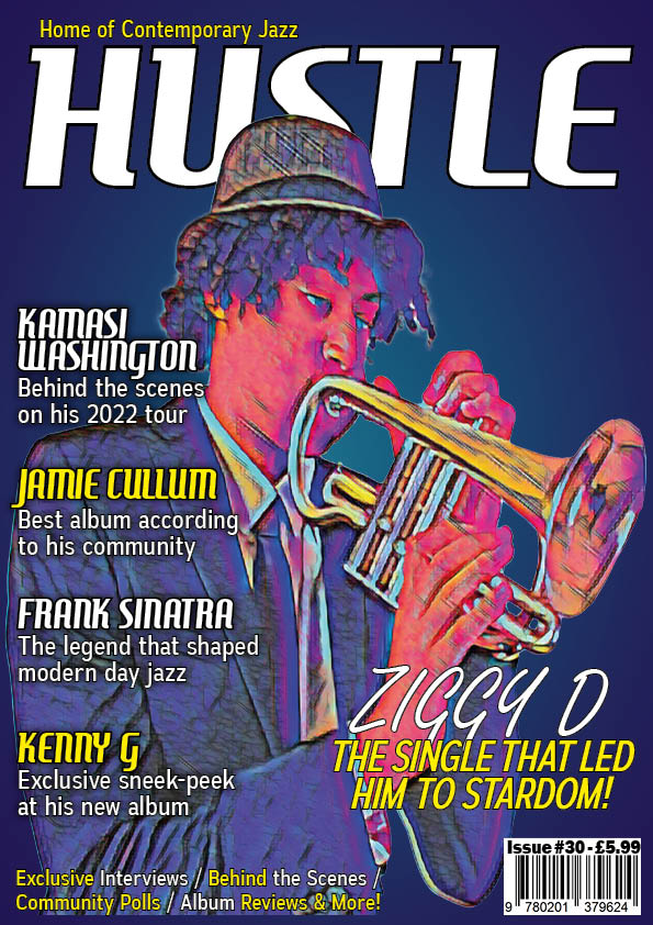
Here is my third draft for my magazines front cover. I have kept many things the same from draft 2 however there are a few differences. The main ones are:

  • Added a Pug
  • Added a reference to my DPS
  • Moved the coverline text
  • De-stretched the image

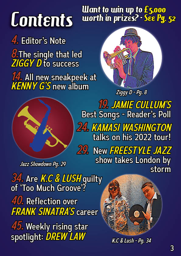
Up next is my contents page. This page has changed the most since draft 2. The main differences are listed below:

  • Added a new picture for ‘Jazz Showdown’
  • Added a headline for ‘Jazz Showdown’
  • Changed the placing of certain text
  • Changed the numbers of the pages
  • Changed the colour of the page numbers

Finally there is my DPS. This one, like the front cover only had minor changes. These are

  • Changed the headline
  • Moved the headline slightly
  • Re-arranged the text in the Q&A segment
  • Adjusted the line spacing in the Q&A segment
  • Adjusted the box sizes in the Q&A segment

Below is the screencastify showing me what to do:

For my front cover I will:

  • Make Ziggy D bigger
  • Switch around the text so it doesn’t clash with Ziggy’s face
  • Move the Pug closer to the edge of the page
  • Try to further destretch the image
  • Add drop shadow to the masthead
  • Play around with the names of the stars & their sizing

For my contents page I will:

  • Change the font of all text & change the size of the smaller cover lines & the editor’s note
  • Try to make the star images pop more through things such as drop shadow and bevel and emboss
  • Change the background to try and make it work better with the page

For my DPS I will:

  • Make ‘Too Much Groove’ bigger
  • Make the Q&A’s questions smaller
  • Make the Q&A text the same size as the rest of the article
  • Move the standfirst down
  • Give K.C a quote

2nd Draft of Double Page Spread


Here I have the second draft of my double page spread. I have made some adjustments from the last to try and improve it so I can get the best final pages I can. Here are some of the things I’ve changed:

  • Changed the colour scheme to match the images
  • Removed the background on the main page
  • Altered the sizes of some of the text
  • Changed the headline
  • Put the interview questions in boxes

To improve on my third draft, I have taken some time to reflect what I can do next:

  • Play around with the image more to see what you can get
  • Make sure the text within the boxes all start at the same point as some of the text has a small gap whilst others are right next to the box
  • Move the Headline to the left slightly as it’s shadow is slightly cut off
  • Make the boxes the same size
  • Try to make sure all the spaces are of the same size
  • Try to come up with a catchier headline that includes the reference to the reflection on the image


2nd Draft of Contents Page

Please click the image to see the PDF

To try and improve my contents page, I decided to make some changes to it and create a second draft. In this draft I have made several changes, these include but aren’t limited to:

  • Colour scheme has changed to match the second draft of my front page
  • Changed the images used to match my other second drafts
  • Changed the font to match with my other second drafts
  • Edited the layout of the text to make the whole page a bit more interesting and spread out
  • Added a few extra stories & other bonus pages

In order to improve in future I have also taken time to reflect on what I think I can change about my page:

  • Perhaps change the colour on the numbers to add some distinction
  • Put the Editors Notes at the start, as that’s where they tend to be
  • Add either some new images by either using pictures you already have or taking new ones in order to stay unreliant on the same two. Definitely get one to replace Kamasi Washington.
  • Maybe add some classifications for the different stories (e.g some would fall under hot news, retrospectives, interviews, etc)
  • Try and see what the images look like with some drop shadow on them
  • Take pictures of jazz instruments to potentially use for logos, backgrounds, etc.

2nd Draft of Front Page

Please click the image to see the PDF version

As this is my second draft, I have drastically changed many of the different aspects of the cover. Here are some of the main changes:

  • The background has changed from a grey gradient to a dark blue to purple gradient
  • The star image has been moved and rotated
  • The star image has been placed under a new neural filter
  • The colour scheme for the lettering has changed to white and yellow
  • Fonts have changed
  • Added a small tagline at the top

In order to improve in future, I have also reflected on what I think could be changed in the image so it can become better:

  • Try to fill the empty space
  • Make sure the star image doesn’t turn out very stretched
  • Could maybe include a pug
  • Make Ziggy D bigger
  • Some of the spacing is incorrect
  • Make the tagline better
  • Add a reference to the Double Page Spread

Draft of Double Page Spread

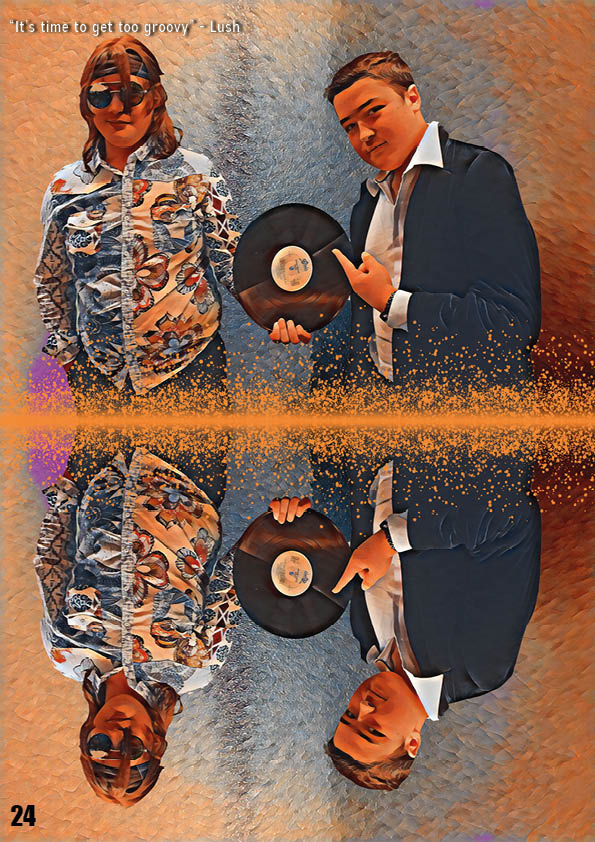
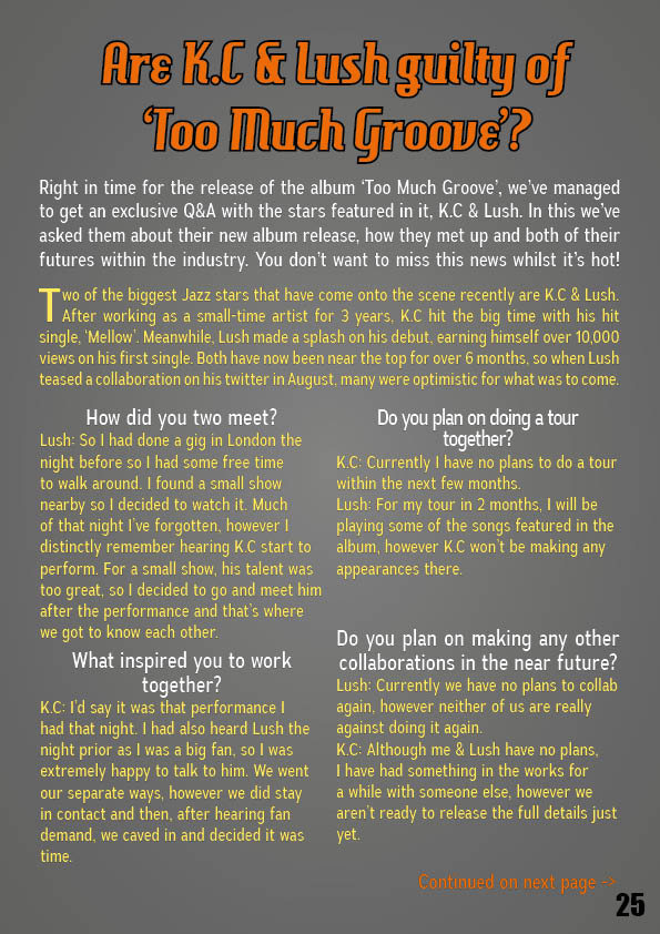
Here is my double page spread. I have made this after taking my second shoot and working with what pictures I got in order to make a draft article to use. In order to improve in future, when I make my real double page spread, I have decided to reflect over what worked and what hasn’t worked for this double page spread.

What went well:

  1. Used photoshop in order to create a good looking image out of one that would’ve been hard to use otherwise
  2. Colour used can highlight the important parts of the article
  3. The picture is very fun and colourful, which represents my genre well

What can be improved:

  1. Background colour on second page can seem quite bland and out of place
  2. Make the orange spots on the image more spread out
  3. Try to reduce the contrast / difference between the first and second backgrounds
  4. Make the artists names a different colour or a different size during the Q&A section
  5. Make the main writing smaller and make the title bigger