Upon completing our mock-up, we were extremely satisfied with the majority of the design elements of our digipak, therefore, there are minimal changes to the backgrounds and most of the typefaces. The first graphic design elements we included were the heavily manipulated and washy backgrounds and the typefaces, which then were carried on through to our first draft.

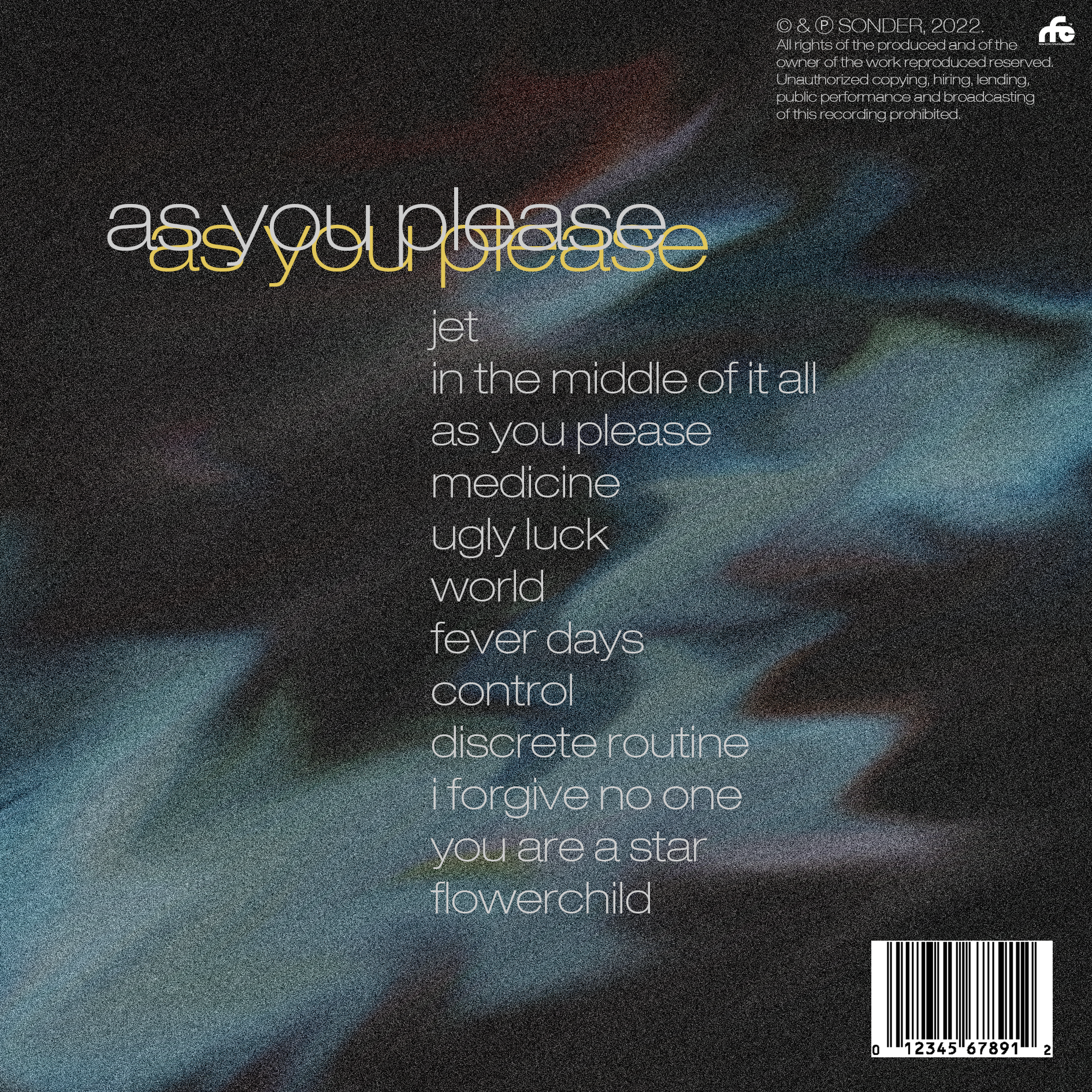
In the next draft, our main targets are to create the inside panes and spines, make the centre image of the eyes stand contrast less to the rest of the front cover by adding a blue tint and add numbers to the tracklist to fill out the empty space. Adding more features, specifically the inside panes, will allow us to focus more on reflecting the brand and star image, in contrast to a very cryptic and open-to-interpretation front and back cover, which is something that we have found to be lacking in this draft so far. Adding some familiar and conventional elements, in conjunction with some different, unconventional elements, is an effective way of implementing a ‘same-but-different’ approach to our digipak which will help feed into our audience’s preferred reading (Hall) and allow us to create a product that won’t be rejected by our target audience.
Published by