Digipack Draft 3:
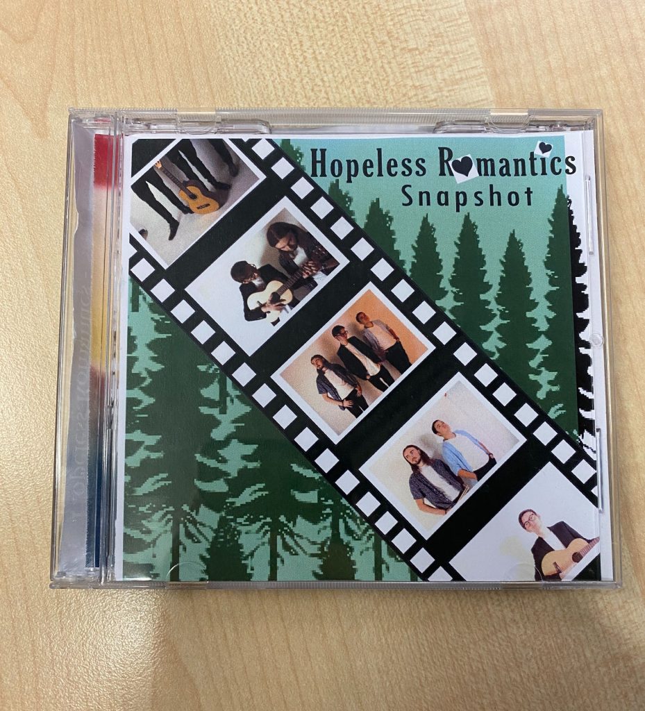
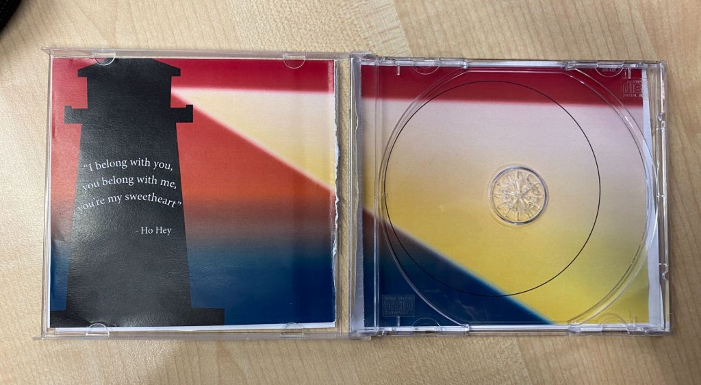
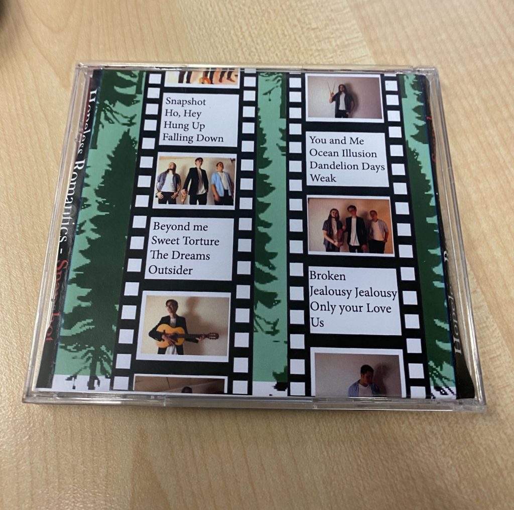
This is the third draft of our digipack in a CD case…
Peer Feedback:
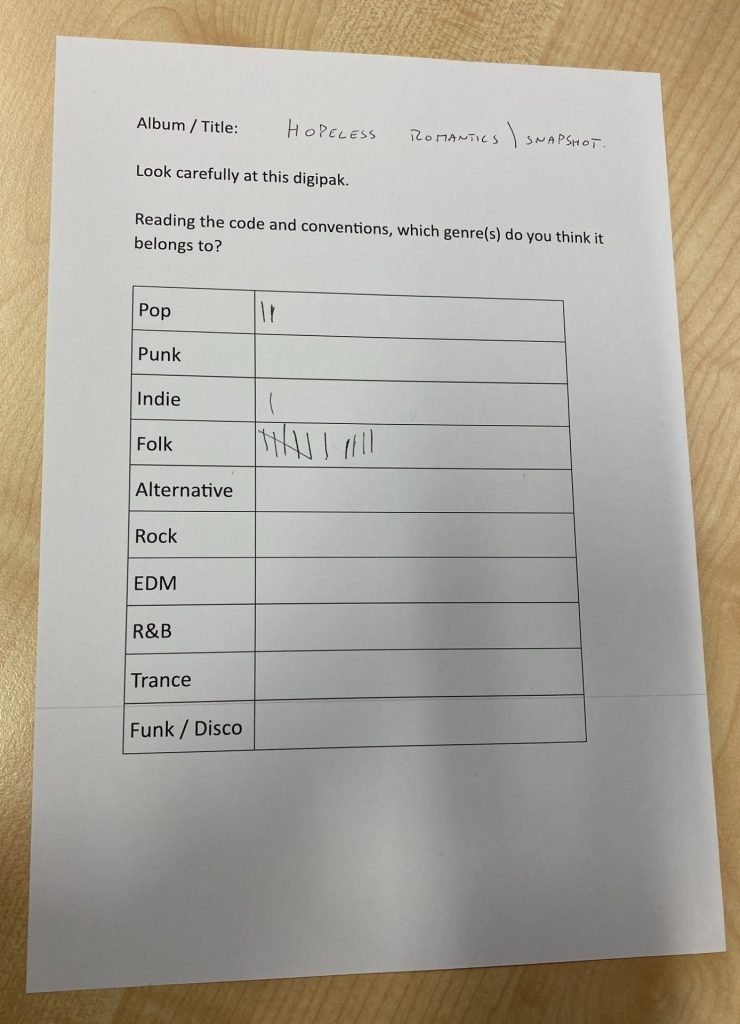
This is the peer feedback sheet we did as a class. We got another media class to guess what genre our band is, based on our digipack. We are very happy with the results, as our band is primarily folk with an indie/ pop twist. So this feedback is very helpful and lets us know that are generic conventions are fitting.
Targets for Improvement:
- We will adjust the hearts, in the title, so that they don’t have a white border/ background (as this wasn’t intended to be there).
- We will change the fonts of the subtitles, and song track titles. We will aim to stay conventional in our genre.
- We also need to edit our photographs. We will follow our teacher’s feedback and colour-correct them whilst also cropping out the unwanted areas, in the backgrounds. This will make them more fitting and coherent. Overall, we want to make the images fit the filmstrip aesthetic and look different from a basic studio shoot.
- We would also like to change the lighthouse, to make it more realistic. We will add windows to the top where the light shines out. This way it will make more sense. We’re going to make the light ray bigger to fully fill the circle (where the CD will go).
- I am going to change the gradient background so that the colours match the theme better.
- Finally, we need to include a barcode, record label, and copyright information on the back panel.
Focus Forward:
I think that this draft is better than our second. It has more generic conventions and is more fitting. It makes the genre of our band’s album more responsible- which is good for attracting new indie-folk fans. I think that adding a green background makes it more eye-catching and less bleak than the white one. I also think that the heart might’ve been too much. So our covers now have a good balance. The fonts are now closer to what we want. We also filled in our track names now. I believe that the film strips now look more realistic and detailed, by us decreasing the size of the gaps between each photograph. By reflecting on this new draft, we can see what improvements have been effective and what we still haven’t done. It helps us plan ahead.