Category Archives: Music Magazine

Chosen Adverts:

Chosen Adverts:

Every magazine has adverts. We have been told to include 2 adverts that we think our target audience would be interested in. I made my decisions based on the information I found on Google. This was because it’s a reliable source that has proof of people’s interests, based on what they typically interact with. These two ads are different from my original ideas (I wrote about them in my creative critical reflection). I changed my mind once I finished my magazine so that I could see the overall aesthetic and impression it gives off.


This is my first ad…

I chose this advert because I think the words “hot” and “spicy” can be associated with punks and their personalities. I also think punks would enjoy fiery snacks. So I think this advert would be something they would be interested in. I also think that Pringles are a very popular brand, that most people have heard of. This advert is also very bright and fits my magazine’s theme. It fits with my mission statement- of wanting to empower and encourage young people to embrace their likes and dislikes. Pringles hope for people to socialize whilst sharing a snack they all enjoy. This product/ brand is easily accessible, in supermarkets or online.


This is my second ad…

I chose this advert because I saw on google that many punks like Pepsi max. I thought that having an advert they enjoy would entice them to buy from the brand even more. It would also persuade punks that haven’t tried Pepsi max to try it (since others like it). I think punks focus on their looks so having a diet drink might be something they feel safe with. It may also make them feel more comfortable in their body. This is the website/ headline that I found which supports my advert decision.


Focus Forward:

I think these adverts are a good choice. They aren’t rough and violent items, however, they are saucy and popular. They are typical items that punks would buy very often. These will help tie my magazine in with my theme, whilst connecting with my audience. It will also mean that the brands will get more sales due to them getting more publicity. I decided to change my first advert ideas (eyeliner and sunglasses) as I don’t think they are punky. I also don’t think my target audience is as likely to buy them. Food and drink are also more commonly bought/ popular.

Completed Magazine Draft 3:

Completed Magazine Draft 3:


Click here…


What’s new and what’s changed:

Front cover:
  • I’ve changed some of the fonts I used on my front cover. I changed from a decorative font to a sans-serif typeface. I did this because I think it made it look more interesting. Otherwise,  I think the decorative font is overused.
  • I also made some of the cover lines bigger to fill more spaces on the front cover. My goal for my first page was to make it busy and vibrant. I wanted to make it stand out so people’s first impression of the magazine would be good, and it would make them want to buy it.
Contents Page:
  • I changed the colour scheme from red to green. I did this so that the pages don’t all look the same. I also think that green is another punky colour.
  • I changed the layout, I moved the pictures and text boxes around. I also added another picture of Archie, so that my contents page didn’t just showcase one star.
  • Another thing I changed was the yellow plug. I think that getting rid of this made the front cover plugs stand out.
  • I also changed the page numbers so that they go to more pages.
Double Page Spread:
  • I added some drop caps to my article. This made the paragraphs stand out.
  • By adding the drop caps it also made the writing bigger, so that it fits the designated area better.
  • I changed the plugs to one single plug (on the single photo of Archie). I did this because I didn’t like the text on the second plug.
  • I moved the text box from the middle of the 3 images to the left side so that I could make the photos bigger.
  • I adjusted the font of the article text to a subtle, easy-to-read serif font.

Teachers Feedback:

The improvements I will make:
Front cover:
  • I will add a pound currency to the price box.
Contents Page:
  • I will get rid of the features box and make the page box bigger. So that it can still fit the same amount of information in it.
  • I will change the gigs guide so that it’s spread out over a group of pages.
  • I am going to increase the page numbers even more (to approximately 100 pages).
  • I will add the rough cuts, that I used on my front cover, to the edges of some of the photos and texts.
  • I want to move or add something to fill the space in the bottom right corner.
Double Page Spread:
  • Similarly, I will also add rough cuts to more photos on the double-page spread (as long as it doesn’t look too much).
  • I would like to change the second or third photo to a close-up. This is because I don’t have many close-up photos on this page.
  • I am going to try and move my group of photos around so that I can move the accessories plug into the middle again. I will do this because I think it makes more sense.
  • I need to change the photoshoot plug to something else. Something that describes who Archie is and why he’s famous.
  • I am going to make the second, third, and fourth drop cap smaller so that the first paragraph stands out the most.
  • Another way I will be able to make the first drop cap stand out will be to change the font. This way the article will include the same typeface that the title has.
  • If I can, I will move the quote into the middle of the article. This will make it look like it’s part of the article, and not just a cover line.

2nd Draft of Double Page Spread:

2nd Draft of Double Page Spread:

Click here for my double page spread…


What’s new and what’s changed?
  • I added the title and article to my double-page spread. This was critical to add to my magazine. It gives the audience information about my chosen star.
  • I also added more captions to my photos, this helps the audience understand what the photos are, and the relevance they have to my article/ magazine.
  • Significantly, I also narrowed down the photos I wanted on page 8 to 1. This makes the 1 particular image stand out. I decided to do this, in order to follow the feedback I was given


What’s next?
  • I am going to make the texts align left-  especially the title. I will do this because I think it’ll look better. I might also make the title bigger.
  • I will try moving the text on page 7 and making the two smaller images bigger. This is so that I fully use the spaces. I could also move them down a bit (to fill the gap).
  • I also really want to make the only image on page 8 bigger. I needs to stand out against the article.
  • I may also add something to the end of the article, where there’s a blank space.

2nd Draft of Contents Page:

2nd Draft of Contents Page:

Click here for my contents page…


What’s new and what’s changed?
  • Again. I adjusted some of the yellow colours to make it look more complimentary.
  • I also added the same typefaces. This makes it look closer to being finished.
  • I added the same filter to my cover star, but made the opacity lower. I also left the colour of the lollipop filterless, so that it stood out amongst the grey.
  • Lastly, I changed the layout of my images slightly. I cropped and tilted my cover star, whilst adding some more text and a small picture. I think this made it look more punky, and the layout less exact.


What’s next?
  • I am going to make the writing underneath the gigs, the page numbers, and the features bigger. This is because they are quite small and hard to read.
  • I am going to change the red and yellow colours for something else, most likely green and purple. This is so that my magazine pages look different and unique. I will then also be following the feedback I was given.
  • I think I will also make some of the images bigger, to fill some of the extra spaces.

2nd Draft of Front Page:

2nd Draft of Front Page:

Click here for my front page…


What’s new and what’s changed?
  • I have changed the fonts, from the basic serifs to the ones I found online. This made a real difference to the overall appearance of the magazine. It makes it look more detailed and professional.
  • Another major appearance change I made was to my cover stars image. I edited her in photoshop to make her grey and have a textured effect. I think this makes her fit into my genre better.
  • I made my title bigger. This is so it stands out more amongst other magazines in a store. It also gives a bigger meaning to the name- particularly the word “punk”.
  • The other change I made to my front cover was the yellow lines. I made them black, so that the yellow was only used a few times. This made it more eye catching and less tacky looking.
What’s next?
  • I am going to make the grey, textured filter on my model less obvious. Which will make it more subtle. This is so that the photo, and overall magazine, will look better quality.
  • I will also make some of the texts bigger. I think that I could fill the front page more. Which would give a more complex and filled appearance.
  • I might also move the top right text box lower down, so that I can make the title even bigger. This is because it’s such a main aspect of my magazine.

Draft of The Double Page Spread:

Draft of The Double Page Spread:

For my finished magazine, I needed to create a double-page spread using Adobe InDesign. I also needed to write the article that’s included in this spread. In order to produce a double-page spread that I like, I have put together a few examples of some professionals’ work that inspires me.

Self Assessment:
Click here…
What I like about my double page spread:
  • I like the ongoing colour pallet that I’m using because I think it’s effective and can be used to represent the punk genre well.
  • I also like the mix of photos my magazine has, now that I’ve included the locational shoots images. In particular, the guitar and rough brick textured backgrounds are my favorite parts of the photos since they convey the theme the best.
  • I like the way my articles’ text starts off with a bold drop capital- which is the same font as my headline.
What I need to do to improve my double page spread:
  • Include a by line,
  • Add captions to some of the photos,
  • Add Page numbers to the bottom of the pages,
  • Write my article, headlines, quotes, captions, etc…
  • Look into adding filters/ effects to my photos (like in my other pages),

Second Shoot Contact Sheets:

Second Shoot Contact Sheets:

In order to make my magazine pages effectively, I needed some more images of another main character star to keep it interesting. I photographed this new model in the white studio, as well as some different locational backgrounds that we found around the school. I finished this photoshoot with approximately 135 photos.

Click here for my contact sheets…

Overall, Im happy with how this shoot turned out. I really liked having a mixture of backgrounds/ settings for my images because it meant that I got to pick from a bigger selection and variation for my final shots. Whilst changing scenes and props (the guitar, bandana, glasses, and lollipop), I also switched up how close/ what angles I took the photos from. Therefore these contact sheets include photos that are; canted, close ups- long shots, and low angles- high angles. I like how this shoot reflects my genre with a more rebellious tone than my first photoshoot. It helps convey punk, and not a pop vibe, in my magazine.

This google slides document has my favourite images from my photoshoot. These are the photos that I feel are the highest quality and best fit for my magazines pages. The first slide are all taken in the white studio, whereas the second slides were taken in various places outside my school. I preferred the outside shoots photos since they came out looking more raw and punky (particularly with the textured/ patterned backgrounds). I could’ve improved my outside shots by constantly checking the camera settings (like the aperture). However, I can go into photoshop to improve the photos colourings/ filters. Due to the strong winds, my stars hair was all over the place. This ultimately fits how popular punk artists typically style their hair.

Production Meeting Agenda For 2nd Photo Shoot:

Production Meeting Agenda For 2nd Photo Shoot:

Click here for Production Meeting Agenda…

This production meeting agenda has been made so that my model and I are fully aware, prepped, and prepared for the photo shoot. Especially, since we have very limited time to complete it in. So this google docs will ensure that we know what costumes, props and locations will be needed in the shoot. Being fully equipped/ ready is essential to producing a good photoshoot, with professional looking final results.

Draft Feature Article:

Draft Feature Article:

This is the article I will include in my magazine, on the double-page spread.


Archie Ward was put on this earth to create popular music! He’s always been a hit, ever since his first debut at 19 years old! However, once his first and only album topped the charts, he disappeared from the public eye. Find out what dark secrets kept him from us…

Archie produced his first professional work at the young age of 19- but he started learning how to play the guitar even earlier! He confesses his dad was a major role model for him growing up; “As a child, I always idolized my dad’s job and talent for music. I was so mesmerized by him, that I would collect all his gig photos and tour posters that were spare to decorate my room with. I was his biggest fan…” Since his dad was a famous rocker, he had a distinctive dress style that he passed down to Archie. Which later caused some rude bullies to comment on Archie’s outlandish, rebellious, and provocative appearance. The several comments he received began riling him up even more; “He’s got a gift for music… but what the hell is this outfit?” and “Loads of chains and leather don’t show dominance- It just looks tacky”. He tells us that his appearance was a soft spot for him- since he had only changed his appearance whilst he was grieving his dad. His tough upbringing shaped Archie Ward into the man he is now, whilst also providing him with the perfect inspiration for some of the greatest punk hits around.

After Archie’s sudden break from the public eye, he left his fans asking; “will he make any more albums”. To which he has now strongly responded yes. We even interviewed him further, gathering all the new launch details about his upcoming album “I’ll hit back harder”. This punchy title defends Archie, by telling all the haters who are trying to knock him down that it’s useless. This strong title represents how raw, realistic, and emotional this upcoming album will be for him. Many people are concerned that due to Archie’s 5-year absence- his music will be a flop. Especially after they heard about what caused his isolation, which begged the big question… What happened to Archie Ward? Well, after his fathers’ death he began to develop a losing battle with his mental health, slowly losing himself more and more along the way. Furthermore, 6 months in mourning and Archie felt himself becoming addicted to alcohol. He got stuck into a pit of depression that seemed inescapable. Luckily, he had his best friend Sammie Gomez force therapy on him. “I owe my life to her, honestly my family weren’t well enough to help me, so she was all I had left!” In particular, his title track “State of support” is dedicated to Sammie and all she has done for him.

A few years back, almost all the relevant headlines told us that Archie’s success was doomed, and yet he’s proved them wrong- currently producing, not one but two, hit albums! His future in the music industry is steadily increasing as we speak. With his fully-booked schedule, Archie is preparing to do more gigs this year than he’s ever done before. Then, once he releases “I’ll hit back harder”, he will be preparing for his first-ever world tour- which we are sure will be a great success!

So how will you keep updated with Archie Ward’s success? Where can you go to pre-order his album and any upcoming gigs? By subscribing to us! Punkzilla guarantees to provide you with all the information you can want within our magazines. 

Language Analysis:

Language Analysis:

CLICK HERE FOR A LINK TO THE ORIGINAL ARTICLE:

The article:

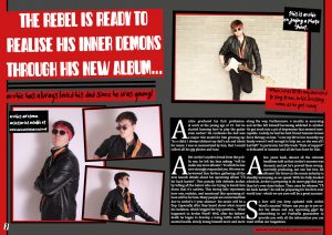
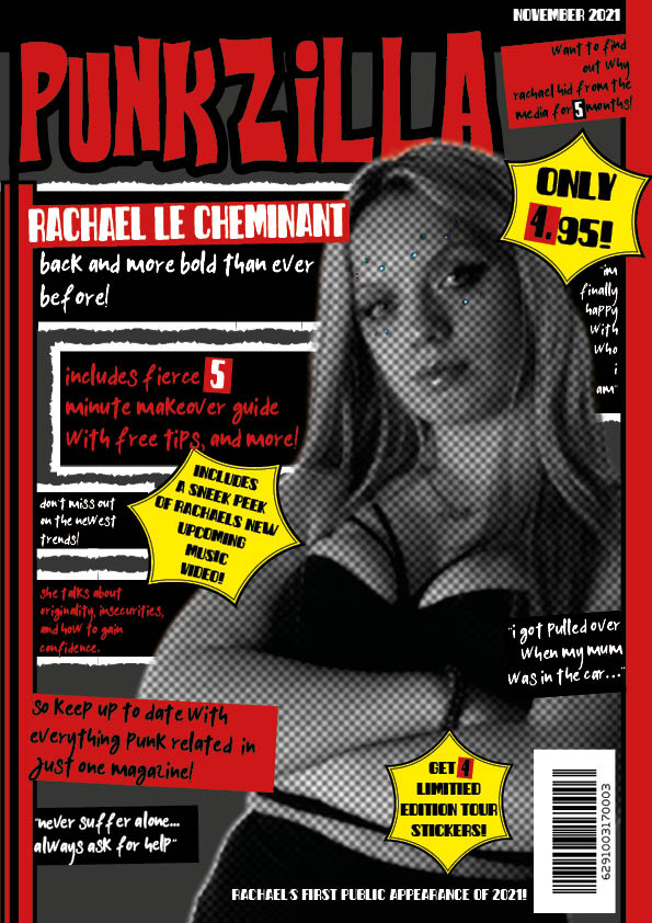
The biography magazine I have chosen to analyze is Q-MAVERICK. The date it was released/ published was September of 2017. Then, the name of the person the biography is written about is James Lavelle. For the journalist/ author, they remain anonymous and unknown. I have chosen this biography because I think it will be insightful for when I create my own music magazine article. Biographies are particularly compelling since they tell us a true-life story, that most people can relate to, in some way. Similarly, most artists don’t produce their work anonymously, because that could make them lose their connection with their audience. Or it could make the audience question the artist’s work.

The evidence of the journalistic technique 5 Ws & an H is present in this biography. The text is based on James Lavelle and his journey, throughout rehab/ recovery, to where he is now. He is from Camden, North London. The story is set from 2003 (when he became bankrupt), through 2017 (where he’s making his comeback). This article was shared to ask the readers what mistakes they’ve made, learned from, and how they affected them. 

Structure:

I know this is a biography because the article is based on James Lavelle’s life stories, what he went through, and how he’s overcoming it. The layout of the page has the title taking up half the space, with an introductory paragraph in bold, and then three smaller columns of the information below that. 

Presence of journalists:

We can tell there’s a journalist’s presence because they address James by his name, and it’s written in the third person. However, this journalist does not address or relate to any of the problems James faced throughout this biography- which keeps the focus solely on him. By doing this it gives the text a personal, more meaningful and effective format. Furthermore, deepening the reader’s connection and empathy they feel towards James. Since it’s written in the third person, the journalist uses quotes to support the article’s stories. There’s a clear introduction in bold, that summarizes his life and what happened to him. Before it goes into more detail. Then at the end, it isn’t a typical conclusion, but they do leave the text with a question addressed to the audience- and a short sentence answer from James.

Language and aim:

The technical techniques used in biographies are adjectives, quotes, name drops, metaphors, personification, and hyperbole. This article uses strong adjectives like; long, intense, powerful, extreme, beautiful, and amazing, to create a bigger sense of importance within its stories. The tone is informal, with words that the typical audience buyers would use (like “fucking”). This fits the article since it creates a realistic impression of what James Lavelle’s own hand-written biography would be like. The similes and metaphors used were to describe his failed attempt at fame, for example; “his star had plunged”, “Everest of cocaine”, and “He proved himself to be a visionary lightning rod”. The audience will gain a deeper understanding of the effects drugs can have on people after reading this article. They will most likely experience a sense of repulsion towards drugs based on the horrible, life-changing problems they can cause. They might also gain a bigger sense of empathy for James Lavelle.

Quotes in the article:

This biography includes quotes from Lavelle. One of the quotes they added in was; “Noel Gallagher, Richard Ashcroft, Ian Brown, Carl Craig, Alexander McQueen and an Everest of cocaine”. Name dropping these bigger names means that the fans of this magazine will know the featured celebrities. This will tempt the audience to read on. He references cocaine to highlight his addiction/ old habit. This generates a sense of excitement that makes the audience want to read on and understand more.

Another quote is “Lavelle was the boy wonder of British music”. This is referring to the fall of his career, and how he was a talented young man that had a successful career lined up for him- but he ended up taking drugs and ruining it all. So now that he’s back, he’s trying to stay on the right path. This quote is basically a conscientious tale for the readers.

Some other interesting quotes in this article are; “The last 13 years have been fucking tough financially”, “It was beautiful,” he says wistfully, ”while I had it”, “In one way I’m probably insane to keep doing what I do. Anybody rational would have stopped trying to do UNKLE years ago”, and “I’ve put myself through quite extreme situations, both financially and emotionally. But then I got used to that very young”. 

Representation of the artist/ star:

Overall, the journalist represents the artist by embodying his and his fans’ slang/ typical vocabulary. They add quotes from James to support the story and show his true feelings of what was happening at the time.