Final Digipack Draft:
This is our final draft, with 4 panels and spines included…
Self Assessment:
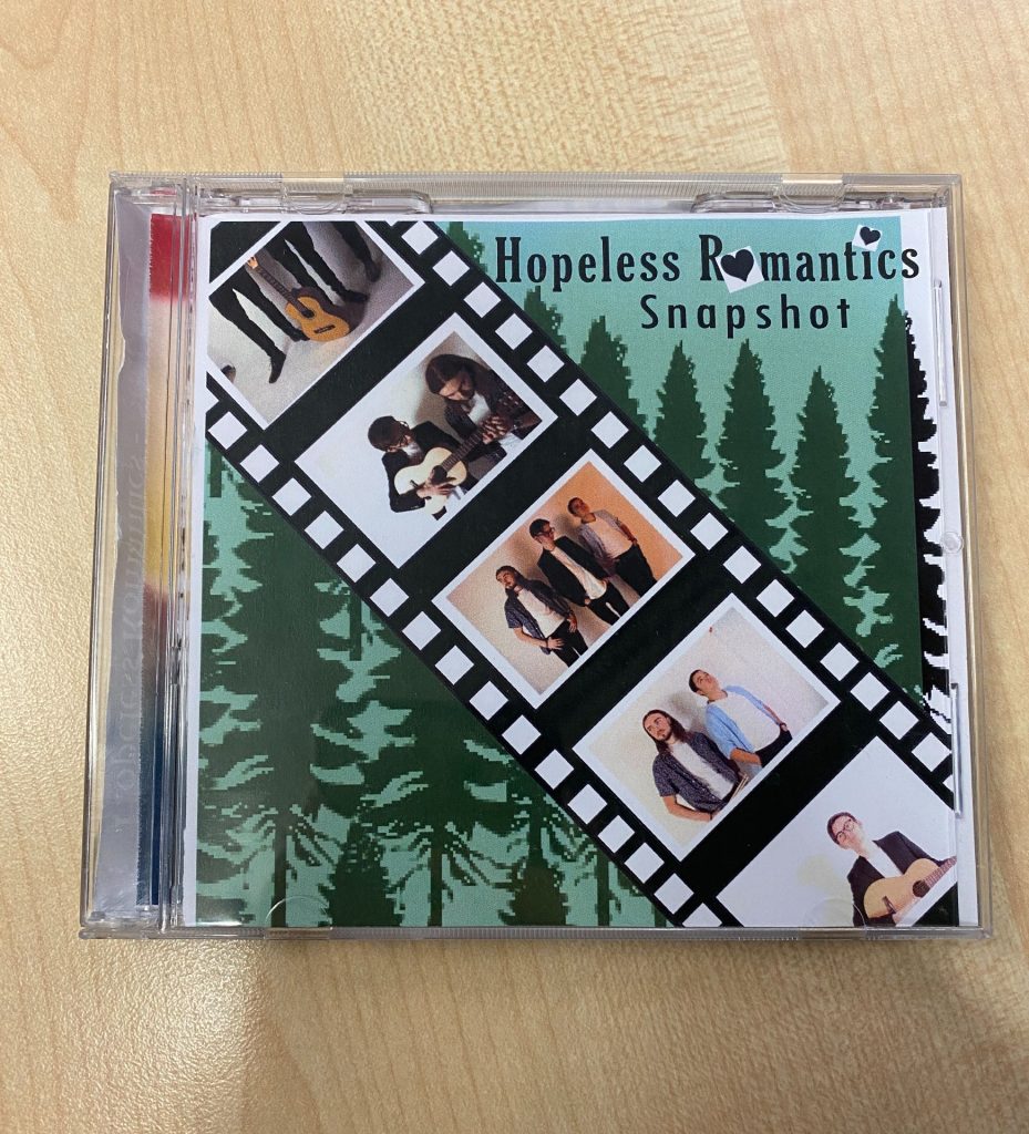
Front cover:
Overall, I like how our digipack front cover turned out. I like the natural, earthy colours. They’re soft tones and shades that complement each other. The tree/ forest background supports our band’s environmental values and ideologies. It’s also convenient for our genre. We made the trees slightly blurred, to focus on the sharp lines of the filmstrip. The film strip is eye-catching and unique. The faded sides make it look more realistic. I think the colour edits we made look effective. The black and white are subtle. It focuses the audience on the coloured parts of the image (band members or their instruments). We made sure to give the members equal attention and representation, by giving each member a photo focused on them. The typeface we used is sans-serif. This is another generic convention. The band’s name is bolder and more of a serif font. This is to suggest the importance of the band. It clearly shows their fans whose album it is. The hearts are a relevant touch. They hint at our music video and merch illustrations. Whilst also presenting our digipack with a hint of pop.
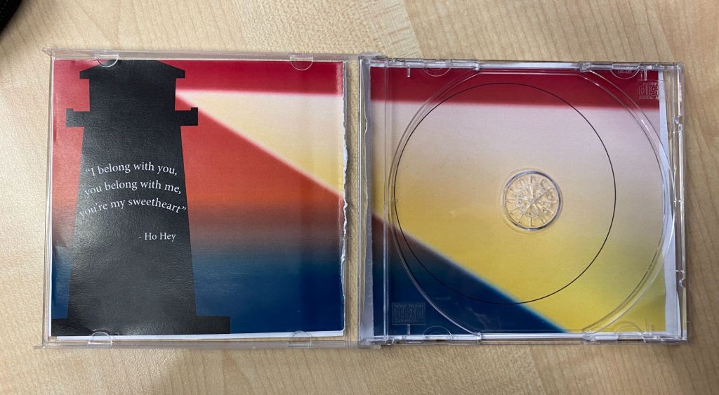
Double-page spread:
We decided to add more colour to our double-page spread. We chose to add a mixed gradient for the background. This matches the lighting of the lighthouse. The sunset idea is a common idea used by other bands of our genre. The bright red represents love, romance, and passion. We have used the colour red throughout our other media products too. Then the darker cyan is a similar tone to the green on our front and back covers backgrounds. It resembles the sea/ ground. The colours are also contrasting, and grab the audience’s attention. Then we designed the lighthouse in adobe photoshop, then illustrator. We went for a realistic silhouette. This supports the cartoon ideas we’ve included throughout our projects. We added a light beam coming out of the lighthouse. We used a gradual gradient (in a triangular shape), with faded edges. To create a realistic illustration. The sides of the light beam frame the outside rim of the CD’s placement. We added the lyrics, on top of the lighthouse, from the band’s main track. By curving the text, it suggests that it is wrapped around the lighthouse. This is a way of making the drawings look 3D. This is also a reference to our music video (of the single’s music) which was partly set at a lighthouse. I like that our products are all coherent and match.
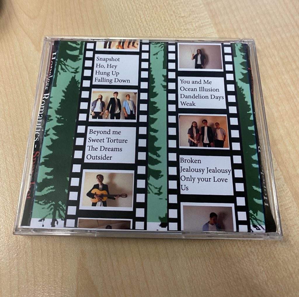
Back cover:
For the back covers background, we used the same idea, colours, and trees as used on the front cover. This kept our digipacks theme going throughout. It also means that our albums are recognisable from the front or back. Which makes it easier and quicker for fans to pick up, from stores. We include the same filmstrip feature, with the same coloured effects added. This is because it’s aesthetically pleasing. However, we only did the middle pictures of the band in colour, instead of individual members across the strips. This helped bring the focus back onto the band’s brotherhood and friendship. Which is shown throughout the various shots of them together. These filmstrips are a common, fun way, many friendship groups use to capture the memories they are making. Therefore, it conveys our stars as ordinary. They are dressed smart-casual in all the photos taken, as is conventional for indie-folk bands. We used the same typeface for the titles on the spine, as used on the band names title. Instead of having photos for each section of the filmstrips, we used 4 alternative squares to display four different track titles. The font for these track titles is sans-serif, so they were legible/ clear. We decided to include tildes (~) at the start and end of each title. This is the same as the album’s name, on the front cover. Finally, we included copyright information, a bar code, and a record label logo. These were key elements required for a digipack. These conventions make our digipack look professional.
Reflection:
To summarize, our digipack publicises and conveys our bands star image. It represents how we wanted to portray them and their ideologies/ personalities. We planned out each aspect and feature involved to construct our desired effect. We wanted their fans to see them as down-to-earth, role models, and most importantly a group of good friends that are hopeless romantics.