Critical Reflection Essay:
How did your research inform your products and the way they use or challenge conventions?
How do your products represent social groups or issues?
How do your products engage with the audience?
How do the elements of your production work together to create a sense of ‘branding’?
I researched indie-folk artist music videos. The narratives were typically personal and based on romantic tropes. The music video I studied was “Hopeless Wanderer” – by Mumford & Sons. Lacey said a music video is successful if It follows the repertoire of elements. This band included the formal conventions; MES, star image, and editing. They made their video aesthetically pleasing. They edited the video to have an old-school film effect. They included an introductory clip of their band and song name. They framed their shots so each band member had an even amount of screen time. The video included single shots, two shots, and full band shots. These are taken from different angles. The lighting ranges from low to high key, whilst maintaining good exposure. These conventions are generic. Our music video has similar props, outfits, settings and lighting. We have challenged and borrowed features from the pop genre. Such as the graphics (cartoon hearts), and bright colours (red braces/ sunglasses). Which is unconventional to the genre of indie-folk. I also watched “Coastline” – by Hollow Coves. They have similar settings and costumes, like in my music video. Both videos include quirky acoustic guitars and hats. They included fragmented narrative clips, like ours. My research informed me of what key features I needed to include and challenge. It helped me understand how to make my products unique. Altman said; following the conventional criteria is the blueprint for creating a thriving music video.
The Mise-en-scène I chose, for the main star, was red braces and a bowtie. This creates a nerdy, formal appearance. The glasses also hint at this. By researching “school nerd”, I knew this costume would create the desired effect. They are all dressed in smart attire, which fits the formal conventions of indie-folk (the braces, shirt/ button ups and jacket/ blazer). However, the bright red colour is a generic convention, used by pop artists. In particular, the red heart sunglasses are conventional to pop. This screenshot showcases the lead singer’s outfit. The props used are typical folk instruments. I chose the acoustic guitars based on what other famous folk artists play.
 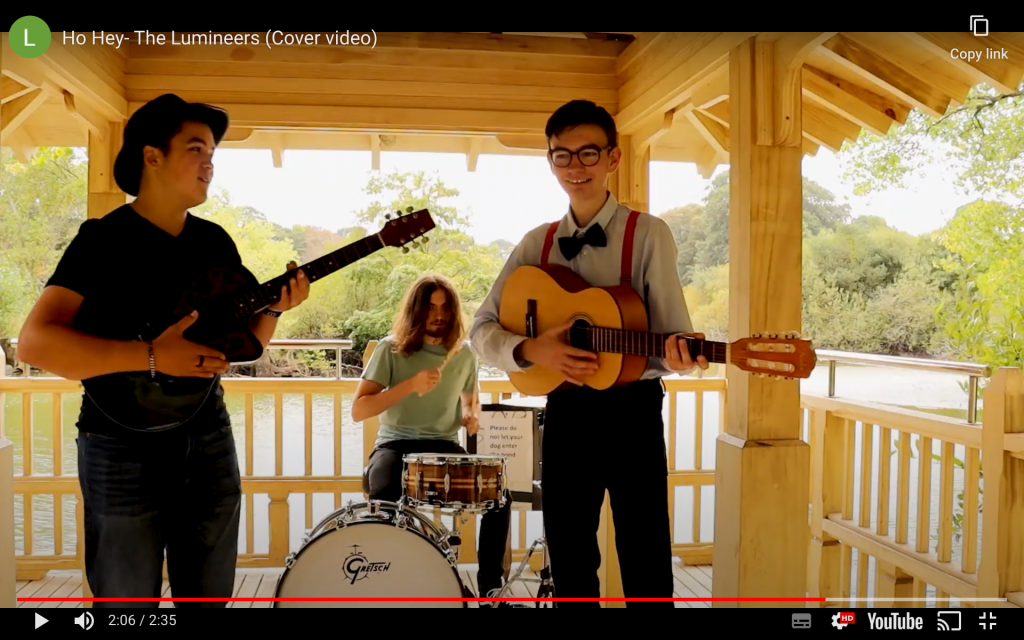 The second screenshot is a clip of the band playing outside. This location is another convention we focused on- a romantic meeting spot. Most indie-folk bands set their music videos outside. They are typically environmentalists, which conveys their sympathetic, natural,
 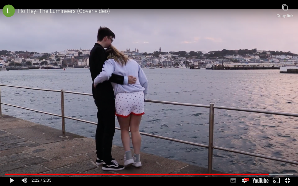 and rural vibes. The outside location displays bright trees, which fit in with their interests. The third screenshot is based on the lighthouse. This is a key location that conveys love, companionship, peace and seclusion.
Hopeless Romantics is the newest indie-folk band around. They aim to bring back old-school romance, with a modern twist. With the use of traditional culture and retro tones, Hopeless Romantics will also add a playful pop vibe, for a younger demographic. It will have them wishing the album “snapshot” was written about them. The band is represented as unique, quirky, loveable guys. They are hopeless romantics at heart. Our lead singer is the one in love, which is why he’s singing to his crush, telling her how he feels. Their views and beliefs are respectable, which gives them a good reputation with the public. Our goal is to showcase their companionship, confidence, unity, quirkiness, talent, and romance within our products.
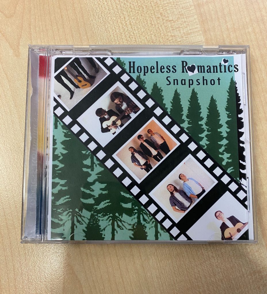
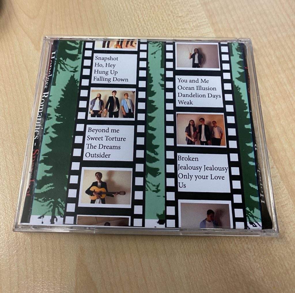
The film strips are playful.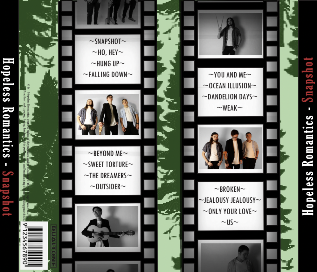 This idea showcases different photographs that portray their friendship. It links with track 1’s name “snapshot”. This modern snapshot idea also links to our social media page. It represents our band’s album as indie-folk, with a pop twist.
 ![]() The trees in the background display a natural, environmental vibe. The green colour signifies an earthy tone (De Saussure). This fits our band’s beliefs. The hearts in the title are a symbolic code to represent a hopelessly romantic vibe broadcasted throughout the album’s songs (Barthes). The acoustic guitars in the film strips are a symbolic code. The photographs are taken in the studio, which implies they are extraordinary stars. However, the film strips make them look like an ordinary group of friends (Dyer theory). The Mise-en-scène and camera angles signify their true brotherhood (De Saussure).
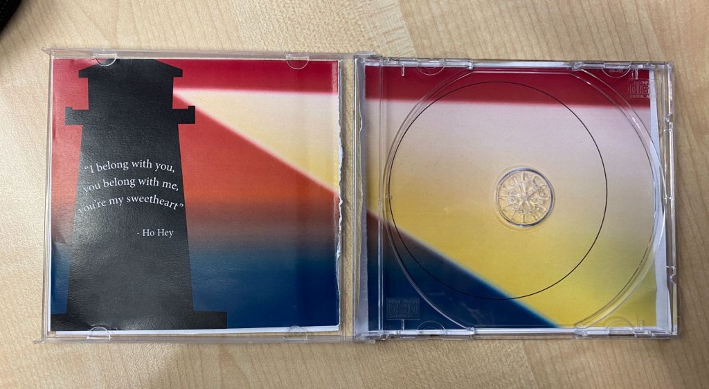
The trees in the background display a natural, environmental vibe. The green colour signifies an earthy tone (De Saussure). This fits our band’s beliefs. The hearts in the title are a symbolic code to represent a hopelessly romantic vibe broadcasted throughout the album’s songs (Barthes). The acoustic guitars in the film strips are a symbolic code. The photographs are taken in the studio, which implies they are extraordinary stars. However, the film strips make them look like an ordinary group of friends (Dyer theory). The Mise-en-scène and camera angles signify their true brotherhood (De Saussure). 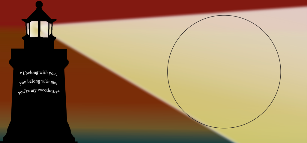 The lighthouse implies love and solitude. It can be a way of asking for help. Lighthouses are man-made, unlike the other natural locations used. These emphasise the band down to earth and loving attitudes. The band display love for many different interests of theirs. They are a normal band of buddies, who care about important things. They’re in sync with nature, a common value that connects them to their fanbase.
Hopeless Romantics have an active audience (b&k’s). Their audience is self-consciously seeking social interaction in their lives, by sharing things. Therefore, I advertised their products to encourage fans to share them. Stuart Hall’s theory answers why fans like certain texts they decode, and not others. This is because they need to have similar ideologies to the texts, to decode them properly. Audiences can now engage with each other too. Our society is now a participatory and democratic environment. This change impacts how the audiences find, share and explore media texts.
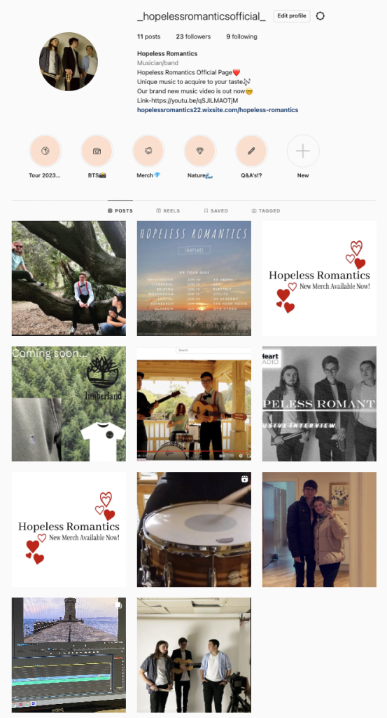
I focused on having my products appealing to the target audience. I followed ADIA- which focuses on the fans’ attention, interest, desire, and action. This made our products desirable to our fans. 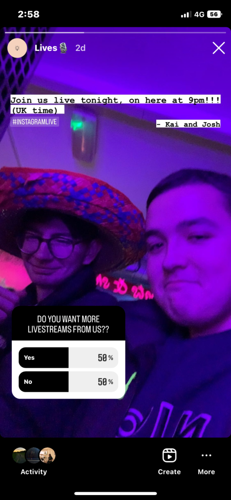 The first screenshot is a story post, from our social media page. It is a selfie of 2 band members, who are announcing their upcoming live. This live stream engaged the audience by having them join the stars (Shirky). The band gain a sense of belonging, by interacting with their fans (via a shared platform). We used a bright coloured, fun selfie. This intrigues their fans, causing them to wonder what the band will be doing. We included a poll option, to gain some feedback on the fans enjoyment for their lives.
 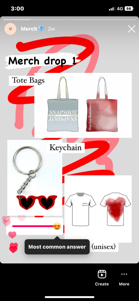 Another story we made advertised our band’s new merch. We used complementary bright colours to draw attention to the products. The captions display the item’s names. The sticker we used to collect insight from our fans was called ‘the most common answer’. We used social media as a market research tool, which helps institutions to understand what different groups of fans think. It’s a personal and manual effect that gives the fans their own say. This means they could swipe how far they wanted too, depending on how much they liked the merch.
  The third example is of our Timberland collaboration post. This gives Timberland and Hopeless Romantics mutual benefits and advertising (synergy). We have included products from Timberland that fit our stars image/ genre/ brand. We tagged their instagram account, so viewers can easily access their profile. We used relevant hashtags, so anyone can see our post. Particularly Timberland fans, or others that are looking under the hashtags’ feed. I encouraged and excited the audience, by sharing tour date information. Our stars are role models for their fans. They’re entertaining, and make the fans feel something.
Hopeless Romantics bring lovers together, causing their fans to become hopeless romantics as well. We communicated this through our products by adding cartoon illustrations of objects that are linked with the word “love”. We conveyed the bands true friendship and togetherness, by having them work together to help each other. There’s a theme throughout our products. We are trying to communicate the development of our main star’s love story, and how he did it (with the help of his friends). Our stars styles stayed the same, throughout our products. We used similar typefaces to keep their albums’ genre recognizable. The conventions work together to signify the message of our mission statement (De Saussure).
Their brand is the story that the audience will buy into and believe. Brands are what the buyers are, stand for, and believe in (their ideologies). It constructs a coherent set of messages about the band. Their psychographics are similar to our target audiences’. This helps their fans connect with them. The metanarrative (Dyer) is our mission statement and branding- the representation that’s been constructed. 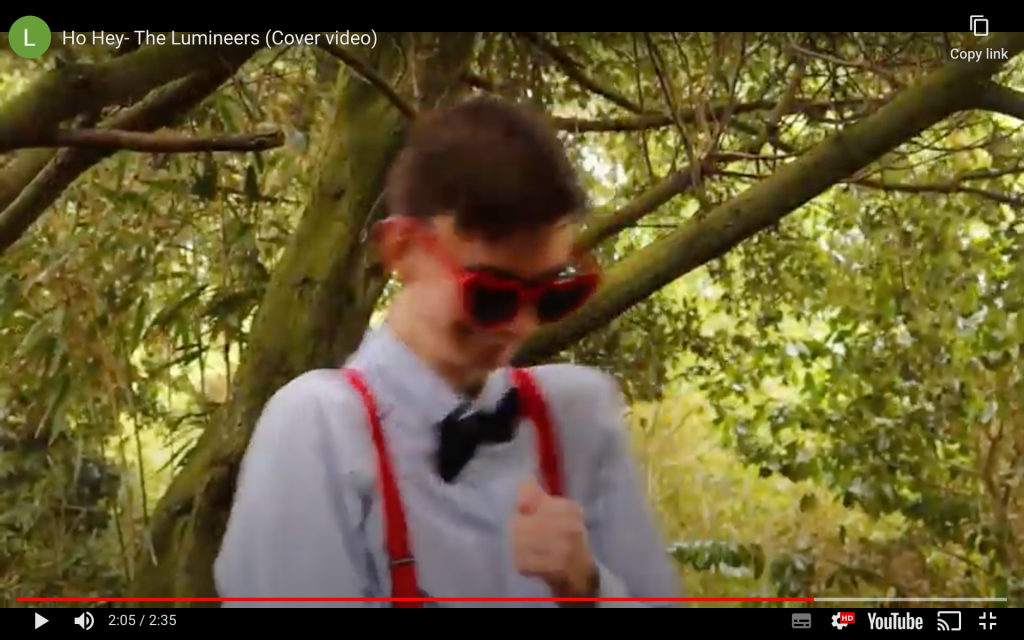 An example, in our music video, that suggests our production work creates a sense of branding is the compositions and framing. I framed the shots, in many different angles, to portray their strong brotherhood. Our target audience have an eye for framing, and enjoy well filled landscapes with bands in them.
 ![]() I included a range of shots on the front of my digipack, that portray their friendship. In particular, the photograph of the band member teaching the main star to play the guitar displays how close they are. Our band is honest with their fans. They don’t fake anything or try to be something they’re not. Their authenticity is shown from the clip, in our music video, of them messing around with the sunglasses. This implies that they have fun together. Our band are branded as environmentalists. They are lovers, with a soft spot for natural landscapes. This is evident across their social media page, under the highlight “Travel”.
I included a range of shots on the front of my digipack, that portray their friendship. In particular, the photograph of the band member teaching the main star to play the guitar displays how close they are. Our band is honest with their fans. They don’t fake anything or try to be something they’re not. Their authenticity is shown from the clip, in our music video, of them messing around with the sunglasses. This implies that they have fun together. Our band are branded as environmentalists. They are lovers, with a soft spot for natural landscapes. This is evident across their social media page, under the highlight “Travel”. 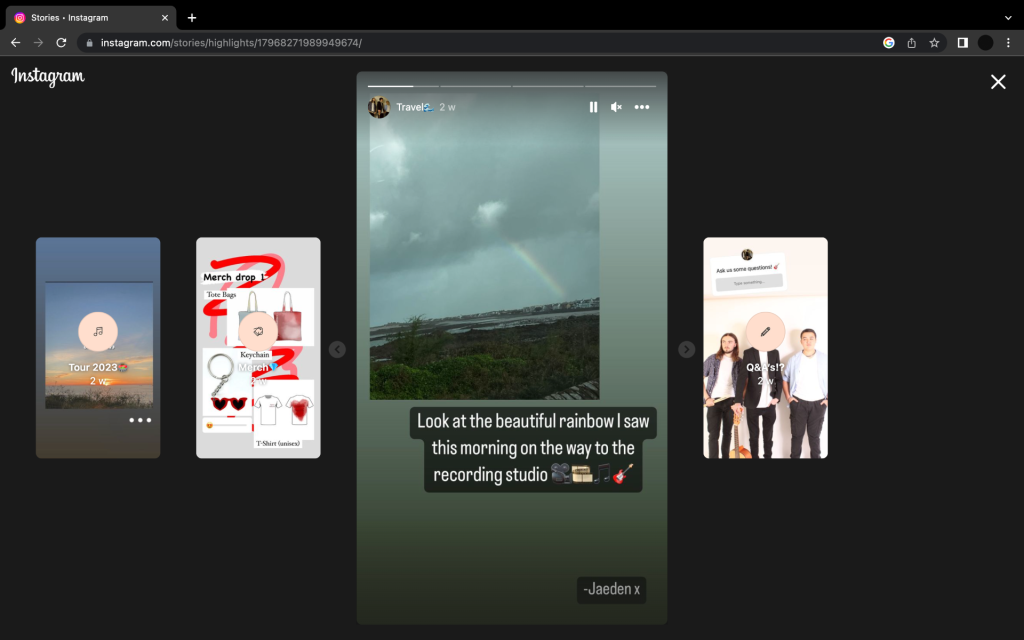 Many of their posts support nature and environmental charities. Their music video is filmed in natural settings. The digipak also includes a natural backdrop. This element is a respectable quality of theirs, that many fans value. Some other ways we created our band’s brand was; formal clothing to show they take old-school romance seriously (music video), collaborating with another brand that fits their values (social media page), and using typefaces and fonts to make our bands brand clear (digipack).