All posts by katiefellows

My Tour Poster:

My Tour Poster:

Click here…

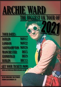
This is my tour poster using photoshop, InDesign and my original MISE-EN-SCENE image. It shows how the fonts, colours, languages and images can all help to convey a genre in print/ media.

Reflection:

I think that overall my tour poster fit the purpose of informing others about my artist/ Archie’s tour. It has everything that was on the brief; name of artist, name of tour, dates and venues, tickets and downloads available. I made a plan on a post-it note before making it so that I could have all the information ready. In my design, I tried to keep a constant colour scheme by making the background the same as the coat/ prop. I struggled to minimize my colour pallet, so the poster ended up with multiple colours. There is a light relationship between the image and the colour of the graphic design. The colours are mainly pastels tones that are typical shades for pop genre media. I researched pop music posters before creating my own version so I could see what fonts and colours are usually used. One of my main focuses was to make sure all the text is legible. My fonts are all clean and easy to read. The typefaces are basic, bold and suit the genre. There is only two typefaces in the design. I don’t have any text that wraps around any images. Instead I overlapped some of my key dates/ numbers over the titles and subtitles. The models looking towards the camera to focus the attention, however the glasses hide his eyes. The models costume reflects popularity and is quirky. This fits the pop genre because pop means popular and rare. The body language of the model is appropriate since it’s a common, casual pose. I tried to make my masthead/ cover lines/ texts prompt a sense of desire by using bold typefaces and short alluring/ tempting words. The idea of the posters text is to communicate the tours timings/ information and persuade the audience to buy tickets. This message is appropriate to the posters genre. The ADIA (Attention, Interest, Desire, Action) in my poster is clear.

My Magazine Front Page Swede:

My Magazine Front Page Swede:

This is my recreation…


This is the original…
3 Positives About My Magazine:
  • I successfully made the question marks and explanation point tilted /diagonal.
  • I didn’t have any spelling or grammar mistakes in my text boxes.
  • I got all the main features from the magazine without skipping any of the small details.
3 Negatives About My Magazine:
  • I couldn’t find 1 of the tour poster images (so I used a similar photo).
  • I struggled getting the correct typefaces for the mastheads and cover lines.
  • The background image isn’t the same- which meant that the composition of the magazines’ right side was slightly different.
2 Useful YouTube Videos On InDesign:
My Focus Forward:

During this week’s lessons on using InDesign, I have learned how to import photos/ insert shapes/ text boxes/ colours, and zoom in/ out. All these will help me moving forward to make my own media efficiently. Once I learnt how to use the basic commands, such as going back and saving, I was able to complete my work much quicker and easier. Even though my fonts aren’t the exact same in my recreation, I learnt how to get more choices, which will be helpful later on.

A Front Cover Analysed – Attracting ‘that’ Audience:

A Front-Cover Analysed – Attracting ‘that’ Audience:

Overall, this magazine is designed to be sold- like every product. Its main purpose of it is to provide entertainment and relevant information for the buyers. Every magazine is made up of many features in order to attract customers. These features include what we have been learning about recently; mise-en-scene, clamps, camera angles/ shots, colour pallets, and mastheads/ cover lines/ cover stars. This research is important because it helped me notice what features magazines use and why. Whilst I was finding and analysing each technique, I gained a better understanding of what they do. In particular, a new thing I learned was what demographics and psychographics means. Moving forward, since I chose the most unfamiliar/ hardest magazine for myself, this task helped challenge my basic knowledge of the main techniques I had to analyse.

The Conventional Design Features Of A Magazine:

The Conventional Design Features Of A Magazine:

Click here…
Reflection:

The main features within a magazine are the; masthead, cover lines, main cover line, main cover star, barcode, price, plug, pug, insets and captions. The masthead is the main title and the most important text on the page. It’s usually the biggest text and named after a brand or something that’s relevant to the topic. The cover lines are the other topics within the magazine that aren’t the main focus. Then the main cover line is the text that’s smaller than the masthead but larger than the other cover lines. The main cover star is a photo of the person who’s the focal point of the magazine. For example, it’s usually a tv shows main character or an upcoming popular singer. The barcode is a necessity for a magazine- whether it’s on the front or back cover. They’re used to scan the product at the till so a customer can buy it. Similarly, the price must also be on the product so customers are aware of the price. Plugs and pugs are extra details or deals that will attract the audience’s eyes and convince them to buy the magazine. Insets are smaller photos that are used to show other categories within the pages. Normally, insets have captions near them which explain what topics they are.

The layout of a magazine cover is important because it’s what will capture the audience’s attention and make them want to buy it. A good layout will increase the sales and magazines popularity. For example, a good layout for a cover would be to have the brands name in the biggest, boldest typeface/ text. Another good example would be to have the most popular and interesting photo/ theme as the main topic.

The Camera Talks:

The Camera Talks:

Click here…
Introduction:

This is a mood board of 9 images that my group took around our school. We went around different locations and took various angled shots. All three of us took turns modelling and photographing. Overall, we finished the shoot with 50 images. This meant that we had more choices to choose from. This exercise helped my group learn about the effects the compositions of the images can have. For example, most of our high angled photos make the subjects look sad and powerless. This is because they didn’t fill the frame and therefore looked small/ helpless. Contrastingly, most of our low angled shots make us look strong and confident. In our extreme long shots the setting becomes more significant than in the extreme close ups. This is because there’s more of the setting/ location visible in the shot. I have learnt that when making a film, or a piece of media, the camera plays a massive part in the images overall meaning. Before the task, I assumed the only emotions we can feel is from the actors facial expressions. However, there’s several parts used in creating media that makes the audience see/feel something (aka: colours, camera angles, facial expressions, costumes, and make-up). For example, in one of our photos we tried to convey a story/ feeling of failure and loneliness. We did this by framing the shot of Kai next to the goal, holding his head down. For each location change we tried to change our poses and the cameras frames. The term media language means how the media text is conveyed to the audience. So when the media is photography (from a camera) the media language is the CLAMPS, and the types of camera shots used.

My Image That Uses MISE-EN-SCENE To Communicate Meaning:

My Image That Uses MISE-EN-SCENE To Communicate Meaning:


Introduction:

This is our Padlet research on the genre “pop”. We looked at the Costumes, Lighting/ Colours, Acting /Proxmetics, Makeup /Hair, Props, and Settings (CLAMPS) that relate to pop artists and bands. For example, our biggest inspirations were The Beatles- particularly Abbey Road. Even thought I wasn’t the model for the shoot I helped choose the outfits and props.

Costumes:

The first outfit is bright, colourful and eye-catching. It was a multicolour pair of sunglasses and a coat- that matches our colour palette. The jacket makes the image link with our artists inspirations. We also did a second outfit in a black uniform. This made Archie look smart and wealthy. Our third costume was a fluffy leather jacket, with the same multicolour glasses as outfit one. This leather jacket is trendy amongst the pop industry. Finally, the forth outfit was a reckless, school boy look. We tied his tie around his head to make him look like many of the teenage/ young bad boy male artists. Even though many male pop artists don’t wear make-up (like Ed Sheeran), most females are usually highly styled/ made up. So based on our model we decided to go with a ‘natural’ effortless look.

After we finished planning all four outfits, we went to photograph them. We took lots of photos, so that after we could narrow them down to the best ones later. Changing the lighting wasn’t possible since we were shooting outside. However, that didn’t affect our photos since ‘pop’ can be associated with bright light/sunshine.

Final Images and My Reflection:
Click here for the original photo…

This is my favorite outfit my team and I produced/created. The lighting illuminates the face, whilst also highlighting the pink coat sleeve. His natural hair in the wind creates a relaxed vibe within the composition. The bright pastels are good contrasts to the shadows and dark patches of colours. The smirk gives the audience a happy, lighthearted impression- just like pop music is supposed to. We also made sure Archie filled the frame and that we didn’t have any extra unnecessary spaces. Each of these elements together created some good final images. Since this was the first practical (experimental) task, it gave us a good insight into the course. Overall, my team and I were happy with the theme we were given, and the results we got.

Media Ecology:

Media Ecology:

Here are our class posters on different aspects of media ecology.

The study of media ecology aims to suggest how media changes society and our everyday lives. It also makes us aware of what we’re doing/using.

  • How does technology change social interaction?
  • Should governments control distribution?
  • Would creators still make content, if they weren’t paid for it?

My Media Diet:

My Media Diet:


The media that I used for information is mainly; Pinterest, Tiktok, and any social apps that my friends update me on. These are fit for providing information because the apps are constantly updated with new information. This means that they keep the target audience coming back and using the app. The media that I use for entertainment is; Netflix, YouTube, and Disney+. These are entertaining because they have films/shows I can watch in my free time. They’re similar to the people that contribute to my personal identity; Taylor Swift, Selena Gomez, Actors (in my favorite films), and certain Youtubers. The influencers and celebrities are part of my personal identity because they are my role models. So is Spotify and any online shops I use because they make up parts of my personality/looks. The media I use for social activities are; Facebook, Snapchat, Instagram, and messages. These keep me in contact with other people- without being with the person in real life. The sizes of all the medias depend on how much I use it (the bigger the picture, the more time I spend on it).