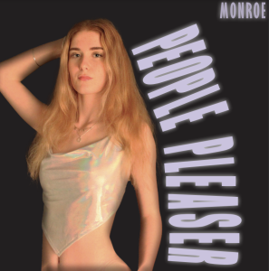
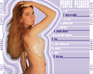
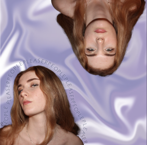
This is draft 2 of our pop artists digipak:
Here is our teachers screencastify:
What went well:
- The darker colours fit in more with typical RnB design conventions,
- The text on the front cover is atypical and unique,
- Has interesting graphics,
What to change:
- The colours are not flattering against the models skin tone,
- The inside cover is too crowded, while the back cover is more 2012 RnB, so both need to have changes made,
- The model needs to be moved so that she doesnt look naked,