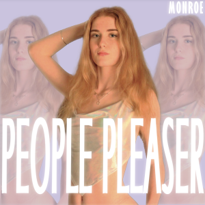
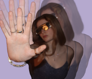
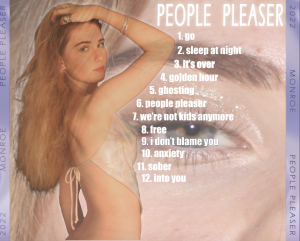
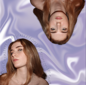
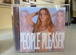
This is draft 3 of our digipak:
What went well:
- The colour scheme is cohesive throughout all covers,
- The layers and graphics are unique and match modern RnB conventions,
- The typeface all goes well together and is clear to read,
- All images images are placed correctly and fit well,
What to change:
- Some spacing is to be changed on the spines,
- Barcode and copyright symbols are to be added,
- Slight changes to fonts and images such as sizing,
- Consider removing back title,

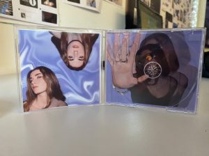
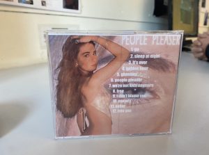
Seeing our digipak in a genuine CD cover allowed us to analyse if and how each cover or spine worked, and if it was aesthetically pleasing.
Here is our audience feedback on what genre people thought our digipak was:
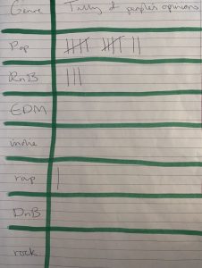
Although more people assumed our digipak was in the pop genre rather than RnB like we had planned, when we asked what genre the audience thought Rihanna or Beyonce was representative of the majority also said pop. This shows that typical female RnB design conventions can often be similar to or mistaken for pop, so it is inevitable for our digipak to have connotations of the pop genre.