SOCIAL MEDIA PAGE TERMINOLOGY

BELOW IS MY ANALYSIS OF MIMI WEBB’S SOCIAL MEDIA PAGE:

REFLECTION AND FOCUSSING FORWARD:

During this research and analysis, I was able to gain more of an insight into how a young, upcoming artist grows their image rather than taking from an established artist that will use different marketing techniques and language etc. This research is more tailored to the type of social media page we will need to create for our star – Monroe. The mix of casual, ordinary posts with extraordinary, tour and performance posts establishes her professionalism whilst maintaining her authentic, normal life that she lived not too long ago, before going viral. Her feed is colourful, vibrant and exciting to draw in Gen Z pop genre listeners, we will aim to use a colour scheme and ensure to make the post cohesive from the offset.


EVALUATION OF SHOOT

SUMMARY:

Overall our digipak shoot went according to plan, using flash kit equipment to sync with the DSLR camera and having our model on a dark background all combined to create well lighted, clear images. I used my knowledge of appeture, ISO and F Stop to tailor our camera to the conditions at hand, once again resulting in professional looking images. The model conveyed our extraordinary star image well with moody, sensual facial expression and confident posing, having been our model for two years, she is comfortable behind the camera and this means body language is open and honest when looking back through the photos. The PMA and prior research lead to us having a clear vision and plan for the shoot, this prohibited any confusion or wasting of time when in the studio.

MY FAVOURITE IMAGES:

POSITIVES OF THE SHOOT:

  • We established an extraordinary star image within the realm of our pop/RnB genre.
  • The model was clearly comfortabe and thrived in this shoot, conveying a level of confidence to the viewer.
  • Despite the black studio not being our first choice, it actually worked more effectively because we can photoshop the model more easily and it creates a moody feeling.
  • Depth and dimension works well in the photographs with the sunglasses.
  • The soft makeup and limited clothing represents the genre effectively and meets the plan we had in mind.
  • The mid shots are similar to the other digipaks we have researched so we can ensure they are inkeeping with the genre.

NEGATIVES OF THE SHOOT:

  • The black backdrop isn’t wide enough for mid and long shots so photoshopping will have to be done to fox this.
  • The black backdrop also isn’t a true, deep black when under flash kit equipment, to alter this some photoshopping of tone and colour quality will need to be done.
  • Some of the flash kit lighting didn’t sync correctly so some quality in a series of photos was lost – making them unusable.

CONTACT SHEETS FROM OUR DP SHOOT

BELOW ARE THE CONTACT SHEETS FROM OUR DIGIPAK SHOOT:

HERE ARE MY FAVOURITE PHOTOS:


These photos are the best options four our album cover when desigining it on Adobe Indesign, they are representtive of our model’s star image and convey a powerful, strong, sultry narrative that we aimed to illustrate through our digipak. The images can also be used on our social media page and will work well for promoting brands, upcoming events and business arrangements.

PMA AND RISK ASSESMENT FOR THE DIGIPAK SHOOT

BELOW IS OUR PMA FOR OUR DIGIPAK SHOOT:

Creating a production meeting agenda for this shoot was crucial as we were limited on time and needed all costume, makeup, lighting and equipment to be ready to access and use. We shared our model into this agenda and briefed her on poses and style to ensure she was comfortable with the planning and costume; this decreased explanation time when in the black studio so we could immediately start shooting.

Our mock up and prior research on album covers of the R’n’B genre was also helpful to gauge how to meet the design conventions and ensure our target audience won’t reject the media text. This research also helped with how to create our extraordinary star image through colour palette, costuming, fonts etc. So combining all of this onto one PMA condensed the research and displayed our understanding and plan for moving forward with the digipak.

BELOW IS THE RISK ASSESMENT FOR OUR DIGIPAK SHOOT:

A risk assesment is a pivotal part of planning a photoshoot, we can avoid any risks that surface and acknowledge problems that may occur, all parties sign the document and this solidifies mutual understanding of the contract.


DIGIPAK MOCKUP

OUR ROUGH, DIGIPAK MOCKUP:

When drawing up our plan we took inspiration fromt he album covers we researched and information we learnt during the lookbook task, we plan to use an establishing mid shot on the front that displays costume and makeup clearly. The background will be plain due to using the white studio for a photoshoot. Unconventionally, we plan to create a banner across the top of our model with her name and not write the album cover name name on the front. On the other hand, we could place the album title in detail on clothing or jewellery to add subtle hints.

On the back of the cover our model will be photographed from an angle behind her, the album name will then be displayed on the back along with a list of songs down the right hand side. The copyright symbols and brand logos will be featured in the bottom right corner along with a barcode etc. The spine typically features the artist name and album title so we followed this in our mockup. We have annotated my drawing with colour schemes, qualities to convey and the type of star image we want our model to portray which is extraordinary. Text will use a sans serif font to not distract from our main focus (the star – Monroe).

Graphics won’t be necessary in the creating of this album, they aren’t inkeeping with the genre so will lead to our target audience rejecting the text. The same will apply with illustrations of special effects, this would lead to our album holding more of a punk, rock or heavy metal vibe. Our audience demographic will be confused meaning advertisement won’t be successful.

Th colour palette we intend to use:

FINAL DRAFT

Here is the final draft of our music video ‘Go’:

All the final amendments of our video were subtle, small technical changes of some timing, lighting and editing choices were altered to finalise the video in a professional manner. An accurate representation of the star image we aimed to create was crucial in the production of this music video; mise en scene created with costume, lighting, setting and editing all worked cohesively to present our star as powerful, independant and strong. The combination of expensive belongings/settings like the convertible car with affordable, everyday items like the Urban Outfitters costume created an idea of our star being ordinary and extraordinary (Dyer). This narrative was a necessity in order to create an interactive, engaging relationship between the star and her audience. We included a repotoire of elements (Altman and Lacey), commonly associated with the pop genre, to ensure our media text wasn’t rejected by the target audience. These included bold makeup looks, fun and experimental lighting, pace of edit, glittery costume etc. All of these elements also work together to represent our audience (Barthes), when researching, we found our audience wore and expressed themselves in these same forms so displaying our star like this represented our audience as a social group well. We ensured to include a large range of camera angles and shot distances that worked effectively when combined with editing techniques; these ranged from close ups, zooms, long shots, wide shots, pans etc. Our lighting ranged from low key to high key and this was dependant on the moods and emotions being expressed through lyrics and acting at that time in the video – if our star was angry the lighting would be more harsh and highkey, whereas if she was sad the lighting would be deeper and lowkey. The lipsyncing was flawless by the end of production and this was due to the editing to the beat, establishing the beat and editing at different paces to keep the video interesting, allowed a flow of different clips when lip syncing to be used seamlessly.

DIGIPAK CONVENTIONS ANALYSIS

When researching the genre of our own artist (Cat Burns) further, we discovered the song – Go – we chose to use is of the pop genre; however Cat Burns herself idenitifies much more with the R’n’B genre. Due to this, for this task I chose to explore the typical design conventions of the R’n’B genre and analyse a CD cover that is more tailored to our chosen artist and the digipack we will go on to create in the following months.

REFLECTION AND FOCUSSING FORWARD:

When completing this task, I was able to familiarise myself with the typical repertoire of elements found in the R’n’B genre, picking apart the design choices and unconventional or conventional features was helpful to conclude what the target audience will reject and accept. I discovered that pushing the boundries of typical conventions slightly is possible, but too much too fast could plumet a star’s image. So when making my CD cover and digipack, I will follow most of the typical design conventions, dennotations and connotations of my genre whilst adding in subtle changes to make my package unique and appealing.

THE LOOKBOOK – THE PACKAGE

WHAT WE RESEARCHED:

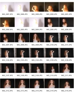
During this research task, we explored the R’n’B genre,  learning about the typical design conventions the demographic expect to see when looking at an album cover. There’s a specific reportoire of elements taken into consideration whe designing the cover, these being: the pose, costume, makeup, colour scheme and lighting. They all collaborate to build a brand and portray the artist in a certain way – this either being ordinary or extraordinary. In the R’n’B genre we discovered most artists are portrayed as extraordinary and the audience expect to see neutral backgrounds in order for the artist to stand out, sans serif font is used to ensure no distraction from the star can happen. The placement of the text is random, we found some brought the artist in front of the text however some text was placed over the artist – mostly the album cover title for clear advertisement.

OUR PADLET:

Made with Padlet

RELECTION AND FOCUS FORWARD:

As displayed in the padlet, integrated advertising across social media platfroms are commonly used, most young and upcoming R’n’B artist use instagram and tiktok to promote new projects, albums and tours. The benefits of social media for an artist’s publicity is massive,  building an online presence and keeping the style of an instagram feed cohesive to the artist’s motives, morals, personality traits and values is crucial. Preferred reading is how the producer wants the audience to view, read and feel about the text put out, this means that as a producer of a music video and album cover, I will strive to use costume, makeup, lighting and colour palettes to send a message of my star being confident, strong and extraoridnay. This task definitely opened my eyes to the many different versions of album covers that still meet design conventions, an album can be unique and inventive whilst still meeting the target audince’s expectations, meaning they won’t reject the text and adveristement will be successful.

5 KEY DESCRIPTORS TO SUMMARISE OUR STAR’S IMAGE AND BRAND:

  • Confident
  • Empowering
  • Desirable
  • Striking
  • Innovative


OUR MISSION STATEMENT – THE PACKAGE BRAND


REFLECTING ON OUR SLIDESHOW ABOVE:

Introducing a star to the media is a careful task, every type of presence the artist has online will shape their image – possibly drasticaslly changing the view an audience holds towards them. The brand created is circulated by promotion, integrated advertising and a range of marketing strategies e.g. guerilla marketing or synergy as referenced in the slideshow above. Our mission statement states: “Monroe, a name you will remember. She is on her way to be the face of pop music in the upcoming generation; her innovative, unique style is heavily influenced by latter R’n’B music which ensures her pop style is like no others. ‘GO’, the new hit single is grammy nominated, throwing this rising star in the deep end of fame. Listening to the inventive rhythms, one of a kind riffs and distinctive lyric writing will leave you wanting more.”. This enforces a extraordinary star image and brings the whole package of our artist’s social media presence together. As displayed in the presentation, our unique seling point is inventive and hasn’t been done before. Our artist has commited to meeting a new fan once a month and taking them on a luxury day in the life, alongside the star. This USP is crucial in order to keep our star image relatable for the target audience, leading to them viewing our artist as a role model. Stating a call to action when making a marketing plan is necessary to cover all bases and guarantee the marketing team and social media presence of the star is coherent. Using conventional marketing techniques and style choices is important when appealing to the target demographic, if a marketing team used unconventional strategies to promote their star, the audience is likely to reject the text. This means an audience won’t respond well to something new or different, leading to the star’s image and fame to rapidly defalte.

FOCUSSING FROWARD:

This post was crucial to complete before moving froward to our digipak planning, creating and editing. A clear plan isn’t negociable if a team wants to promote a star successfully and professionally. Going through the motions of a real marketing team is helpful in order to make our work as realistic and triumphant as possible. Reminding myself of the key terms, marketing strategies and typical audience demographics of the genre I’m working with – pop music – is beneficial when moving onto the designing stages.

PEER FEEDBACK

Peer assessment is helpful to gain new ideas and critiques, it means a fresh set of eyes can look at the video with no bias or preconcieved ideas. The feedback will be raw and honest to improve videos as much as possible. During this task, two people assessed and marked our music video in relation to a specific criteria.

1ST PEER FEEDBACK:

“Great music video that fits the song well, not much is bad only lacking movement and instrumentals, with alright uses of stuff like transitions and filters only really needing a few more for both of them. The lip sync seems slightly off in some spots but is good for the majority of the video. I think a few more shots like the one of her on the car would’ve made the star image great. The songs are edited to the beat well and the acting is great. The shots are all steady and the locations and framing for the shots were well chosen. Overall good stuff.”

2ND PEER FEEDBACK:

OVERALL POSITIVE FEEDBACK:

  • MES was effective and matched the song and genre well.
  • Editing to the beat was successful and effective in montages.
  • Acting told the narrative well and the trasnitions between performance and narrative were seamless.
  • Good range of angles and shots, range of close to long shots was great.
  • Tripod was used well to keep shots steady and editing keeps shots steady.
  • Star image is communicated clearly.

OVERALL NEGATIVE FEEDBACK:

  • Blue lighting was overused and somewhat distracting.
  • Some parts of lip syncing seemed off.
  • Editing to the beat seemed slightly off in one montage.
  • Lacked variety of movement.

WHAT I WILL TAKE ONBOARD:

  • I went through the video and checked all the montages to the second and all are in time, sometimes the video glitches meaning it can look out of time.
  • I checked the lip syncing and one clip was off which has now been fixed, the rest were all perfectly in time.
  • Variety of movement wasn’t prioritised when filming due to the fact our video focussed on being 70/80 of performance and little narrative to keep the video as professional and polished as possible. This meant movement was small. However, when the blue strobe lights come in the whole video gets bigger and bolder, including a new range of actions and massive movement in chorus sections.
  • I happen to disagree with the blue lights comment, the blue flashing lights have been a key part most poeple like when watching our music video so I believe going off the majority is the best decision. I enjoy the slow introduction of the blue lights when the opacity is down and layred over other videos, it means when the blue light videos are opaque at the chorus it isn’t a shock and the video feels more cohesive this way.