Draft Feature Article

Article Plan 

In order to write an article for my magazine I must have a general understanding of the structure of a conventional article. I also need to know what my article is going to be about. This plan below will allow me to easily transfer it so that it can become a flowing article for my double page spread. I have made it so that it fits my genre and relates to my cover star. I have aimed to give a full insight of the star and the language and techniques I have used will attract my target audience.

The Hook

‘A hook’ is a treatment for an article. It is a form of pitch that the journalist or writer uses to give to their editor before being given permission to write and publish the article. It gives the editor an idea of what the journalist writes like and the content that will be included, consisting of entertainment, information and their personal identity. Below is the hook that I have written to encourage the editor to give permission for my article.

Article – DRAFT

Using my planning and the hook, below I have included a draft of my final article. I have made sure to refer to my plan throughout , as well as kept it conventional to my Indie genre – aimed it at my target audience so they accept it as an overall article.

Voice Recording of Draft Article

Inserted below is a voice memo of my draft article. By recording myself reading the article aloud, it will allow me to pick up on any language that doesn’t sound quite right or things that need to be moved around or changed.

Language Analysis

Click here to view full article

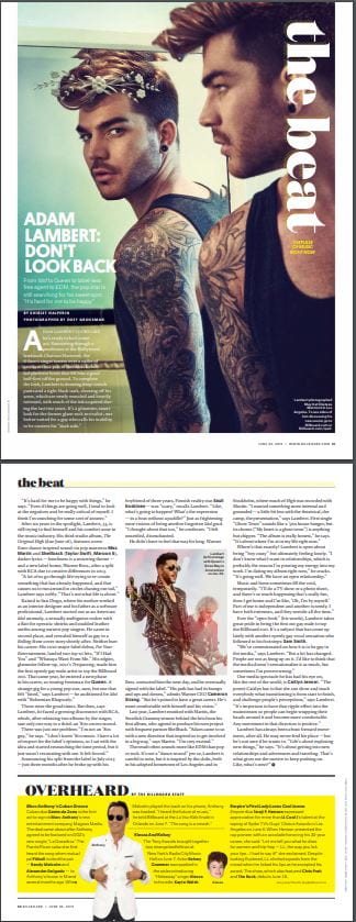
For my language analysis of a double page spread, I decided to explore the Billboard (June 2015) article ‘Adam Lambert: Don’t Look Back’ by Shirley Halperin. In this article she interviews the singer, songwriter, and actor Adam Lambert. She writes the article about the star trying to find himself and his comfort zone in the music industry.

It is not clear where the journalist wrote it but describes the star as; “Sauntering through a penthouse at the Hollywood landmark Chateau Marmont”. The way that she expresses him as being in a ‘penthouse’ in ‘Hollywood’ clearly highlights the wealth of the Lambert. The article states that it was officially written in 2015 however the contents of the writing refers back to 2012. I believe this article was written for numerous reasons: to teach everyone to be comfortable and confident with who you are, to challenge peoples perceptions, life is about being the best version of yourself and to be excited for the future – what’s the point in being hung up on the past? The journalist engages the reader by referring to other well known artists of that specific genre, allowing the audience to see a wider range of music artists from the genre that they are attracted to. The editor has put these in bold so that it is clearer for the reader.

The journalist has made it clear that this article is an interview as it includes many quotations from the star, and he expresses things that he probably wouldn’t say if he wasn’t asked about them. It has a simple layout (3 columns of text), and the whole article is over a double page spread with one large main image taking up one side – with a small introduction wrapped around the body. There is a smaller image on the main article page with block text wrapped around it. At the bottom of the article there is an additional write-up on Marc Anthony which includes a couple insets.

As a reader I am not that aware of the journalists presence even though it has been written in 3rd person. However, due to the fact that there are also quotes from other stars that are referring to him – “His path has had its bumps and ups and downs” admits Warner CEO Cameron Strang” – it can imply that they have interviewed more than one person – therefore must be a journalist of some sort. These quotations allow the reader to feel as if they know the star on a more personal level. The subheading ‘From Idol to Queen to label-less free agent to EDM’ helps to give a clear introduction to the article and allows the main body of the text to follow on from it fluently. There is also a clear conclusion that summarises what was said in the write-up using of quotes from the star. It also ends with a powerful statement from the star – highlighting that it was all about him and ultimately leaves an impact on the reader.

There are multiple types of words and techniques used throughout the article, including the rule of three. An example of this is, “throwback club-kid platform boots”. This helps to portray his style and connotes a sense of confidence and dominance in the music industry. It could also be attempting to teach the reader that confidence allows you to be happy with who you are. In addition to the rule of three that is used, the journalist has also used similes and metaphors to help create an image of the star. The metaphor “towers over a cadre of assistants” connotes the star as powerful, superior and the main focus for the audience. Quotes from the Lambert himself are used consistently throughout the article and they are used to join together the text and make it flow with much more ease. For example, “A lot of us go through life trying to recreate something that has already happened, and that causes us to run around in circles chasing our tail,” Lambert says softly. “That’s not what life is about”. These quotes were used not only to lead the article onto the next topic, but to also inspire the readers to have a different perspective on how they treat their life. The reader will experience numerous things as a result of reading the article such as:

  • Getting to know the star to a ‘personal’ level – now have a better understanding of his life and the struggles that he had to endure to get to where he is now
  • Allows readers to be more comfortable with themselves – know they are not alone – even famous people have troubles with ‘ordinary people’ problem
  • Teaches the reader to be more aware of other peoples situations
  • Become more informed of what other music artists are associated with him – widening the audience profile for this genre

Through the journalists writing, they represent the star as a down to earth, ordinary person, just like any other. He is not portrayed as extraordinary as the aim of this article was to uncover the underlay of his main star image to make the reader become more attached and feel as if they know him more than just what the media communicates him as.

Draft of Contents Page

Contents Page – DRAFT

Click on image to view PDF of draft

Peer Assessment

It is crucial to assess your work when you have completed it. This peer assessment will help me to improve my contents page so that it is conventional, unique and clear to the readers. My contents page considers all aspects of AIDA however, it is clear that there are improvements to be made. Below this assessment I have included 5 targets to aid me in the right direction of producing the best possible contents page I can. A successful magazine is one that my target audience will be attracted to and gain interest from so that they continue with the music magazine and ultimately purchase it.

Click on image to view full peer assessment

5 Targets for Next Draft

  1. Change the typefaces to make it more conventional for the genre
  2. Spread out the cover lines so that it is clearer for the reader
  3. Try cutting out cover star on Photoshop so show more skill
  4. Brighten dress to make it stand out, also brighten facial features to draw more attention to her face
  5. Consider including insets to make it more conventional as a contents page

What is a Contents Page?

Inspirational Contents Pages

When designing anything it is key to research and evaluate what you are trying to achieve. Below are some examples of contents pages in magazines that I would like to refer to when creating my own one. All of these contents pages are conventional to a music magazine as most of them include:

  • Editors hello
  • Page numbers
  • Short description of each topic
  • Hyperbole and superlatives in headlines
  • Images and word clues
  • Graphic illustrations and designs
  • Reminder of the magazine’s name and mission statement

These will be used as inspiration for my designing when I’m making my contents page, and they will help me to produce one that will attract my target audience and consider all aspects of AIDA – making it a successful music magazine contents page.

Hand Drawn Draft Layouts

Catchy Headlines

  1. Top 10 Trending Tracks
  2. 7 Tips to Feel Free in Your Music
  3. Secret to Writing Award-winning Songs
  4. The Latest King of Indie
  5. Why Being an Independent Artist is the Way Forward
  6. Millie Sutton – “Its been tough but I don’t regret anything”
  7. The Benefits of Putting Yourself Out There
  8. Coldplay – “How we turned out to become the most well known alternative indie music artists in the UK”
  9. 3 Quick Tips in Boosting Your Confidence on Stage

Reflection

I would like my contents page to be conventional yet reflect my genre accurately. The contents page is the second most important page in a magazine – after the front cover – so it is necessary for it to attract my target audience within the first few seconds that they look at my magazine. I cannot have an overwhelming number of images or amount of text on the page as readers will not bother with it due to a cramped appearance. In my magazine I will need to include all the aspects of a conventional contents page such as; page numbers,  headlines, short descriptions, images etc – an overview of what is included. An effective contents page instantly gains interest from the reader and with the help of my understanding of AIDA, I feel I can successfully create an index that attracts, entertains and informs my target audience.

Draft of Front Page and Self Assessment

Front Page – DRAFT

Click on image to view full PDF

Self Assessment

It is incredibly important to self assess whatever work that you carry out, especially when you can see that it needs improvement. The only way to get that improvement is to carefully look at your work and critique it until you can see exactly what needs changing. Self assessing my front page draft will help me when creating my final front cover as I can look back over this and know what to do and what not to do. By doing this I can make a music magazine cover to the best of my ability. Here is my first self assessment for my draft cover page:

Targets for Final Front Cover

  1. Make the face brighter to accentuate the facial features – allow model to stand out on the page more
  2. Have the cover stars name bigger and bolder to catch readers attention quicker
  3. The captions need to be clearer
  4. Move the artists names from the right hand side of the cover to the top of the page to act as a plug
  5. Attach the quote to the text above it to make it clearer that it is related
  6. Change ‘independent’ to ‘indie’ so that it doesn’t overlap on the image so much
  7. Think of another phrase than ‘rising up’ – needs to be catchier so it fits with the cover stars name more effectively

First Shoot Contact Sheet

Using Adobe Bridge and Photoshop, I have created a contact sheet of the photo shoot I carried out for my music magazine. This photo shoot is one I am proud of, and I am looking forward to working with the images. I crafted my model so that she would be conventional of the Indie aesthetic I am aiming for, by taking inspiration from my mood board on Pinterest. I needed my star to go from ordinary to extraordinary. I wanted to try a few different sets of clothing so that I could see what worked best when all of the photos are laid out in front of me.

On my model I included statement accessories like a chunky gold necklace and stand out earrings with a unique green eye shadow. All of these small things added up to make a conventional star image that suits my genre, and allows my audience to correctly decode the costume into various connotations. I decided to go for a more classy and sophisticated look for this shoot, so chose items of clothing that would represent these things. I opted for the denotations of three different blazers, all of which connote something different:

  • A small blue one that represents sophistication
  • An oversized navy one to connote classiness and modernist styles
  • A uniform type one that can portray confidence

For my final look I used a balletic white dress. In contrast to the modern and confident style that was conveyed with the first costumes, this denotation connotes an artist who is free with their music and is represented as someone who is much more relaxed. These conventional yet trendy and cultivated looks will allow my model to be portrayed to the audience as someone who is a popular and unique artist in the independent music world.

In my shoot I used the studio flashes so that I could get the correct amount of lighting on my models face – helping me enormously in the shoot. The umbrella diffuser attached to the flashes allowed the lighting to be considerably less harsh, giving softer tones evenly spread out on my model. I opted to use the white studio as I wanted my front cover image to be bright and enticing. The genre of music that I am trying to convey is young and new – I don’t think the black studio would have given me high quality images that connote these things.

Throughout the shoot I experimented with a number of poses and camera angles to see which ones would turn out the best. There are a few collections of images in my contact sheet which I believe have not been as successful as others, purely down to the positioning of the model and camera. Despite this, due to my experimentation I have discovered new ways of taking photos that work really well, and I will be using some of these techniques in more upcoming photo shoots. I also tried my best to ensure that the lens was continuously focused, and as a result all of my photos are clear enough to use as a front cover image (excluding the anomaly that is the black image that was accidentally taken with a very low exposure). I also considered all aspects of Mine En Scene as I want the images to also be accepted by my target audience and attractive enough for the audience to pick up my magazine. During this photo shoot I also thought I would take some pictures that I could use on my double page spread of the magazine – I successfully did this. There are numerous images that I will definitely take into consideration when choosing photos for the interior of the magazine. When deciding on a final image to use for my cover page, I will encode my star image in a way that my target audience can successfully decode and ultimately have more engagement and interest in my music magazine.

So What Am I Up Against?

Researching the Competition

In order to create the most impressionable music magazine I can, it is crucial to do thorough research of the competition. This will aid me in making my magazine as I can adapt my magazine so that it is firstly, conventional yet unique, and secondly allow it to meet the criteria of my target audience so that it is accepted by the market.

Production Meeting Agenda for First Photoshoot

So that I can publish the best front cover for my magazine that I can, it is important to make a shoot plan (PMA) so that I can carry out an organised photoshoot. This plan consists of:

  • The model
  • Location
  • Equipment
  • Costume and make up
  • Poses I’d like to see

This PMA will help me to achieve images that are relevant to my genre and will attract my target audience.

Click to view full PMA

Masthead Designs

Branding is one of the most important things to consider when producing a magazine, and the masthead is the first thing that readers see when purchasing magazines. I have tried to include Indie features, yet made it so that they are unique. This is ensuring that it is convenional yet unique. I have designed my mastheads so that they attract my target audience – following the understanding of AIDA. I will need to take my typefaces into consideration when shooting for my front cover, as it will need to relate to the colour scheme and style of the image. To make my mastheads I have used InDesign and created 7 different typefaces that I would consider using:

My favourite and final masthead is the third one. This is one that I designed myself and I think it fits well with my genre as it is authentic and retro. I think that it is eye catching and will attract my target audience – producing a successful magazine.