Branding Ideas and Mission Statement
I have chosen to make a pop music magazine, with the name FAZE.
The definition of faze is to disturb or disconcert, this represents in my magazine how pop music disturbs the norms of more traditional music by creating a new genre.
My Brand’s Ideology

My Mission Statement
“FAZE is proud to publish the most cutting-edge and up-to-date news on the music of today. We aim to provide today’s youth with everything they need to know about popular music artists and bands, with exclusive inside info on what’s hot and what’s not. FAZE magazine intends to inspire and empower its readers by being inclusive to all and bring the fun back into music.”
So… I’m Ready to Make Some Media
In the past few weeks I have learnt multiple components that help towards making a successful piece of media, all of which will help me in choosing how I design my own music magazine.
Here are all the different components I need to be aware of:
CAMERA – Camera angles can communicate a lot about a photo, including the overall mood or story trying to be conveyed. The camera’s distance can also bring attention to certain parts of the photo, mostly if you want the audience to focus on either the subject or the setting.
MISE-EN-SCENE – MES is used to add deeper detail so that the audience can deduce ideas about the photo/video without further context, for example, wearing shabby clothes could show a subject is poor. This is a very important component because it’s the audience’s first impression of your story/character.
LAYOUT AND TYPOGRAPHY – Magazine covers are often laid out with all of the text wrapped to the subject or a side of the page, this allows the cover star to not be covered up by text so the page looks smart and not cluttered. Typeface is also important, more often than not all of the text is in capitals which creates a sense of urgency and calls the reader to attention. Typography can be used for AIDA: Attention, Interest, Desire and Action. This means that by how your message is phrased (usually using imperatives) it can draw the reader in and implore them to take action.
USES AND GRATIFICATION – This theory by Blumler and Katz is about the four reasons for media: information, personal identity, social interaction and media. This means that I must be mindful of all of these reasons when producing my magazine.
My Tour Poster
This week we were given the brief of creating a tour poster with our assigned genre, mine being heavy rock. To gather inspiration for my design I created a moodboard of some stereotypical rock album art and tour posters:
Moodboard of rock tour posters/album art
From this research I deduced that capital letters are almost exclusively used in the typeface, thus influencing me to use capitals in my tour poster. Lots of the covers include reds, greens, black and white and so I decided to use some of these for my colour scheme.
My Tour Poster
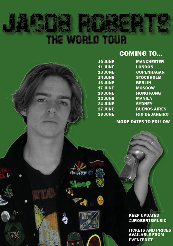
My Evaluation
Targets:
- Use vocabulary that connote a sense of urgency
- Add more specific information
- Cut photo out more precisely, without the white outline
- Choose colours which create more of an impact and contrast with the background; an example would be bright red
My Magazine Front Page Swede
My Magazine Swede:
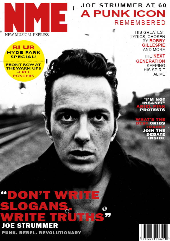
Original Magazine Cover:
This week we learned how the basic skills of InDesign, the software which we will be using to create our own music magazine later on. To familiarise ourselves with InDesign we recreated an existing magazine cover.
This helped to make me more aware of what particular techniques are used prominently in magazine covers; one main thing I noticed was the lack of use of lower cases letters because all of the text on the cover is in capitals. This gives the text impact and creates a sense of urgency, imploring the audience to read on. Another thing to be mindful of is colour schemes. In the professional NME cover apart from black, white and grey only two other colour are used as accents. This makes the colourful text stand out at first glance but also creates a cohesive and clean cover, too many more colours would make the cover appear cluttered and less easy to read.
Text InDesign Tutorial
Some techniques I used in InDesign I used to create the exact typeface I needed, this involved changing the width and spacing between the letters, a tool I found was particularly used was word spacing which was used in between the letters but also in between lines of text. This is used to create more obvious groups of headlines and emphasised certain words.
Another InDesign Tutorial I found useful
These techniques and tools will be useful in producing my own music magazine because I now know how to insert pugs, have an effective colour scheme and how to manipulate text into the required typeface. Some tools that will be useful in making my magazine will be the text wrapping tool, the text spacing tool and also the lock tool, this means I can edit a layer without disrupting ones I’ve already done.
A Front Cover Analysed
After accumulating knowledge of who the magazine is directed towards, we produced an audience analysis for the front cover and how specific techniques are used to cater to it’s audience demographic:
Billboard audience analysis
Billboard’s target audience, in conclusion, is roughly 20-30, financially stable and mostly female. This then dictates what is displayed on the cover, for example having mainly female cover stars for a mainly female audience, allowing them to relate more, the financial assets of the audience are also reflected in the costume of the cover star because of the amount of expensive-looking rings she has on. Billboard’s target audience is also politically aware and contemporary, communicated through the mission statement involving rebellion.
Audience Profiling
Magazines are directed at a certain demographic, which influences what content goes into them in order to cater to the interests of the reader.
Yougov.co.uk is a website which shows the demographics for different bands, sports teams and people etc so can help deduce what kinds of people as interested in the same things. Using this website and other sources we created an audience profile for a popular music magazine, mine being Billboard:
Billboard audience profiling
From this research, I deduced that the audience Billboard is directed at are young adults, mostly women, who are interested in a plethora of different music genres. These people are also into mostly mainstream music, which becomes apparent by the popular music artists featured on many of it’s front covers. Another way in which Billboard caters to it’s audience is in its’ colour scheme, the black and white photo creates an edgy feel, reflecting the young and contemporary reader demographic.
It is important to cater to your specific audience because, as shown by Blumler and Katz’s Uses and Gratification theory, the audience controls what media is produced by only consuming what they want to. This leads to the media institutions, including magazine companies, to be mindful of their audience when producing because if the audience chooses not to engage then the magazine will not be successful.
Conventional design features of a magazine
Every magazine cover must have certain elements, including:
- masthead
- main cover line
- main cover stars
These elements and several more (labelled below) create a magazine cover which appears professional and enticing to the public, two features which are essential to any magazine aspiring to be successful.
Labelled professional magazine cover

How will this affect my magazine?
When making my music magazine I have to be aware of all of the features that make a magazine intriguing, especially using lots of capital letters and pugs to engage the reader. Another component I need to be conscious about is colour scheme, a conventional magazine will only include about 2 or 3 colours other than black and white on their front cover. A small colour scheme makes a cover appear more cohesive and easier on the eye for the reader.
This research of an existing magazine will contribute to my design process by directing my magazine in the same direction as a professional one. This will include the size of the masthead compared to the rest of the writing (much larger) and how plugs and pugs can be placed effectively to interest the reader.
So… How can an image communicate meaning?
Throughout the past few lessons and posts we have been learning how to convey meaning and present messages to the viewer through the media we produce. This has been done mainly through two mediums:
Camera Framing
How the camera is used for an image can say a lot about it, for example:
Long shot- gives more peripheral detail, often placing the subject in their surroundings/location.
Close-up- directs audience’s attention to the only thing/person in frame, enabling them to convey the mood of the image more easily.
High angle- makes subject seem small and inferior
Low angle- subject can appear bigger and stronger, as if they were towering over the camera
Example of long shot angle:

Mise-en-scene
All components of mise-en-scene contribute to communicating meaning through an image, these components are:
Makeup/hair/clothing- all of these factors can convey the model’s social class and interests, but also the time period in which it is set in.
Lighting- can create the mood, for example a low-lit and shadowy scene connotes feelings of sadness or fear whereas a warm and well-lit scene implies a happier scene.
Props/setting- as in costume, where a piece is set can illustrate the time period it is set in and the class of the characters. Props can be used to give the audience more information about the characters and what they do, for example, a musician may hold a microphone in a poster to show they are a singer.
Acting/proxemics- where actors are in comparison to one another says a lot about their relationship. This could mean when a character is facing away from the other they are angry, or if they are close together then they may be friends.
Focus forward
Using these two techniques are essential to the production of my own music magazine. This is because the cover must be able to display the magazine’s genre and features immediately to the reader, without this they will not feel enticed to pick it up and read it.
The Camera Talks
Using the pictures taken from the contact sheet, I picked the top 9 using varying angles and distances in order to convey different meanings for each image:
Moodboard
To each photo, we had to add 3 hashtags; one technical camera term, one denotation, and one connotation. These tags help identify what is trying to be conveyed through the camera work, for example the emotions and predicament of the subject of the picture.
I think that in order to further communicate the meanings in the photos the camera techniques could’ve been taken further. By this I mean using further distances in long-shots and more extreme high angles to display the stories of the pictures more strongly.
Technical Camera Terms
When taking photos an important part of how the meaning/story is conveyed is what’s in the photo. However, an equally important part is how the camera is used. This can include changes in angles and distance from the camera, we took these pictures to try and experiment with what meanings different camera techniques can produce.
Contact Sheet
How can camera create meaning?
Angles- a high angle connotes a sense of vulnerability on the model whereas a low angle makes them appear strong and superior.
Distance- close-ups bring attention to the face, allowing the model to portray their emotions more clearly. Long-shots show the entire body so the meaning of the picture can be portrayed through actions.
Straight/cantered- a cantered (or dutch) angle creates a more dramatic image.