A New Improved Front Page
Here is the second draft that I made of my magazine. I have improved many aspects from my previous draft:
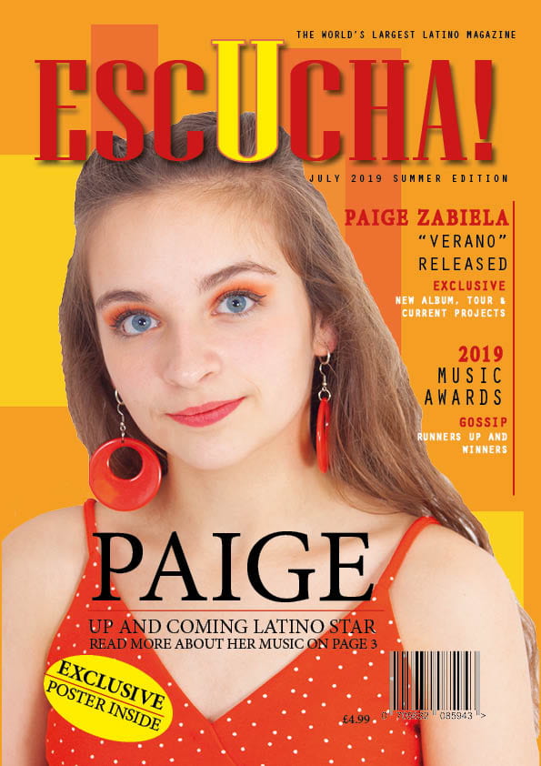
- The biggest change that I made was adding a background behind the image of my model. I made this background on photoshop, I think that it is effective because it adds much more to the magazine and makes it stand out a lot more. I also think that it gives more energy to the front cover and makes it more exciting.
- I also used photoshop to darken the lips of my model and make them more red. I did this because I think that it helps to draw the red of the earrings and also the masthead and text, it broadens the colour scheme, and makes it more interesting.
- I changed the fonts and layout of my captions. I think that this works better as there is no sans serif making it easier to read and also it stands out more with the change of colours.
- Another change that I made was to the pug, as I did not like where it was situated. I moved it to the opposite side, and also changed the text inside of it as I thought that this was more gripping.
I think the changes that I made were beneficial to my front page, and have made it much more exciting. It also is more reflective of the genre with the bright colours. I think that there are still things that I could improve on such as the positioning of text (for example the plug). However, I think that this draft has gone well, and that the changes that I have made are beneficial.
I think that there are still some changes that I can make to my magazine. I think that are some small changes that I can make which will impact the look of my magazine as a whole for example the colours and positioning of parts of my magazine for example the plug.