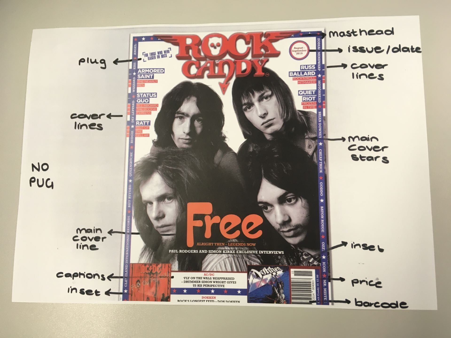
Conventional design features of a magazine
We began to look at different magazine covers so that we could understand the conventional design features. These features are included in many successful and conventional magazines:
- MASTHEAD: the title of the magazine, often very bold and big
- PLUG: a selling point of the magazine that describes who it’s for
- PUG: promotes something inside the magazine, often in a coloured shape
- COVER STAR: the main celebrity star photographed on the cover
- MAIN COVER LINE: relates to the main cover star, and what they are in the magazine for
- COVER LINES: additional information often to the sides/commonly the left hand side of the page
- INSETS: inserted additional photos onto the page
- CAPTIONS: describe what the inserts are
- PRICE: gives the price of the magazine, often with the bar code on the right hand side.
- BAR CODE: on the right hand side of the cover for shop assistant
- ISSUE/DATE: gives which issue and when it was released.
Above shows a magazine that we looked at. It has some conventional features that we were able to highlight. The magazine also is missing some of the features such as a pug.
Without these features, a magazine to us may not appear to be a magazine, as it does not look as we expect it to, or how that we think it should look. Therefore when making my magazine, I must use these features to help my magazine be a success. It will help to draw people’s attention my magazine when looking at the shelf and convince them that that is the right one to buy. These conventions build the foundation of a magazine cover and also what the audience expect it to be. By looking at these magazine covers I have been able to see good demonstrations and different ways to use this structure, and also how to use it in different ways to suit different themes.
