Reflection
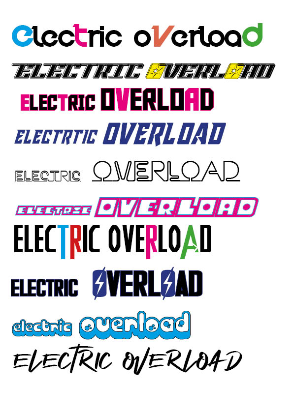
Here I have started playing around with different typefaces which I can use for my Masthead on my front cover. I used a range of very different fonts to get an idea of different fonts as well as sizes and colours. I also played with the idea of ‘electric’ being smaller and ‘Overload’ being the main focus of the title, since this is quite a long mastheads this would work well. I also liked how it looked when I changed a few letters within the name to be different colours to add a feature to a what would otherwise be potentially boring masthead.
Although when I was designing these it was on a white background, I am envisioning my actual front cover to have a darker backdrop therefore where I have used the black in these mastheads I would replace with white to allow it to stand out. I also thought about possibly positioning ‘Overload’ diagonally beneath ‘electric’ to give different heights in the title and give overload the importance, being bigger.
The branding of my magazine is very important and therefore doing this task allowed me to compare very contrasting fonts to see what style I preferred, for example some of these type faces are very bold and blocky whereas some are more delicate. It was important when designing these mastheads that I thought about my genre which is EDM therefore the lightning bolts and bold colours reflect this vibe. It was also key to make sure the fonts were eye catching and bold as this is one of the first things that my audience will see when looking at my magazine.
My favourite type faces which I designed are the 1st, 3rd and 6th one. I think that these link best to my genre and are very bold so will stand out on my cover which is very important.