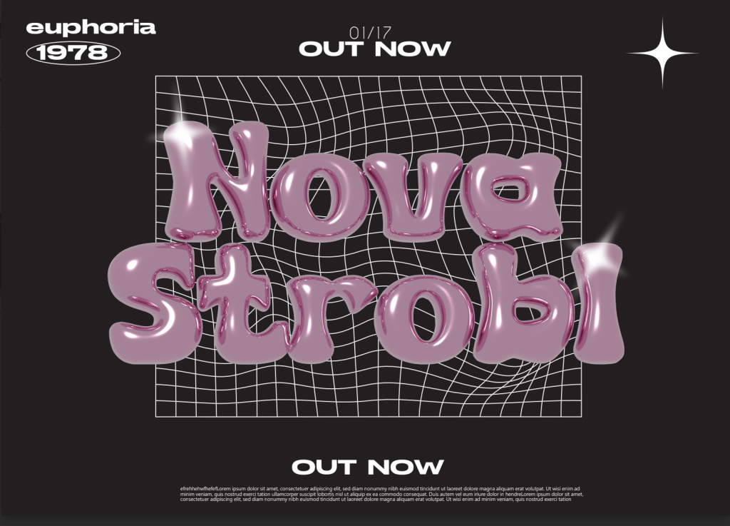
Here is our Digipack draft 1 for the front and back cover as well as the tv design.


Whats Good
- Some technical conventions like copyright, barcode, track list and the album title
- The bold, modern font for the album title looks sleek
- The front cover background colour scheme looks well blended and the purple represents nostolgia and our brand identity very well. Having a signiture colour throughout our campaign helps keep a brand identity consitent and more recognisable.
Whats Next
- We need to sort the track list layout out by fitting the inside the disco ball curving the text
- We need to add the advertisment inside the tv with our stars name as this is a conventional technical feature
- We should make the image bigger to fill the front cover as the star is a bit small as well as consider the rule of thirds
- We will add some graphic design feature like some shine and sparkles to really make sure our digipack stands out and looks more exciting
- For the back cover we need to match the background colour to the front to create more of a consitency as the shades are off.
- Removing the reflection off the disco ball will help give a more proffessional look
- Make the stars name bigger to really sell that extrodinary star image
- Add a barcode on tv advert design as right now the media language won’t denote (Hall) to an audience an advertisment
Overall, we have lots more to do to ensure we produce a eye catching, engaging digipack to help captavate an audience to promote purchases of our album. We have been using Adobe Illustrator the make the graphics and the tv advertisment to add some more dimension as right now the design is very simplistic.