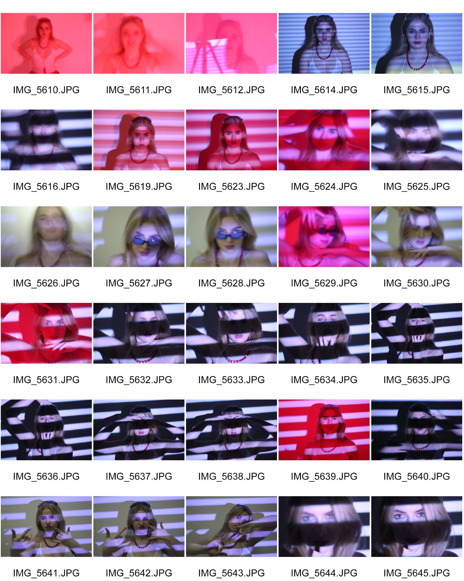
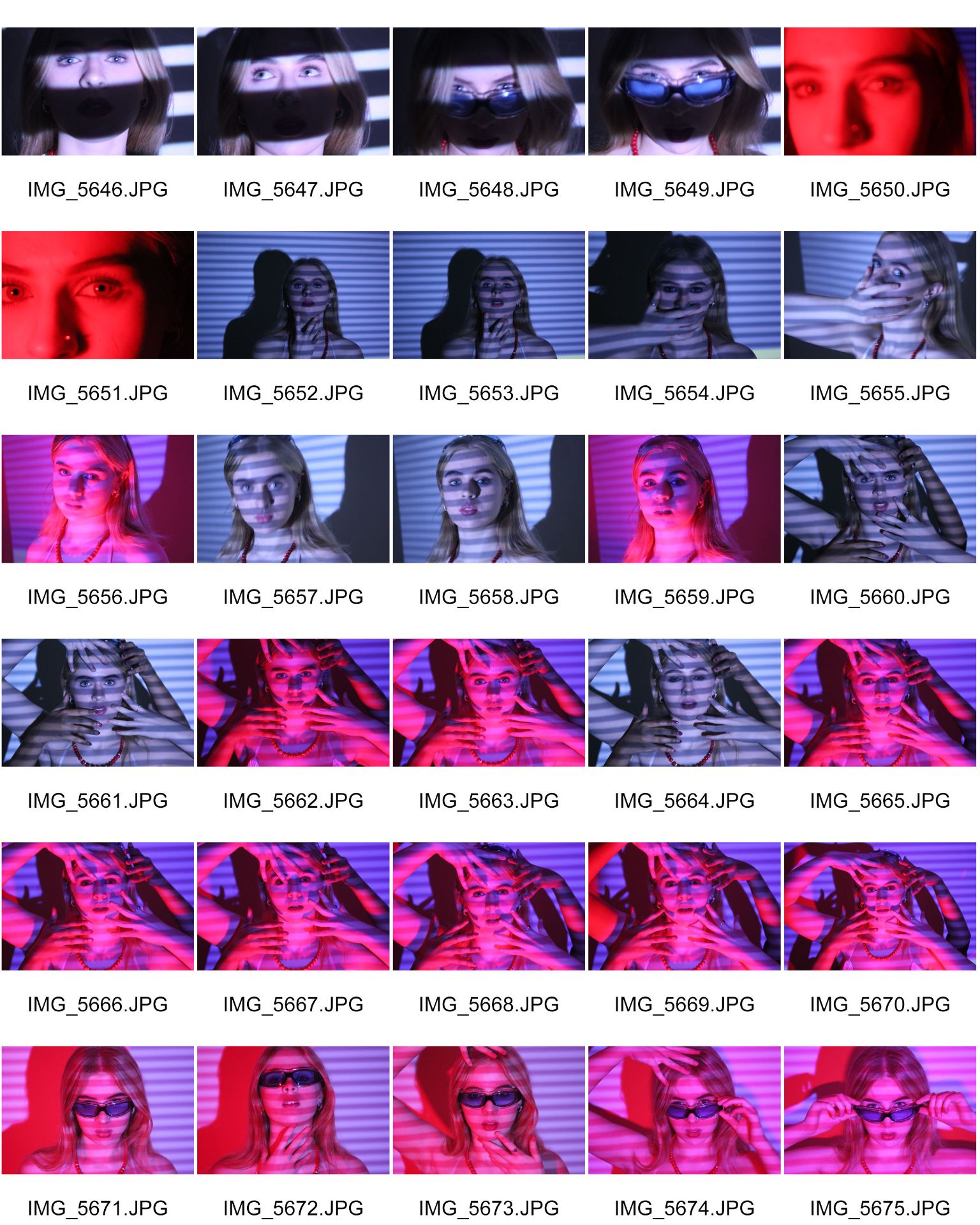
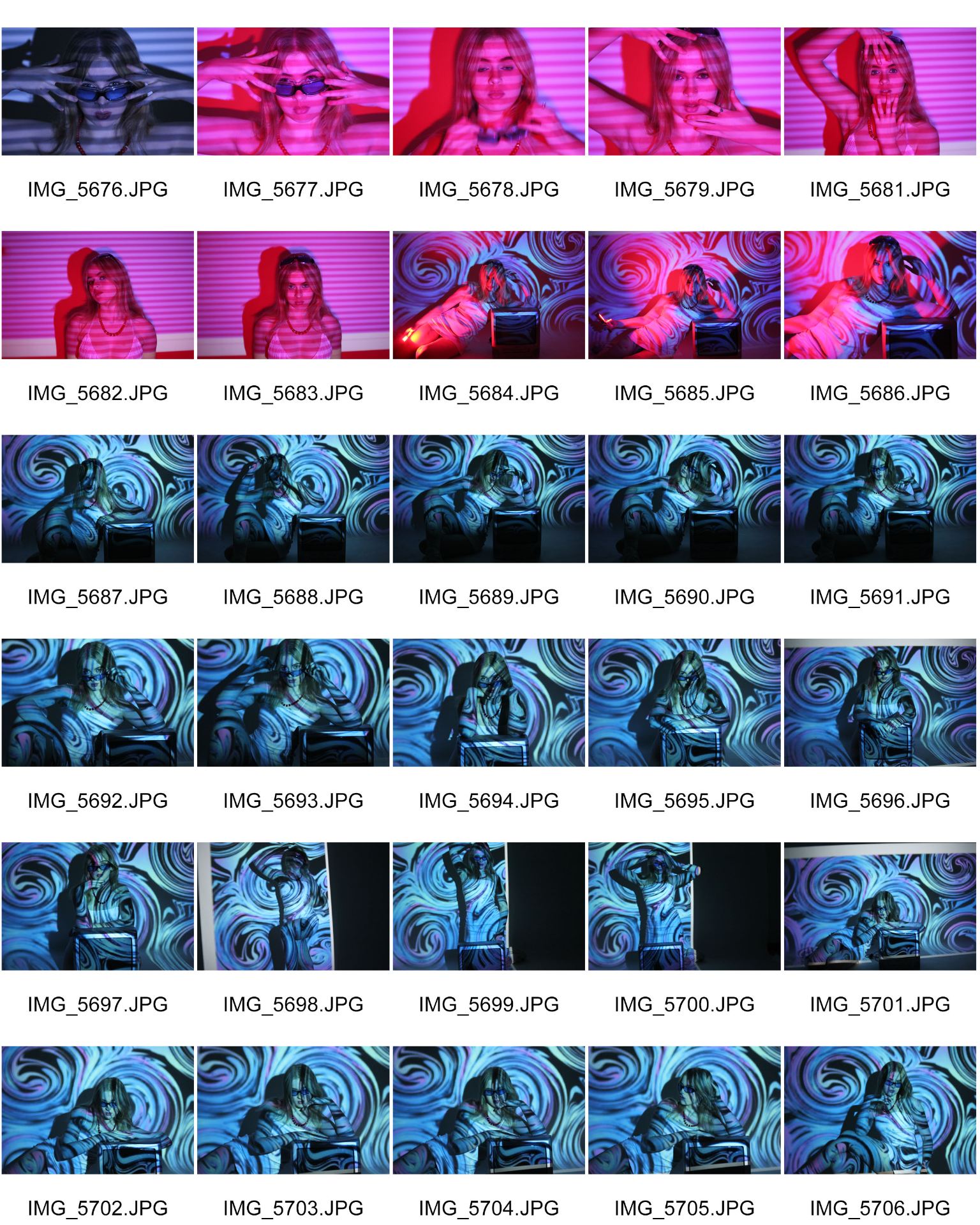
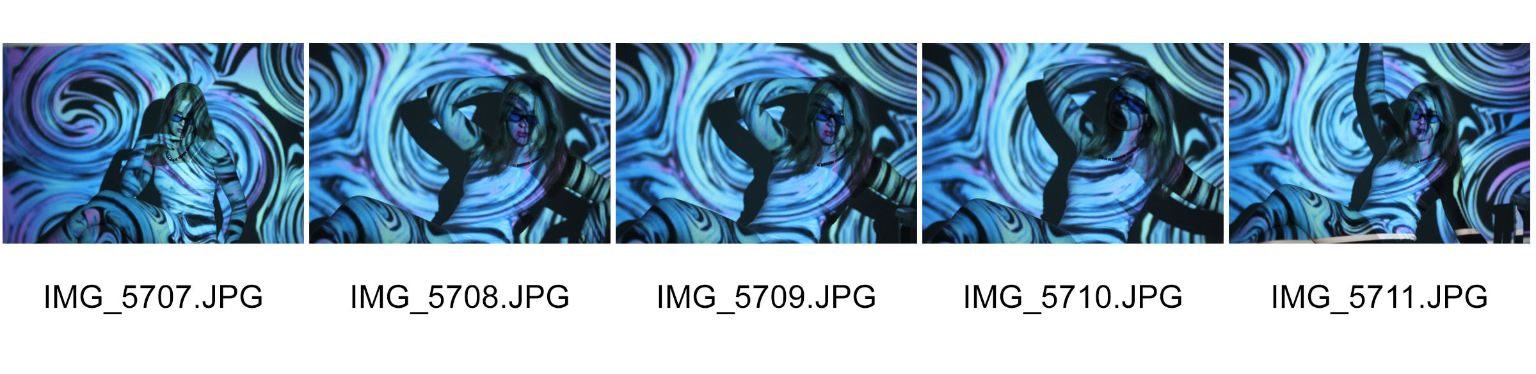
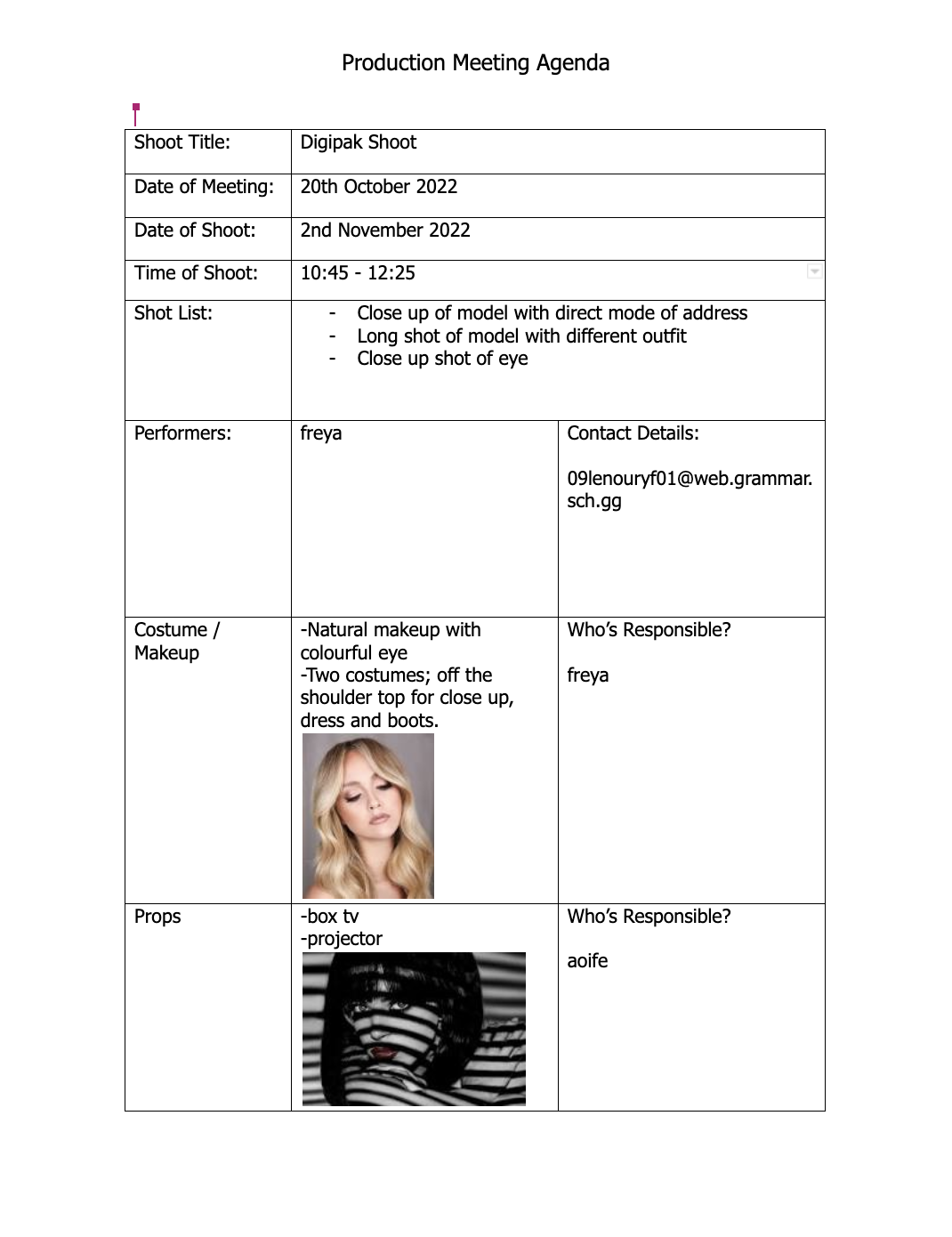
Included above are the contact sheets from our photoshoot for our Digipak. Before we took our photos, we looked at the typical conventions for a Digipak from our chosen genre of Pop and gathered ideas on what we would like our Digipak to look like. The typical conventions of our genre tended to be bright colours, low key lighting and the artist on the front pane.
During our shoot, we used a projector to create the swirl and line effects on our model to help portray a unique idea to our audience. It was also important that we took a variety of shots from different angles and distances so that we were able to have a wider range of images to choose from when creating our first drafts. Within these photos, we made sure that there was a direct mode of address, close ups, long shots, midshots as well as different poses.
We found this shoot to be successful for multiple reasons as my partner and I had planned effectively before hand able to take plenty of photos, which has allowed us to use our time shooting efficiently and has allowed us to complete the shoot with a sufficient amount of images to complete our digipak.
Attached below is a handrawn mock design of the digipak my partner and I would like to create. In doing this task we were able to visulise and compile our ideas together as well as having a clear and consice plan when we come to producing our digipak through Photoshop and Indesign, which will help my partner and I to stay organised and keep on track with this task. Below we have included the types of images we would like to use, as well as different fonts and a brief colour palette.
When we began to produce our mockup, we looked at a variety of different album covers within our genre to help inspire us for our own designs, with no intention of copying these sources as we need our digipak to be our own original work. During the designing process of our mockup it was crucial that we thought about the key techinical conventions of a CD album cover and layout within the genre of pop, this included features such as bold text, brighter colours, digital design aspects, our cover star and song titles which will help our audience to accept the text that we produce.
Our Front Cover will consist of our artist, her name and the album name, “Faces in the crowd”. We aim to feature our artist in the centre of the cover as a direct mode of address towards our audience, as well as the album title at the top of the cover in a bold font which will allow it to stand out from the background. We will compile these features together with a bright, coulourful palette allowing us to express an energetic, unique artist while following the repetoire of elements best suited to the typical conventions of our genre. During our shoot we intend on using a projector in the white studio to project different patterns and colours onto our model to help infer and convey our different and unique star image.
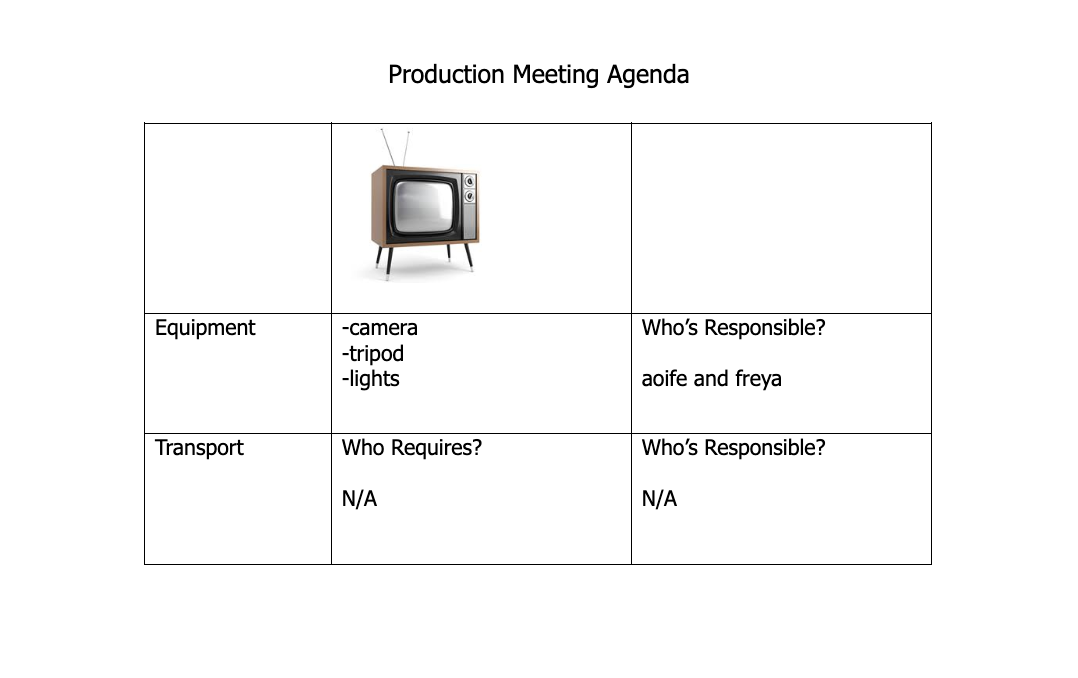
Our Back Cover will again include our artist, however for this shot it will be taken from further away to allow us to include a prop TV. As well as using imagery, my partner and I also intend on including digital design within the back cover as well, this will be featured through the use of the TV screen as we plan on creatign a crowd of faceless people to refer to the name of our album. We plan on having our star leaning against the TV in a relaxed, laidback way whilst projecting a design over her, this will also help us to convey our ideal star image. The back cover will also include our song titles down the left handside so that our model is still fully visable.
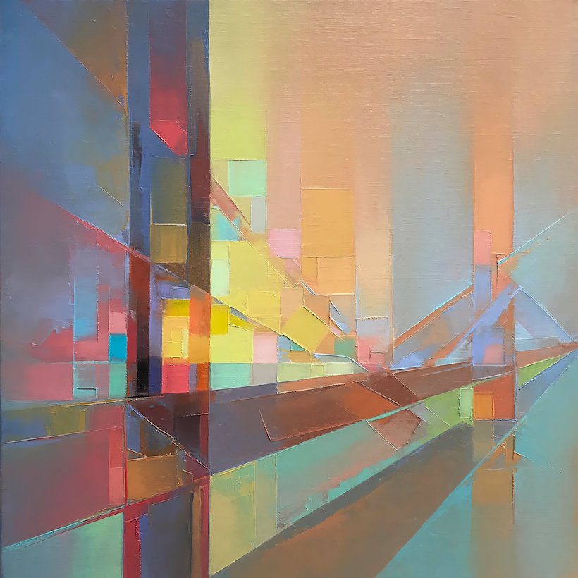
The Inside covers will be made up of a colour full background image which we intend on designing ourselves taking inspiration from the image attached below. From this image we intend, on using a similar colour palette as well across both sides of the inside cover to create continuity. However the first page of the inside will also include an extreme close up image of an eye to help convey a sense of emotion within our designs.
Included below is an analysis of an artists Digipak which includes the front and back cover. In order to understand the repetoire of elements and all the technical conventions that need to be used when designing and producing a digipak, it was important to analyse a media text that has been successful within my chosen genre of pop. Included below is an analysis of British singer songwriter ‘Adele'(s) album 21 which was released in January of 2011. During the analysis of this text it was important for me to focus on the main conventions, blueprints and modes of address that are used within pop digipaks.
In completing this task, I have been able to grasp an understanding of the typical conventions, forms and repetoire of elements that are used within the genre of pop. In analysing the portrayal of this artist and the overall composition and design features of this digipak, I now understand the elements that a vital to create a successful media text within the music industry that is able to stand out against the products of other competitors. It is important to that my partner and I are capable of producing a design that catches and holds the attention of our audience. During the design phases of our digipak, we will refer back to this analysis and use key points that will allow us to produce work that portrays similar meanings of albums in our genre as well as allowing us to create and individualist and unique product.
Attached above is a Moodboard that my partner and I created together to help us gather a firm idea of what is appropriate to help create a cohearent brand across all of our branding. Within the moodboard we have included a variety of different albums and album artwork that consist of colour palettes similar to what we plan on using, on top of this, we have also included a mixture of fonts that we could use that would fit the conventions of our genre. Carrying out this task has enabled me and my partner to understand our competition within the industry, the products that they design and the work that they produce. Our chosen genre is pop however we are also gathering inspiration from work produced by R&B Soul, Techno and Electronica genres.
It is crucial that when a star is represent through intergrated advertising within the media, that everywhere that they appear within that media wether its on a billboard, a TV advert or a Magazine interview; their audience is able to form personal viewpoints and opinions of the star, their image and their brand. This means that we need the products that we produce and promote fit our stars image as well as our brand. Included in the moodboard above is a list of our core aims and values for the representation of our star which includes: emotive, quirky, unique, powerful, dramatic and eccentric. By having clear descriptors for our star image, it allows my partner and I to keep focus on our branding and how we aim to portray our star to our audience. The common blueprints above display design and photography as well as vibrant colours, powerful themes and emotive and contrasting images which allow us as a brand to use technical design features such as MES, a direct mode of address and the preferred reading for our audience.
The inspiration photos above relate perfectly to our brands mission statement and help to create an atmospheric, emotive feeling. We want our audience to have a connection with our brand as well as invoking some sort of emotion. We want our audience to feel connected and involved with our products as well as excited and intrigued by them as we need them to accept the text and not reject it. To do this we will follow the conventional repetoire of elements typically within the variety of genres we are focusing on.
Now that we have compiled a moodboard, my partner and I have a clear and concise understanding of how to portray our star image and branding. In doing this task we are now able to begin thinking about design ideas for our digipak using the images above as inspiration for our designs, this inculdes thinking about photography, digital design, lighting, Mise en Scene and fonts. All of these elements will help us to create a product that can compete within the music media industry.
It is extremely important to create a star image when promoting an artists new album, however it is also just as important to build a connection through the star with the audience. Above is a slideshow in which my partner and I have analysed three different artists and how they are represent on a social media platform of our choice. We chose to analyse the Instagram accounts of James Vickery, Ella Henderson and Leona Lewis. In doing this we were able to gather knowledge on how to promote an artist that represents multiple genres.
It was important to focus on the different ways in which artists promote themselves or are promoted as well as building a brand on top of this. This could be done through the use of integrated advertising, synergy and guerilla marketing. It is also vital that we think about the general conventions often found within pages such as these, having a unique selling point and to be able to compete with competition in the market. We also need to think about the demographics and psychographics that will allow our audience to accept the text, interact with our page, gain information and explore their personal identity. Furthermore, it is very important that we try to create continuity throughout our products such as our digipak. This will be done through the use of a certain colour palette, lighting, costumes and make-up to stay in-keeping with our brand.
All the information that we have collated above will allow us to produce a social media page to the best of our ability. Creating a mission statement for our star is vital in allowing us to portray our star positively within the industry. The research has allowed us to understand the key elements that are needed, and has allowed us to create a plan and pathway for our Instagram page.
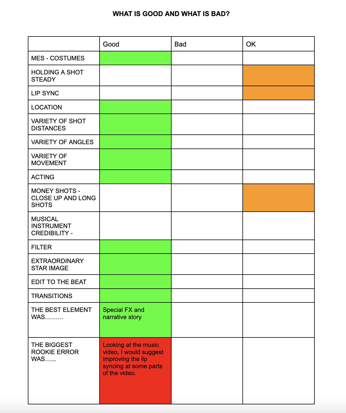
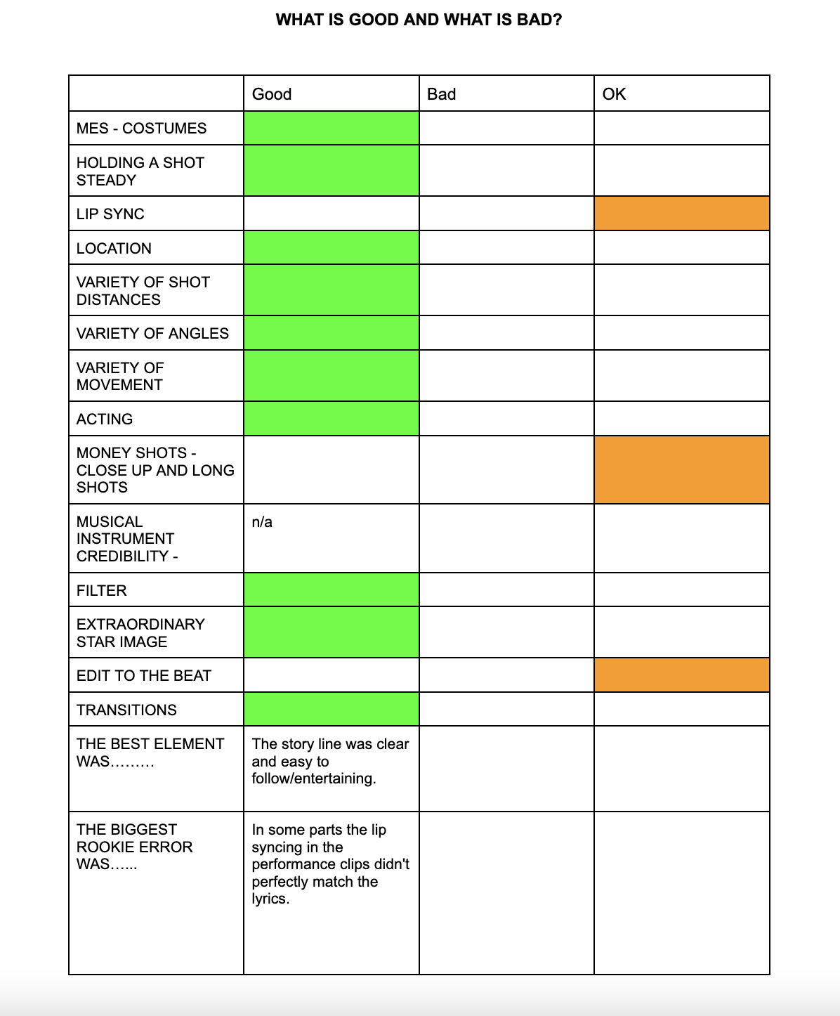
My partner and I have now produced the final version of our music video, as seen below. We feel that our music video is able to provide entertainment for our audience with the use of both performance and narrative aspects. It is clear that our video follows most of the common technical conventions that can be found within our chosen genres of R&B, Pop and Electronica, along with this there is a clear focus on the repetoire of elements (Altman) such as, lip syncing, narrative and performance, a variety of shot distances and angles, and editing to the beat. All of these elements combined together are used to help our target audience accept the text.
However, we felt that is was important that we did not directly follow these conventions, we wanted to challenge them so that our audience found our product interesting and informative. A common theme that is often found within pop music videos is lust, love and heartbreak. We focused on these themes for our own storyline, developing them to show our character as heartbroken and grief-stricken at the loss of her boyfriend and unable to focus on the happiness and people surrounding her. Our star is shown to be extraordinary (Dyer), as she is seen wearing a classy, timeless black dress, creating a sophisticated, mature and elegant image. There is a focus on the use of performance and how our star is portrayed, emotion is an important signifier (De Saussure) throughout our video as without it would not be possible to accurately portray our narrative.
(Please Note – Unfortunately we experienced uploading issues with our video, meaning that some areas of our video are out of sync, whereas the original video on premier pro is in time.)
Changes Made Since Draft is 4:
We have made sure that we have successfully edited to the beat and correctly timed our lip syncing.
Some of the clips used have been changed to fit more appropriately with the style of our video.
To have a more personal effect, we have increased the use of close ups for emotional effect.
We have adapted the lighting and exposure within some of the clips to improve their quality and effectiveness.
Overall, myself and my partner are extremely happy with the final outcome of our music video. We believe that our video follows the crucial assessment criteria that was placed before us at the beginning of production and that we have done our best to fulfil this. WE believe that there is a clear and concise use of MES as well as a variety of shot distances and angles such as framing shots, close ups, high angles and low angles. All of these elements combined together have helped us in production to produce a music video that follows the typical conventions and the assessment criteria, as well as creating a video that is ‘the same but different’ within our genre.
As we have now produced our fourth draft, it is crucial that my partner and I receive more feedback this time from our peers, this will be the final set of feedback we receive as we go on to our final draft, this will help us to grasp any aspects that work and don’t and on what we could still improve in our video. During this draft, we began to finalise any effect and filters that we want to use, as well as any transitions that we want to make the final cut. Throughout the whole process of creating our video, my partner and I have become a lot more confident with the use of the Premier Pro software which has helped to enjoy creating our music video.
Draft 4 –
There is still some things that could be improved upon such as, the exporting issue that causes our video to go out of sync and some editing to the beat which has continued to be improved in every draft. Hopefully with two fresh sets of eyes viewing our video we will be able to move on to our final draft with a clear and constructive plan.
Peer Feedback –
Below is the feedback that my partner and I have received on our fourth draft of our music video. We have received two sets of feedback from two different people as to help us improve our video further as we near our final draft as well as what we’ve done well. We will take all of this feedback onboard when it comes to finalising our final video.
Peer Feedback 1 –
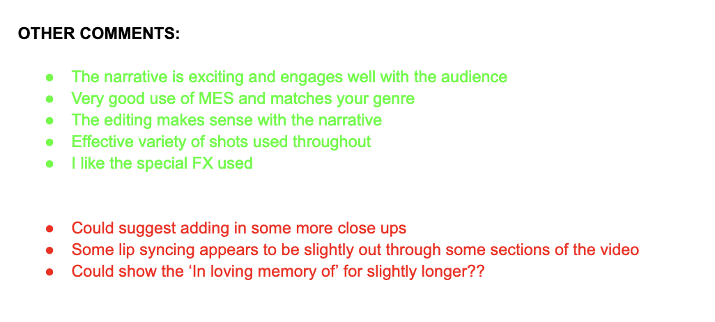
Our first set of feedback suggests that we use more close up shots throughout the video to engage more with our audience. They also suggest that we look at some of the lip syncing aspects of our video as some parts seem to be out of time. My partner and I know about this issue and have recently discovered that it is an uploading issue that needs to be fixed. Finally, they have suggested that we use a longer clip of the ‘in loving memory’ card, this could benefit the emotion side of our video and help our audience to connect on a more personal level.
The feedback that we have received from this person is overall very good and that there is not too much that can be improved upon in our video. It shows that our narrative storyline is easy to follow and become engaged with and that there is an effective variety of shots and special effects throughout.
Peer Feedback 2 –
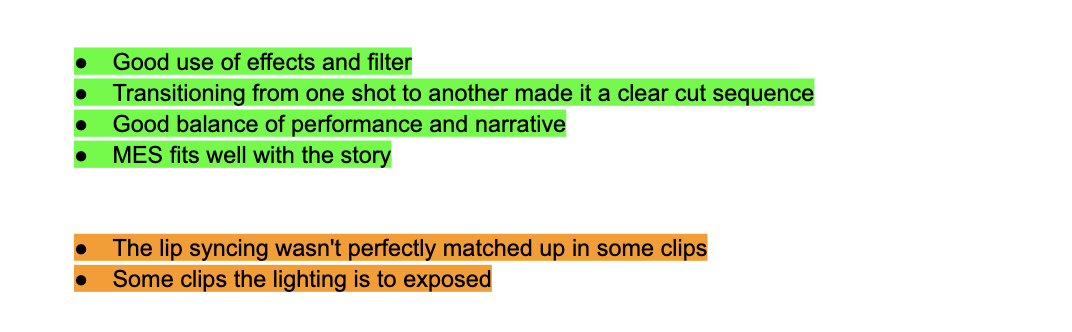
The second set of feedback received gives the same point of improvement as the first on the lip syncing aspect of the video. They have also said that we could improve how we edit to the beat as well as using more money shots (close ups). They have also noticed that some of our clips are over exposed. This is an easy correction to make our video through the use of the effects and editing panels in premier pro.
This feedback has show that we have a good balance between our performance and narrative aspects as well as our mise en scene fitting in well with the story. They have also said that there is a good use of transitions and other special fx that have helped to make a clear cut sequence.
Focusing forward to our final product, my partner and I will take on board all of the feedback that we have received to ensure that we have a high quality final product. This feedback has allowed us to have specific areas that need to be focused on in the time that we have left to edit to ensure that our audience receive the best video possible.
As we now have a third draft of our music video on our blogs, we were able to receive feedback from our teacher on what we need to improve upon in our next draft. This will help us reflect upon what we can continue to improve in our next drafts.
Screencastify –
Targets for Improvement –
At the beginning of performance aspect we need to have a close up of our star. This is so that our audience feels involved from the start of the video.
The dip to white transition that is used when the curtains are opened, needs to be longer.
We need to create more of a connection to the audience during our performance scenes, we could do this through the use of close ups.
When uploading our video, there is a recurrent issue which in turn causes our lip syncing aspect to go out of time. We need to correct this issue with the guidance of the creative team from specsavers.
We need to ensure that we edit to the beat more frequently.
When the gown is thrown at the camera, the transition needs to be longer than it currently is for better effect.
During our party scene we need to look at canting some of the images for more excitement.
More variety is needed during the flashing scenes, to do this we need to alter the colours in the effects panel.
We need to add a clip of our actor arriving home as well as including a close up of her lighting the candle.
Slow down the fade out on the ending so it doesn’t feel as rushed.
We have continued to improve and add new elements to our video, meaning we have now produced a third draft. During the editing of this draft, we began to add and experiment with more special effects on certain parts of our narrative and performance. These effects included dissolve transitions, colour filters and distortions effects. By adding these effects to the video, because we are more comfortable with using premier pro, has helped us to produce a much higher quality draft.
Draft 3 –
What we have Changed and Improved –
We have began to add effects to our party scene, however these effects are not final and we will continue to play around with different effects.
In some parts we have edited to the beat very well, however in other parts of the video it could be better so we will continue to improve this.
We have begun to include footage from a shoot that we completed during the summer holidays. This footage has allowed us to have a wider variety of shot angles and distances.
With many of our shots, we have started to change the framing and positioning for more variety throughout the video.
We have also begun to create continuity throughout our performance shots as during some she has a microphone and others she does not, this was found to be quite confusing.
Our teacher will now record a screencastify of our third draft and give us feedback which we will need to reflect upon. This feedback will be extremely important at this stage of our post-production as we are nearing our final drafts and would like to produce the best outcome possible.