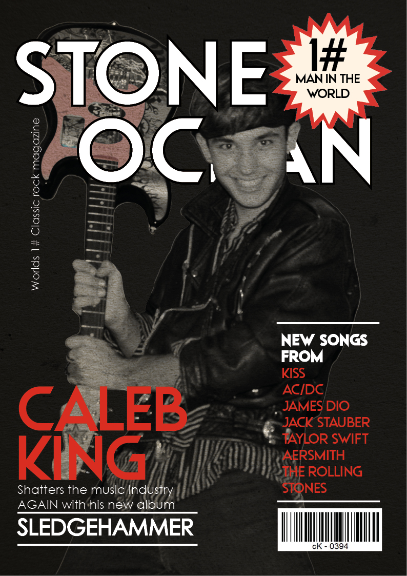
The masthead is adequately placed with a Ubiquitous typeface. It’s just about big enough to make an impression and jump out from the shelves as well as convey the classic rock genre although the background gives it a sort of color boost to help it to stand out with more color and patterns.
Staring into from camera, the cover model is satisfactorily framed using the rule of thirds well but the eye is drawn to the camera with malicious intent. He could of done with a bit more of an angrier face to portray this aggression to create a presence and own the front cover so this section is just about competent.
Desktop publishing, InDesign, has been used well to layout the text and images so that they give more depth by over and under lapping the star image
A bold red, black and white color palette communicates an brilliant energetic and dramatic mood that represents the rock genre, although perhaps some fiery yellow or orange could have lifted it even more to draw in that attention to the model
The font is a mixture of Ubiquitous and Century Gothic but it might be slightly too tame for its mainly older male audience target audience. The font in the plug is laid out quite well as to not cover up the whole magazine and make it cluttered
The costumes are relatively rock themed although eye and face make up might have added that edge to the relevant representation but I think more accessories like bracelets and rings could of made the costume that little bit better
In terms of the language used in the cover lines, the use of superlatives as in the “worlds 1# classic rock magazine” attracts the reader and draws a sense of importance to the magazine and its contents. The use of the word “AGAIN” creates with surprise that makes the magazine more intriguing as it displays shock that he’s done it more than once, but the lack of quotes on the front, to convey a sense of personal account, as though he will be confiding in the reader on a personal level does not help draw in the audience and falls short in creating a buzz about the contents.
The magazine is recognizable as a magazine as it has all the conventional features like a masthead, price, issue, main cover star, main cover lines and cover lines along with pugs and plugs to entice the reader to read on.
Photoshop has been used to cut out the cover star to place on a dark and grainy background that’s just a few shades lighter than the model so that he becomes the focus but the inserts are not particularly well framed and have a bad image quality.