Entering the second draft of my Double Page Spread
What’s new:
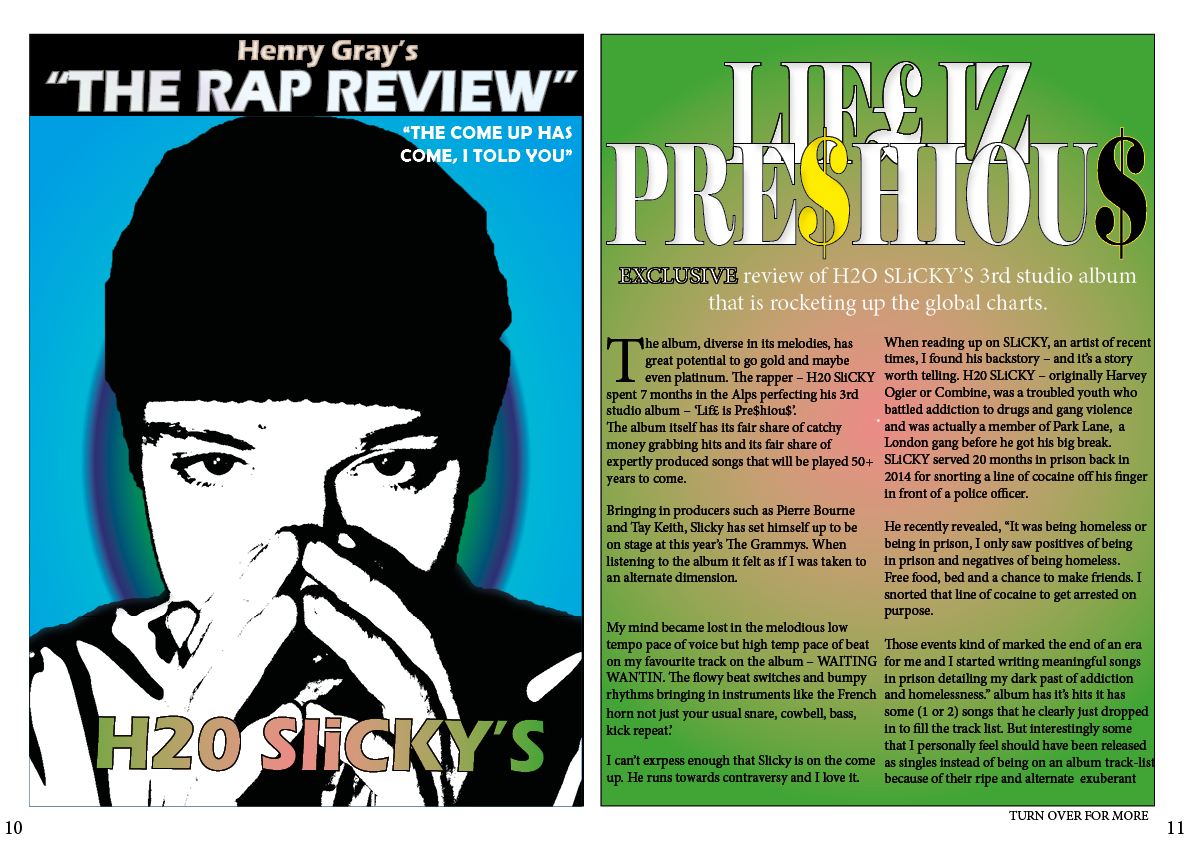
- To make my double page spread seem more conventional I added different colours across the pages unlike before when it was just one solid gradient.
- I added a new gradient in an egg shape to draw the eyes of the reader in for my main image.
- I added a new image where I chose to play with it’s appearance so it looks less real and more like a comic which I love the effect of.
- I added a quote and a drop capitol to further conventionalize my double page spread.
- I had a play with my colour scheming.
What’s next:
- I absolutely need to rethink the left hand side of the double page spread because I feel like it looks like a poster more of a page in a magazine.
- I could look at taking more images as I feel I could take some mugshots of my model to spark controversy.
- I need to come up with a more personal quote to boost emotion in my story.
- I need more colour to my text and effects. I might try 3d looking text and colours other than white.
- I’m not sure the blues and the greens of my backgrounds match- I think I need to rethink it and have a play for draft 3.