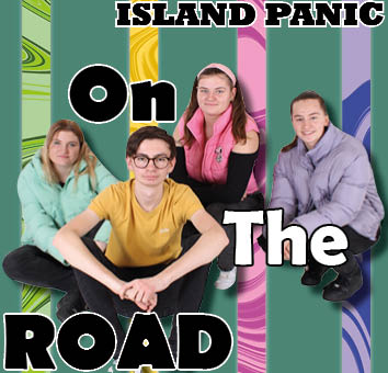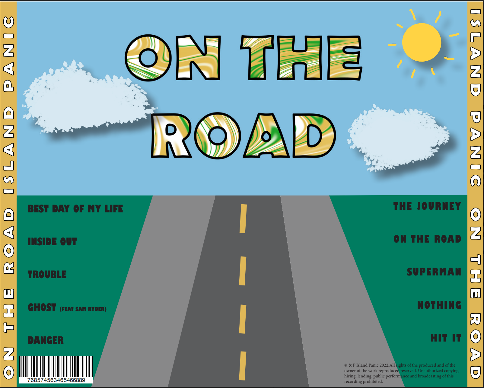


During making our Digipak there was a lot of conventions that we had to consider during production – e.g. conveying the brand and the star image in the correct way, choosing the correct colour pallet and typeface to fit our genre and appeal to our target audience.
I am very happy with our Digipak as I think that we have used graphics and photo manipulation well to make the 4 panes good.
If I was to make the Digipak again, I would change:
- The front cover to be more interesting
- Back cover to fit the theme of the front cover more
- Add more to the middle panes as there is e empty space