Final Draft – Digipak

Digipak

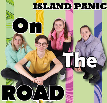
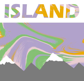
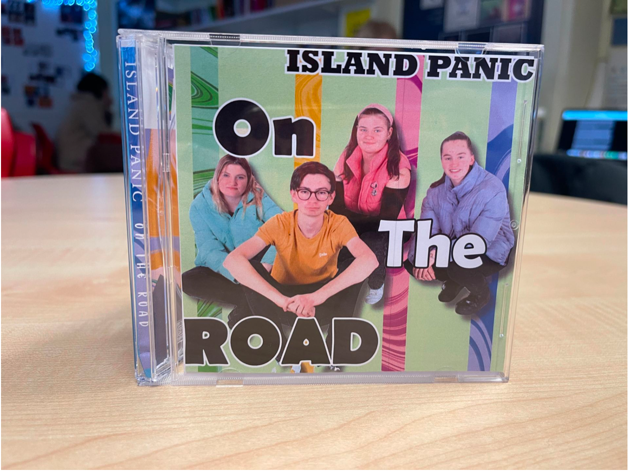
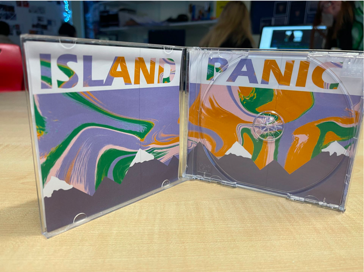
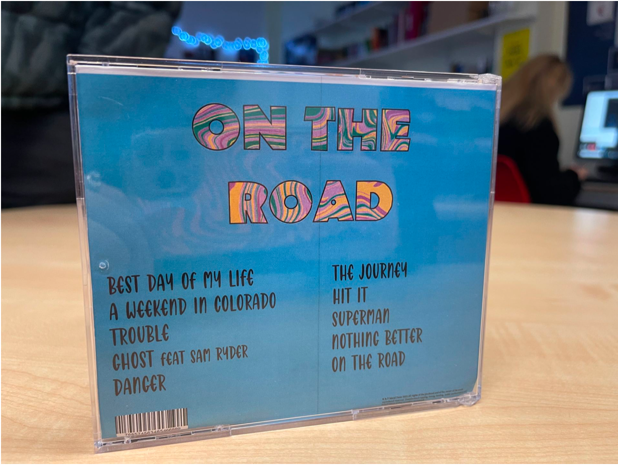
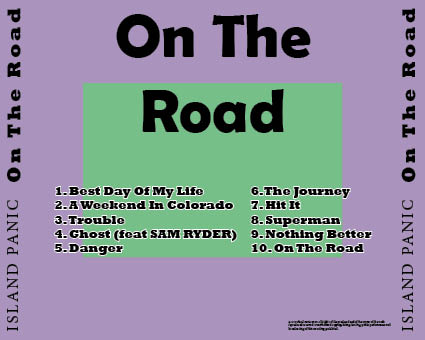
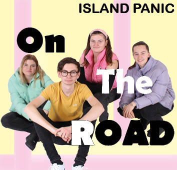
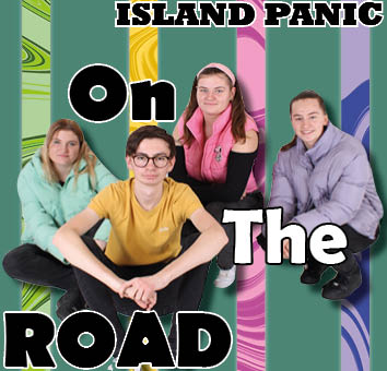
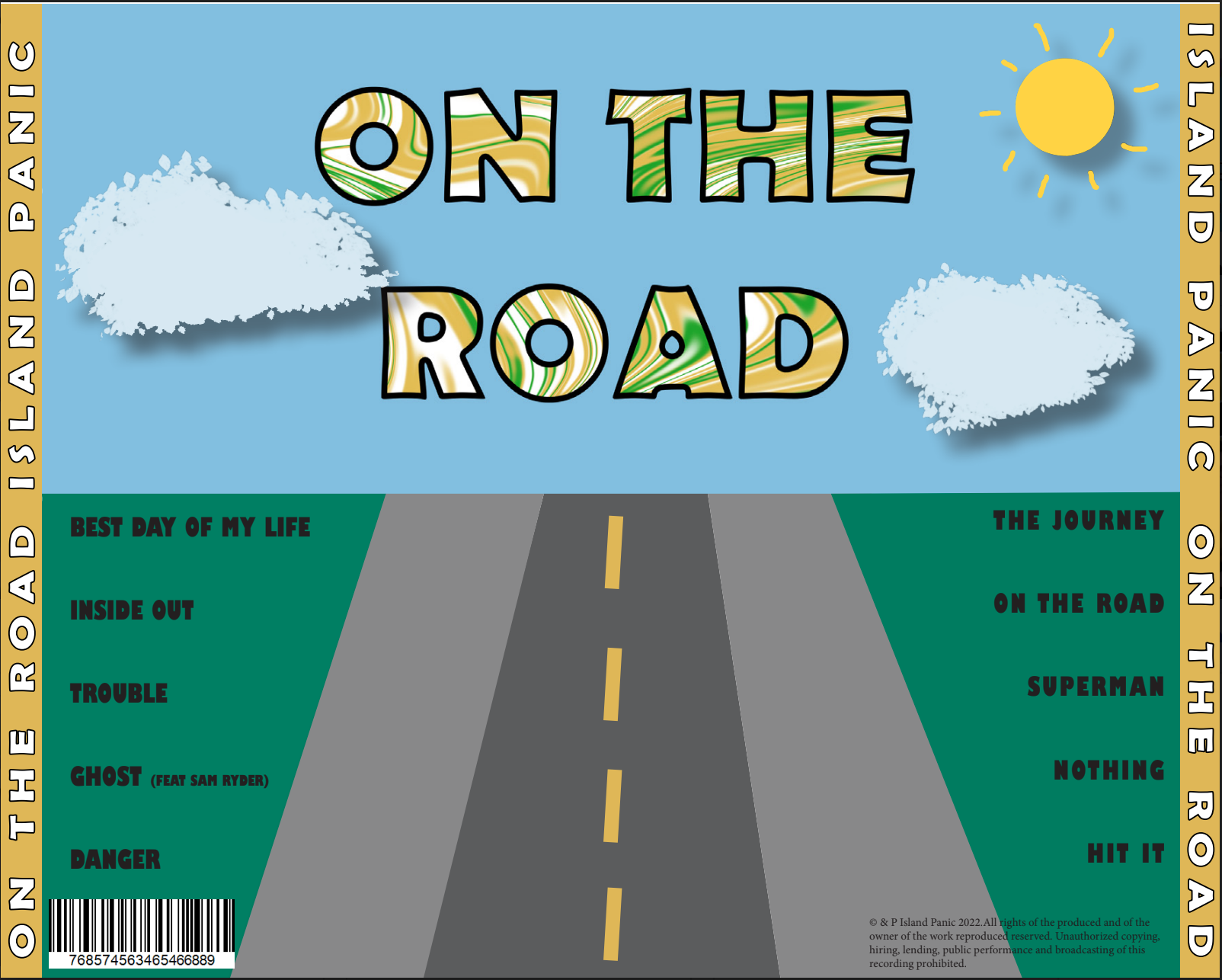
During making our Digipak there was a lot of conventions that we had to consider during production – e.g. conveying the brand and the star image in the correct way, choosing the correct colour pallet and typeface to fit our genre and appeal to our target audience.

I am very happy with our Digipak as I think that we have used graphics and photo manipulation well to make the 4 panes good.

If I was to make the Digipak again, I would change:

  • The front cover to be more interesting
  • Back cover to fit the theme of the front cover more
  • Add more to the middle panes as there is e empty space

Digipak Draft 3

Digipak

Above is our Draft 3 of our Digipak. The noticeable changes that we made are

  • Changing the colour of the front page
  • Outlining the title on the back
  • Changing the spines on the side

Front

Inside Left and Inside Right

Back

We were asked multiple people what genre of music they think that our digipak is and this is the results:

This is evidence that our digipak is received in the way that we anticipating, the representation of the star image is evident in the design and our branding is communicated and fits our mission statement

Teacher feedback on Digipak

Digipak

Our teacher has given us some feedback on our digipak to give us some suggestions on what would look good and what wouldn’t. The screencastify is below:


Teachers feedback:

  • Add shadow to models to make them pop
  • Change ‘Island Panic’ font
  • Change one strip to green to break up colour
  • Swap right pane as goes down the other way
  • Change the font of track list
  • Finish list of lyrics
  • Change colours inside as too flat
  • Make inside more interesting
  • More noise on back
  • Chevrons on the back?

What we aim to do first:

  • Add shadows
  • Change font
  • Finish 2 middle panes

Digipak Draft 1

Digipak

The front cover of our Digipak

Back cover of Digipak

This is the front cover of our Digipak to promote our band and star image alongside a social media page. There are many ways that we can promote our brand – for example, integrated advertising.  As this is the first design, there is going to many improvements to the design.

Assessment Criteria

Camera and photoshop – Image cut out it photoshop – more needed to make it interesting

MES – lead singer in front of the rest of the band to make them pop more

DTP – Different colours on the text, coloured stripes in the background.

Targets:

  • Add more to both panes to make more interesting
  • Rework colours to fit a theme
  • Make the track list on the back fit in with the back pane better

Evaluation of Digipak shoot

Digipak

Our photoshoot didn’t entirely go to plan. We created a plan to shoot in a car or caravan to fit with the “Road Trip” theme that we are going for with our digipak but every time that we planned to shoot outside it was raining or too windy to shoot.

So instead we did a studio shoot that did turn out well. We have a lot of potential with the images we took to make a good social media page and digipak. To say that we had to change the plan quickly I think that the shoot turned out well. Below is some of the images we took:

DP Mockup

Digipak

It is important to make a mock up for our digipak to make sure that we are aware of the type of thing that we are planning on making. It gives us a framework to build off of to make the digipak look as good as we can possibly make it. We need to make sure that the cover displays a narrative and that it can be decoded by the audience that it is intended for.

I need to make sure that I add the key conventions and develop an idea that fits with the genre that I have chosen to try to portray a star image.

The colour palette will include:

  • Bright colours like oranges and yellows
  • Colourful car
  • Greens, blues and reds

Our colour palette is below:

Green, Orange & Pink Color Scheme » Green » SchemeColor.com

PMA and Risk Assessment for DP Shoot

Digipak

Production Meeting Agendas (PMA) and Risk Assessments are important when shooting for any type of media text as it makes sure that everyone involved knows what is expected of them, what risks are involved and how to minimise the risks.

Above is our PMA and Risk Assessment for our Digipak photo shoot, this shoot is so we can begin our drafts for our DP. This purpose of a PMA is so that everyone is aware of the arrangements for the shoot.


Digipak Convention Analysis

Digipak

Analysing a digipak has allowed me to recognise what conventions are needed to make a good and typical digipak. Whilst this is important it also has to have a unique selling point (USP) that can be marketed to attract the target audience.

Some of the technical conventions that are needed on a digipak are barcode, artists name, album name and list of tracks that are appearing on the album. Digipaks can also be connotated and denotated as each of the faces can be used to create meaning.

Analysing this digipak is now allowing me to make a blueprint for my real digipak that we are going to be make in combination with a social media page to market the release of the digipak.