Tour Poster

Preliminary Print

The Research

Made with Padlet


All Pop tour posters have many conventions that make it stand out and attract the target audience. They are

  • Large pop star in the centre
  • Bold masthead at the top of the poster
  • Minimal text describing when and where the tour is

Many of the Pop Tour Posters have very dark colour schemes, but many of them are also very colourful. This wide variety allows me to pick the colour scheme that fits best with the tour that I am advertising. This allows for more creativity and for me to have fun with making the poster.

The dark coloured background often make the main subject of the poster stand out. For example, the Michael Jackson posters black background, draws your eyes to the rainbow in the middle of the poster. Whereas the really bright Billie Eilish tour poster draws your eyes to the bold lime text at the top of the page.

The use of large cover stars on the poster allows the audience to gather who is on the tour. This created a desire to see them on tour as the audience may really like the person that is going to be featured on the tour. The audience may feel a connection between them and the star because they are a good fan for supporting them on their tour.

There are some uses of AIDA in the tour posters, for example, The Wanted. Their tour poster draws the readers attention due to the large and bold masthead at the top of the poster, if the attracted audience is a fan of The Wanted then they are going to be interested in the tour that they are going on. The interest in the band is going to form a desire to see them live on stage as it is a completely different experience than listening to one of their songs. The call to action is when the poster says: “Ticket’s available at SM tickets” this informs the reader that the tickets are available for sale now and that they should buy one.

The Poster

Please click the image to see the PDF

The Reflection

My tour poster is conventional as it includes all of the key aspects of a tour poster such as:

  • The name of the artist
  • The name of the tour
  • Dates and venues
  • Where tickets can be bought

My poster is unique because although it has all of the key conventions, it also has many things that are specific to my tour poster. For example, I made my model into a hologram because it fitted in with the retro/urban feel on my tour poster.

What I have learnt about photoshop, inDesign and how to make a tour poster will help with Music Magazine as the key components of both are very similar. Although the themes are going to be completely different I can transfer my knowledge from Pop to Rap.

My Magazine Front Page Swede

Preliminary Print

Please click on the image to see the PDF


All magazines have many core aspects that make up the magazine and make them stand out and attract the target audience, such as:

  • The masthead,
  • The main cover star,
  • The cover lines.

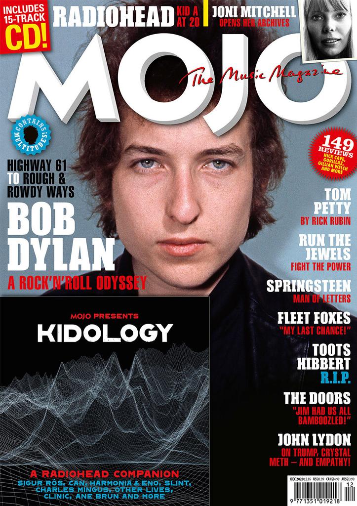
I was tasked to recreate a famous magazine as a mock-up before I make my own music magazine. Above is the original magazine and above that is the my recreation of the magazine that I made. The software that I used Adobe InDesign and tried to match the magazine the best I could.

We were given a masterclass in InDesign before we went on and recreated the magazine. So I went in with basic knowledge of the software and I think that it turned out very good. There are a few things looking back on what I have created I could have improved but overall I am quite happy with what I have made.

With my experience on InDesign:

  • I found it quite easy to get the hang of the basics of the software as it is very similar to to other programs that I have used previously, like Photoshop,
  • I think that the “Contains Multitude” pug came out very well and is very close of the actual one,
  • The Mojo logo looks quite close to the original one. It would look better if the shadow was more opaque,
  • I think that the other red pug also resembles the original,
  • I think that the text looks okay but the border on the circle isn’t as close as I would have liked.

Although there are many good things about the swede, there are also many things that aren’t quite right and bother me:

  • The cover lines on the right hand side are way to close to the border of the magazine and it isn’t like that in the original magazine,
  • Some of the text on the pug in the corner has been cut off and the Joni Mitchell text is very squashed.

Before making my swede I searched on YouTube some tutorials that would help me. They are: “Learn Adobe InDesign in 9 Minutes” by LYH Studio and “Placing and Formatting Images In InDesign” by Good Creative Academy.

These videos really helped me grasp the basics of InDesign and helped me make my swede as close as I could to the real magazine.

The Camera Talks

Preliminary Print

The use of camera framing and movement in partnership with mise-en-scene can create a narrative. There are many different camera movements that each have their own denotations. These denotations create the story for the audience to uncover.

We were randomly put into groups and took a selection of photos, each of us taking turns to model for the camera. With the photos collected I used a website called “Canva” to make a moodboard. This moodboard is compiled with 9 photos that all display a narrative. The hashtags infer the distance that the shot was taken from, the denotation of the image and the connotation that comes with it.

Although most denotations may look very similar, the connotations may be completely different. This is because mise-en-scene relies on five things: costumes, lighting, acting, make-up, props and setting. These 5 aspects of mise-en-scene plus the variety of camera movements and framing makes for a very different narrative. For example, a close up shot of the subject wearing a spacesuit in a rocket ship has entirely different connotations to an extreme long shot, of a man walking down the road all alone at night.

The angle of the camera is very important as it can make the subject have more power by filming the shot at a lower angle, but it can also make the subject have less power and be victimised by a high angle shot. This makes it easy for producers to explain to the audience that a character has power without directly telling them, which allows them to have more creative freedom and really create a good narrative.

With the information that I have learnt it will allow me to use different camera framing techniques and camera movement techniques in my music magazine and my music video in Year 13. I have leant another way to display a narrative, this in unison with mise-en-scene will allow me to make a very good narrative for the audience to uncover.

My Image That Uses MES To Communicate Meaning

Preliminary Print


All denotations of a media text are there for a reason. The producer has chosen them to display a narrative. All elements in a media text is called Mise en Scene. This phrase is french for “everything in the scene”.

We got into groups and created a moodboard as displayed above that was created on Padlet, the moodboard is compiled with images related to the genre of music that we got given at random. A genre is a category that can be used to describe music, films or literature. The genre of music that we got given was pop music.

When the moodboard was complete we had one member of our group wear a costume of the related genre. We then had a photoshoot where the model had to pose as if they were a pop star.

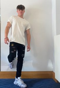
This image below is one of my classmates dressed up as a pop star. This is one of the images that I didn’t think that the pop culture was displayed enough to add to a tour poster. Throughout the photoshoot there were many photos which we had to retake and manipulate to really show the pop culture. Here are some of them.

I think that the camera angle on this image is too wide and doesn’t focus on the key details of the pop media. The lighting and shadows doesn’t catch the model in the correct way and makes it hard to cut out with the correct lighting.

In this image I think that the the pose of the model doesn’t fit with the traditional prop culture. This will make it harder to promote a pop tour as it will not be recognisable as a pop tour.

After the photoshoot we then got class connotations and adjectives about our pop star and how his outfit portrays him. The connotations on the post-it notes are adjectives like “young” and “vein”. I agree with this as many pop stars look very young and some do like themselves a bit too much.

The image above is going to be the image that I am going to use for my tour poster because it shows the models full outfit. The lighting on the image is also very good as it also leads to better quality photos.

After this task, I understand what mise-en-scene is and how important it is in the media world. This will help me make my music magazine as I now know that everything is in the media for a reason. This means that I can pose my model in a certain way, make them wear something that is relevant and pick an appropriate setting to display a narrative.

Textual Analysis Of A Tour Poster

Preliminary Print

Every media text has denotations and connotations, no matter what the media is. The denotations are the things in the scene and the connotations are the meanings behind the denotations that needed to be decoded to display the narrative of the media. All types of media have a narrative but each narrative is different and have different reasons behind them.

Each denotation that is identified in the media text will have a connotation which will reflect the narrative of the poster. The purpose of the tour poster is to promote an event to a certain target audience that is reflected by the poster. The denotations can imply the target audience by the way they are presented

For example, the blue Caribbean shirt that Kes has chosen in the poster above relates to the type of music that he preforms. The colour of the shirt also connotes to his personality. The colour is often associated with trust, loyalty and freedom which we can theorise that this is a reflection of his personality as everything in the image is chosen for a reason.

The red and orange cartoon background portrays a fun and colourful atmosphere due to warm colours and the cartoon overlay added to the image. This could also be an implication that he is a very fun person and enjoys a good laugh.

The information that I have learnt will be very useful as it will allow me to display my own narrative in my music magazine in the correct way and appeal to a certain target audience. It means that I now know how to design a costume and the setting of the magazine in a certain way to reflect a narrative to the audience.