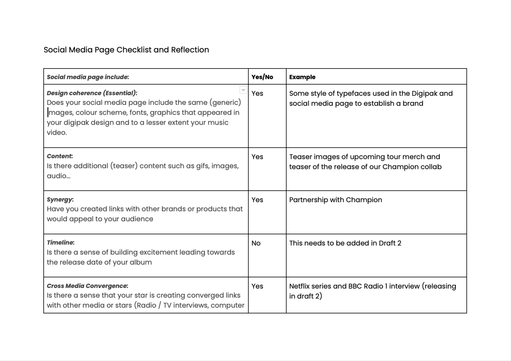
- How do the elements of your production work together to create a sense of ‘branding’?
- How did your research inform your products and the way they use or challenge conventions?
- How do your products represent social groups or issues?
- How do your products engage with the audience?
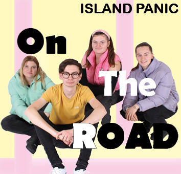
It is important that we make our brand distinguishable and recognisable to our audience. This is why our package had to have a cohesive theme that blended all three media texts together – the music video, digipak and the SMP. We did this by using a mission statement. Our mission statement was to make our package very bright and happy to match with our overarching theme. This is important as the whole package is a signifier (de Saussure) of the genre and the artist and all products must convey, represent the narrative for our audience.
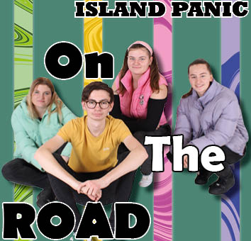
Our mission statement had to be consistent across the products and we endeavoured to represent the key descriptors of “life”, “indie” and “energy” in the various platforms. . The package is used to represent the star image in a specific way to create a connection to the audience. All of the media texts in the package work well together and it is clear to see that there is a cohesive theme.

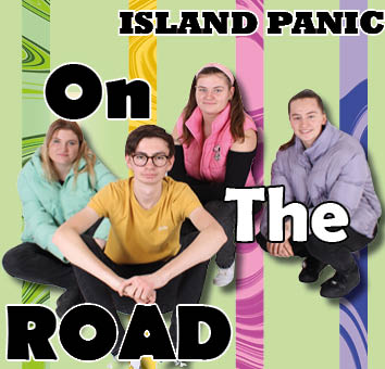
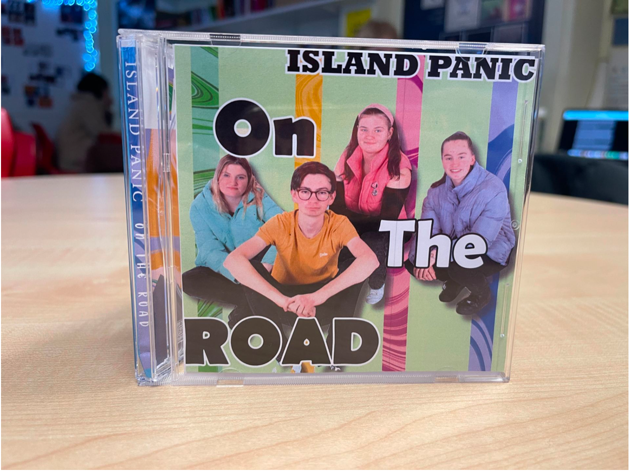
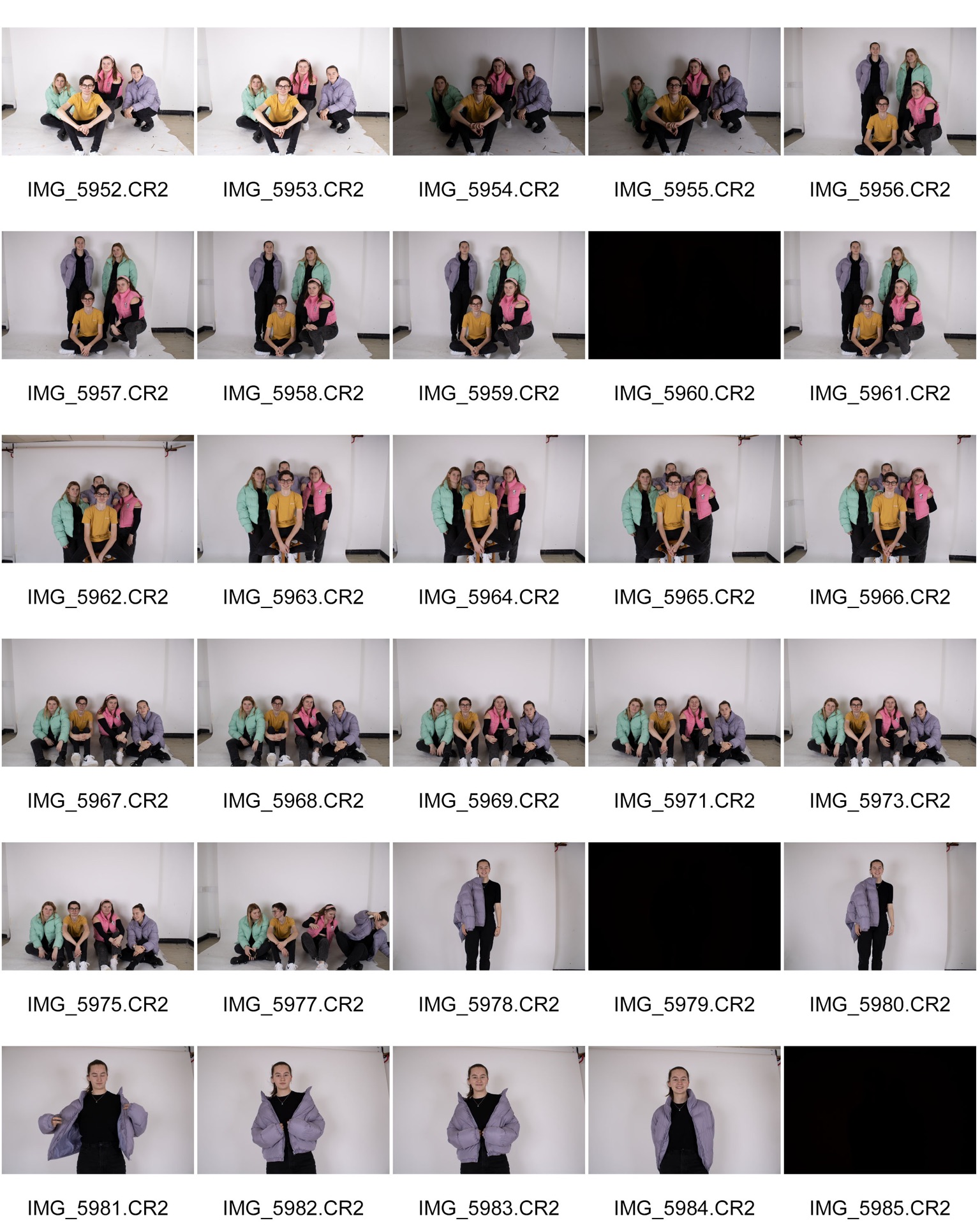
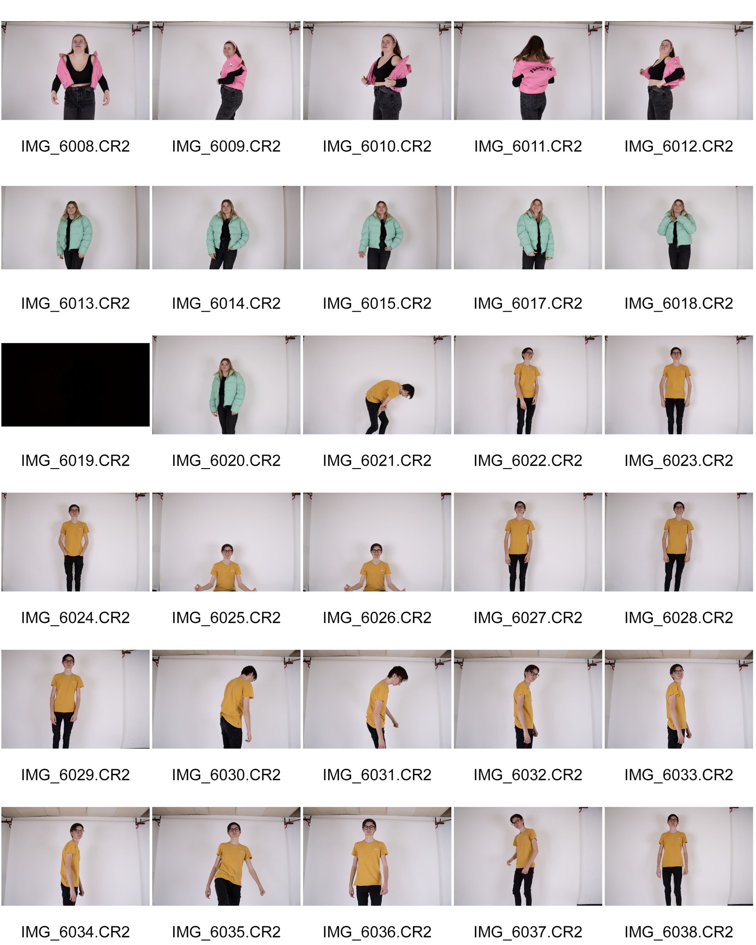
We used the key ideologies that the audience would expect to see when representing our star image in all of our media texts in the package. The Hawaii shirts used in our music video displays the idea that all of the band members have a chill nature and are really fun and energetic. Whilst on our Digipak, the body language of the band shows that they are very youthful and ordinary to create a secure connection between the band and the audience, while also displaying their laid back nature.
On the SMP we have been teasing and promoting both products (music video and digipak)as this gives a chance for the audience to voice their opinions about the releases and give feedback to the band to help them improve the overarching theme of the package.
We researched typical indie pop music videos and found that they are heavily narrative based as well as the overarching conventions for music videos e.g editing to the beat and lip syncing, with the addition of different conventions depending on the emotions that the music is designed to convey. The conventional MES involved in this genre of music video is very contemporary colourful costumes, high key lighting, light make-up for happy music videos but very dull grey and black costumes, low-key lighting, and very bold black make-up to signify the stress of the protagonist for depressing style love songs. So the indie pop genre of music is very diverse which makes for good music videos as there is a lot of variation for narratives. We specifically looked at a music video by Tom Grennan – A Little Bit of Love to get an idea of the conventional camera angles and shots for a music video. We found out that low angle shots are very common and conventional to the indie pop genre as it gives the performer or star a very dominating role.
  In our music video we used a typical band with guitars and drums during our performance sector. This is a convention that Lacey would call one of the repertoire of elements, which are the expectations that the audience are looking for when viewing a media text. Altman has a similar outlook at which he would argue that it is the fundamental blueprint that is required when making an indie pop music video.
We also found out that many indie pop music videos use anachronic narratives. We challenged this convention as we decided to make the narrative of the music video chronological so it was a clear series of events and easier to follow for the audience as our narrative is harder to understand than typical narratives that appear in music videos. Our narrative consists of a woman wanting to purchase a plot of land that is part of a forest and destroy it and turn it into a hotel. The woman’s daughter convinces her to make a nature reserve instead as there are animals living there. Even though this doesn’t fit the unwritten contract (Altman) between the indie pop industry and the target audience, we made sure to fulfil the expectations whilst also adding some other additions to make our music video ‘the same but different’ which is important to stand out in the industry – our example of this is an addition of a different and unconventional narrative. Cutting to close up is very important as it helps convey a narrative, which is why we developed this convention. We did this when introducing the animals into the narrative as their role and response in the narrative are very significant.
To create a successful package, it is important that the star image and genre is presented in the same way on all products involved in the package – for example a social media page and specifically a digipak.
Our stars are presented as being kind, caring and chill which is one of the conventional ways that a star image is presented in our genre. Dyer’s Paradox of The Star suggests that the star image has extreme polars in their metanarrative – extraordinary and ordinary.
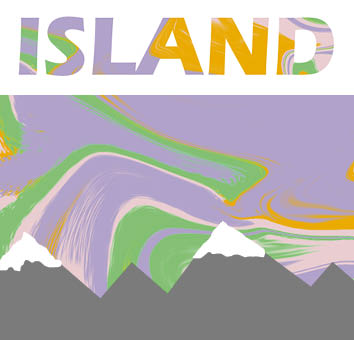
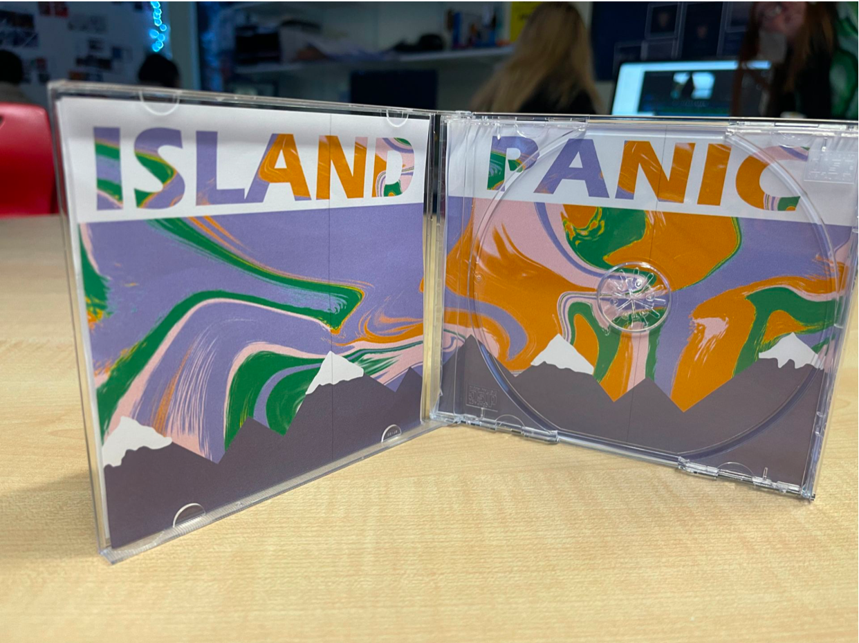
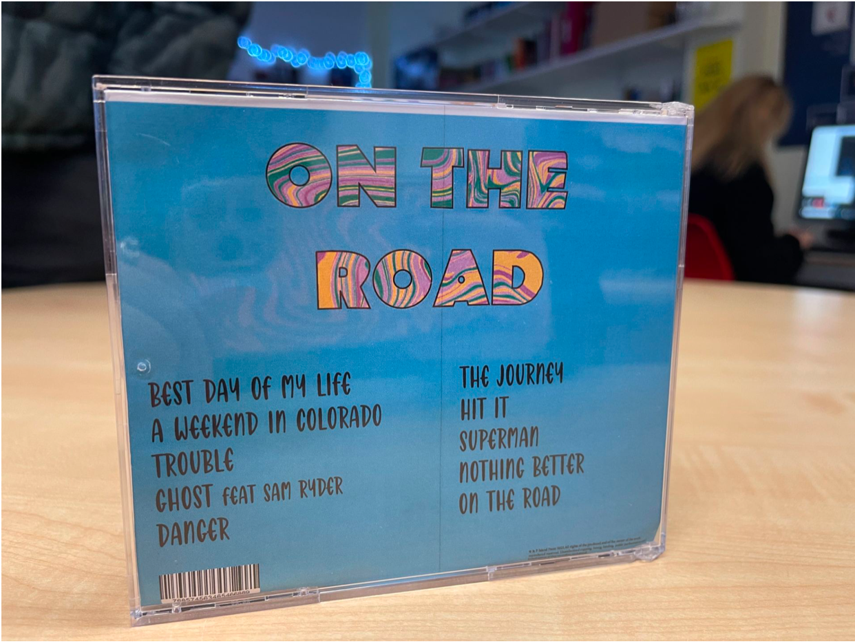
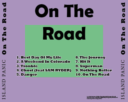
We wanted to represent them in this way on a digipak as it is important that we portray them as close as they would be in real life, relaxed and down to earth, as it gives the audience a chance to connect with the artist on a more personal level and breaks the fourth wall. The colour yellow of the main cover star’s yellow t-shirt is a symbolic code (Barthes) and connotes joy, happiness, energy and friendship. Extraordinary is portrayed in the digipak in numerous ways – the most obvious one is the tracklist. We made sure that some of the song titles represent some good things that the band have done. The indie pop genre is a very youthful genre, so we had to appeal to this social group. Media language is a key concept that we learnt whilst making our digipak – it is the way that the fonts and colours etc are used and what they represent. For example we appealed to the youth by making our digipak look contemporary and as modern as possible and the models represented a 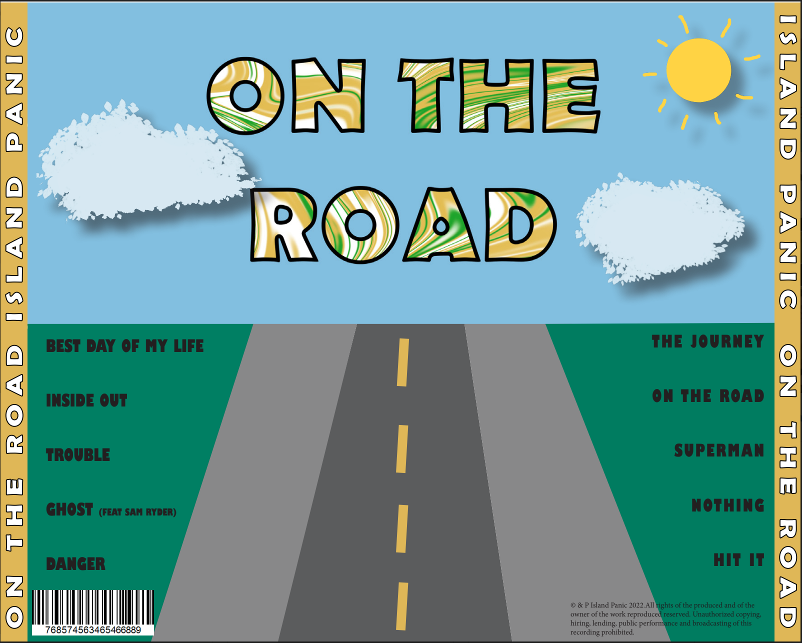 narrative being our models appearing as very relaxed, chummy and part of a team all wearing puffer jackets each a different colour to show that they are all the same but the different colour represents their different personalities. Our colour palette has pastel colours that can appeal to both genders. This is a cultural code (Barthes) as the colours used are very directed towards Gen Z, as they have the correct cultural competence to tap into this. Their relaxed pose, that breaks the fourth wall, is a semic code (Barthes) that adds to the friendly and relaxed nature that we are trying to portray the stars as. De Saussure says that every detail on a media text signifies something and will have denotations and connotations – so we made sure that we took this into consideration when making our digipak, for example – the pastel rainbow has a metro-sexual vibe which is a cultural code (Barthes).
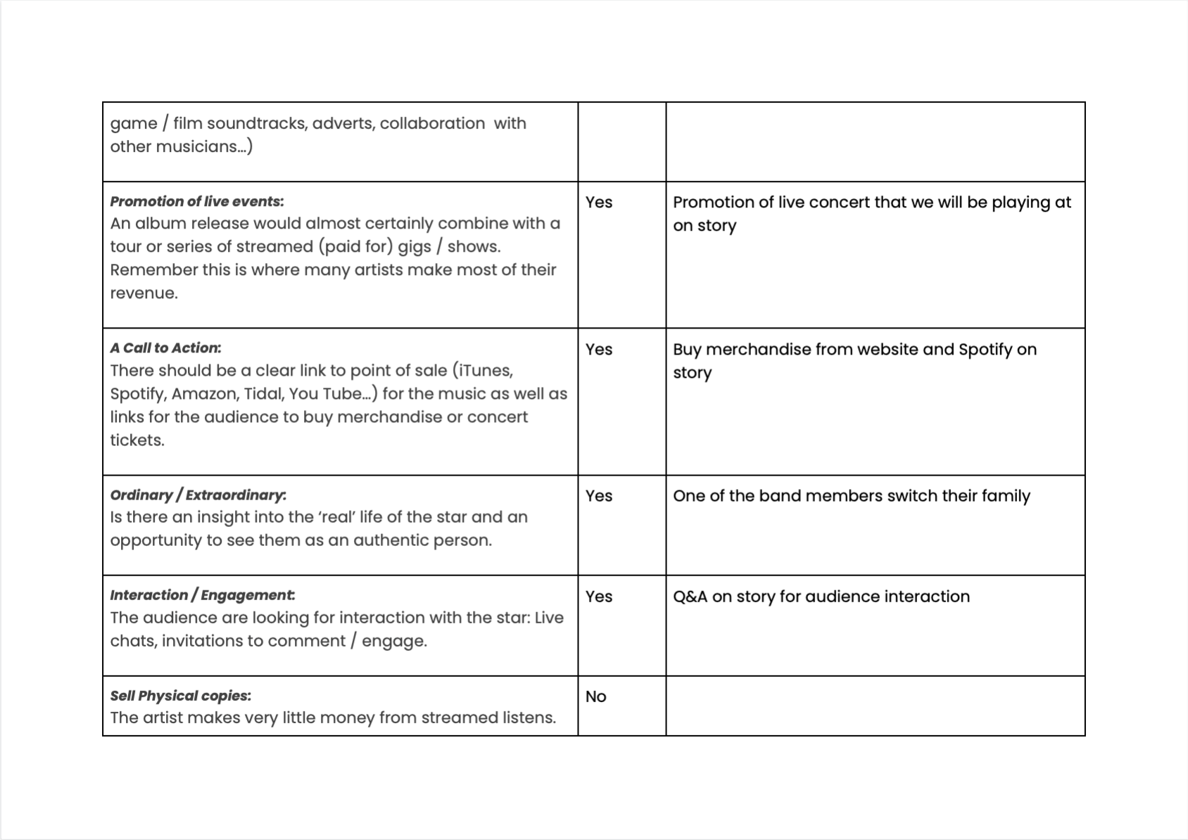
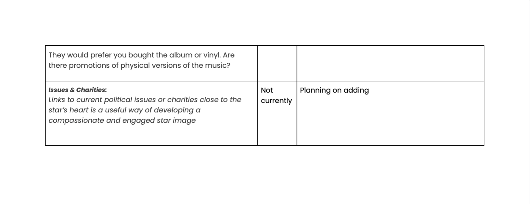
Making your audience purchase a product is the main goal, this can be achieved by engaging the audience through promotion and marketing. Our way of engaging the audience is our SMP. Our audience are typically youthful, around the ages of 16-24 and they are quite relaxed and kind. We have used many different campaigns to promote our brand –  some including a cross media convergence with Champion clothing or synergy with Netflix. This engages the audience as it follows the AIDA (Audience, Interest, Desire and Action) theory. Our SMP has given us many opportunities to engage our audience of the Indie Pop genre. As Hall describes, all media texts can be encoded or decoded and are only targeted at specific demographics and psychographics.
We had to make sure that the elements that engage the audience were part of our SMP. Blumler and Katz would argue that these include – creating social interaction whether this is between different audience members or the audience and the producer. We achieved this by adding a Q&A on our Instagram story so that the audience can get to know us on a more personal level. Shirky would argue that the boundary between the producer and the audience has eroded so therefore the audience demand for the interaction. Which is why we added these interactive segments to our SMP.  We also maximised our engagement by appearing to our audience as very ordinary but also extraordinary as it makes us more approachable and related. The media produced also has to be entertaining and any prosumer (Gauntlett) would know this. We made our SMP entertaining by adding different posts that we knew our audience would enjoy – e.g. adding a BBC Radio 1 interview.