
Loading…
Loading…


Here is my MP3 of me reading the letter:

Businesses will only pay for an advert in a magazine if it fits their target audience. For example, a beauty brand its going to put their advert in a football magazine as they know that the primary audience is not going to the same.
I have had to use the demographics and psychographics of rap or drill listeners to get adverts that appeal to the correct audience.
Advert 1

I have chosen Coca Cola as one of adverts as many people like Coca Cola and it appeals to a wider target audience. This is good because it means that whoever reads the advert is going to be interested in the advert. They will sponsor my magazine because they are a big company and have enough money to pay £100,000 to gain more sales.
Advert 2

I have chosen the Kanye West ‘Stronger’ poster as it it relevant to rap and is a music related advert. It will get people to listen to Kanye’s song in a familiar poster that was used during the war which means that people have seen this format before which has a chance to increase his revenue so I am sure that he will be delighted to pay £100,000 to put an advert in my magazine.
I appreciate that this isn’t going to be marked but for the purposes of presentation, having an extra page in the magazine and helping me make the Flipsnack platform work better. Nonetheless it was an interesting exercise in reaffirming that I know who exactly my target audience are
My Cover Page – Draft 3

Click the image to see the PDF
What’s New?
My Contents Page – Draft 3
Click the image to see the PDF
What’s New?
DPS – Draft 3
Click the image to see the PDF
What’s New?
Teacher’s Feedback
With listening to my teachers screen castify these are the changes I have made:

Click the image to see the PDF
Front Cover

Click the image to see the PDF
Contents Page

Click the image to see the PDF
DPS
My Double Page Spread

Click on the image to see the PDF
What’s New?
What’s Next?
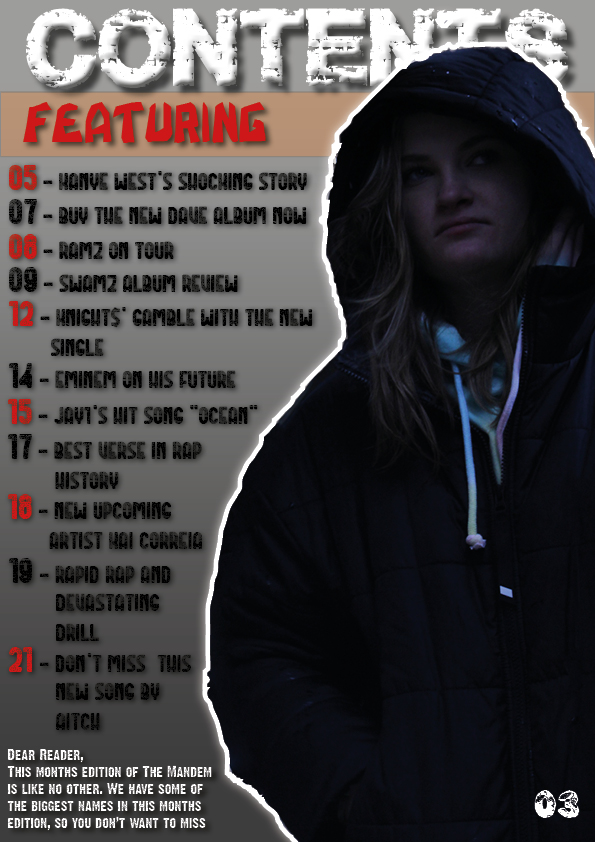
My Contents Page

Click on the image to see the PDF
What’s New?
What’s Next?
My Front Cover

Click on the image to see the PDF
What’s New?
What’s Next?
Double Page Spread

Please click the image to see the PDF
Reflection
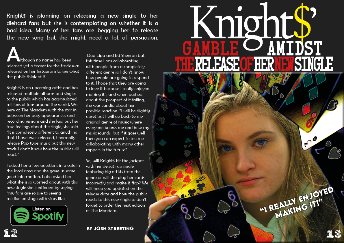
This is the first draft of my double page spread, I think that I came out well and I like how everything is laid out. The edited colours makes the image stand out more and your eyes are drawn towards the piercing blue eyes to try and establish a connect with the star. This makes the article fell more personal and allows for a better read.
I also like how headline alternates the colours and associated with playing cards, this further illustrates the “gambling” theme of the article. This makes the reader intrigued to see what the star is gambling for and about. This entices the reader to read the article and look up who the star is and what sone they are going to be releasing.
Although it is a good, there are some things that I need to improve to make it better:
With these ideas in mind I need to go back into InDesign and make these changes where appropriate to improve the design of my double page spread. My second draft will be a better copy of this draft with a few changes to make it more conventional but also personal to me.