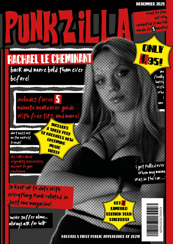
I have changed the fonts, from the basic serifs to the ones I found online. This made a real difference to the overall appearance of the magazine. It makes it look more detailed and professional.
Another major appearance change I made was to my cover stars image. I edited her in photoshop to make her grey and have a textured effect. I think this makes her fit into my genre better.
I made my title bigger. This is so it stands out more amongst other magazines in a store. It also gives a bigger meaning to the name- particularly the word “punk”.
The other change I made to my front cover was the yellow lines. I made them black, so that the yellow was only used a few times. This made it more eye catching and less tacky looking.
What’s next?
I am going to make the grey, textured filter on my model less obvious. Which will make it more subtle. This is so that the photo, and overall magazine, will look better quality.
I will also make some of the texts bigger. I think that I could fill the front page more. Which would give a more complex and filled appearance.
I might also move the top right text box lower down, so that I can make the title even bigger. This is because it’s such a main aspect of my magazine.