
Conventional design features of a magazine
Below is a magazine I have deconstructed into technical conventions, and as you can see it has the typical magazine features which include;
- Plug
- Main cover stars
- Main cover lines
- Inset images
- Barcode,price,date
- Cover lines
- Captions
- Masterhead
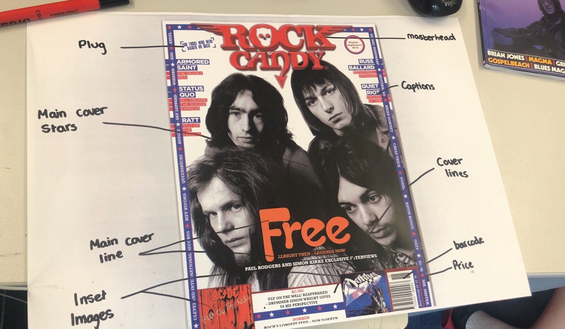
Although issues with this magazine that the producer should note is that; the masterhead isn’t big enough, as it’s the same size or smaller than the main cover lines, they have missed out the date by the barcode, and overall I think they have put too much writing on it, and with the important writing it doesn’t stand out to the audience.
This will help me decide how to present my product in a appealing way to the audience, while including Mise-En-Scene, also the technical conventions.