
Here is my second draft of my double page spread. This is what I came out with after going over my targets from my first one. After assessing this draft and creating targets for my final product, I should turn out with a very successful double page spread.
Click on image to view PDF
What’s new?
I have changed many more things on my double page spread than I did on my contents page and front cover. I was not very happy with my first draft so was looking forward to making improvements. A lot of the targets that I made via feedback from my teacher were only minor things that were quick and easy to change, such as:
- Making the page numbers slightly higher – further up the page and a bigger number itself so that it doesn’t get lost at the edge of the magazine and so that it matches with the front cover numbers
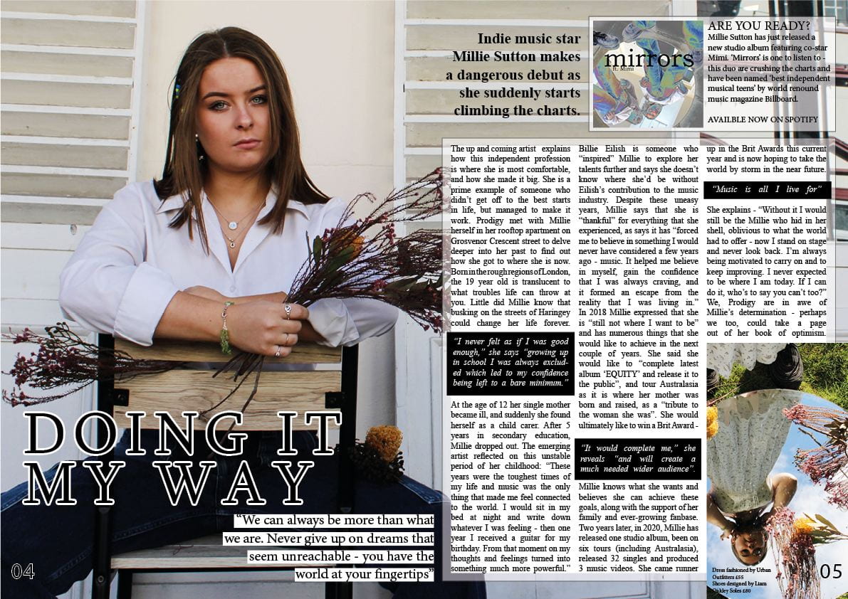
- I made a minor spelling error – ‘avaliable’ – so that had to be changed to the correct spelling
- Turning the font of the quotes in the black boxes to bold and italic so that they stand out more on the page and attract the readers attention faster – drawing them into the article itself
- The standfirst needed to be bolder so that the reader immediately sees what the article is about
- Make the main image itself much bigger as the star is who the article is about – needs to take centre stage
- Changing the typeface of the headline so that it fits the genre better as well as matches the rest of the magazine more fluently
- Removed the black bordering lines of the double page spread as I felt like it made the whole thing feel much too enclosed and cramped
In addition to these minor changes there were still numerous other things that needed changing. I felt it was necessary to add in another quote within the article to make it appear more even to the eye – I think the rule of three that can be used as a language technique can also be applied here, but in a different context. Furthermore, the headline ‘Doing it my way’ seemed crowded at the top of the page so decided to relocate it down at the bottom. After changing the typeface and by outlining the letters in white, I think it stands out much more now and fills a space that was empty on my first draft. I also think it was necessary to move my headline to the bottom because when it was at the top it was distracting the attention from the cover stars face. By making the image itself bigger and relocating the headline, it is not only drawing more attention to the headline, but allowing the stars face to be the main focus which is what is conventional in magazines.
Next I thought that the inserted image at the bottom right was in need of a caption of some sort. In order to keep it conventional but not repeat myself I chose to put the prices and places of where the outfit my model was wearing in the picture was from. I put the prices fairly high on this to show my stars wealth through fame yet made it an affordable price because I expect people of all backgrounds to pick up and read my magazine.
Finally, in my first draft I did not consider the fact that I would end up with a staple fold on my double page spread – I had my quotation over where the fold would be. To avoid this I moved the quotation down to underneath the headline. Doing this meant that I had to rearrange a couple of things, however, it is now looking much better than what it was before. It is becoming more conventional and more unique by every edit.
What’s next?
- Move quote under headline further left to avoid staple fold
- Make the far right picture fit the text box?
- Add in a drop capital
- Rearrange – move ‘mirrors’ box to the bottom? and put headline along top?
- Have a very small white border around the article itself so not as cramped appearance
- Paragraphs
- Make the inset photo with a frame or less towards the right hand edge of the page
- Make the quote black a dark blue, like her jeans with rounded edges and italic font?
- Perhaps do the Mirrors inset in a different font to make it stand out like an advert?
- Flowers fade under the article?