
Below I have inserted the front and back cover of what we have completed for our digipak draft 1. I have additionally self assessed this work against the assessment criteria – helping me to understand whether our DP star image included the correct conventional and technical elements. From this I can then see if what improvements need to be made for draft 2.

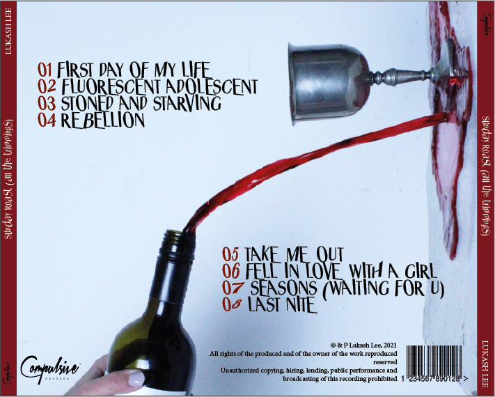
Below I have self assessed our digipak draft 2 and this close analysis will significantly help me and our group when it comes to completing the draft 3.
Targets for improvement:
- Change the typeface/positioning of the artists name on the front cover so that it is more easily recognisable and clearer for the audience to read
- Straighten the left candle on the front cover so that it does not disrupt the cover by drawing attention to it rather than the star themselves
- Play around with the colour layers on the front so that it has more correlation to the back cover – making it more of a ‘package’ DP rather than two individual items
- Placement/colour of the album name? May need to be readjusted
- Add in some deep reds to the front cover so that it matches the back cover
- Create more line-spacing between the tracks on the back cover so that it is easier for the audience to read