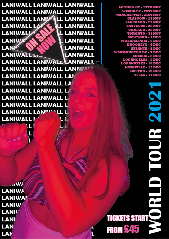
Here I have created a mood board with images of ‘POP’ tour posters to give me inspiration and ideas for creating my own tour poster. Doing this allowed me to see the details within a tour poster and the important things which need to be included such as-
- tour dates
- price
- where to purchase tickets from
- name of artist
When creating media one of the most important things before you start is research. By researching into what makes a good piece of media and researching into your target audience allows you to know what will attract and draw in the audience to your media in order to be successful. When researching and looking into tour posters ‘AIDA’ is important, this stands for –
- ATTRACT – initially attracting the audience drawing them into your poster
- INTREST – interesting the audience making them want to be like your cover star artist
- DESIRE – the desire for your audience to want to buy a ticket after seeing your tour poster
- CALL TO ACTION – details on the poster which allows the audience to then purchase the tickets
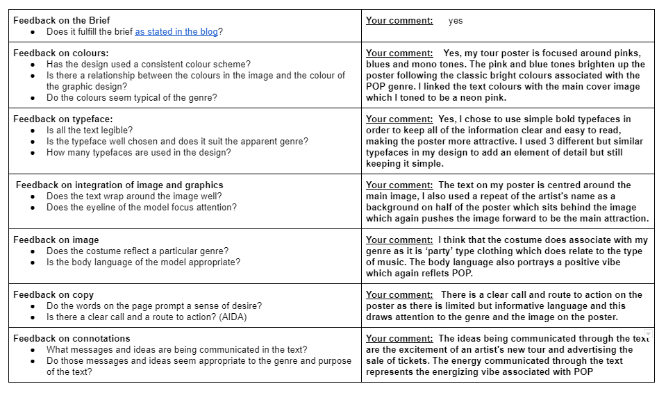
After looking into AIDA and also looking art already successful tour posters, I now understand key factors which I need to focus on in my tour poster such as color palettes, type faces, body language and costumes on the image. These elements are what will help me to create my own successful tour poster. By looking at the example tour posters included in my mood board I noticed that the designers used bright color palettes to stand out with bold contrasting type faces making the information clear to the reader.
Focusing Forward
When looking forward to creating my own poster I am now aware of the important design elements I need to include in order to link my tour poster with the genre POP and for it to be successful.


Reflection
In my tour poster I focused on ensuring that my poster was attractive as-well as informative to the audience to advertise my artists tour. To create my tour poster I started with using the app Photoshop to cut out the background of my image which allowed me to place the image on top of my own background. After I had cut my image out I then inserted my image into InDesign where I was able to edit my background and add text to my poster. InDesign has a huge range of fonts available which was very useful when deciding which fonts fitted my poster best.
3 things that went well –>
– I am pleased with my editing on my main image
-I like my use of colour and my chosen colour palette as the whole poster works well as a result
-I am pleased with my use of fonts and size to create bold and clear text making an informative poster
3 things I could have done better –>
-If I was to do this poster again I would enlarge the main image to fill up more space
-I would ensure to ass the last part of AIDA (call to action) by adding a website link as to where to get tickets for the tour
-I would potentially add in one more contrasting colour as I have used my 3 colours quite a lot and a contrasting colour for one piece of text could have a bold effect
Focusing Forward
This task was very useful as it allowed me to get used to using the apps InDesign and Photoshop which are two of the apps which will help me create my magazine. Now that I have practiced using the different tools I have learnt things that I can apply to editing my magazine cover to make it better.