Reflection
Overall I am pleased with my front cover drafting think that some elements work really well but there also some elements which I can definitely improve on for my final cover.
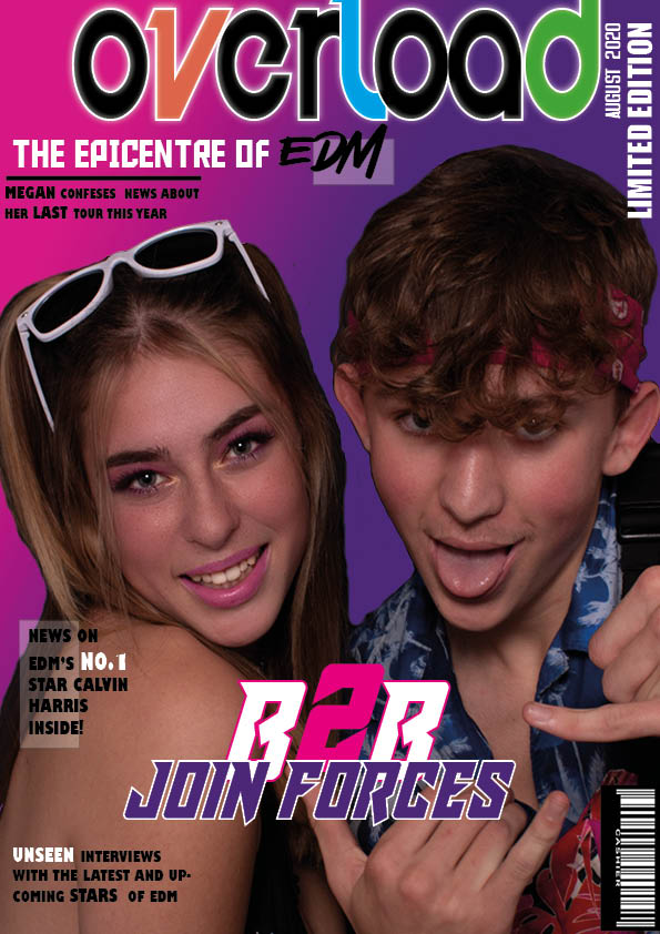
MASTHEAD, COVER MODELS & DESIGN PROGRAMME
My masthead is one of the elements of my front cover which I am really please with, I think that the different coloured letters within the title make it unique and help it stand out. Originally my brand name was going to be “electric overload’ although when I came to create my masthead I found that this heading was too long and that a one work heading would work better and allowed it to be bigger. When positioning my masthead I wanted it to be as big as possible and big enough to stand out from the other text on the cover, I also added a white strike around the masthead to help the colours stand out and be separate from the background gradient. When positioning my masthead I pushed it to the very top of my page making the ‘L’ and ‘D’ run off the page which added another small detail to the cover.
I am very pleased with my cover models and how their image turned out as I think that the Mise en scene is very successful. Their body language reflects the vibe associated with EDM as a genre which was very important to me as well as the eye contact making a direct interaction with the audience. I chose to use a close up image focusing on the top half of my models and their faces in order to capture their emotion whilst still showing their costumes, I think this was successful.
I have used the programme InDesign well to layout my whole front cover and add detail such as low opacity rectangles as a backing to some my cover lines, pushing them away from the image. InDesign also gave me a huge range of fonts to use for my front cover which was important to help match the font to the genre. Another programme which I used was Photoshop which helped me to cut out my image from its background so that I could place it onto a different background. I also successfully used other elements on Photoshop such as skin blurring and brighting, lipstick filters and exposure settings to improve quality and enhance details on my models making then of a high level.
COLOUR PALETTE, FONTS & MISE EN SCENE
I think that I successfully chose a colour palette relative to my genre which focused on bright pinks, purples and whites. These are a few of the classic rave colours which influenced my decision for choosing them, I also included accents of orange, green and blue to display the fun vibe of EDM to my audience. After choosing my colour palette I used accents of these colours throughout the front cover in order to help it all link together.
My fonts are very bold and the majority of my text is capitalised which does a excellent job of attracting my audience into reading these headlines. A lot of my typefaces are the same for my cover lines in order to not over complicate the design and allow the masthead and main cover line to stand out in different typefaces.
My costumes are bold but also minimalistic as EDM clothing portrays a festival vibe therefore I chose costumes with colours swell as including accessories like like sunglasses and bum bags. My models makeup also has a element of fun to it which pink eyeshadow and this is reflected in my models facial expressions which show excitement drawing In the audience by showing the genre to be positive. My models body language is confident but also cheeky and displays my main cover line of these two popular EDM artists joining forces.
LANGUAGE & MAGAZINE
When looking at the language I have used in my front cover and within my cover lines I think that they are bold phrases which will attract the audience although when editing this draft to make my final cover I would like to add a few more pugs and cover lines to my design. Creating my cover lines I looking into language which draws in a audience like imperatives and hyperboles.
It is clear that my front cover is a magazine as It include the majority of the conventional features such as masthead, main cover lines, cover lines, cover star image, issue, barcode.
Other important elements I focused on when creating my front cover was ensuring I had elements meeting all expectations of media – personal identity, social interaction etc. To do this I used language to make it seem like I was speaking straight to my audience directing it at them personally. When editing my front cover draft to make my final draft I would like to add a few more cover lines and details around the cover star as it potentially looks too empty at the moment for a front cover.
What I did well-
- cut out and edited my image on photoshop
- created a bold masthead
- designed a bright eye-catching background
What I can improve on-
- possibly adding more small design features (shapes)
- ensuring I have all of the necessary conventions including price etc.
- adding more catchy cover lines around the cover star