Screen Castify
This is a screen castify which gives me an overview of what I can improve within my music magazine.

What’s new?
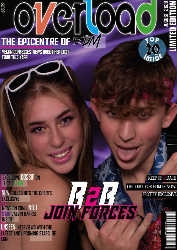
I changes a lot between my second and third draft after looking at more expamples of front covers and realising it was not busy enough for a EDM front cover.
- I added features such as ‘Top 20 Inside’ which helps show my range of skills on indesign
- Adding lots of cover lines on both sides of my front cover made it a lot more busy and gave a lot more of an insight to what is included in my magazine
- I changed my background as the plain background was quite bland and this graphic background I created on photoshop gives a ‘rave’ effect to my cover
What’s next?
- I am not completely happy with the typefaces and layout of my coverlids on the left
- I need to enlarge my title so that it is the main focus of the front cover and not fighting with the main cover line
- I am also going to put ‘Spotify’ in the actual Spotify logo type face as an additional feature
- I also need to check my wording for my headlines ad I do not want to overuse words like ‘exclusive’

What’s new?
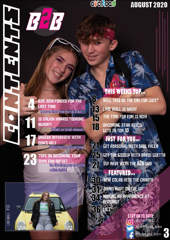
- I added a tinted slash through the corner of my contents page to add dynamics
- I also played around with my cover lines and page numbers adding more colour and strikes to make them stand out more
- Rearranging the ‘B2B’ logo to where there was more space
What’s next?
- I am going to try and cut out my background image as I think It would look better put onto a contrasting background
- I also do not need to date at the top of my contents page so am going to remove that and possibly re-arrange the ‘overload’ logo into the top right
- I am going to add a page number under the ‘B2B’ logo to link it with the cover line
- I need to ensure that all of my columns are lined up

What’s new?
- I added a heading to my model to link her with the article
- I also added a album cover which is the album mentioned in my article
- Another feature I added was more straight lines on the other side of the model which gives more business and details to my ups
What’s next?
- I am going to try moving ‘LUCE’ to the bottom of the model as this area is boring
- I also need to enlarge my heading to make it stand out even more
- I am going to play around with my article text and try justifying the second column to the right