DPS 1st Article Draft

This is the plan I made before beginning to write up my 1st draft for my article. This plan helps me have structure and also reminds me to think of the Blumer and Katz gratification theory trying to include some forms of information, entertainment, social interaction and include ways to reinforce my readers personal identity.

I’ve recorded me reading my first draft of the the article out loud to check everything makes sense and will help me highlight any changes I want to make. And I have received teachers feedback which from this I will edit and make any final changes.

Click to listen to my mp3 recording

Some Changes:

  • Add a conclusion note from the celebrity
  • Edit the stand first as it didn’t sound right
  • Fix grammar errors

Final Draft

This is my final draft of my article, I’ve included a mix of real life problems which is conventional to the agony aunt sections as well as music related problems as this is a music magazine. I’m hoping this article will entertain the reader with some of the scandalous situations as well as inform them with some advice and information about the music industry. Furthermore, the article is a form of social interaction as I’m including an email were the fans can have a chance to send in their questions in hopes their star will read it in next months article.

Now, I have completed the article, I can pick certain parts to include to shorten it down so it will fit in my double page spread and just put a “Continued on next page”.

1st Draft of Double Page Spread

Click to see me DPS

A double page spread is an article in the magazine which has many conventional features like a byline (who it’s by), stand first (Mini paragraph to introduce and engage interest for the article), pull quote (an interesting quote taken from the article itself) page numbers, captions (go under photos to anchor it) and a drop capital (large letter that indicated where the article starts). Here is my self assessment of my DPS.

The star image is communicated well through the mise-en-scene and how she appears very dominant on the page. She is placed unconventionally however it works as she is placed strategically so that the center cuts through the stomach. The good use of  a pull quotes in the interview article such as ‘My ex husband cheated… help intrigue the audience to read and find out more.

The Feature Article is laid out well and complies with some of the conventional techniques with no copy going over the staple fold, page numbers, a large full page image. However not all the other conventional elements such as bylines, serif font for the feature article and captions all proficiently integrated.

The themes and subject matter have not be included yet. 

The use of key phrases like ‘burning questions’ and direct address ‘your’ are all well crafted to hook the reader making it feel personal to them as well as in and tempt them to read on. But it doesn’t show reveal anything about the star image. 

Bold san serif fonts are used for the headlines, stand first and pull quotes to stand out. But the feature article should not be in a san serif font as well. The colour pallet matches the genre being bright and fun.

Overall, I’m happy with the 1st draft layout, although it’s breaking conventions of a tradition double page article as the image is spread across both pages I believe it works and stands out more. Thinking forward here is my overview for when I begin my second draft.

3 Things I Like:

  • The layout
  • The photoshop used to cut her out
  • How the headline is layed out

5 Improvements:

  • Change feature article to a serif font
  • Play around with “Izzy Upson” maybe making it more transparent
  • Add a byline
  • Make the pull quote stand out change the layout paly with colours
  • Edit the page numbers

Contact Sheets for 2nd Shoot

These are my contact sheets from my 2nd shoot. In this shoot I wanted to get photos for my double page spread and for my contents page and try reshoot the front cover to see if it cuts out easier. For this shoot we tried out more props and effects to create more interesting and intriguing pictures. I also used my phone to recreate some photo effects I saw online where I used a toilet roll and just my flash to create a spotlight effect.

I love this image for my double page spread her expression is shocked which will match with my double page spread having some gossip and scandals in it. I used the same mis-en-scene as I did in my 1st shoot which I think I will try brighten the outfit making it more bright and fun which is conventional to my genre.

This photo was my funky photo, I love this one for my contents page she looks happy and really exciting. I used the fan to make it look like her top and the mise-en-scene matches the pop genre.

I used the flamingo as another weird and exciting prop, although I don’t think it will make it into my magazine I thought it looks interesting and very different which can be a good thing.

Overall, the shoot went well and I really like the use of the fun props which will attract the audience and gage interest  to the reader. The props also fit my genre as it creates a fun, exciting tone which is very conventional. Now that I have done my second shoot, I can begin making my double page spread for my music magazine using one of my favourite photos and also pick out the photo I’ll put in my contents page.

Language Analysis

This is my analysis of a double page spread from a published magazine. I will be unpicking how the journalist has represented the individual with the language and how this article follows the rules of AIDA (attract, interest, desire, action) and linking this in with Blumer and Katz uses and gratification theory.

Journalistic Reportage

  • Who- Wyclef Jean
  • What- “The rappers and musicians rules for life” in the stand first
  • Where- An interview, most likely done in office
  • When- September 2017
  • Why- He is a popular rapper/musician with a positive view of life
  • How- He is reveling all, states in the stand first

What’s this article about? 

This article is an interview with the rapper/musician Wyclef Jean on his top 10 rules for life. The audience will learn his personal tips and his perspective on life. Thinking of the uses and gratification theory by Blumer and Katz this article will inform the audience and reinforce their personal identity if they follow any of these tips as he can be seen as a role model.

What’s my sense of this person that the Journalist is writing about?

When I read through the article and even just by looking at it I got a sense of who this person is, he comes across as calm, chill, wise and also I have the impression of fun and quite youthful as well as a respectable person. I’m going to analyze how this representation was achieved.

How do they represent the artist?

Firstly, the use of colloquial language within the headlines and sub heading for example the simile heading “Get moves like Jagger” is a cultural allusion to the popular song by Maroon 5, as well as referencing the famous Mick Jagger this makes him seem fun and also relatable to the audience. He also uses slang language which you can see with “Leave big tips, baby!” saying “baby” is very colloquial which again represent him as relatable, fun, youthful individual. Then we see this respectable side to him with the heading “A perfect gentlemen has respect” this creates a kind, perfect star image, with the noun “gentlemen” and adjective “respect”, which is very appealing for the audience. One of the stories he shares his hardship in his childhood/teen hood in tip number 3, sharing a personal experience presents him as human and can evoke emotion from the audience and represents him as authentic and not fake which is really appealing to an audience. There is also a section of his top 5 albums, which informs the reader on his personals likes and can create a connection and relatability to his readers if they perhaps like the same albums.

Conclusion

Overall, the journalist has captured a respectable, fun and relatable star to the audience with a very positive, optimistic tone throughout the article. It’s clear that the journalist thought about AIDA as the article really attracts and interests the reader through the use of quotes and the language used in the headings. And finally, the uses and gratification theory this article is evidently one to inform the audience as he is giving the reader tips for life, reinforce their personal identity by sharing personal stories and his favourite albums and finally some entertainment as well with some of the interesting stories he shares.

Thinking forward, I decided to do this analysis in order to understand what sort of language the journalists uses to represent the star so for when I start writing my own article I have an idea in what  language to include to create a successful article. Furthermore, I also know that I must keep in mind AIDA and the gratification theory when designing my double page spread.

PMA for 2nd Shoot

Here is my PMA document for my 2nd shoot. A production meeting agenda, is basically a guide and all the information needed to carry out the shoot to make sure everyone knows what to do. For this shoot I will be retaking my main cover star in the same costume and makeup but in the white room as in photoshop the black room made it hard to cut my model out due to her dark hair. I will also be taking some photos of a new model for my contents page as it’s very conventional to have more then one model in contents page for my genre.

My idea for the props for my 2nd model is to go with a headline like “How to write the next best hit” with my model holding a notebook and pen. I have also found some youtube tutorials on cool photo hacks that I’m excited to try out as they may end up working well with my magazine.

1st Draft of Contents Page


This is my first draft of my contents page, I used indesign and photoshop to cut and design the layout of it. Overall, I’m happy how it has turned out and I think it looks conventional to the pop genre but I have asked a peer to assess my contents page to see what I should improve or change to get the higher marks.

From this feedback I my own opinion, I have made 5 targets for me to complete for when I do my second draft.

  • Do the editors note
  • Change the 2nd image to the person I used in my 2nd shoot
  • Change the pink font to stand out more
  • Make the headlines more music magazine
  • Add higher page numbers

Content Page Preparation


10 Catchy Headlines

  • Izzy Spills All
  • Win 2 Lizzo Concert tickets
  • Reading and Leads lineup leaked!
  • Shocking new scandal
  • Confessions of an A list Star
  • Are you Harry Styles dream girl?
  • Find out the true story of the divorce that shocked the world
  • How to become the next hot sensation
  • 10 fabulous hair hacks for flawless hair
  • Strictly Confidential!

Above is some of my research I conducted on what is a contents page. A contents page is like an index in a book but instead for a magazine, it helps the reader navigate what page to go to and also is a great opportunity to engage the reader to carry on reading.

I composed a slide of 10 different contents page and drew out the layout of design of contents pages of magazines I had paper copies of. From my research, I found conventional features like most at the top of the page would include the headline ‘Contents’ and also include the name of the magazine, most had more than one picture with different people, they include categorise that would help the reader navigate which topic they are interested in “Features” “Celebs”, all would have page numbers and all have catchy headlines and engaging cover lines.

Thinking Forward, remebering the uses and gratification theory by Blumer and Katz I know that there are 4 main uses for media and thats social interaction, social identity, information and entertainment. So when I do my contents page I need to make sure I remember I check all these boxes. So I wrote 10 catchy headlines that I could include for when I do my magazine. Some headlines are for the entertainment purpose and can also link into social interaction to give the readers something to talk about- “Confessions of an A list Star” or “Shocking New Scandal”, also one for information could be “Reading and Leads lineup leaked!”. To reinforce their identity I included healines like “Are you Harry Styles Dream girl” and “10 Fabulous Hair Hacks for Flawless Hair”.


Front Cover Draft 1- Self Assessment


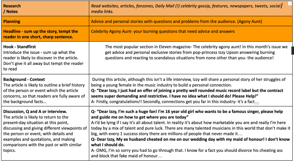
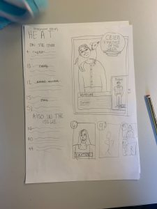
Above is my 1st draft of my front cover. It isn’t quite finished yet as it’s missing the cover lines.

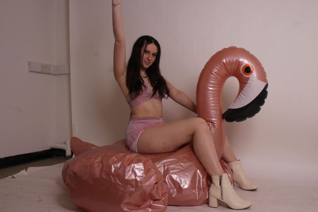
The masthead is conventionally placed, very big and the pop of colour that is colour matched to the two piece outfit of my main cover star in the two ‘1’ that make up the l in Eleven. It’s big enough to stand out and make an impression and also fits the pop genre which conventionally as a modern typeface.

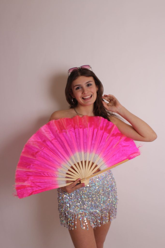
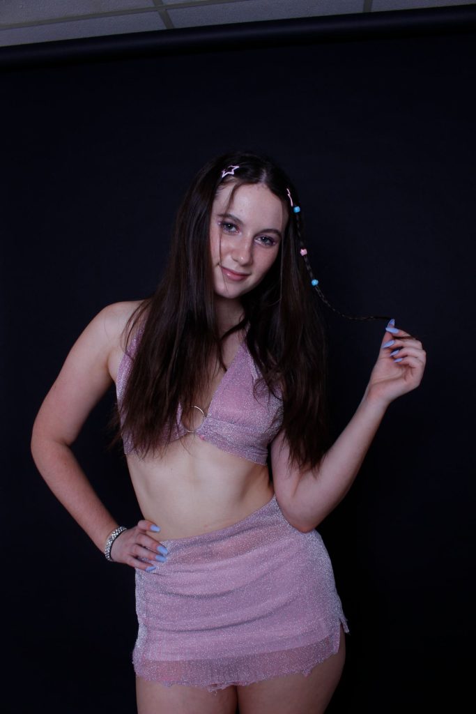
The model is staring at the camera and is large enough to make a presence on the cover and is satisfactorily framed using the rule of thirds. Her expression looks approachable and a little flirty with the smile.

Desktop publishing, Indesign, has been used well to layout the text and images so that they integrate. The pug is different from how a conventional pug would be displayed but it’s well designed.  The layout is poor with the cover lines on the left and are randomly sized which looks messy.

A purple, blue, black, grey and white colour palette communicates a fun and girly visual that represents the pop genre in more of an older and a little more sophisticated way in compared to young teen pop magazines. But is done so without losing it’s fun and exciting feel that a pop magazine conventionally has – colour pallet used to good effect and impact.

The font is modern but is hard to read especially the cover lines when put in a different colour, the font is messy and the cover lines feels out of place and is something I will defiantly change.

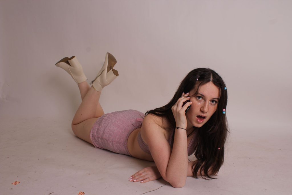
The costume is very pop very sparkly and not very ordinary which creates a star image. The make up is again sparkly with little gems and the eyeshadow matches the outfit nicely also the body language and posture represents her as glamorous and fun which mirrors the genre brilliantly.

In terms of the language used in the cover lines, it’s okay. For the agony aunt section, I included a quote of a problem on the front, ‘My best-friend kissed my boyfriend’,  to attract and entice my target audience knowing this is something that will entertain them.  Also ‘Exclusive’ and ‘Secrets’ will attract the audience as it creates a feeling of superiority as it will make them feel included and have knowledge that no one else will know.

The magazine is recognisable as a magazine as it has all the conventional features like a masthead, issue, main cover star, barcode and cover lines along with a pug to entice the reader to read on but it is evidently not finished. 

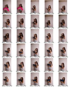
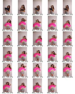
Photoshop has been used to cut out the cover star to place on a graduated background so that she becomes the focus but the inserts are not particularly well framed and feel badly composed. The cut out around the hair is poor and overall looks averagely done. They also lack variety as include the main cover star.

The garde I would give myself if I were to send this off now would be a D Grade, it obviously not done and feels very empty and incomplete. Here are 6 things I will want to improve when I go onto to do my 2nd draft:

  • Change the font and typeface of the cover lines 
  • Make sure the issue date and plug match in size 
  • Add more cover lines and enticing language- include superlatives and imperatives
  • Try play around with photoshop with the image to fix the hair 
  • Make the two piece outfit brighter and fix the skin discolouration 
  • Add more icons like the heart around to have consistency and to  keep up with the fun girly vibe


My Audience Profile

Above is my dating profile I created and designed showcasing a typical target audience for my magazine genre pop. I have analyzed the targets audience gender, age, job (demographics)  and then from this I researched the types of attitudes and hobbies (psychographics) that they may have. It’s important for a media producer to know and bear in mind their audience to make sure the audience has a preferred reading.

Keeping in mind, the Blumer and Katz gratification theory people chose to engage in media for 4 reasons: entertainment, social interaction, information and to reinforce their personal identity. So, from this I understand that I must make sure I appeal to the audience by adapting certain features. For example, to reinforce my target audience personal identity, I will feature things like popular, trendy clothes and for entertainment I will include gossip of popular artists in the pop genre- tailoring my magazine to my audience.

Thinking forward, I now know my target audience and can now plan out how I can adjust some content and features of my magazine to suit them in order for my readers to get a preferred reading.  I also have to think about design features, like the colour pallet, to make sure it can be decoded into a fun, girly vibe which can be conventional for the pop genre and hopefully engage my target audience.

Here I used YouGov to help find my target audience. However it’s a little outdated for age demographics (doesn’t include Genz) however from my own knowledge and some research I deducted the main age group is between Millennials and Genz (15-28).

1st Shoot Contact Sheet

This was my 1st cover shoot were I directed, designed took the photos by myself. I really enjoyed myself as it was a fun shoot while also productive. Overall I took over 50 photos, which was the minium I aiming for, in order to make sure I managed to capture the “money shot”. Also, I considered I needed some photos for my content page so I tried out some fun, different poses using props like the phone case and the stool.

These 2 photos are some of my favourite which I’m sure to tryout or even use for my magazine. The 1st one is a mid-shot and my model looks fun, flirty and playful as you can see with the pose and acting of her playing with her hair. I find this photo really captured the genre and what the star image I was aiming to represent. The 2nd photo is one I directed her to pose with the phone prop as I visioned this on my contents page with the ‘star as the agony aunt’ section I planned to do to make my magazine different from the competition.

Finally, I believe the shoot went well however, a couple things I would change if I could go back is to use the white room as her hair is really dark and when it comes to editing her I predict it will be difficult to cut her out- especially the plait with the beads on it. Furthermore, I wish I could of gotten a telephone prop and painted it pink instead of using an iPhone case as I believe it would of looked cooler and stand out more.

Thinking forward, now that I have my cover photos and masthead done I can now start planning and designing my magazine- which I can’t wait! Moreover, for when I do my 2nd shoot for my double page spread I have the knowledge and now experience of how to set up the studio and direct the model succesfully.