Front Page Layout

Above I researched some magazines front covers that I really like and think the graphics, layout, colour pallets, cover lines, font and the photo manipulation is very interesting and will help inspire me when designing my cover.

The bright colour pallet and the cover model really make the front covers stand out. For the “Cool!” magazine I really like the heart graphics which make cover line underneath it stand out. And the cover lines on the “teenvogue” magazine are super catchy and very fun which I will aim to replicate. For the ‘Instyle’ magazine the layout drew my attention especially I love the way the name “Rosa” is laid out and the different colour pallets/shades of pink they designed which I will create something similar for when I make mine.

Focusing forward, I have knowledge of the different designs of magazines and what works/looks good from the colour pallet to the layout. I can now use my knowledge and take inspiration for when I begin designing and I now understand some feature that makes a magazine front cover stand out.

Masthead Design

These are some of the designs that I would potentially use for my main masthead. A masthead is one of the most important features on a magazine as it distinguishes your brand and also can help attract a potential audience. When designing the masthead it’s important that it matches your genre so you wouldn’t have a sleek modern masthead for a heavy metal music magazine. This helps you audience have a preferred reading so you have to ensure the design is conventional to the genre.

This is my chosen masthead, I’ve picked this as it’s bold and modern which matches the pop genre as conventionally they use bold, contemporary fonts. But, I also made sure that it looks different as I designed the “l” in Eleven with two ones and made sure it stands out by putting them in a different colour. I will most likely change the colours of ’11’ to colour match something that my main cover star is wearing. I find this masthead looks fun while also modern which is the vibe I was aiming for.

Looking forward, I now have designed my masthead which is a very important feature and now can start thinking about other aspects

Production Meeting Agenda for 1st Shoot

The is my production meeting agenda for my very 1st shoot where I’m trying to get my main cover star photos along with some photos for the content page. I made this so I remember what to bring and keep organized whilst also giving my model an idea of my vison. I’ve carefully thought out about the mise-en-scene I will use to create my star and represent her in my desired way. I’m excited to create a fun, glamorous star which I’m hoping will translate to the audience with the choices I make. I chose a costume with lots of sparkles and colorful makeup and accessories which is very conventional for my pop music genre.

In the future, I now know how to book slots in the studio and create a PMA which will be very useful for when I come to my second shoot for my magazine as well as future projects.

Star Image- Theirs and Mine

Above is my slideshow of a star that, if I had any budget, I would love to have for my magazine. I picked Ariana Grande who is a very famous pop star and I researched about how she is represented to her audience. Most celebrities have this star image which is constructed to make them appear a certain way. Richard Dyer is a media theorist (The Paradox of the Star) which he states a star must be presented as extraordinary (super talented) and ordinary (shopping, wear casual clothes), as well as present (tv, concerts, interviews) and absent (out of reach). I looked at the meta-narrative (the mix of media that shapes the star in the mind of the audience) that has made Ariana to be constructed the way she is.

Above is my college of the mise-en-scene I want to use to represent my star for my first photoshoot. I looked at the costume and makeup to create an image of a glamorous, fun star (extraordinary) and the poses and acting I want further conveying this as well as a little flirty and confident. I will try out both high-key as I see commonly used in pop magazines, as it creates a happy mood. I will try out a range of angles to see which I like better but I know a mid-shot and a close up is the most conventional angle that I want for when I create my magazine.

Overall, this research has helped me understand how I need to represent my star as super talented as well as like an everyday ordinary person to create a sense of relatability for the audience. I now know that I’ll incorporate media text that shows my star is like them highlighting problems that my star may had faced that are very ordinary (boy problems) as well as stories that captivate the audience due to it being so extraordinary (stories while on tour). Furthermore, I have a rough idea of the mise-en-scene I will use for my main cover star.

So What am I up Against? The Competition?

I created and designed a Pikto Chart to display my research on the competition and features they use in their magazine. By doing this, I now understand the conventional features that I see all pop genre magazine commonly use which I will include in my magazine in order to achieve a preferred reading.

Some conventional features I will use: top charts, well known artists, bright colours, catchy cover lines, gossip and fashion.

Moreover, I need to take into account that my magazine needs to stand out yet be conventional- if it’s the same as another magazine it will not be successful. So, to make my magazine a little different I will include empowering stories about the artist (not just gossip) and also may include an agony aunt section where readers can send in problems that their favourite singers will advice/help them with.

For when I do my magazine, I will also take into consideration the Blumler and Katz gratification theory and plan out features which can create entertainment, inform, create social interaction and finally reinforce my readers personal identity.

Branding and Mission Statement

I have researched lot’s of different genre of music and the conventions of a magazine that comes along with the genre, in the end I decided to do pop music which is the genre I listen to the most and have lots of knowledge about. My idea is to make my magazine mainly women oriented, I’m aiming to have a feel good, fun, fashionable magazine which mirrors the pop genre. It will mainly target a young, teenage, female demographic with a more fun yet not too childish feel.

For deciding the name, I have chosen “Eleven” which originally was just a random idea as it was my lucky number, however with further research the number has great, fitting connotations according numerology “Individuals who are gifted with the number 11 in numerology are most likely to excel in the fields of philosophy, art, music, as well as entertainment.” This suits the purpose and the contents of my magazine as I will be showcasing the individuals who have excelled in the music and entertainment industry.


I created this word cloud including some content I will include in my magazine as well as some word that connote the overall feel I’m aiming to create for my magazine which reflects the pop genre. Blumler and Katz agreed that there are 4 main reasons why people engage in media: entertainment, information/education, social interaction and reinforce their personal identity. So by following this uses and gratification theory, I should be able to maximize sells and attract my target audience. So my magazine should provide entertainment through some interviews with the artist, information by tour/concert dates, social interaction perhaps by letting the audience pick questions to ask the next music star and reinforcing their personal identity by showcasing the fashion they are wearing.

It is vital to create a mission statement which is a statement that establishes the purpose of the brand and what they want to achieve. Elevens mission statement:

At Eleven, one of the leading teen-pop magazine in the Uk, our aim is to share the love and passion our community have for pop music. Eleven showcases those who has excelled in the pop entertainment industry, those who’s gift is music, those who’s passion shines through their work. We will deliver you: rising stars, the legendary icons, exclusive interviews, shocking scandals, new music, the latest trends and fun fashion advice. You will get an inside look on the lives and the stories behind your favourite pop stars and their music- what’s more to love!

If I had to chose 5 words to sum up my brand, I would pick:

  • Fun
  • Exciting
  • Trendy
  • Colourful
  • Upbeat

Focusing forward, now that I have chosen a genre, magazine name and established the purpose, I can now start thinking about the design of the magazine and model of who I’m going to use as my main cover star. From the research, I now know the design will be fun colours like pinks and blues which is very conventional for a pop magazine, as well as looking into the mis-en-scene on how I chose to present my main cover star.

My Tour Poster

Here I found 10 different tour posters from male and female hip-hop music artists.

AIDA (attract, interest, desire and call attention). Media producers need their product to look the same as the typical conventions of a hip-hop tour posters while also different in order to attract the right audience, interest their target audience, make sure it looks fun and worth their time (the desire to go) and finally make it stand out in order to reach a wider audience.

From observation, I have noted that they all have a black/dark background, looking contemporary, which is very conventional for the hip-hop genre as it connotes mystery and is quite intimidating like how a lot of the artists present themselves. Moreover, they all tend that have a colour pallet of red and a yellowy gold on the poster which these colours have connotations of confidence, success and creativity- mirroring their personality and the genre. Some of typeface used is very bold, blocky and modern as you can see it’s very commonly used throughout the tour posters. Conventional images are the main artists looking confident and tough creating this cool, gangster image I’ve seen whilst studying this genre. The camera angles seem to vary but majority are either mid-shots or close shots of the star.

From this I can now transfer these conventional features on the tour poster I create in order to attract, interest, call attention and give people the desire to go to the tour in order to achieve the main purpose of the media industry- to make money. I’m hoping I can successfully create a conventional yet engaging and unique tour poster with help from my research.

Please click on image

This is my final draft of my tour poster, I enjoyed using indesign and photoshop to create/design this tour poster, it’s really helped me get to grips on how to use certain features which will help me in the future when I use indesign and photoshop for other projects like my music magazine and digi pack. Also, I now have the knowledge of AIDA which I believe can also be transferred for when I do my magazine cover.

Here is my personal evaluation:

Feedback on the Brief

  • Does it fulfil the brief as stated in the blog?
Your comment:      Yes
Feedback on colours:

  • Has the design used a consistent colour scheme?
  • Is there a relationship between the colours in the image and the colour of the graphic design?
  • Do the colours seem typical of the genre?
Your comment:     Yes, I have kept a constant colour scheme of red, black and white. I chose red as I made the image of the star red so it all matched together nicely. I made sure to have a black background as this was the most common convention I have seen in the hip-hop genre as well as the red colours I have seen used commonly.
Feedback on typeface:

  • Is all the text legible? 
  • Is the typeface well chosen and does it suit the apparent genre?
  • How many typefaces are used in the design?
Your comment:     I have chosen a big blocky font for the mast head and the cover line, then I chose a more graffiti-like typeface matching with the genre. I made sure the typeface was big and bold as it is very conventional in the hip-hop genre. Altogether, I used 2 fonts. One thing I could improve is that the cover lines with the states on may not be legible and are hard to read as it goes over the image which is also red, so next time I may use a different colour like yellow or outline the letters in a white. 
Feedback on integration of image and graphics

  • Does the text wrap around the image well?
  • Does the eyeline of the model focus attention?
Your comment:       I put the cover lines with the dates and locations over the image as they show important information, and then I put the image over the cover lines on the left to make sure the image/main cover star stands out. The model is looking towards the audience which also helps focus attention. 
Feedback on image

  • Does the costume reflect a particular genre?
  • Is the body language of the model appropriate?
Your comment:        The costume reflects the genre well as the body language because it shows an action in which she is holding a gun up to the audience which reflects this gangster image, and I added a bullet hole to make it seem like she has just shoot. The costume is very hip hop with the iconic backward hat, fur, aviator sunglasses and long jewellery. One thing I may change would be to switch the pearls to chains as I find chains to be more conventional to the genre.  
Feedback on copy

  • Do the words on the page prompt a sense of desire?
  • Is there a clear call and a route to action? (AIDA)
Your comment:      There is a clear call and route to action on the poster as there is limited but informative language, which keeps it easy to locate information in order to make it easier to sell. With the name of the star being the biggest text on the page which makes it easily identifiable and draws attention. Maybe next time I could add some phrases to the poster to prompt more of a sense of desire like “live for the first time”. 
Feedback on connotations

  • What messages and ideas are being communicated in the text?
  • Do those messages and ideas seem appropriate to the genre and purpose of the text?
Your comment:        The ideas being communicated through the text are that it’s a gangster, cool hip-hop star and I believe the colours, costume and acting communicates this. The colours used have connotations which match the genre with red connoting the danger gangster side and the costume and acting connotes a cool, confident side. 

My Magazine Front Page Swede

Please click on the image to see my PDF
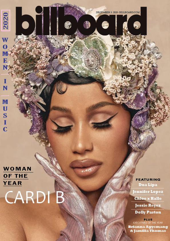
Cardi B: Photos of Billboard's Woman of the Year – Billboard
This is the original magazine cover

In order to learn how to use some of the features on InDesign, I picked a magazine cover and copied the technical forms and conventions used, in order to gain understanding on how they used these techniques. The top image is my attempt and the bottom one is the one I copied. From doing this, I have learned how to layout the cover lines in different ways like the “women in music” cover line.  I also learned how to use the different typeface and colours trying to find the same fonts and colours used in the original (as best as I could). All magazines have conventional features, in order to achieve a preferred viewing- a magazine has to look like a magazine! The feature we can see on this particular cover are: masthead, main cover line, main cover star, plug and cover lines.

Reflecting on my work, I believe I did well on the bottom right hand side cover lines, the proportions and layout look almost the same, I managed to find very similar fonts to the original. Also, the black and white colours and when words are capitalised or in lowercase have been copied accurately. One thing that I struggled with is the purple colours, I was unable to match the colour accurately to the original, I need to learn how to mix colours and make swatches. Moreover, next time I need to make sure the photo used is at a high resolution and not blurry as the main cover star in mine is a little blurry in comparison to the original, making it look less professional.

Having the skills to use and edit on InDesign will help me when I begin to make my music magazine as well as looking closer to the time this will help me design my tour poster for my hip-hop star. I can now successfully create a masthead, cover lines, place and size an image as well as using different typeface and graphological features- all vital skills to create a successful conventional magazine cover.

In order to help me improve I’ve linked 2 video tutorial which will teach me how to make and access more colours:

A Front Cover Analyses- attracting “that” audience

This is my analyses of a music magazine front cover, I explored how media language can be used to attract a target audience in order to achieve a “preferred reading“.

Firstly, I went on Music Week’s website in order to find it’s mission statement which is a concise explanation of what the purpose and the organisations overall intension is, it aids understanding of what vision they are trying to create. Then, I looked into who their target audience could be as you must know your audience in order to cater to their likes and interests (“preferred reading“)  in order for them to buy the magazine and make money- the main purpose in the media industry. You can segment your audience in many different ways to really tailor the magazine to suit them, I segmented the audience by demographic and their psychographic traits. By looking at the demographic I decoded that this magazine is quite gender neutral but this particular cover targets more female audience and the age seemed to target young adults/university students ages 18-25. For psychographics, it was apparent that this was a magazine aimed for individualists who don’t follow the mainstream music which is evident with the other artists featured in the cover lines.

Next, I decoded the design of the magazine (media language), interpreting why the media producer used that typeface, those colours, that image and that choice of language to communicate meaning. Analysing the magazine made me realise that, the type of font to the colour pallet are all significant. For example, we can see they chose the greyish simple colours to represent a contemporary feel with the pop of colour to stand out the name of the star “Olivia” mirroring her signature colour throughout her album.

Thinking forward, this activity has taught me how to analyse front covers in great detail and I now can understand the thought process of why they chose that particular image or why the picked that colour pallet. As a result, these skill will aid me for when I make my magazine cover and I now have the knowledge of what makes a conventional magazine cover, how to use media language to attract the target audience and finally how to overall achieve this “preferred reading” to cater to the desired audience needs and wants in order for success.

Conventional Design Features of a Magazine

This is my annotated music magazine where I highlighted all the technical and formal conventional features of a magazine front cover. A magazine needs to look like a magazine in order to reach customers expectations, they need to look the same whilst also looking different to stand out. In this magazine, I labeled the: masthead, main cover line, main cover star, cover lines, plug, pug and the features on the barcode. In this magazine, I noticed that 2 conventional features were missing which were insets and the captions to go with them.

The masthead is the biggest text and is the title which displays the name/brand of the magazine.

Then there is a main cover star which is the man featured in the center which is followed by a main cover line which establishes who the cover star is.

Then on the left hand side there are cover lines which typically say short but interesting statements of what’s to come in the magazine which is statically placed as the way magazines are laid out in shops usually only the left hand side is showing.

Then there is a pug which is in a circle shape to stand out from the rest of the text, a pug usually contains exciting news or promotions.

Finally, there is a barcode however usually it’s on the right hand side as it’s easier to scan in the shop. The barcode displays the price and issue date of a magazine.

From my research, I now can incorporate all the technical and formal conventional features when I do my music magazine to make sure I can successfully reach my audiences expectations. I have to make sure I use most of the features to create a conventional magazine cover whilst also making it look different so it stands out and attracts more people; which reaches the main purpose– to make money.