Completed Magazine Draft 3:
What’s new and what’s changed:
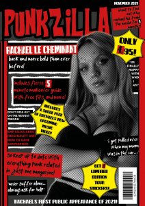
Front cover:
- I’ve changed some of the fonts I used on my front cover. I changed from a decorative font to a sans-serif typeface. I did this because I think it made it look more interesting. Otherwise, I think the decorative font is overused.
- I also made some of the cover lines bigger to fill more spaces on the front cover. My goal for my first page was to make it busy and vibrant. I wanted to make it stand out so people’s first impression of the magazine would be good, and it would make them want to buy it.
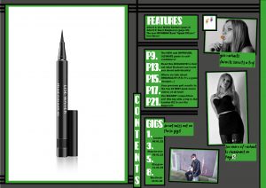
Contents Page:
- I changed the colour scheme from red to green. I did this so that the pages don’t all look the same. I also think that green is another punky colour.
- I changed the layout, I moved the pictures and text boxes around. I also added another picture of Archie, so that my contents page didn’t just showcase one star.
- Another thing I changed was the yellow plug. I think that getting rid of this made the front cover plugs stand out.
- I also changed the page numbers so that they go to more pages.
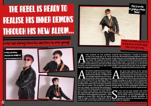
Double Page Spread:
- I added some drop caps to my article. This made the paragraphs stand out.
- By adding the drop caps it also made the writing bigger, so that it fits the designated area better.
- I changed the plugs to one single plug (on the single photo of Archie). I did this because I didn’t like the text on the second plug.
- I moved the text box from the middle of the 3 images to the left side so that I could make the photos bigger.
- I adjusted the font of the article text to a subtle, easy-to-read serif font.
Teachers Feedback:
The improvements I will make:
Front cover:
- I will add a pound currency to the price box.
Contents Page:
- I will get rid of the features box and make the page box bigger. So that it can still fit the same amount of information in it.
- I will change the gigs guide so that it’s spread out over a group of pages.
- I am going to increase the page numbers even more (to approximately 100 pages).
- I will add the rough cuts, that I used on my front cover, to the edges of some of the photos and texts.
- I want to move or add something to fill the space in the bottom right corner.
Double Page Spread:
- Similarly, I will also add rough cuts to more photos on the double-page spread (as long as it doesn’t look too much).
- I would like to change the second or third photo to a close-up. This is because I don’t have many close-up photos on this page.
- I am going to try and move my group of photos around so that I can move the accessories plug into the middle again. I will do this because I think it makes more sense.
- I need to change the photoshoot plug to something else. Something that describes who Archie is and why he’s famous.
- I am going to make the second, third, and fourth drop cap smaller so that the first paragraph stands out the most.
- Another way I will be able to make the first drop cap stand out will be to change the font. This way the article will include the same typeface that the title has.
- If I can, I will move the quote into the middle of the article. This will make it look like it’s part of the article, and not just a cover line.