Category: Music Magazine

Star Image – theirs and mine

Below I have made a prezi on a star that I thought is best suited for the Genre I am going to use when I create my magazine. I chose Beyonce because I think she best describes the ideal person for my magazine and target audience.

Richard Dyer (the media theorist) looks at the paradox of the star. Which is;

  • Extraordinary – the amazing talent the star has
  • Ordinary – How we as an audience would relate to them by common jobs such as driving and shopping.

We also look at the meta-narrative which should be complimentary and communicate the same star image or brand ideas. Could be constucted through;

  • Music covers
  • Album covers
  • Concerts
  • social media (twitter, Facebook ect)
  • Words and images in magazines

For more information please click on the link on the photo.

please click on photo to view

Above are my ideas of how I want my star to be portrayed. With hair I want it to display the modal as tidy and presentable. The makeup will be kept simple to portraybold and confident look for the star. The jewellery will also be kept limited due to the fact it isn’t necessary and I don’t want my star to be presented as if they show off their money. The outfit will be classy to display my star as respectable.

Communicating my Brand

Below is a pintrest board I made, and our task was to gather information and ideas we liked which linked well to our magazine and genre. This included different ideas such as; tour posters, magazines, fonts, graphic designs, and extra stuff I liked or thought would be good to use in/for my magazine.

I have learnt that all designers are constantly on the search for ideas they can appropriate and incorporate into their own work.

This acts as a go to place for me when I need inspiration or to develop my ideas more.

Click on picture to get link to see in full clearer detail

My Audience Profile

Above is a dating profile I created, and I used google slides to design a profile for my target audience which they might upload to a dating site. So above are the psychographics of someone who like R&B genre music.

I researched some of the main artists linked to my genre using https://today.yougov.com/. I found demographics from my genre which has helped me create my dating profile and also will help me find my target audience. I chose two big, well known artists; Beyoncé, and Rihanna and found their demographics as shown below.

So from my research I have found out the demographics are:

  • The gender is mostly equal although still more popular to women
  • The music is more popular to millennial with Generation X close

When producing my product this will help me encode my ideas, which hopefully my target audience will be able to decode and have a preferred reading of the text. These ideas include; competitions, quizzes, fashion advice to keep my audience interested and addressing the ideas of the uses of gratification theory by Blumler, and Katz.


Branding Ideas + Mission Statement

Name- Swing. I picked the name ‘swing’ due to the genre. My ideas came from ‘B’ being blues, as it has an easy vibe to it, as well as the ‘R’ being rhythm, and rhythm compliments the name ‘swing’.

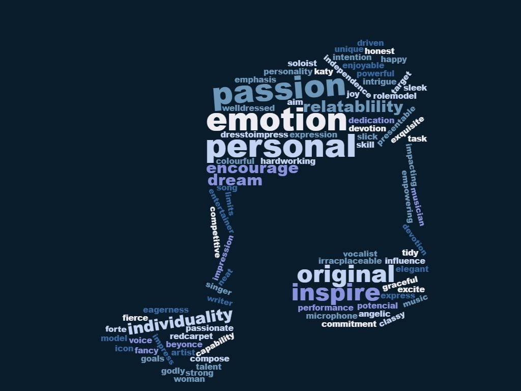
Genre- R&B/SOUL. I picked the genre ‘R&B’ as I thought it would be easier to present my model since I have some ideas. In my opinion some key words suited with ‘R&B’ is –

  • Personal
  • Emotional
  • Individuality
  • passion

and these words really stood out to me in the image I want to portray.

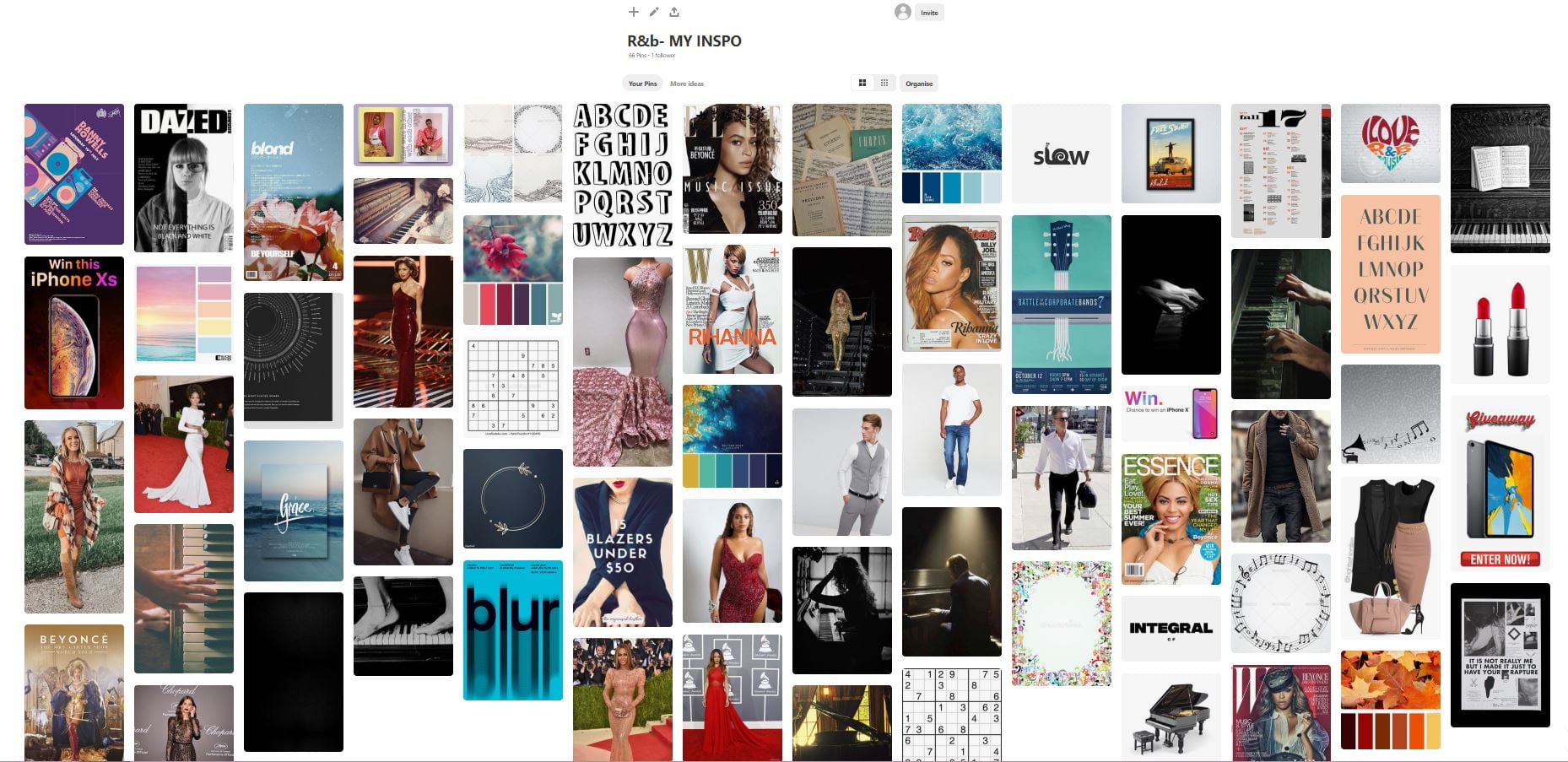
Below is a wordcloud I have created which expresses words I have come up with that link with the genre I have picked.

I will also include fashion and products that my target audience would like grabbing their attention more. Also having; quizzes, competitions, and even a Sudoku.

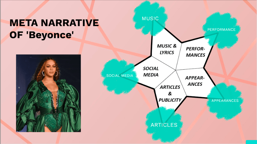
Swing portrays a perfect example of ‘R&B’. It not only inspires and encourages, but is personal, meaning it gives the artist individuality, and their originality is expressed through their passion, which we present. Swing encourages powerful role models to influence our audience to follow their dreams, as well as bringing them the latest news on their most loved. Swing brings you the latest and greatest news.


A Front Cover Analysed

Here I have textually analysed and deconstruct the magazine to find the target audience. As you can see just from a simple magazine cover so much can be seen and I will take this into account when creating my product. The messages that the magazine suggests to the audience is  that they are still young. It also gives the readers the feeling of power and masculinity.

Looking at this magazine and how they have used colour, language, text, and image is so vital to attract the audience, and this is something I will keep in my mind when designing my product. Knowing the target audience will help me involve feature which will appeal to the audience making my product more successful.

Audience Profiling

Above is a magazine where I have deconstructed the psychographic and demographics which is shown through the key above. Psychographic information might be your buyer’s habits, hobbies, spending habits and values. Demographics explain “who” your buyer is, while psychographics explain “why” they buy. Demographic information includes gender, age, income, marital status – the dry facts. These both help as it implies what your audience likes, and other things linked to it to make your audience the happiest, implying the greatest success rate as a producer.

They also help as a producer to target the audience, also audience segmentation is used to divide the audience up making it easy for the producer to sell their product. This will help with my product in the future as it means I am able to make my product more appealing and target the audience hoping to make my profit greater.

Conventional design features of a magazine

Below is a magazine I have deconstructed into technical conventions, and as you can see it has the typical magazine features which include;

  • Plug
  • Main cover stars
  • Main cover lines
  • Inset images
  • Barcode,price,date
  • Cover lines
  • Captions 
  • Masterhead

Although issues with this magazine that the producer should note is that; the masterhead isn’t big enough, as it’s the same size or smaller than the main cover lines, they have missed out the date by the barcode, and overall I think they have put too much writing on it, and with the important writing it doesn’t stand out to the audience.

This will help me decide how to present my product in a appealing way to the audience, while including Mise-En-Scene, also the technical conventions.