November 25

First Shoot Contact Sheet(s)

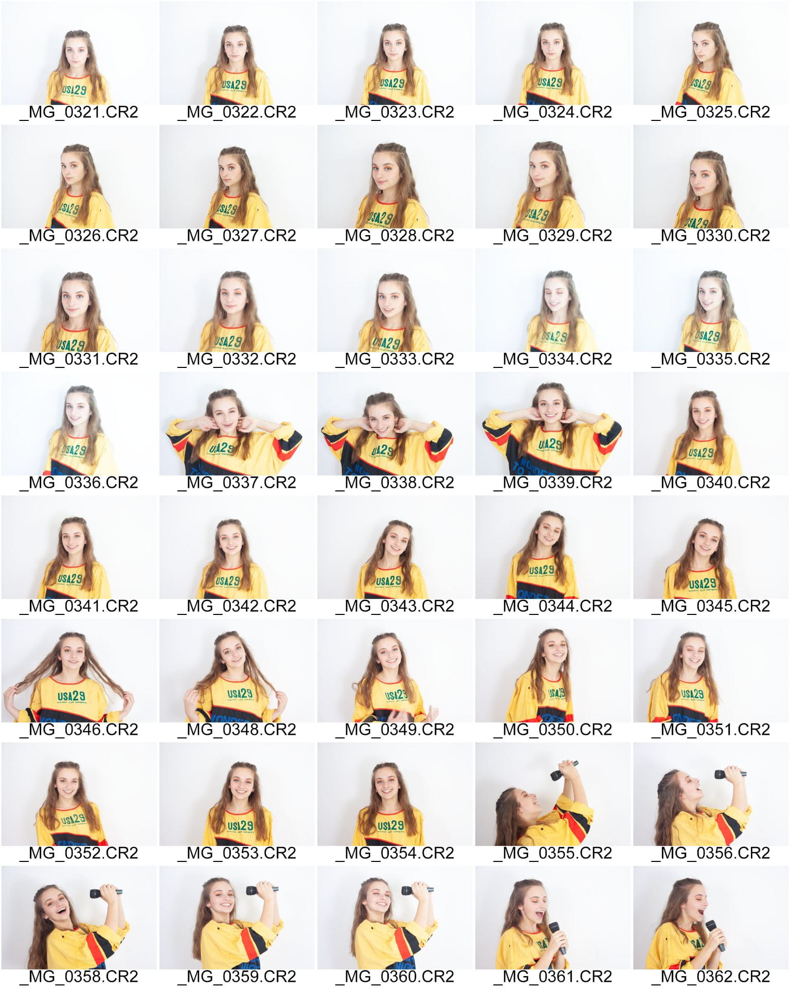
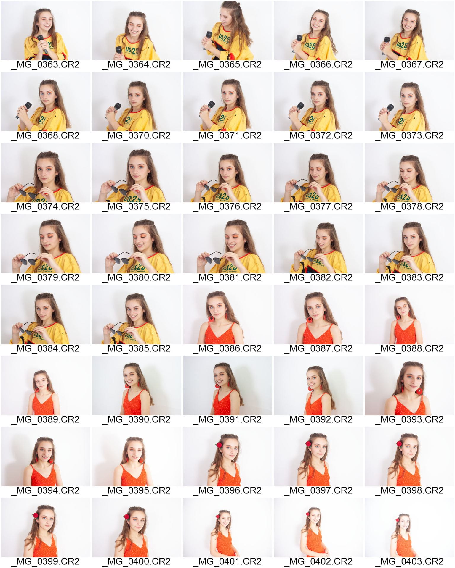
Here are the contact sheets from my first shoot for my music magazine.

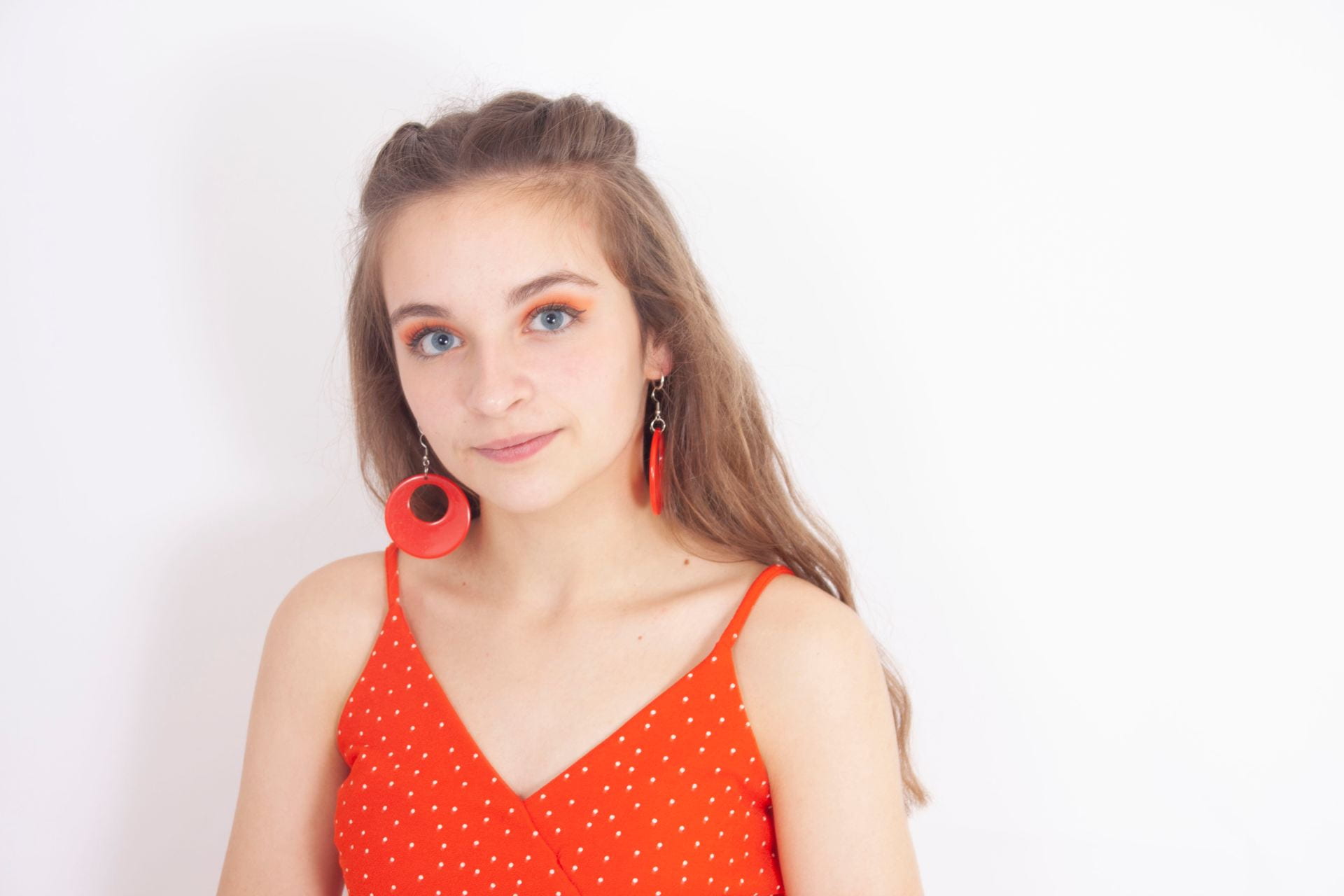
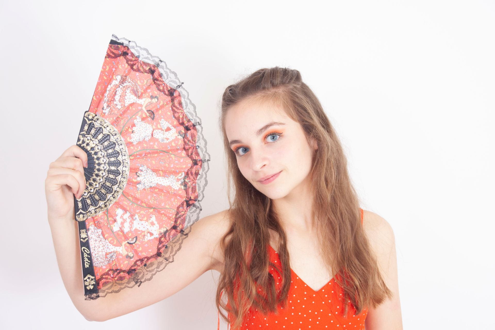
I think that my shoot went well, because there are some strong images that I could use.  I think that these images below are the best ones, and would work for the front cover of my magazine. Overall my shoot went really went, I am happy with the images that I got for my magazine and think that I can use them for my magazine. Out of my three favourite images, I think that the one without the fan will work best fro my front cover, however I think that the ones with the fan may work for the double page spread.


November 13

Production Meeting Agenda for 1st Photo Shoot

My overall aims for my first shoot are to photograph my model to represent the star. I gathered together all the parts of my costume for my star and also the props that I would be bringing in. Then I was ready to complete my shoot. Below is the production meeting agenda that I have filled out, it includes all the planing and details that I have decided upon for my shoot.

Please click to see the full document

I planned a few different outfits for my star to wear.

  1.  Firstly the orange dress which I would photograph her with the fan.
  2. Secondly the yellow jumper with a black skirt and bandanna.
  3. Thirdly the crop top with denim jacket and black skirt.


November 13

So what am I up against?

I began to look at other magazines that would act as competition to my magazine, Escucha. It gave me an idea of what sort of things I could include in my own magazine, and the way they attract their target audience. Whilst there are a limited number of Latino magazines, I looked at other magazines such as Pop Magazines that interview Latino stars and reference Latin music. I feel that with this gap and limited number of products, it allows my magazine to fill a hole where there are limited magazines in this genre. This could help my magazine to be successful as there are limited competition and a space in the market for it.

For my magazine to be successful it needs to fit into the conventional design in order for the audience not to reject it. However is also needs to be different to be unique, and eye catching so that it stands it against its competition. This presentation outlines what I am up against when making my magazine. And also the things that I have learnt and can include to make my magazine successful. For example the ways in which it can meet Blumler and Katz’ Uses and Gratification Theory.


November 8

Mast Head Designs

I began to experiment with mast head designs InDesign. I looked at different colour schemes and fonts that I could use to demonstrate the brand image. I decided that I liked the red or yellow colours the best as I think that they show the music genre the best and highlight the connotations of Latin music. I also think that the exclamation mark adds to the sharp Latin style of dancing and the strength within the Latin music. In these mastheads I tried to portray the Latin Vibe, and the connotations of the sun, the beach and the heat.

I personally like the top mast head and the masthead with the yellow U. I think that these are my best designs, as I think that they effectively show the genre.

November 7

Star Image – theirs and mine

Please click to see the full Prezi.

A star image is the way in which a star portrays themselves to the audience, this is created through many different ways such as the music they produce or their performances. The star can construct their image to the way that they want to portray themselves to their audience. Camilla Cabello is an example of what Richard Dyer would call the paradox of the star, in many ways she is ordinary with her charity work and the help she gives to others. On the other hand she is the extraordinary as she is unreachable and appears to have perfection.

I researched a cover star and their styling. I chose Camilla Cabello as any of her songs represent the Latino style that I will be basing my magazine around. I researched the aspects that form her meta narrative, and looked into her as a star. I learnt about the ways she constructs her star image, and the factors that affect it. I also learnt about the different methods that I can use when building my own star.

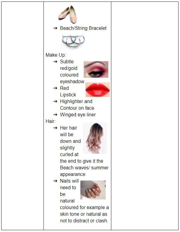
I then made this diagram to show how I want my star to look. I have showed the clothes, hair, make up and accessories that I think will portray the character that I want. I would like my star to be passionate, kind and caring. But also a bit rebellious. I have connotations of how I want the audience to perceive my star.

October 23

Communicating my Brand

I made a Pinterest mood board to give myself ideas for my music magazine. I looked at different layouts, font, colours and imagery that could inspire me when designing my own magazine. This research has helped me to understand and look at different ways that I could design my magazine and different styles that I could use.

Please click on the image to see the full board.

October 23

My Audience Profile

To understand more about my audience profile, I made a dating page for a member of my target audience. This helped me to really understand who my target audience was and how I could aim my magazine towards them and their personality traits, and things that they will have in common.

This has helped me to make my own magazine, as I now know the likes and dislikes of my audience. The reception Theory by Stuart Hall explores how when ideologies meet, meaning is made. This is due to the crossing over of the producers ideology (encodes) and the audiences ideology (decodes). I looked at:

  • Demographics: who they are
  • Psychographics: their personal ideologies
  • Situated Culture: how and where they could consume the text
  • Cultural competence: their previous cultural understanding and experiences

A preferred reading is when the audience responds to the ideas in the way the media producer wants them to. For the preferred reading I need to make sure I am encoding everything that they like so that the audience can decode it, this will then make my music magazine successful. Otherwise the text would be oppositional and would be rejected by the audience.

The  demographics of my target audience are that they are young, mainly women, and fans of Latin Music. They like to be busy and always doing something, they love going to festivals, dancing, and the beach. Their personal ideologies suggest that life is about having fun and enjoying yourself, nothing should hold you back. Their situated culture could vary depending on their age, but mainly online or in printed media.

October 22

Branding Ideas + Mission Statement

For my magazine I chose the music genre Latino. I chose this theme because it was very upbeat and I enjoy this music myself. I like the styles and moods surrounded with this genre, such as happiness and summer as well as the music.

My magazine is going to be called “Escucha”. This means listen in Spanish. I think that this is a suitable name for my magazine as it catches peoples attention, and is a command word telling that this is something that they must do. I think that it is unique and suits the Latino style well. I thought of many different names, but I think that this one is the best suited.

Here is some research that I did into my music genre and the connotations of it. These words are all related to or thought of with the music genre Latino.

For my magazine to satisfy Blumler and Katz’s Uses and Gratification Theory, it must include many other factors. Such as interviews for information, fashion for personal identity, fan forums for social interaction and tours for entertainment. This will help to make my music magazine successful as it will target the desires of the audience and therefore it will interest them.

My Mission Statement: 

“Escucha” is the top magazine for any Latino fans! We include exclusive interviews from your favourite and upcoming bands and artists! We give you the top Latino charts and more! Escucha will also support and grow your passion for Latino music. We allow our readers to express themselves and fall in love with Latino music.

October 2

A Front Cover Analysed

For this magazine I have completed a textual analysis of a front cover of one of their magazines. I have researched and discovered the demographics and psychographics of typical ‘mixmag’ readers. For example I have establishes that many are young, free spirited singles whop love to party and have fun, falling into the millennial category. Below is a spider diagram that I created demonstrating the target audience of ‘mixmag’ and many of their common factors.

The magazine conveys a simplistic and exciting atmosphere to the audience, the readers would be excited by the contents of the music magazine demonstrated on the front. The front cover is specifically designed to suit the target audience, for example the dark imagery conveys the darkness of inside a club or bar, where many of the audiences would often find themselves. The image is also of a man dressed quite smartly, but his shirt is undone highlighting the class of the readers as they are not the upper middle class. The baby pink colour used could be to attract the high number of women readers, as well as the imagery of the man with his shirt unbuttoned.

This has helped me to understand that I must carefully research my target audience before designing my music magazine. This will help me to make my magazine suitable for my audience and demonstrate to them why they should buy the magazine. I can do this by getting to know my client base, which will then help me to understand what they would look for in a magazine. This will make mine successful as it will suit the target audience and would therefore cause more sales. From my previous work, I know that I will also need to think about Mise-En -Scene for the photographs that I will take for my magazine, as this will affect the front cover for the target audience.

October 1

Audience Profiling

I researched the magazine MOJO and their target audience, as preparation for my magazine. I have deconstructed the psychographics and the demographics:

PSYCHO-GRAPHICS: the classification of people according to their attitudes, aspirations, and other psychological criteria (their likes and dislikes)

DEMOGRAPHICS: statistical data relating to the population and particular groups within it, that cannot be changed such as gender, age

These both help the magazine to be successful, as it helps to demonstrate what the readers like and dislike, and therefore what would be good content to include in the magazine to meet Blumer and Katz uses and gratifications for media (entertainment, information, social interaction and personal identity).

It helped me to understand that the magazine is specifically target to the audience it is directed it, through its use of many things such as imagery, colours, designs and articles. In MOJO it has been targeted to suit its audience through the use of:

  • MASTHEAD: The masthead is large, but not the main focus of the magazine, this is the imagery of the arctic monkeys.
  • NAME: the word MOJO means influence or magic
  • COLOURS: the page is mostly black and white, with pops or red and yellow
  • DESIGN: the design is simplistic but stands out
  • ARTICLES: this issues contains articles on the Arctic Monkeys and many other rock artists
  • IMAGES: the image is of a popular rock band called the Arctic Monkeys which is the main focus of the cover.