December 12

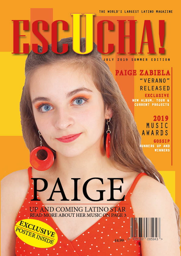
Second Shoot Contact Sheets

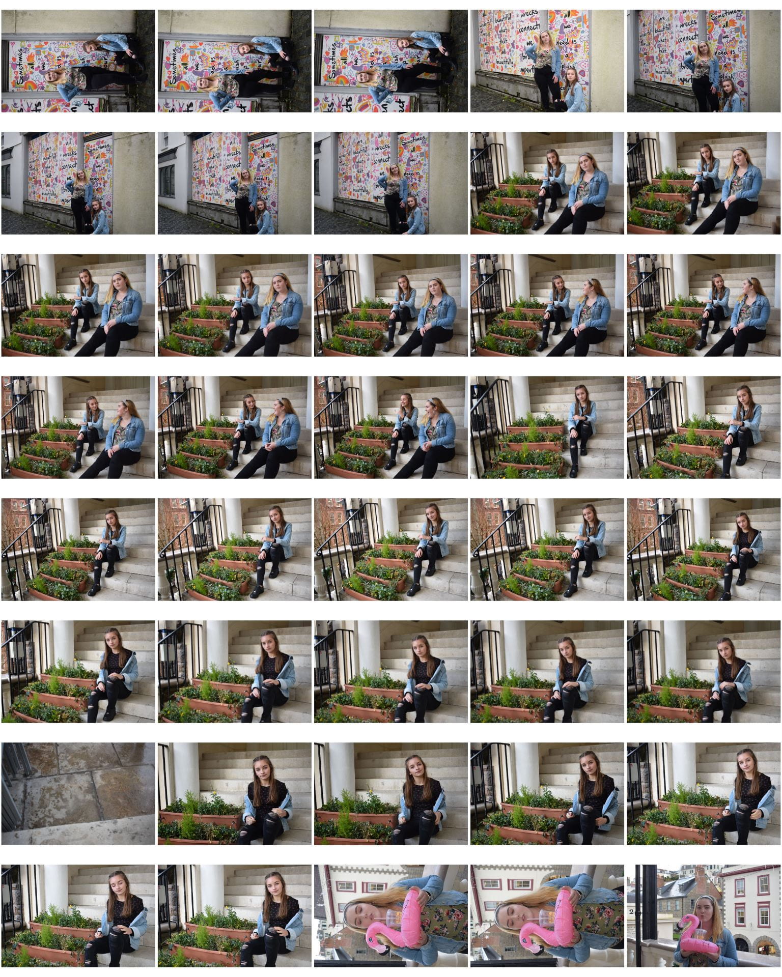
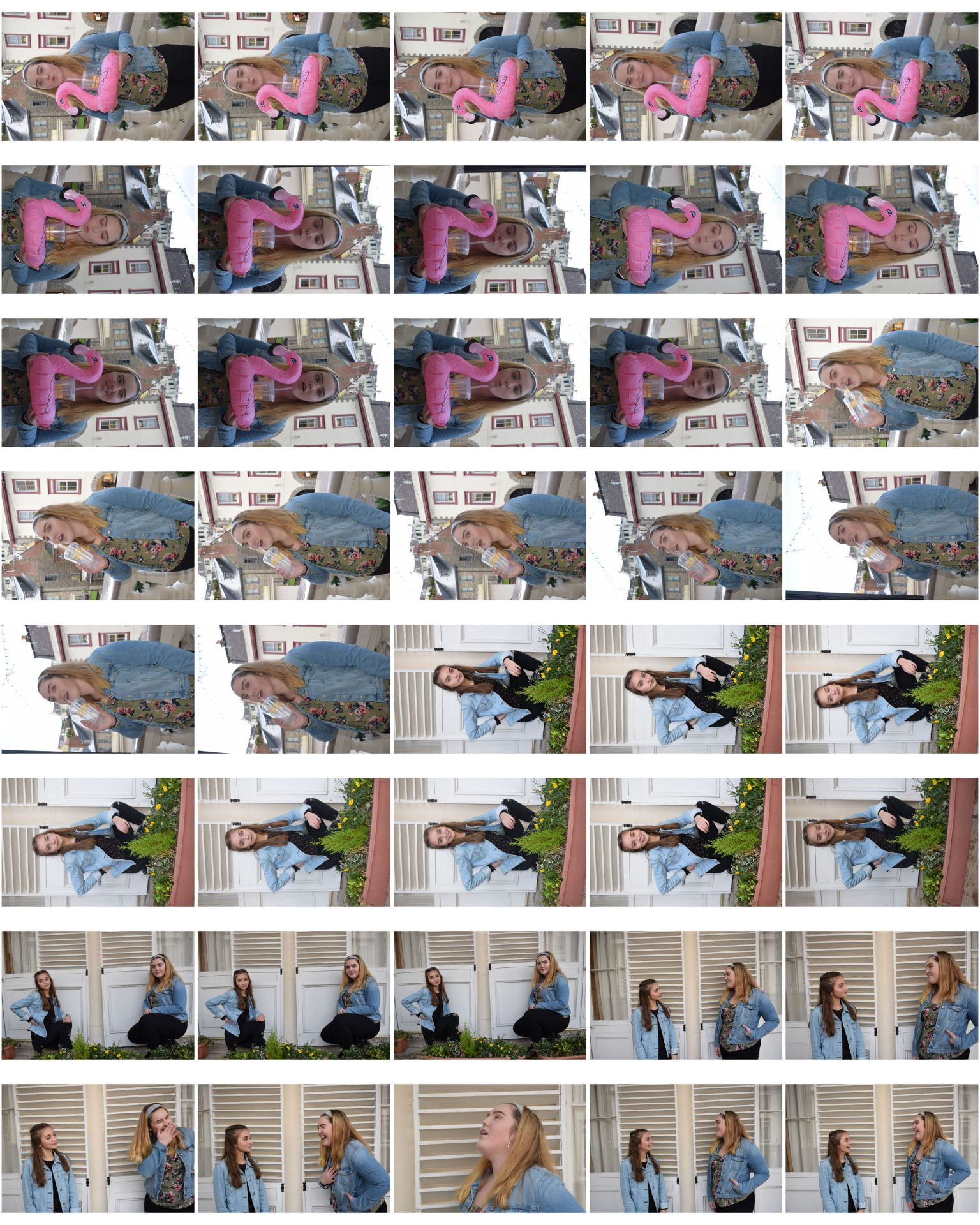
Here are the contact sheets from my Location Shoot in Town. I think that this shoot went well and that I got some good photos for me to use in my mgazine. I think that these images below were the most successful, as they show my genre of music and are creative.

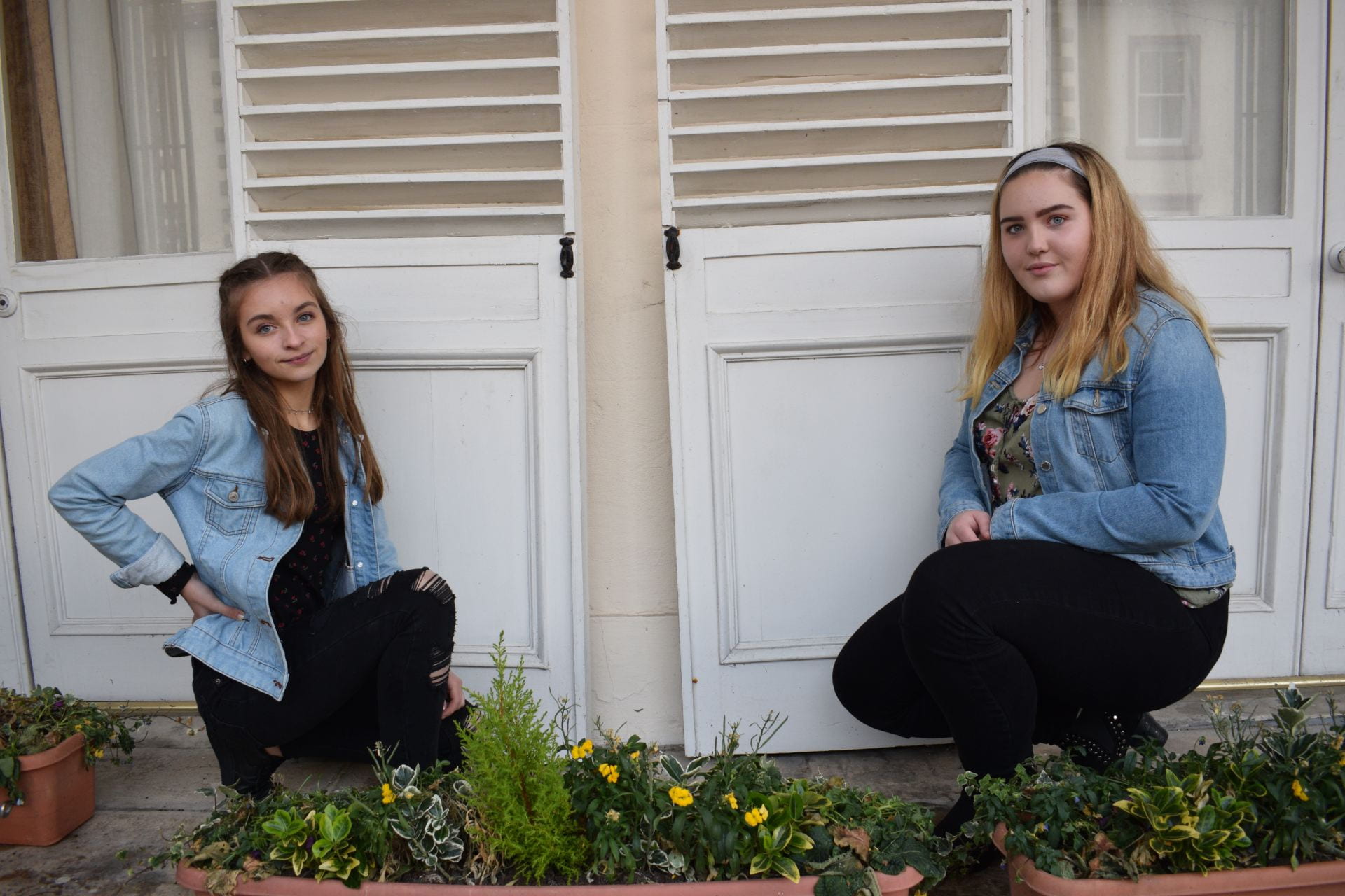
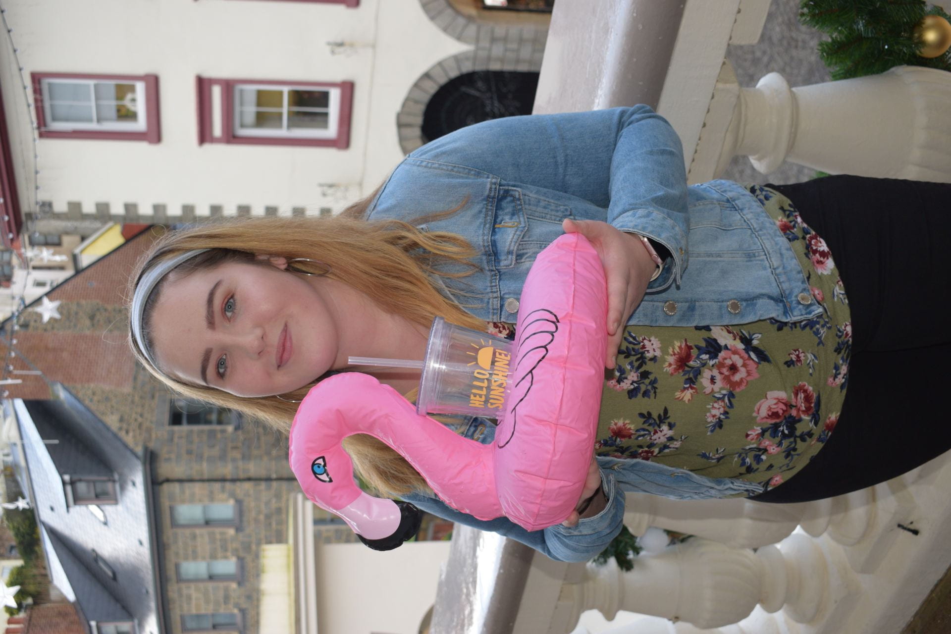
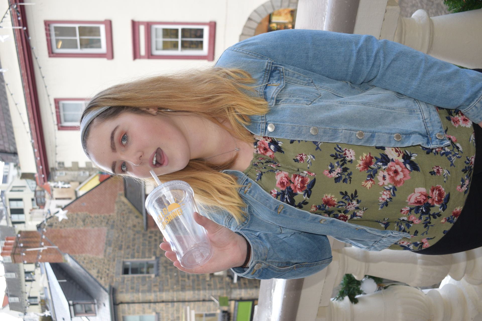
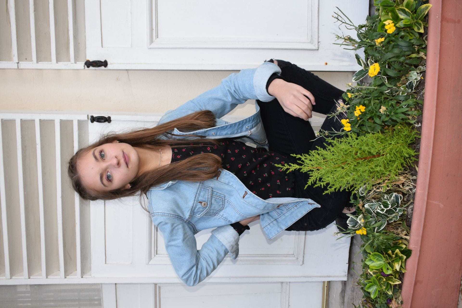
I think that my images met my production agenda as they suit my genre of music. I also used the outfits that I planned for and the props as well. Overall, for me the day was very successful. I used 2 different locations for my shoot, firstly I went to Mill Street to use the graffiti walls. I liked this part of the shoot, however it was difficult because of the rain. We then went to the balcony, where there were many shutters, steps and plants. This was also successful as it suited my genre and worked well as a background. The main problem that I found was the weather. This was because the rain interfered with the focus on my camera, it was also hard for my models as they were getting wet. Even with these problems, I think that I still managed to get some good shots that I can use for my magazine, and I am happy with how it went.

December 10

Draft Feature Article

I read through my draft for my article, by doing this I found many things that I needed to change:

  • spelling and punctuation errors
  • repetition of words
  • parts where it did not flow properly

To improve my article, I think that I need to add the following:

  • I need to add more drama into my article to make it more interesting and to hook the audience.
  • explain how I interviewed her and where to set the scene
  • Add more sentence structures
  • Be careful with tenses
  • Add more technical music detail
December 2

Language Analysis

To help me further understand the contents of  a double page spread, I looked at an article so that I could see the layout, language, and other features that it includes. I chose to look at an article from the September 2017 edition and it is entitled The Rapper and musicians rule’s for life. This article is a top ten tips for life, and it is about the artist that they have interviewed. In this article there is no presence of journalism, this helps the audience to feel that they are speaking directly to the band, and it is not being reported. They feel as though they are listening to the words of the artist directly.  This makes them feel that they are not out of reach and are contactable. It is written 1st person, this makes it more direct and gives the audience more contact with the artist. It also makes it appear to be more reliable and true. In the article there is no clear introduction or conclusion, it is very simple, demonstrating how following his ten tips for life would also make your life simple.

In this article, the star has used very personal, common and informal language. This helps the reader to feel that they are on a level with the star. This gives them the feeling that they are on a pile with each other and that they are not below them. This is important to the audience as it makes them feel that they can associate and are similar to the artist themselves. The tone of the genre is informal, and chatty, this gives the idea of you having a normal conversation with the artist, and they are not out of reach. They have also used quotes for example parts of general conversations that he has had with his team. This makes it seem more personal, and that the reader is getting an insight into their life. After reading this article, the reader feels that they know the artist on a more personal level. It is structured into 10 paragraphs to answer the questions. This makes it easy to read and understand fro the audience.

In this article, the star is represented as approachable, down to earth, and on the same level as everyone else. This makes the audience feel as tough they can relate to the star, and gives them a sense of connection.


November 29

A New Improved Front Page

Here is the second draft that I made of my magazine. I have improved many aspects from my previous draft:

  • The biggest change that I made was adding a background behind the image of my model. I made this background on photoshop, I think that it is effective because it adds much more to the magazine and makes it stand out a lot more. I also think that it gives more energy to the front cover and makes it more exciting.
  • I also used photoshop to darken the lips of my model and make them more red. I did this because I think that it helps to draw the red of the earrings and also the masthead and text, it broadens the colour scheme, and makes it more interesting.
  • I changed the fonts and layout of my captions. I think that this works better as there is no sans serif making it easier to read and also it stands out more with the change of colours.
  • Another change that I made was to the pug, as I did not like where it was situated. I moved it to the opposite side, and also changed the text inside of it as I thought that this was more gripping.

I think the changes that I made were beneficial to my front page, and have made it much more exciting. It also is more reflective of the genre with the bright colours. I think that there are still things that I could improve on such as the positioning of text (for example the plug). However, I think that this draft has gone well, and that the changes that I have made are beneficial.

I think that there are still some changes that I can make to my magazine. I think that are some small changes that I can make which will impact the look of my magazine as a whole for example the colours and positioning of parts of my magazine for example the plug.

November 25

Draft of Front Page

This is the first draft of my magazine cover. So far I am happy with how my magazine is going.

I think that these factors all work well:

  • The masthead- it stands out and is interesting
  • The colour scheme- is eye catching and suits the theme
  • The imagery- is suitable for the genre and different

I think that there are some areas that I need to improve on to make my magazine even better such as:

  • A background- as currently my magazine is too plain.
  • Texts- don’t use too many different texts and ensure they can all be read clearly.
  • The pug- is not situated in a suitable place and is too large

A peer assessment stated that I should think more about:

  • adding more colour to make it more interesting
  • think about using a background
  • change some of the fonts so they are easier to read
  • lower the date and edition as it is too close to the masthead
  • add more small bits of information to engage with the reader so that they want to buy it

I think that my masthead works well as it stands out and is interesting. I also like the colour scheme that I have used. To improve my front cover, I think that I need to make a background to improve it and make is stand out even more.


November 25

First Shoot Contact Sheet(s)

Here are the contact sheets from my first shoot for my music magazine.

I think that my shoot went well, because there are some strong images that I could use.  I think that these images below are the best ones, and would work for the front cover of my magazine. Overall my shoot went really went, I am happy with the images that I got for my magazine and think that I can use them for my magazine. Out of my three favourite images, I think that the one without the fan will work best fro my front cover, however I think that the ones with the fan may work for the double page spread.


November 15

So… I am ready to photograph my star.

I have learned many things about camera and mise-en-scene that will help me when photographing my star.

  1. COSTUME: I have chosen a floral dress as the Latino style is very summery so this will help to convey my genre.
  2. LIGHTING: I am going to light my star from both sides so that the image is bright, this is important otherwise it would not be seen clearly.
  3. ACTING: I can use acting to also change the atmosphere, I can make her appear happy as this is what this music style conveys.
  4. MAKE-UP: I have planned to use red/gold eye shadow and red lipstick as this will also go with the genre.
  5. PROPS: I chose to use a rose and a fan as I think that they are interesting and suit the genre.
  6. SETTING: I have chosen to take my photos in the white studios as I can them change the background using Photoshop easily.

I can use the camera also in many different ways such as the angle that I position myself to take the photo. I could use low or high vantage points for different effects. I can also change the settings for example I could change the ISO to make it brighter or darker. When using my camera I can change these aspects to change the appearance of my photograph:

  1. ISO
  2. Aperture
  3. Shutter Speed
  4. Focus
  5. Vantage Point
  6. Shot Type
  7. Distance
  8. Framing
  9. Angle

By adjusting and changing all of these factors, I can correctly show the brand values, mission statement and narrative of my music magazine “Escucha!” What I learnt about the paradox of the star, from Richard Dyers Theory, will also help me to convey my star in the right way. This theory highlights how are star presents them self for example as ordinary but also extraordinary. I will also think about the demographics and psychographics of my target audience when taking my imagery, as this will help me capture their attention. Finally I can use my knowledge on star image and audience reading on a text in my magazine.

November 13

Production Meeting Agenda for 1st Photo Shoot

My overall aims for my first shoot are to photograph my model to represent the star. I gathered together all the parts of my costume for my star and also the props that I would be bringing in. Then I was ready to complete my shoot. Below is the production meeting agenda that I have filled out, it includes all the planing and details that I have decided upon for my shoot.

Please click to see the full document

I planned a few different outfits for my star to wear.

  1.  Firstly the orange dress which I would photograph her with the fan.
  2. Secondly the yellow jumper with a black skirt and bandanna.
  3. Thirdly the crop top with denim jacket and black skirt.