November 13

So what am I up against?

I began to look at other magazines that would act as competition to my magazine, Escucha. It gave me an idea of what sort of things I could include in my own magazine, and the way they attract their target audience. Whilst there are a limited number of Latino magazines, I looked at other magazines such as Pop Magazines that interview Latino stars and reference Latin music. I feel that with this gap and limited number of products, it allows my magazine to fill a hole where there are limited magazines in this genre. This could help my magazine to be successful as there are limited competition and a space in the market for it.

For my magazine to be successful it needs to fit into the conventional design in order for the audience not to reject it. However is also needs to be different to be unique, and eye catching so that it stands it against its competition. This presentation outlines what I am up against when making my magazine. And also the things that I have learnt and can include to make my magazine successful. For example the ways in which it can meet Blumler and Katz’ Uses and Gratification Theory.

 

November 8

Mast Head Designs

I began to experiment with mast head designs InDesign. I looked at different colour schemes and fonts that I could use to demonstrate the brand image. I decided that I liked the red or yellow colours the best as I think that they show the music genre the best and highlight the connotations of Latin music. I also think that the exclamation mark adds to the sharp Latin style of dancing and the strength within the Latin music. In these mastheads I tried to portray the Latin Vibe, and the connotations of the sun, the beach and the heat.

I personally like the top mast head and the masthead with the yellow U. I think that these are my best designs, as I think that they effectively show the genre.

November 7

Star Image – theirs and mine

Please click to see the full Prezi.

A star image is the way in which a star portrays themselves to the audience, this is created through many different ways such as the music they produce or their performances. The star can construct their image to the way that they want to portray themselves to their audience. Camilla Cabello is an example of what Richard Dyer would call the paradox of the star, in many ways she is ordinary with her charity work and the help she gives to others. On the other hand she is the extraordinary as she is unreachable and appears to have perfection.

I researched a cover star and their styling. I chose Camilla Cabello as any of her songs represent the Latino style that I will be basing my magazine around. I researched the aspects that form her meta narrative, and looked into her as a star. I learnt about the ways she constructs her star image, and the factors that affect it. I also learnt about the different methods that I can use when building my own star.

I then made this diagram to show how I want my star to look. I have showed the clothes, hair, make up and accessories that I think will portray the character that I want. I would like my star to be passionate, kind and caring. But also a bit rebellious. I have connotations of how I want the audience to perceive my star.

October 23

Communicating my Brand

I made a Pinterest mood board to give myself ideas for my music magazine. I looked at different layouts, font, colours and imagery that could inspire me when designing my own magazine. This research has helped me to understand and look at different ways that I could design my magazine and different styles that I could use.

Please click on the image to see the full board.

October 23

My Audience Profile

To understand more about my audience profile, I made a dating page for a member of my target audience. This helped me to really understand who my target audience was and how I could aim my magazine towards them and their personality traits, and things that they will have in common.

This has helped me to make my own magazine, as I now know the likes and dislikes of my audience. The reception Theory by Stuart Hall explores how when ideologies meet, meaning is made. This is due to the crossing over of the producers ideology (encodes) and the audiences ideology (decodes). I looked at:

  • Demographics: who they are
  • Psychographics: their personal ideologies
  • Situated Culture: how and where they could consume the text
  • Cultural competence: their previous cultural understanding and experiences

A preferred reading is when the audience responds to the ideas in the way the media producer wants them to. For the preferred reading I need to make sure I am encoding everything that they like so that the audience can decode it, this will then make my music magazine successful. Otherwise the text would be oppositional and would be rejected by the audience.

The  demographics of my target audience are that they are young, mainly women, and fans of Latin Music. They like to be busy and always doing something, they love going to festivals, dancing, and the beach. Their personal ideologies suggest that life is about having fun and enjoying yourself, nothing should hold you back. Their situated culture could vary depending on their age, but mainly online or in printed media.

October 22

Branding Ideas + Mission Statement

For my magazine I chose the music genre Latino. I chose this theme because it was very upbeat and I enjoy this music myself. I like the styles and moods surrounded with this genre, such as happiness and summer as well as the music.

My magazine is going to be called “Escucha”. This means listen in Spanish. I think that this is a suitable name for my magazine as it catches peoples attention, and is a command word telling that this is something that they must do. I think that it is unique and suits the Latino style well. I thought of many different names, but I think that this one is the best suited.

Here is some research that I did into my music genre and the connotations of it. These words are all related to or thought of with the music genre Latino.

For my magazine to satisfy Blumler and Katz’s Uses and Gratification Theory, it must include many other factors. Such as interviews for information, fashion for personal identity, fan forums for social interaction and tours for entertainment. This will help to make my music magazine successful as it will target the desires of the audience and therefore it will interest them.

My Mission Statement: 

“Escucha” is the top magazine for any Latino fans! We include exclusive interviews from your favourite and upcoming bands and artists! We give you the top Latino charts and more! Escucha will also support and grow your passion for Latino music. We allow our readers to express themselves and fall in love with Latino music.

October 17

So… I’m ready to make some media!

I know understand the process of making a magazine front cover and the softwares used. I feel confident using InDesign and Photoshop and think that I can effectively use these platforms to make my own magazine. I have learnt a lot about what goes into a magazine and the way that they are produced. So when I make my magazine I will need to consider the following:

  • the colour scheme that I use as this must fit the genre to convey the right message.
  • typography as the font must suit the genre but be legible.
  • AIDA (attract, interest, desire and action) as I need to make the front cover capturing for the audience, as this will make them want to purchase it.
  • the camera techniques that I will need to use when taking photos for my magazine, as they must suit the genre and convey the right message.
  • the imagery that I will take must fit the genre and the editing skills and techniques that I will then use.
  • Mise-en-scene in the photographs that I will take, as this will play a very important role in the front cover for the target audience.
  • I need to know who my target audience is and what will attract them to be able to target my design towards them.
  • the layout of my magazine and what will be effective for the audience and what will stand out.
  • I must also consider Blumler and Katz Theory as these factors will help to make my magazine successful.

By considering all of these factors, it will help to make my magazine successful! This is because it will suit the target audience and address what they would be looking for in the magazine. I can then use the information that I decide and plan to aim my magazine at them. I can do this with the skills that I have learnt in InDesign and Photoshop to make my magazine suitable!

October 9

My Tour Poster

To help my research, I began to research Rap Tour Posters. I now know that to make my poster successful I must consider the following elements of AIDA:

  • Attention
  • Interest
  • Desire
  • Action

Addressing these will help to make my tour poster successful and suit the target audience. It also must be unique so that it stands out, while fitting in the conventional style.

I have learnt that Rap Tour Posters often:

  • have a Black Background
  • contain imagery of the star
  • imagery often in black and white
  • have bold text
  • contain splashes of colour (often red, blue or yellow)
  • have a simple layout

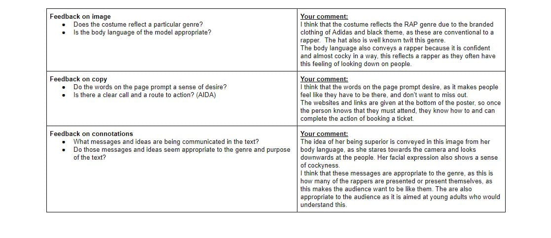
After knowing these conventions, I began to deign my own poster. I chose to use a black and white theme, I then used red and yellow colours for the titles and information, against the black, this stands out, and makes it very eye catching. It also shows the information clearly to the viewer, this would encourage them to be interested in the event. It meets the comnventional designs of a rap tour poster with the black and white theme, and colour added. It also contains imagery of the cover star, and bold text, which all suits the theme. However I think that my poster is unique due to the layout I used and the fonts. I used a simple layout, as majority of the posters do, but used different angles to make it slightly more interesting.

My poster also addresses AIDA as it draws attention due to the bright colours and large imagery. It generates interest due to the lack of information about what the tour is, this makes people interested as they want to know more about the tour. It creates desire, as the audience want to be like the cover star and also not miss out on the event. Finally, it has information at the bottom for the stars website and where they can buy tickets, this makes it easy for the audience to take action on what they are seeing.

I think that the colour scheme and imagery both work well together, however I think that the white outline around the star really distracts from the poster, and to improve I could get rid of this line.

Here is my self assessment sheet for my poster:

Please click on the link to see the full attachment


October 8

My Magazine Front Page Swede


My copy… Please click on the link to see the PDF

Real magazine cover


To help me learn to understand InDesign, I tried to make a replica of the front cover of a professional magazine. I chose the NME edition with the cover star Joe Strummer. I found the image that was used on the actual front cover on Google, and then uploaded it into InDesign. I could now begin to insert text into the style of the professional cover.

In my design I think that this went successfully:

  1. I think that most of the fonts that I used replicate the ones in the original
  2. I think that I have placed and correctly laid out the parts of my magazine.
  3. I think that the Pug that I inserted looks like the original, and I have included lots of detail.

To improve my magazine cover I could

  1. Edited the original photo that I used, and reduce the contrast between black and white, as this would make it look more like the professional cover.
  2. Used a different font on “REMEMBERED” as it is too thick and does not look like the font used on the professional cover.
  3. Used a lighter shade of red as mine is slightly too dark in comparison.

In this activity I have learnt the Basics of InDesign, and also have learnt the length of time and detail that is put into making a magazine. Also this will help me with making my own magazine cover, as I now know the basics and how yo use InDesign.

YouTube Tutorial Links:

These links will help me in the future with areas that I struggled with:

October 2

A Front Cover Analysed

For this magazine I have completed a textual analysis of a front cover of one of their magazines. I have researched and discovered the demographics and psychographics of typical ‘mixmag’ readers. For example I have establishes that many are young, free spirited singles whop love to party and have fun, falling into the millennial category. Below is a spider diagram that I created demonstrating the target audience of ‘mixmag’ and many of their common factors.

The magazine conveys a simplistic and exciting atmosphere to the audience, the readers would be excited by the contents of the music magazine demonstrated on the front. The front cover is specifically designed to suit the target audience, for example the dark imagery conveys the darkness of inside a club or bar, where many of the audiences would often find themselves. The image is also of a man dressed quite smartly, but his shirt is undone highlighting the class of the readers as they are not the upper middle class. The baby pink colour used could be to attract the high number of women readers, as well as the imagery of the man with his shirt unbuttoned.

This has helped me to understand that I must carefully research my target audience before designing my music magazine. This will help me to make my magazine suitable for my audience and demonstrate to them why they should buy the magazine. I can do this by getting to know my client base, which will then help me to understand what they would look for in a magazine. This will make mine successful as it will suit the target audience and would therefore cause more sales. From my previous work, I know that I will also need to think about Mise-En -Scene for the photographs that I will take for my magazine, as this will affect the front cover for the target audience.