So what am I up against- The competition


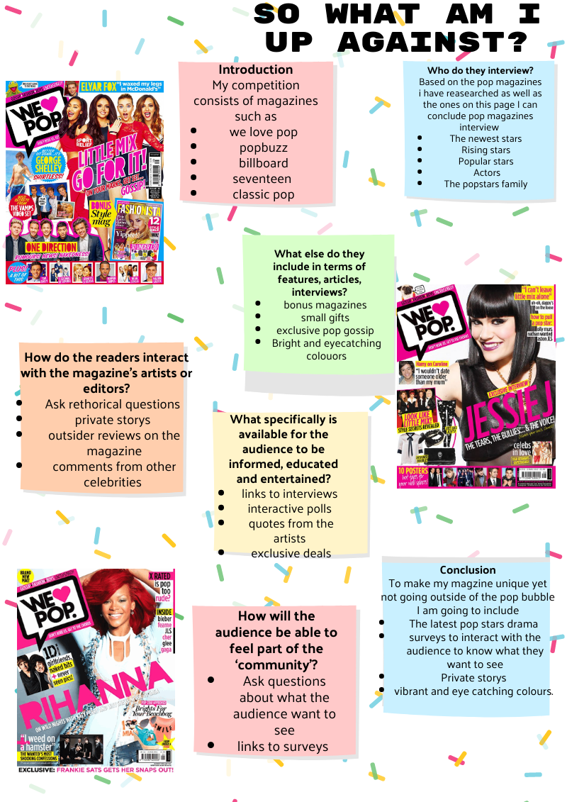
As a media creator I now know that in order to create a succesful magazine I need to include several things such as:

  • How to include the audience
  • How to keep the audience entertained
  • How the audience can interact
  • Succesful articles, terms and exclusive inetrviews

Apon reflection and now knowing what I am up against I can now include the same and more as them to get a bigger audience, in my magazine I am going to include links to surveys to encourage social interaction, personal stories from pop artsists, vibrant and eye catching colours, what is part of the artists personal identity (what they like doing in their spare time or private storys, information and recomendations) these are all my USP.

These will all help my magazine stand out and become a leader in the pop magazine leauge. The AIDA meets my target audience of teenage girls feel included and close to their favourite stars.By adding links and interactive activities to my magazine it will add more to my music magazine as well as it being different and more unique to other music magazines. This will also help the audience engage more with my magazine. I will also be linking all my models social media below the images or inside the magazine.

Branding Ideas, Marketing Strategy & Mission Statement

The name of my magazine is

§

some words that helped me come up with this name aswell as words that I associate with pop I have put into a word cloud below. There also words that I will include in my music magazine such as ‘inclusive interviews’ ‘cover page’.  Our brands unique selling point is inclusive interviews and gossip from your favourite pop stars. As well as including social interaction, personal identity persific information.


Mission statement:

As you read Snap Pop magazine you will be given all the latest and inclusive interviews with your favourite pop stars, as well as a passenger seat ride into the pop industry as we take you on a journey backstage with your favourite stars. We want you to feel like you are at a sleepover with your fav pop stars as we tell you all the latest gossip, relationship drama and pop music rising up the charts. So buckle your seatbelt and enjoy the ride!


My Tour Poster

Here are some inspiration pop tour posters I found and took ideaas from.

Here is the poster I created using indesign. For my poster I was assigned the task of creating a tour poster for a pop artist. I chose this image over the ohter ones I had taken because I feel it has the best angles and lighting. This was an image that when I put it into photoshop to cut the main cover star out as the background of the image was the same as the pop stars shirt it was difficult to get the cut out correct.

Please click on the image to see the PDF

please click on image to view PDF

By gaining this knowlege and understanding I can now use all of this information to create a succesful tour poster for a succesful artist. This is going to help me as I can now use this knowlege to reflect it onto my own magazine cover. I am going to use the same genre in my music magazine as I was assigned for this tour poster. I like my fonts and my images a i took indpiration from one of my favourite artists tour poster. The colours are very warm and nuteral colours compared to pop colours that are normally more vibrant and bold.

The layout of the tour poster is a classic mastehead top and centre image in the middle and the tour dates and where to get tickets on the bottom.

2 things I like about my poster is:

  • The way the model is positioned
  • The colour pallete

2 things i could imporve about my poster is:

  • making the main cover star bigger
  • making the link for the tickets bigger and easier to read


Inspiration for my tour poster

Pop Tour posters for inspiration

By doing my research I found that pop tour posters manily contain the following conventions:

  • The main cover star on the front
  • Title of the tour as the masthead
  • Tour dates
  • Either dark or bright colours

By noe knowing this imformation I know to craete an attractive, eye catching and succesful tour poster I need to use the bullet points above.


My Magazine Front Page Swede

please click on the image to see the PDF

This exercise was very  benneficial for me in experimenting  how indesign works this will help me when it comes to creating my own music magazine.

The layout of this magzazine looks simple however once I placed the image and resized it to the rihgt size, it was challenging to get the positioning right and still keep the main cover star proportinal. Therefore the best positioning of the cover star I could do while keeping  her proportional is shown above. This is why the porportions of my mian cover star are a bit off.

It was also hard to get the colour fill part in the iner part of the letters the colours they should be as the colour selection on indesign is hard to get the exact colour desired. To do this I had to draw a circle a little bit bigger then the inner hole in the text, then I had to align it with the gap it its in. I then sent it to the back so the text aligned perfectly with the colurs. There is a youtube video below to show how you to send images or text to the back.


Fonts and typefaces

Upon reflection I can now see I should’ve lowered the Billboard masthead and made the text bigger so the masthead stands out more. A nother issue I had with the masthead is indesign didn’t have the exact text for the masthead. I also didnt have the rihgt text for any part of my magazine so i spent a lot of time changing the fonts stoke and weight. Also I added more bevel and emboss to the name of the star, this is so we can see her name clearer instead of before I bevel and emboosesd the name when you couldnt see the ‘B’ as the image isnt proportinal so it was fading into the background.


My magazine inspiration

Made with Padlet


While researching pop magazines to improve my idea of what a pop magazine looks like I found a common occurence of bright bold colours especially the colour pink.

I also reasearched some common hair styles and make-up looks for my magzine, I found most make-up looks are natual face and an eye catching bold eye shadow look.

I added some key words I found associated with pop magazines such as ‘eye catching’ ‘bright vibrant colours’

This has broadened my knowlege on pop magazines and also what I need to include in my magazine.