Here are some inspiration pop tour posters I found and took ideaas from.
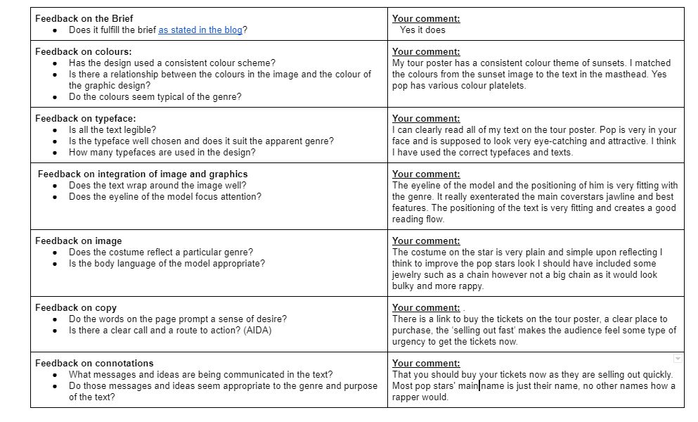
Here is the poster I created using indesign. For my poster I was assigned the task of creating a tour poster for a pop artist. I chose this image over the ohter ones I had taken because I feel it has the best angles and lighting. This was an image that when I put it into photoshop to cut the main cover star out as the background of the image was the same as the pop stars shirt it was difficult to get the cut out correct.

Please click on the image to see the PDF
please click on image to view PDF
By gaining this knowlege and understanding I can now use all of this information to create a succesful tour poster for a succesful artist. This is going to help me as I can now use this knowlege to reflect it onto my own magazine cover. I am going to use the same genre in my music magazine as I was assigned for this tour poster. I like my fonts and my images a i took indpiration from one of my favourite artists tour poster. The colours are very warm and nuteral colours compared to pop colours that are normally more vibrant and bold.
The layout of the tour poster is a classic mastehead top and centre image in the middle and the tour dates and where to get tickets on the bottom.
2 things I like about my poster is:
- The way the model is positioned
- The colour pallete
2 things i could imporve about my poster is:
- making the main cover star bigger
- making the link for the tickets bigger and easier to read