Chosen Adverts

The company that owns the music magazine will only accept the adverts that fit into their grene of music or that suits their target audience. For example a rap magazine wont have an advert about ballet slippers.

Milka Advertisement on Behance

I chose this Milka advert as it suits my target audience and also ties in with nmy colour scheme I like the creativity of the gradineted background and also how simple it is with the colours and logos. This company will be interested in being in my magazine as it is a very wide target audience brand and by being in my magazine will bring in more poeple they want to buy their product.

Every Music Festival Poster From 2018 | Music Festival Wizard | Music festival poster, Music festival, Festival posters

I chose this advert as it is a music festival the colour and design is very friendly to the eye, I also feel this would be a good idea to add colour to my magazine. This festival will want to be involved in my magazine as my magazine is for the same target audience (Teens of all ages)  as they are wanting for their music magazine.
4th Drafts From Feedback

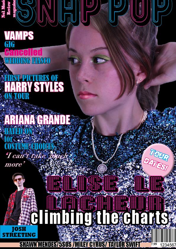
Front cover edits from teachers feedback

draft 4 of front cover 3.0

  • dded a banner with artists 
  • Pug colour 
  • Made the headlines upper case 
  • Added price 
  • Added next to snap pop what the magazine is 
  • Added the names on the bottom 
  • Bevel and emboss on pug
  • Image looked stretched 
  • Cover line font


Click on image to see PDF

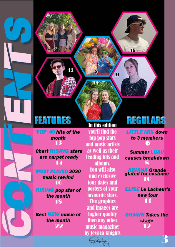
contents page edits from teachers feedback
  • Add a graphic in the background 
  • Coherency on page numbers 
  • Move regulars and features down 

Click on image to see PDF

Click on image to see PDF

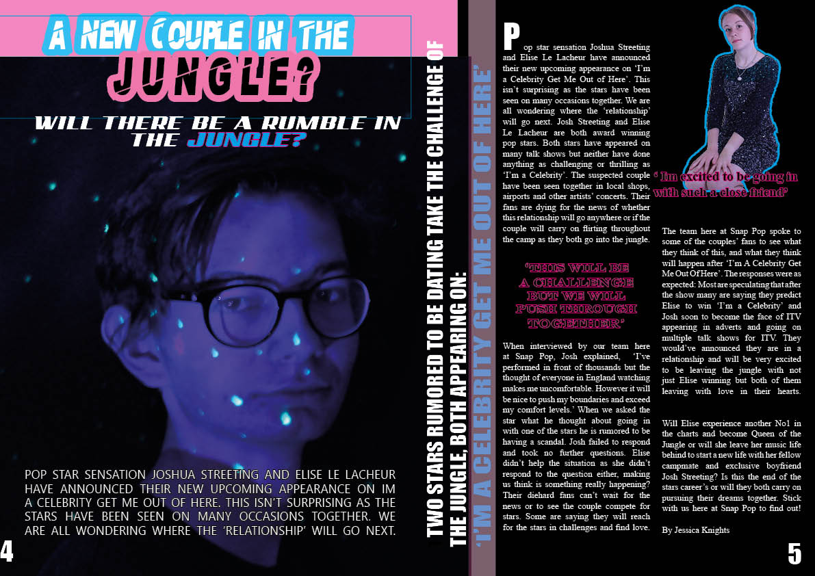
double page spread edits from teachers feedback
  • Make number smaller and so stand first uppercase 
  • Quote by josh and Elise 
  • Change font for a new couple and move a rumble in the jungle aloung the side 
  • Move josh down 
  • Stand first on other page 
  • Bigger headline 
  • Quote josh on right page
  • By line 
  • Center headline rumble in jungle 

Here is my teachers feedback:

Draft 3 Of All Posts

Click on image to see PDF#

In draft 3 of my front cover I changed the background colour, moved up the headlines and spaced the headlines correctly.

Click on image to see PDF

For draft 3 of my contents page I moved the masthead off the headlines, I also added the key words from the headlines and highlighted them in blue to make them stand out. For draft 3 I also changed some of the headlines to match the images.

Click on image to see PDF

For draft 3 of my double page spread I changed the headline to go across rather then down, I also added an image in a hexagan next tothe other image so it doesn’t look so out of place.

2nd Draft of Contents Page

Click on image to see the PDF

Whats new?
  • The positioning of the hexagons has changed
  • The top half of the background is now black instead of white
  • The contents masthead is now 2 alternating colours
  • I have added my own images
  • The font of the page numbers and the headlines
Whats next
  • change the font of the subheadings ‘regulars’ and ‘features’
  • change the font off the top of of ‘the next top hits’ to match the other font
  • move the contents masthead to the left more so it isnt right on top of the of the headlines
  • change a couple of headlines to match my images at the top
  • Add a page number